Mapping the Winds
LOS ANGELES — It's undeniable that the weather affects us, everyday. But understanding the patterns, the amazing global cause-and-effect, is difficult for anyone to wrap their head around.

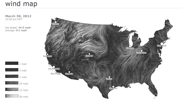
LOS ANGELES — It’s undeniable that the weather affects us, everyday. But understanding the patterns, the amazing global cause-and-effect, is difficult for anyone to wrap their head around. The internet helps: just a few weeks ago, I watched friends in Vancouver then San Francisco post pictures of rain, and a day or two later, Los Angeles got those same rain clouds.
How on, ahem, earth does that work? Wind Map, a new project from Fernanda Viégas and Martin Wattenberg’s HINT.FM, pulls data from the the National Digital Forecast Database and turns it into a beautiful visualization of how wind flows throughout the United States. The whiter the wind, the faster it goes, and as of today’s check, the top speed was a brisk 44.5 mph.
“An invisible, ancient source of energy surrounds us — energy that powered the first explorations of the world, and that may be a key to the future,” they write in their statement. And indeed, it’s easy to see the wind corridors of the US and imagine the clean energy that could be gathered from it.
I’d love to see this expanded to include the globe, should that data become available. Like David Bowen’s wave visualizer I reviewed earlier, this makes remote weather patterns accessible and easy to understand. And fun to watch too.