Tougher than the Rest: Joan Mitchell's Tree Paintings and Black Drawings
There are currently two exhibitions of Joan Mitchell’s paintings and drawings on the same Chelsea street. Taken together, they offer an extended examination of a painter’s process as her sensibilities shift from a dominant mode expression to something altogether different.

There are currently two exhibitions of Joan Mitchell’s paintings and drawings on the same Chelsea street. Taken together, they offer an extended examination of a painter’s process as her sensibilities shift from a dominant mode expression to something altogether different.
Cheim & Read, at 547 West 25th, has mounted a show of eleven paintings and pastels based on trees, while across the street at 514, Lennon, Weinberg is displaying twice that number, mostly small to midsize charcoal drawings alongside a few oil paintings.
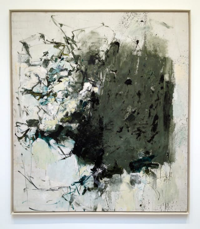
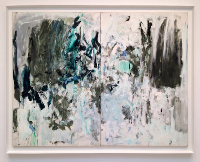
The two shows overlap in terms of time period (the sixties for both, the seventies and nineties for Cheim & Read); they also each feature an oil painting from 1964 that’s a close sibling of the other. At Cheim & Read, the canvas is “First Cypress,” measuring 88 1/2 x 78 inches; at Lennon, Weinberg, it is smaller (63 3/4 x 51 1/8 inches) and untitled. Both are made with thick, gummy, black-infused chrome green that’s massed into one half of the picture while wispy brushstrokes spin off to the other side.
In fact, if you rotate the Lennon, Weinberg painting 90 degrees clockwise, the dynamic between the feathery lines and the moss-colored, blocky mass is identical to the one at Cheim & Read; the brushstrokes propel the green shape to the right or explode off of it to the left, depending on you interpret the paint’s formal interaction.
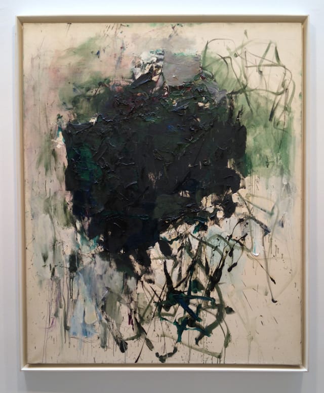
There is nothing ingratiating about these paintings. Chrome green is one of the drabbest colors in the palette, and it is unpleasant to work with — sticky and invasive. Mitchell pushes its dourness further by darkening it with black, which erupts in smears across the surface. While her clumpy masses may be related to the floating planes of color explored by Mark Rothko and Adolph Gottlieb, their assertively tough surfaces point toward the ideological materiality of Minimalism.
By the time she was making these works, Mitchell (1925 – 1992) was already ten years into a successful career and had begun splitting her time between New York and France, where she settled for good in 1968. At this remove, she continued to explore the idea of paint at a juncture in postwar American art when the very notion of painting was being called into question.
But Mitchell was not using paint in conventional ways. It was not paint-as-catharsis, as it was for many of the first-generation Abstract Expressionists, nor was it decidedly paint-as-paint, as it was for Frank Stella, Robert Ryman and others tagged as Minimalists. And it certainly wasn’t geared toward a lyrical exploration of flatness, as it was for Helen Frankenthaler, Morris Louis or Kenneth Noland.
As my Hyperallergic Weekend colleague John Yau notes in his incisive catalogue essay for the Cheim & Read show:
Mitchell is neither an observational artist nor one who abstracts from experience. Rather, she feels her way across a canvas, activating it with a wide ranges of marks — verticals, diagonals and horizontals, and calligraphic strokes that turn in any number of ways, in midflight.
Yau also quotes curator Paul Schimmel, who described Mitchell’s process in a 1984 essay titled “The Lost Generation”:
Her works are “about making a picture” (cubism) and not “letting it happen” (automatism). Her works epitomize a shift in abstract expressionism from chance, hazard and the uncontrolled freedom of the unconscious to a new direction with breath, freshness, and light within a highly structured armature not unlike [Piet] Mondrian’s trees.
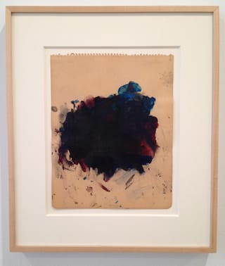
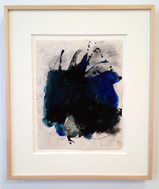
With these distinctions in mind, it is intriguing to compare the convergences and disparities between the works in the Cheim & Read exhibition, which is simply called Joan Mitchell: Trees, and those at Lennon, Weinberg (Joan Mitchell: The Black Drawings and Related Works 1964 – 1967). In the introduction to the catalogue for the Lennon, Weinberg show, Jill Weinberg Adams writes of the kinship between the “black drawings” and those explicitly referencing trees:
Mitchell generally spoke of her work in terms of feelings rather than their theoretical or structural aspects. The formal issue that did engage her was the relationship between figure and ground; never before had she addressed it so directly as in these mid-1960s works. We know from the titles of the related paintings that these compositions refer to trees, most specifically cypresses, perhaps silhouetted against the sky in favorite places like Calvi and Girolata in Corsica that she visited during summers sailing on the Mediterranean […]
Like the green mass in the two paintings mentioned above, the drawings Mitchell made in 1964 consist of an impenetrable tangle of marks; unlike the paintings, they don’t dissolve into an array of twisty brushstrokes. The jangling profusion of lines in “First Cypress” and its untitled sibling at Lennon, Weinberg is a trademark (or cliché, depending on your point of view) of Abstract Expressionism, and thus feels less anchored to our time than the green, ugly mass on the other side of the painting. The drawings, by contrast, seem as if they were made yesterday.
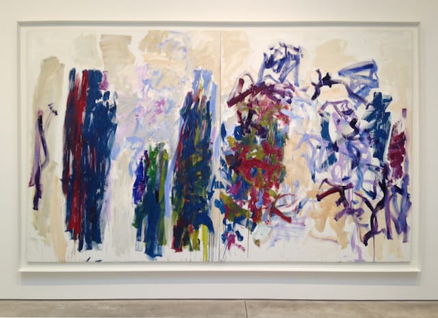
The allusive materiality of the 1964 drawings (as opposed to the later ones, which are more linear and fragmented) poses pigment as both a thing in itself and a portal into an emotional realm of pressure and release. Similarly, the two vividly colored paintings from the 1990s at Cheim & Read (both called “Trees” and dated 1990-91) as well as the churning “Cypresses” from 1975 (which, like 1964’s “First Cypress,” employs chrome green and black) concentrate more on their own making than on outside indicators, as slashing brushstrokes coagulate into groupings of unstable forms while carving out deep recesses of space.
If these paintings and drawings seem to enter more directly into the contemporary moment than those that happen to be more suggestive of the source material — such as the baldly representational “Tilleul (Linden Tree)” (1978) — it is not because they are more abstract. Rather, they are the ones that feel as if they are carrying the most internal contradictions — offhand and purposeful; firmly in control and barreling off a cliff. Simultaneously conclusive and inconclusive, they are geographies without maps.
Joan Mitchell: Trees continues at Cheim & Read (547 West 25th Street, Chelsea, Manhattan) through August 29.
Joan Mitchell: The Black Drawings and Related Works 1964 – 1967 continues at Lennon, Weinberg (514 West 25th Street, Chelsea, Manhattan) through June 28.


