Go Figure: Dona Nelson's "Phigor"
Dona Nelson's paintings are by turns joyous, confounding, risky, mysterious, straightforward, difficult, tied up in knots and freewheeling. One thing they are not is uniform. Nelson has long resisted a signature style, committing herself instead to an adventurousness in her means of expression.
Dona Nelson’s paintings are by turns joyous, confounding, risky, mysterious, straightforward, difficult, tied up in knots and freewheeling. One thing they are not is uniform. Nelson has long resisted a signature style, committing herself instead to an adventurousness in her means of expression. With her inclusion in the 2014 Whitney Biennial, a slew of recent awards, and now her current exhibition, Phigor, at Thomas Erben Gallery, Nelson’s on a roll.
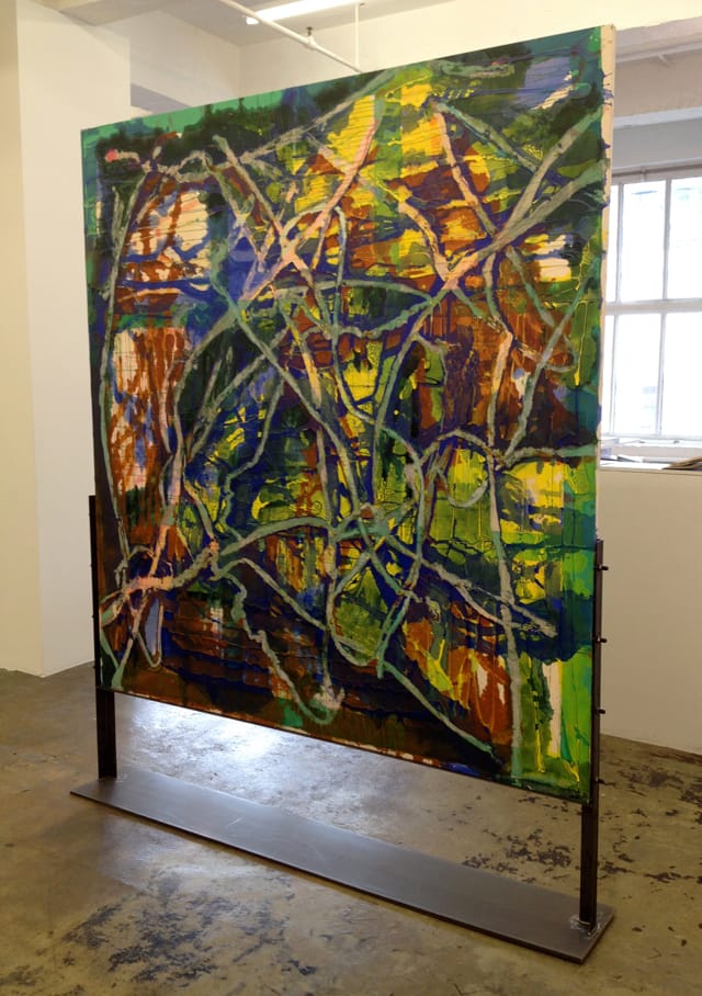
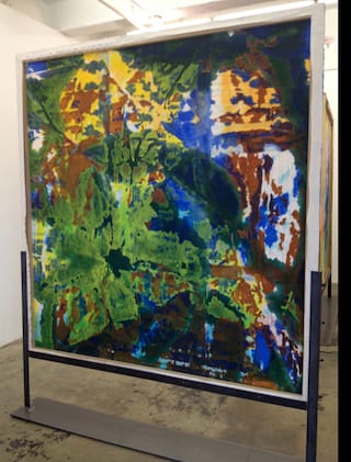
The Erben show features five freestanding, double-sided paintings and three paintings hung high on the walls, including the sparely painted “Bright!” (2014) and “Violet Bridge” (2014), as a buoyant counterpoint to the double-sided paintings, which tend to be larger, more complex, and held in place by floor-bound metal stands. The idea of a two-sided painting has precedents in Sigmar Polke’s “Transparents,” shown in New York at the Mary Boone Gallery in 1989 and, more famously, Marcel Duchamp’s “Large Glass” at the Philadelphia Museum of Art. Nelson shares Polke’s love of process and a resistance to categorization, having moved freely between figuration and abstraction.
(Full disclosure: When I met Dona Nelson 30 years ago, she was a figurative painter who had previously been abstract and later returned to abstraction. Before I had even heard of Sigmar Polke or Gerhard Richter, I saw Nelson as a painter willing to take the risk of big stylistic changes at the service of her expressive needs.)
With Nelson’s work, there has long been a preoccupation with the basic material elements of painting: canvas, stretcher, and paint, which comes out of a Minimalist idea of specificity. To this, she combines emotional and performative aspects derived from Abstract Expressionism in general and Jackson Pollock in particular.
The Pollock influence can be seen most readily in a painting like “March Hare” (2014), with its intertwining of poured paint, poured clear acrylic medium and removed muslin (more on that in a moment), making for a rough-surfaced, spatially ambiguous web. Her process is both intuitive and intensive. As the gallery press release describes it: “Working from both sides of the canvas, and often stretching and restretching it several times before deciding which is front or back, she stains, soaks and pours paint, sometimes forcing it through incisions or hosing down the canvas with water.”
Part of the fun of a Dona Nelson exhibition is tracing out the physical permutations she exerts upon the canvas – unwrapping the how. But don’t expect to unravel these mysteries in one go. They’re complex enough to make your head spin. Take the standout “Orangey” (2013), a large, vertical, double-sided painting. As positioned in the gallery, we approach the back of the painting with its two large vertical shapes – one orange and one blue – life-size figures, if you will. Since you are looking at the back, you also notice the stretcher frame and, oddly, thick red paint emerging from the underside of the stretcher bar to the left – although the stretcher itself is clean.
Walk around to the front and one of the first things you notice is the bright orange imprint of the stretcher’s supporting crossbars. Turn again to the back and sure enough, the crossbars are missing. She’s either switched out the entire stretcher frame or removed the crossbars. While there, you also notice that the blue shape has been painted on the back and the orange shape was painted on the front. Dizzy yet? Because the mysteries continue, compounded by Nelson’s practice of flipping the front of the canvas back and forth during the painting process. The painting is littered with little incisions, or canvas punctures, a form of mark making à la Lucio Fontana, through which paint has been pushed to the front, emerging in the form of droplets. (Although how the incisions were made in the vicinity of the stretcher bars remains a mystery. My guess: the punctures were made when the canvas was unstretched while being flipped from back to front.)
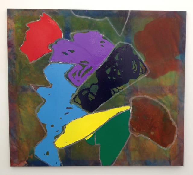
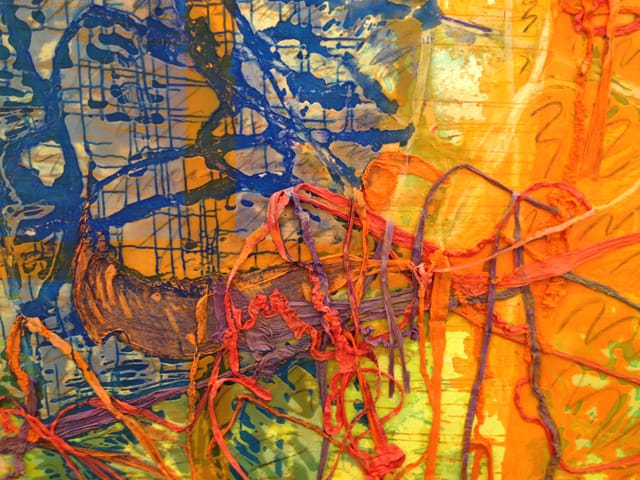
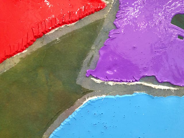
Applied to the front are multi-colored strips of rope-like cheesecloth that form a loopy, webbed line. The cloth acts as a dam to contain the flowing acrylic paint. In some areas, the fabric has been peeled off to reveal the white of the canvas and then reattached elsewhere, sometimes mirroring the vacated line. This peeling seems to have inspired a similar move in a few other paintings — “Top” (2014), “March Hare,” and “Red and Green Noses” (2013) — where Nelson cleverly creates a positive line from the deleted material. “Top,” another standout, is wall-bound and consequently provides a simpler viewing experience, but one that isn’t any less rewarding. With its thickly pooled areas of glossy Wet’N’Wild colors – bright violet, baby blue and cadmium lemon yellow – on a stained, camouflage-like ground, the painting evokes the immediacy and primacy of a fully formed Chauvet cave painting.
One of the relative constants amidst the variety of these paintings is the previously mentioned imprint of the grid of the stretcher and crossbars on the canvas. Nelson’s grids function as compositional scaffolds for the painting’s riot of material complexity and brightly colored images; they also act as direct indexical markers regarding the physical structure of the painting. Nelson’s constantly points to painting as both image and object. Similarly, in “Red and Green Noses,” she sews lengths of colored string through the canvas, front to back and back and forth, before knotting them off – the line, both literally and figuratively, ties the two sides together. In a recent artist’s statement regarding this interdependence of the two sides, Nelson spoke of her fascination with “the way in which two very different visual and physical manifestations can be inseparable from and, indeed, create each other.”
She has also called what inadvertently happens to the back side of the canvas as a result of the staining, soaking, and hosing-down of the paint as “received images,” or, as in the case of “March Hare,” “a completely received image,” (meaning she applied no paint at all to the back). That Nelson has chosen to honor these happenstance developments is a reflection of how much she values the element of chance, which was most influentially applied to art in the notion of automatic drawing, which the Surrealists saw as a way of triggering the unconscious. As with a dream, images simply arrive as a byproduct of experience, not of volition.
While most of our attention is rightly focused on her visual and material splendor, these qualities are merely conduits. What Dona Nelson is really working with is imagination, mystery, chance, time, and possibility itself, and we’re all the richer for it.
Dona Nelson: Phigor continues at the Thomas Erben Gallery (526 West 26th Street, 4th Floor, Chelsea, Manhattan) through May 24.


