The Victorian Christmas Card as Aesthetic Object
Christmas card imagery today ranges from the classic depictions of elves and reindeer to the more comical and topical, but every picture is assuredly holiday-themed: you wouldn't be able to unironically give someone a Christmas card on their birthday.

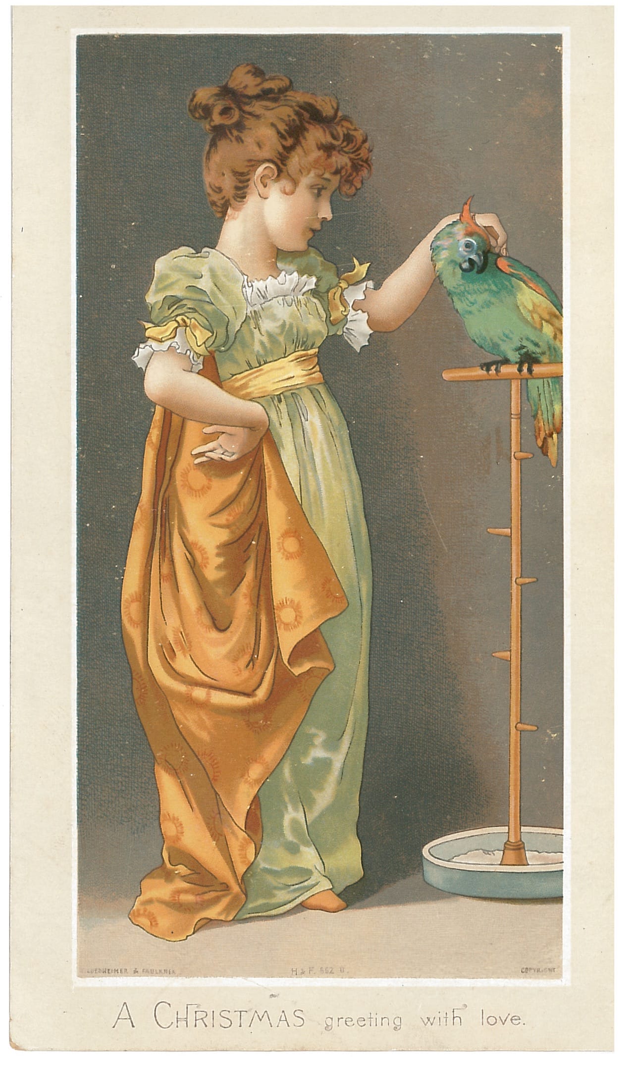
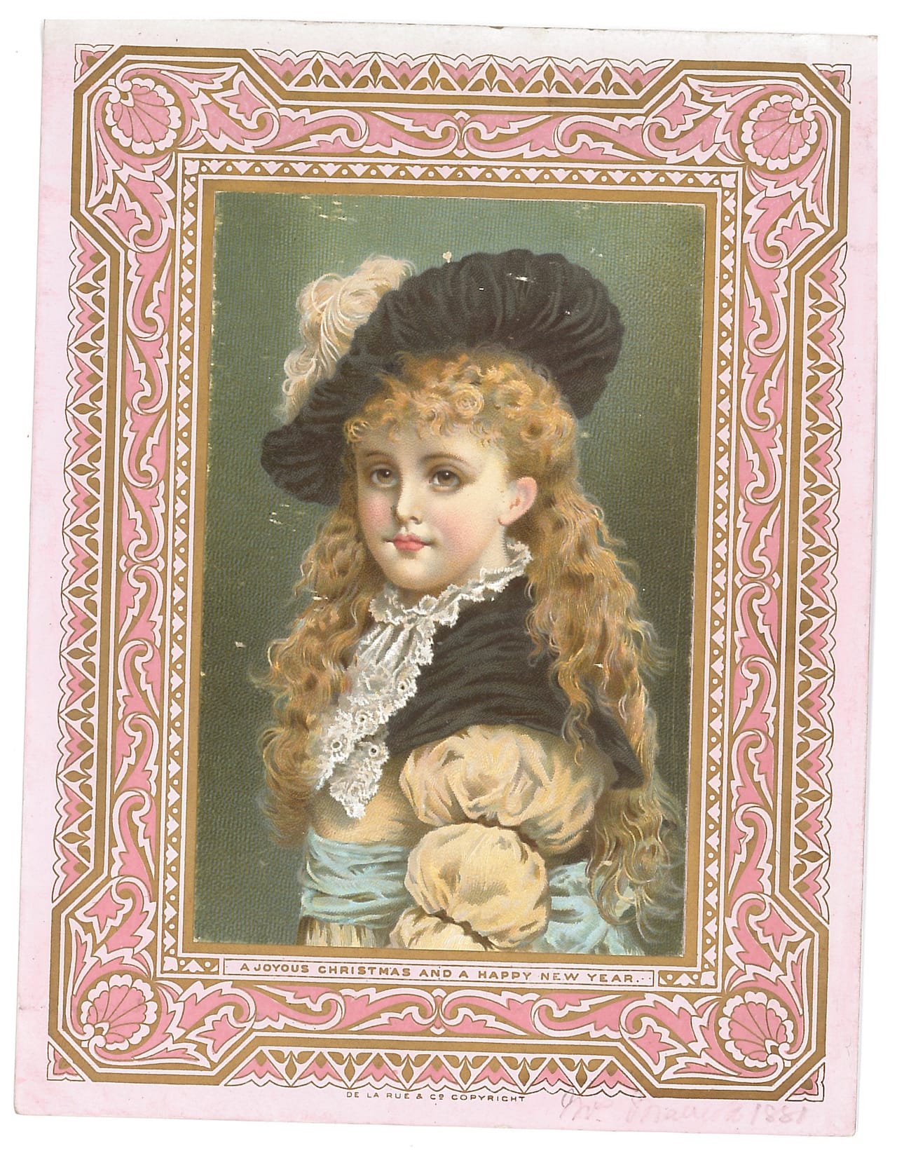
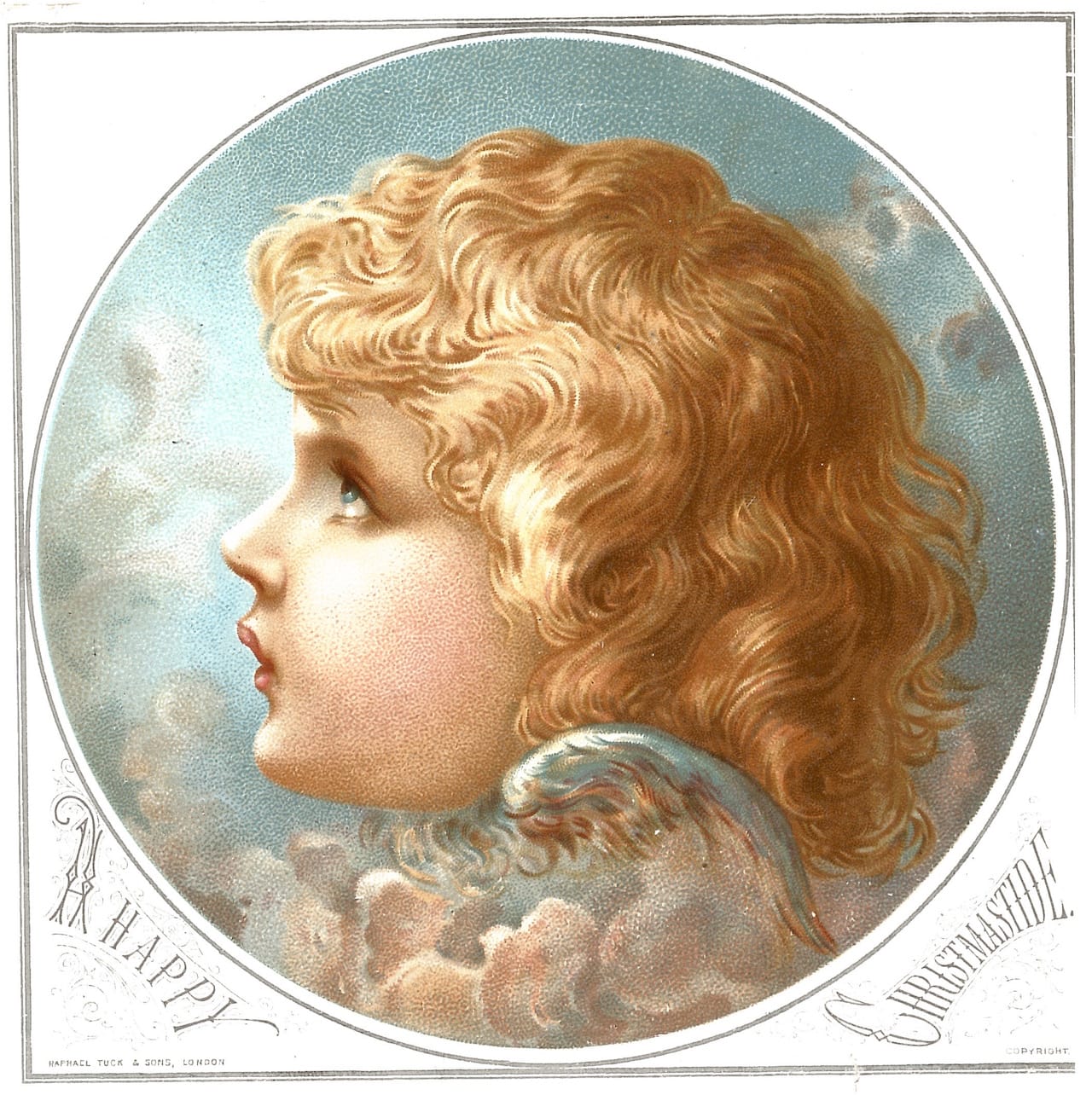
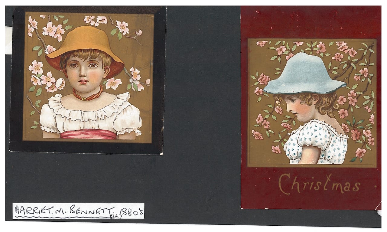
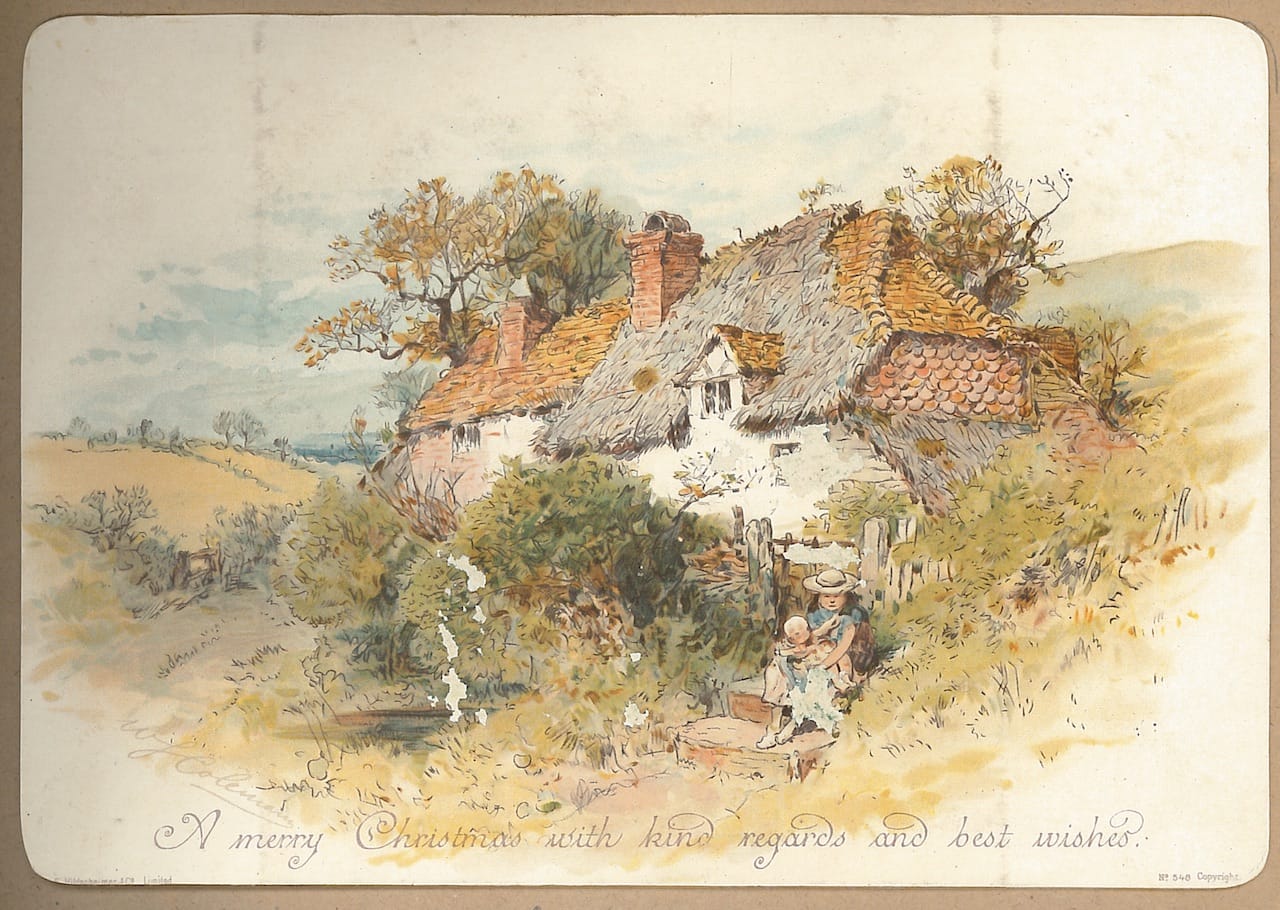
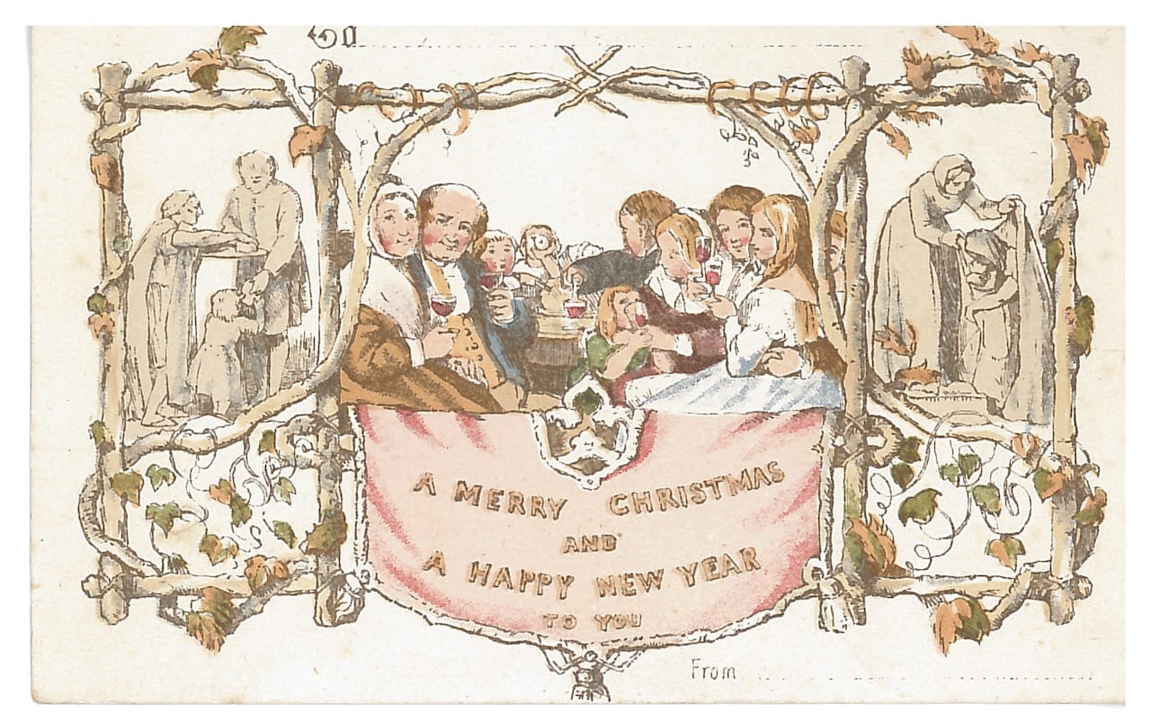
Christmas card imagery today ranges from the classic depictions of elves and reindeer to the more comical and topical, but every picture is assuredly holiday-themed: you wouldn’t be able to unironically give someone a Christmas card on their birthday. This wasn’t always the case in the Victorian era, when card artists focused on aesthetics rather than seasonal imagery, and few illustrations of Santas, nativity scenes, or even children with sleds circulated widely. Instead, a late-19th-century focus on beautiful designs was likely a way to counter concerns about the increasing commercialism and commodification of the holiday, as Patricia Zakreski, a lecturer on Victorian literature and culture at University of Exeter, writes in a new paper published in the Journal of Design History. The Victorian Christmas card, she found, became a mass-produced aesthetic object that — often in exchange for just few pennies — allowed anyone, regardless of class, to own a small, decorative work of art.
“The main publishers of Christmas cards invested throughout the 1880s in promoting the aesthetic value of their cards by drawing on the conventions of high art production and exhibition as publicity tools,” Zakreski told Hyperallergic. “They attracted relatively successful artists (though never the most successful) and quite a few decorative and female artists to design for them.”
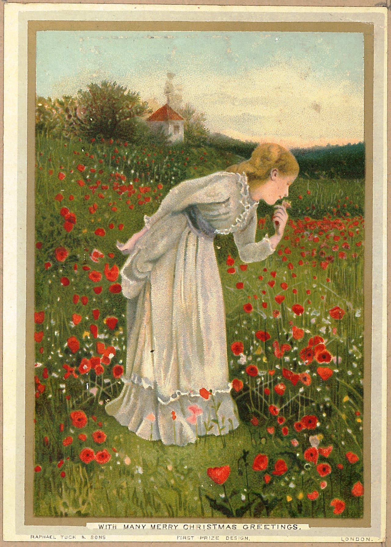
Some artists include Walter Crane, the painter Henry Stacy Marks, and Kate Greenaway, who was known for her illustrations in children’s books. The publisher Raphael Tuck & Sons even started a Royal Academy Series that involved commissioning Royal Academy members to create designs, and many firms hosted Christmas card competitions that exhibited the entries in a gallery and rewarded winners with cash prizes of up to £100.
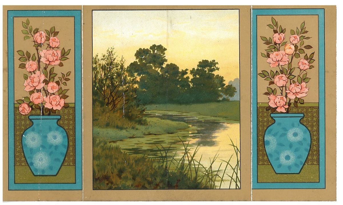
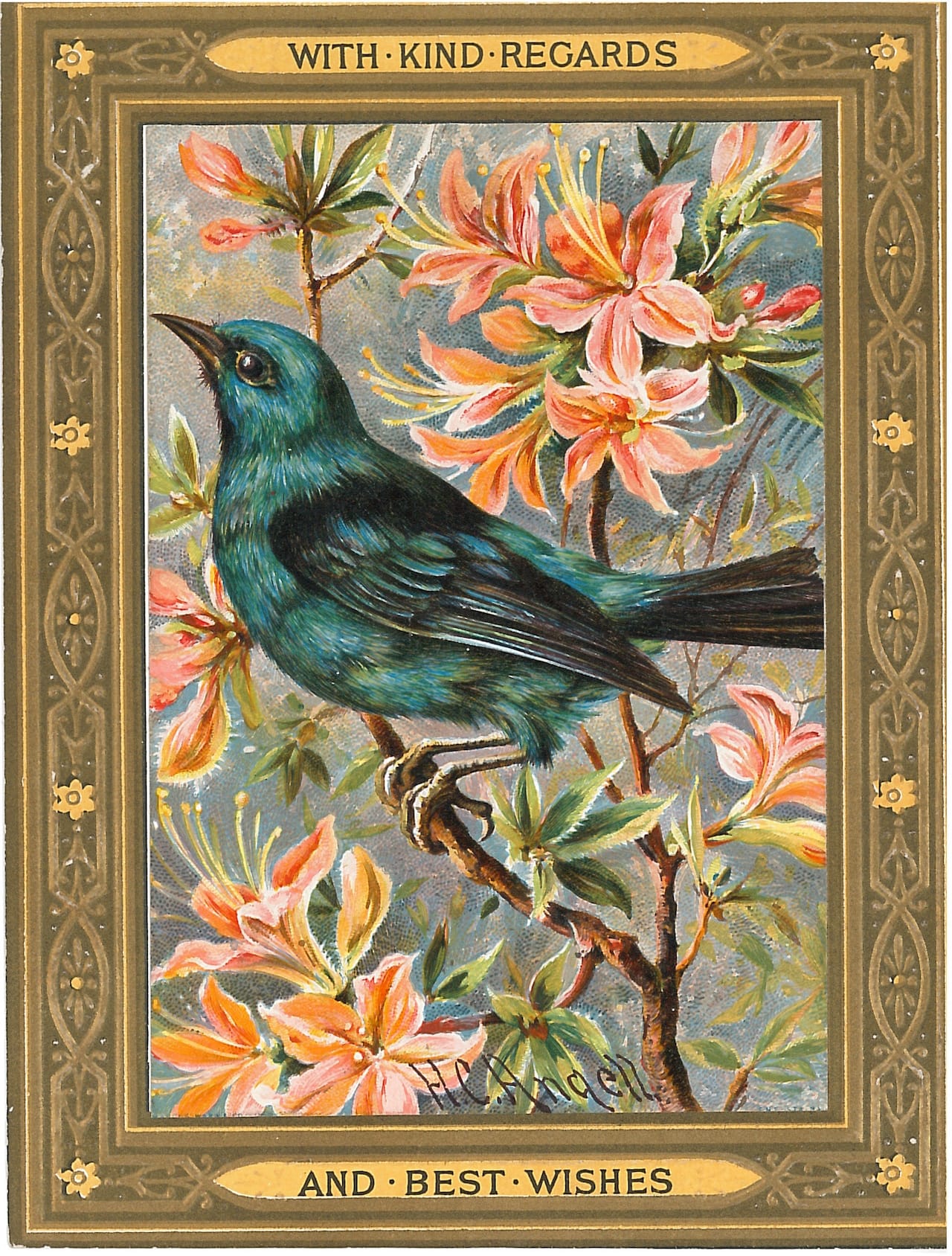
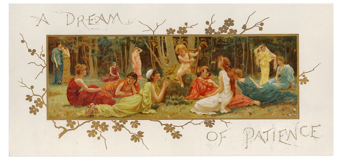
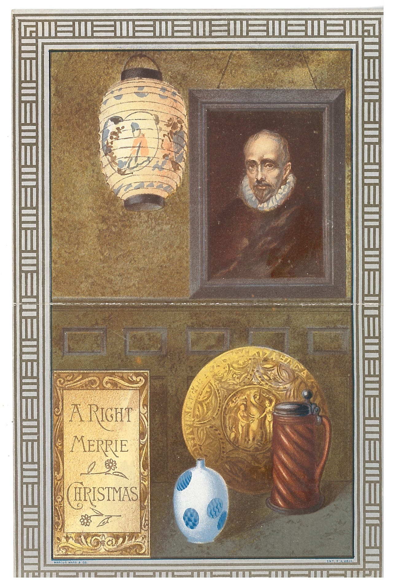
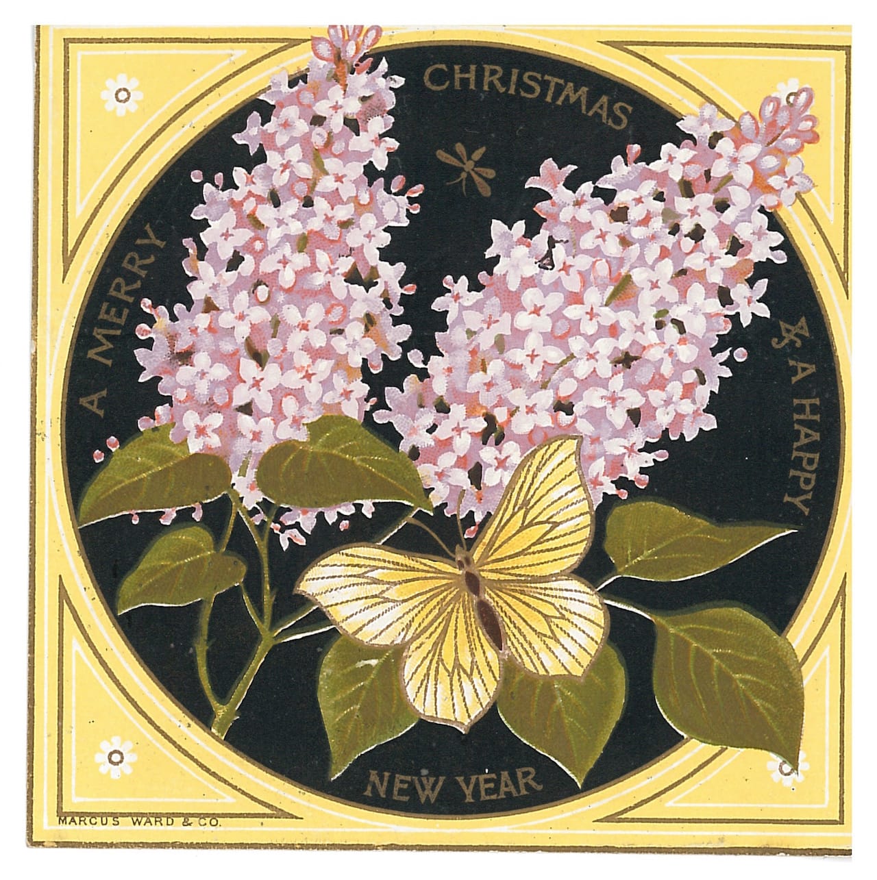
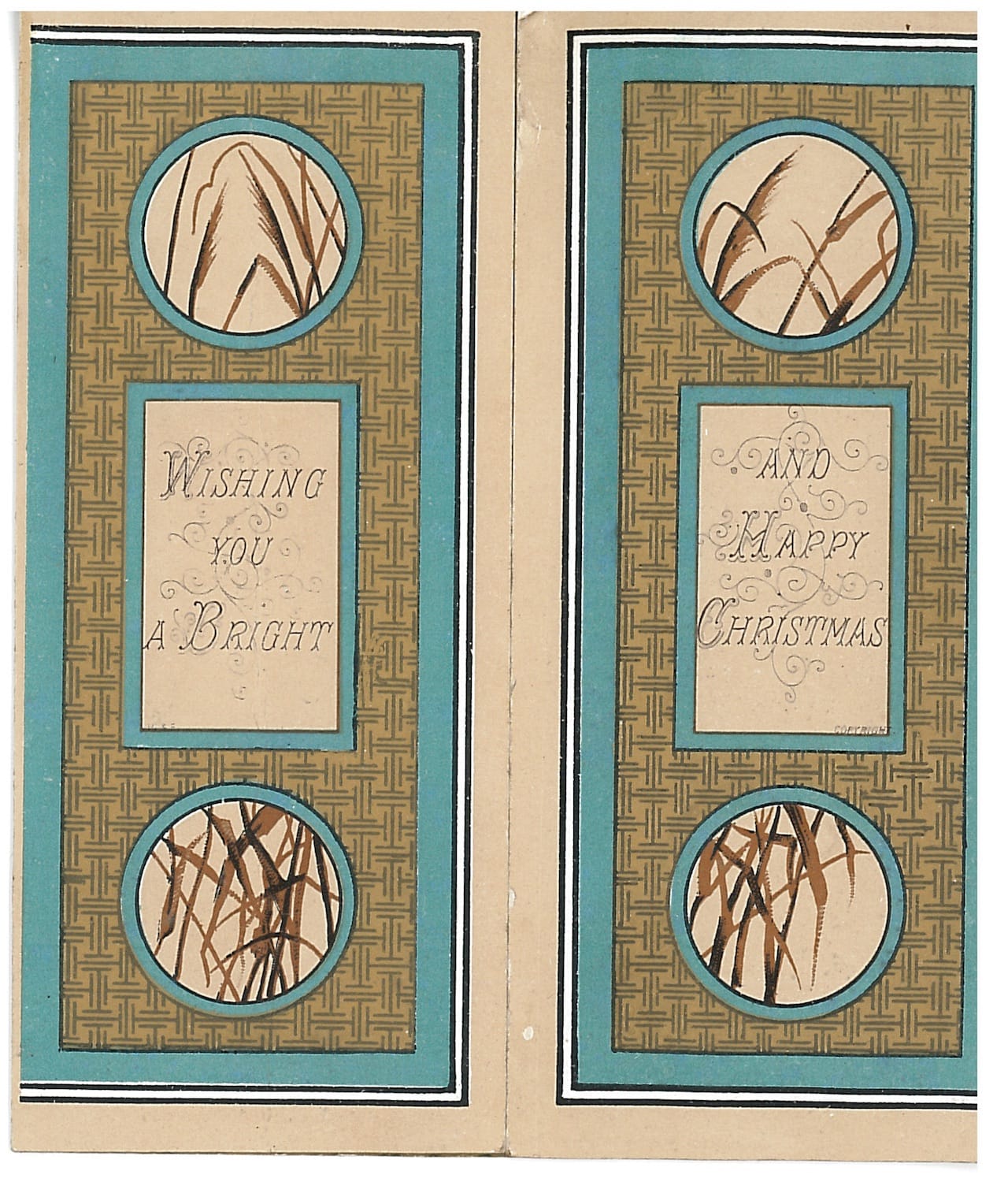
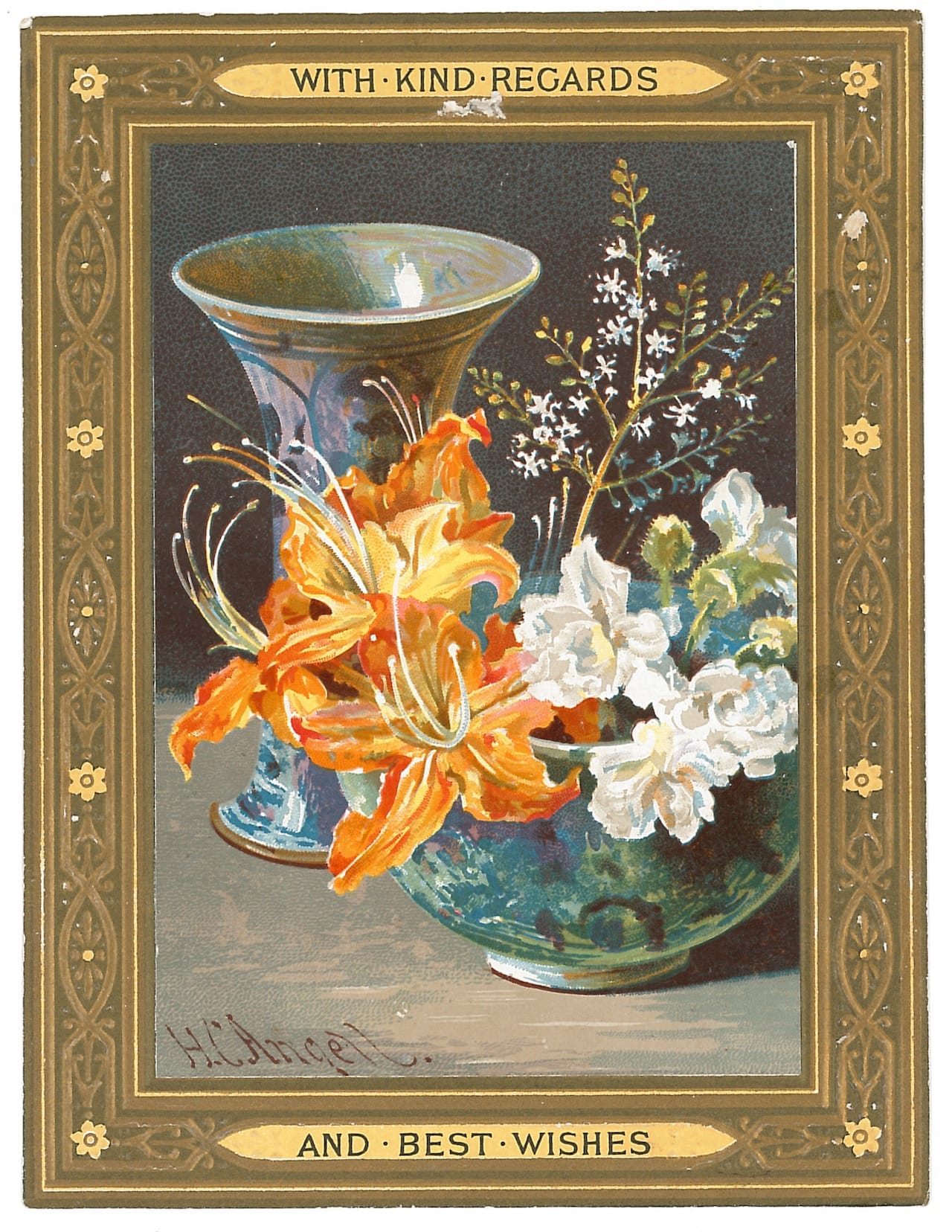
Flora and fauna were commonly depicted alongside fine art motifs, with only the accompanying seasonal greetings and well wishes suggesting the cards’ functions. Helen Cordelia Angell, for instance, popular for her still life paintings of floral arrangements, illustrated the same imagery in her designs for Marcus Ward, one of the first and most successful Christmas card publishers. A foldable three-panel card by its art director Thomas Crane — Walter’s brother — reveals a landscape flanked by two planters as well as Japanese-influenced patterns. As Zakreski writes, these cards reflected the style of “The House Beautiful,” an aesthetic movement vocalized by Oscar Wilde in 1882 that led to the production of everyday objects that were as much beautiful as they were functional.
“The House Beautiful was a concept of interior design within the Aesthetic Movement that sought to transform the Victorian home into a haven of beauty and good taste,” Zakreski said. “While the higher end of the market was supplied by the objects created by Arts and Crafts artists, cheaper versions were made available by manufacturers who mass-produced these objects, making them more affordable and therefore more widespread … the aesthetic Christmas card was one of these objects.”
Multiple copies of these designs were then produced at low costs thanks to developments in industrial technology; factory workers would carve every line into steel, sending their engravings to the printing room where others colored and stamped the cards, tint by tint. Along with spreading messages of joy and good health to someone’s friends and family, the cards were also gifts of good taste, products of careful handcraft. They also educated the public on respected decorative aesthetics and visual trends: Zakreski references a 1881 article in the journal The Relinquary that notes, “Christmas Cards are decidedly to the fore as art educators of the people … [T]hey bring high art — really high art — along with loving words and friendly wishes to the poorest cottages … ” Often displayed in drawing rooms, these cards were often later preserved in albums, kept as objects cherished not only for the holiday sentiments they carried but also their detailed drawings and skilled coloring.
