Beer with a Painter: Erika Ranee
I met Erika Ranee last summer when I took students to see a pop-up exhibition she curated in a Brooklyn studio, arranged around the theme of imagery of the eye.

I met Erika Ranee last summer when I took students to see a pop-up exhibition she curated in a Brooklyn studio, arranged around the theme of imagery of the eye. I was struck by how Ranee succinctly and clearly discussed the work, even as she addressed everything from its politics and subject matter to the studio processes of the artists in the show and her personal relationships with them. The exhibition included several artists of color, a variety of media, and both high profile and emerging artists. Ranee’s tour — and the conversation we had recently in her Bushwick studio — pointed to the fact that hers was an alternative canon of contemporary art and art history.
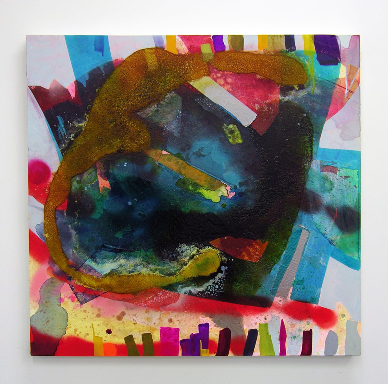
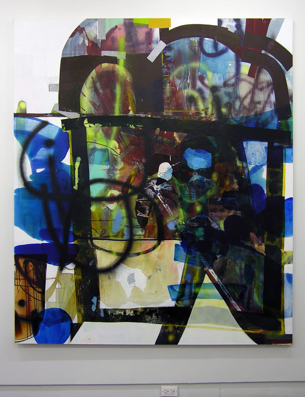
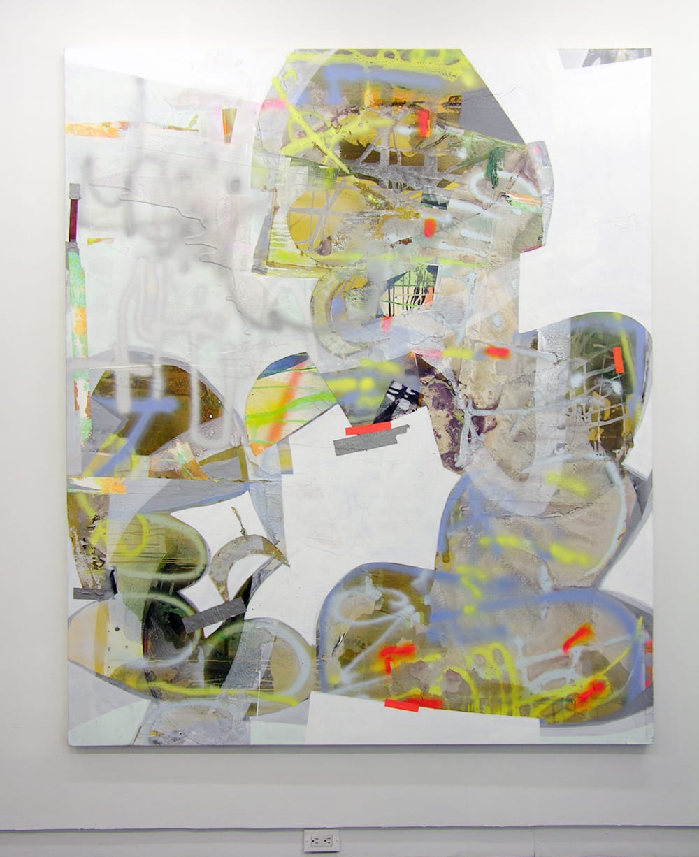
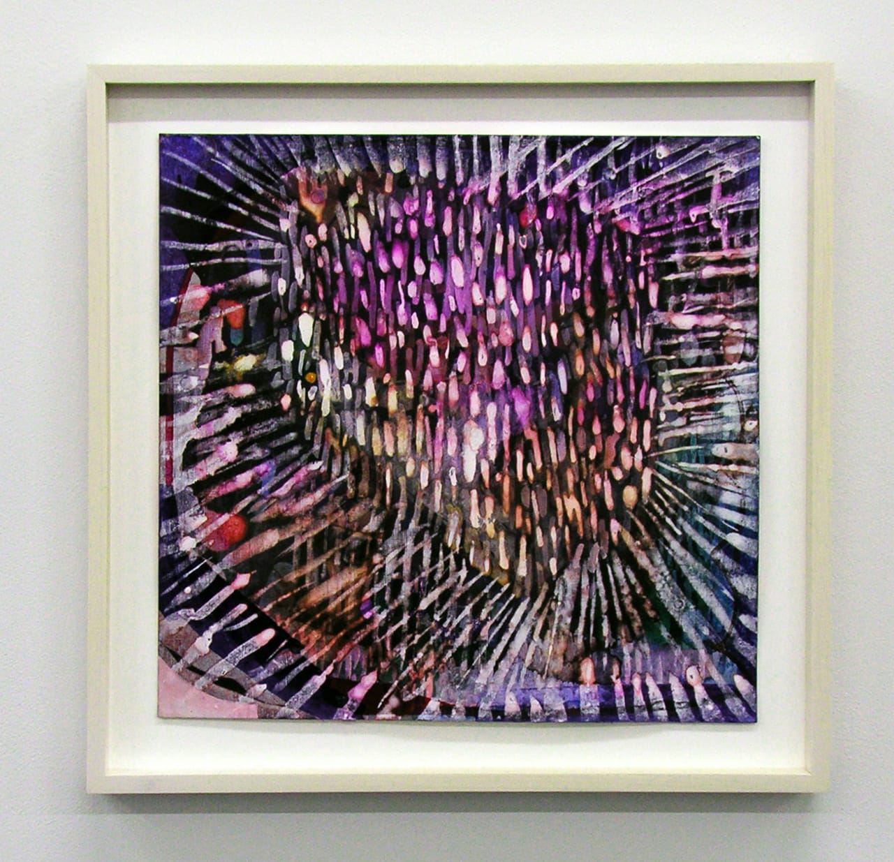
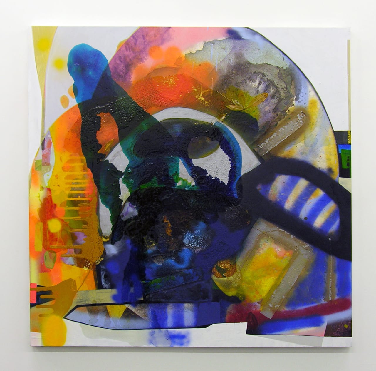
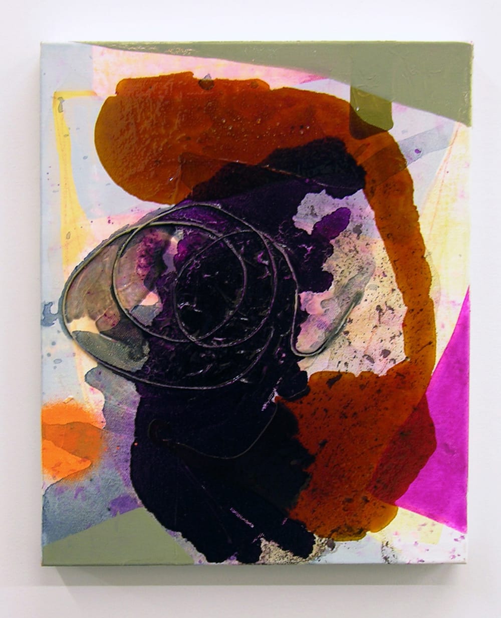
This personal pantheon, and diverse range of influences and impulses, catalyze Ranee’s painting. They are internalized and made visible in the variety of materials, which can include acrylic, oil, spray paint, shellac, and tape, and range of mark-making within the work — pouring, scrawling and cutting into forms. Ranee has transitioned from more overtly political imagery to an abstract narrative; the paintings nonetheless conjure passage through urban streets, with colors and marks that are fresh and distinctly of our time. They evoke the feeling of moving through a timeless terrain where our words or memories are embedded in matter – surfaces that are touched, adorned, and marred.
Ranee received her BA from Wesleyan University in 1987, her BFA from the School of Visual Arts in 1991, and her MFA from the University of California, Berkeley, in 1993. She was a 2009-10 Artist-in-Residence at the Abrons Art Center, and was awarded a studio grant from the Marie Walsh Sharpe Foundation in 2011-12. She was included in group exhibitions recently at BravinLee Programs, New York, and The Parlour, Bushwick, New York. A solo exhibition of her paintings, entitled Gasoline Rainbows, is currently on view at LMAKgallery, New York, through June 5, 2016.
* * *
Jennifer Samet: Did you draw or make art as a child? What memorable experiences did you have with art as a young person?
Erika Ranee: I wanted to be an ornithologist, entomologist, or a botanist when I was a child. I grew up in rural Massachusetts, and after school I would go for long walks with my dog and collect abandoned bird’s nests. I liked examining insects preserved in amber. It is such a beautiful rich color; that has stayed with me. I like the idea of preserving things. When I travel, I always collect something as a reminder of that place. My apartment is full of those objects.
As a child, I liked to make up stories, but writing wasn’t completely my thing, so I would create worlds and draw them. My aunt, who is only six years older than I, was into drawing and crafts like macramé. My grandmother, who lived with us, taught us how to knit and sew. I was not patient enough to complete a sweater, but I would make a tree or some odd object.
JS: How did you end up at art school, and who are some of the people you studied with at the School of Visual Arts and University of California, Berkeley?
ER: When I went to college, I was a government major. In my senior year at Wesleyan, I went abroad to Paris and took some classes at Parsons. I had no experience with painting. Our professor had us making our own oil and egg tempera paints, building stretcher bars and canvases. We were taught painting from start to finish. I made a decision to not go to law school.
In 1987-88, I moved to New York and enrolled in the School of Visual Arts. Marilyn Minter, a professor, would send us to see shows, and have us write reviews. She wanted us to learn who the artists were, how it tied together to what we were doing in school. Jane Rosen saw that I was trying to grasp drawing and worked with me; from her, I learned about precision and tenacity.
Jack Whitten told me I needed to loosen up. My propensity is to over-think and try to perfect things, but I also wanted to be full-on expressionistic, and you can’t have both. He was always sending me back to make another piece. One night, I had gone out and had quite a few drinks. When I came back, I realized I had forgotten to do the drawing assignment. So I made these drawings, which I thought looked like crap. I brought them in to class, and he said, “That’s what I’m talking about.”
Hannah Wilke was also a teacher. She would spend classes railing against “Claes.” We were all like, “Who is Claes?” It wasn’t until later we realized she was talking about Oldenburg, who had broken her heart. I think our class period was like therapy for her. She had a raw and lively spirit. Then, she shared with us that she was sick, and, very quickly after, she had died. Looking back, I can’t believe my roster of professors; they are heroes to me now. Back then, it was as if we were hanging out in their living rooms, rather than sitting in a classroom.
JS: I have noticed that your personal canon of art history is not the one generally taught to students; it includes a lot of artists of color. You and I have also talked about your love of de Kooning’s “Woman” paintings, which are problematic in the canon because of their perceived content and misogyny. Can you talk about this?
ER: In graduate school, a professor selected a book he felt was the go-to source for documenting the most important artists in the country. He asked us to choose several artists from the list and write a twenty-page paper about them. There was only one woman (Cindy Sherman) and not a single African American artist represented. I was not the only woman or artist of color in the class; there were a few of us, so it felt particularly egregious. Some other students and I brought it to his attention, and he actually challenged us to name any significant black artists. We started to name names – like William H. Johnson, Bob Thompson, Elizabeth Catlett, Beauford Delaney, Minnie Evans, Martin Puryear, and Alma Thomas – many of whom were part of my family’s art collection [Erika Ranee is the daughter of Bill and Camille Cosby]. The professor remained defiant.
In terms of de Kooning, the thing that I wanted to get at was the way the paint was applied, in layers. I wanted to learn how to do that, so I was trying to make copies of those paintings – not the exact images, but their energy – and collaging. In order to do so, I had to overlook their misogynist content to some extent. It is a tricky thing.
I think about the ways film historians have heralded D.W. Griffith’s film, The Birth of a Nation. They consider it a masterpiece, not least because it’s the first full-length film ever recorded. However, you often have to remind people that it was a Ku Klux Klan propaganda film. Another example is Leni Riefenstahl’s film “Triumph of the Will,” made for the Nazis. You hear the accolades, and it can be infuriating. But that is the complex territory you enter sometimes. I don’t think you can seamlessly compare misogyny to KKK or Nazi fascist propaganda, but on some small level that is the weird disconnect I had to make with the de Kooning paintings.
JS: Your early work dealt with imagery of black stereotypes. How did this become a subject in your painting, and how does it relate to some of these ideas about content and technique?
ER: When I first started painting, I was interested in how de Kooning, Dubuffet, and Basquiat, treated the figure: how it was so broken up and expressive – the flatness and cartoon-like imagery. I wanted to treat the figure with that kind of language, and I felt compelled to address imagery of black stereotypes.
My love of Pop art, de Kooning and his “Woman” series — the grimaces, the teeth —came together when I was researching black stereotypes. I found books that archived the images, and I would project the images right onto the canvas. I would create a narrative, which I hoped would illuminate how horrible they really were.
I was starting to collect postcards and black collectibles from flea markets. The largest flea market in the country is in Brimfield, Massachusetts, not far from where I grew up in the western region of Massachusetts. The postcards I found are from the 1930s and 1940s, and were mailed home by people from New England visiting the south. There were grotesque images: like scenes of a black man being flogged in the public square, with white people attending and watching. Yet, on the flip side were simple messages inscribed to loved ones.
I wanted to know why I was drawn into it even though it was a negative image. I realized that the common thread was the easy-to-read graphics, and the way the images were reduced to the simplest elements of a clean black line.
A lot of black artists were doing that kind of work in the 1990s. Ellen Gallagher, who is a friend of mine from Skowhegan, was making work with imagery of disembodied lips and eyes. I was doing full-on, giant mammy faces like Aunt Jemima, Uncle Ben, from books, films, and other collected artifacts.
I started to research Saartjie Baartman, who was labeled by her enslavers as Hottentot Venus. She was from South Africa, and during the early 19th century was placed on display as a freak in a traveling circus in Britain, then Paris. After her death, an anatomy professor from the Museum of Natural History in Paris dissected her, and placed her genitalia and other body parts on display. The work that I made was about rebuilding her body, and giving it honor.
I was also looking at Warner Bros. videos with characters that were monkeys, which were really black people, specifically the Honey and Bosko cartoon characters. I made a body of work using the Bosko images, including a large-scale painting, “Honeychild” (1995), with Honey’s head placed on a Shirley Temple-type body.
At that time, I was exhibiting a lot, as were other artists working with similar themes. However, I was getting depressed looking at all of these images and dealing with the issues behind it, seeing and absorbing the racism involved. Then, at about the same time, in 1997, my brother died.
I had reached my limit with those images, and when my brother died, I felt like I could stop making that work. I kept painting, but the work changed, and was very private and personal. I was in a dark basement studio in TriBeCa. For nine years I had another job, not in the art world, and I ended up not showing my work.
Finally, a friend of mine encouraged me to get back into the art world. I had gone to Amsterdam and Rotterdam and found some children’s vintage coloring books, which had, again, Black stereotypical images, but also images of children and nature, which I loved. I started making paintings inspired by these images, and was having more fun with it. Then the figures started to disappear. I was building up the trees and forests around the images of children in my paintings.
I went to the Vermont Studio Center and I was working on a painting that was inspired by Botticelli’s Birth of Venus. It was a black woman emerging from flowers and trees. She had a huge Afro, and there was a little creature or child with her. It was like the emergence of Black Power. I had the same Afro in the 1970s. For me, she was the central force of the painting.
In Vermont, people were always walking in and out of my studio, and I’d been alone in my studio for 10 years. One night, after a struggle with the painting, my neighbor strolled in and casually asked: “Do you really need the figure? The painting is great, but why do you need the figure?” The same question kept coming up throughout my time there.
In an interview I read, Jack Whitten talked about the assumption of “illustrated imagery as conveying a narrative.” He states that in his abstract work the narrative is in there, but it is not illustrated. I was fixated on everything being read clearly and hadn’t realized a painting could be interesting without that clarified image of narrative articulated on the canvas. So, it made me think differently.
Eventually, I ended up obscuring everything except her eyes, which are two gold stars, and the little creature’s face. The illustrated narrative was holding me back. I still have to have content. But, as Jack was saying, “The content is in there but you just can’t read it or see it.” I live by this rule right now.
JS: You transitioned into making abstract paintings, which is what you do now, but there is often some kind of text or writing embedded in your painting. How did this become part of your process?
ER: When I stopped using images from the postcards, I started reading the notes. The notes were so sweet, like, “Hi honey, are you coming for supper next week?” with the flip side as the black man being flogged — or a black child being devoured by an alligator. You think, “This is what you are sending home with a loving message?” There was such a crazy disconnect. I would project the notes onto the canvas and build a painting around it. In 2001, those were the first fully abstract paintings I was doing with text.
I had an experience recently that is an example of how text can become embedded as experience, informing the painting. I was driving over the Brooklyn Bridge. If you don’t take the bridge often, you don’t realize that you can use both lanes to turn onto the bridge. The left lane is clearly marked, but in the right lane, the arrow has eroded. I was in the right lane and another driver was honking and giving me the finger because he thought I was cutting in. I thought about how eroded that arrow was, how beautiful it was — the ghost of a sign — and how that could lead to miscommunication and possibly violence.
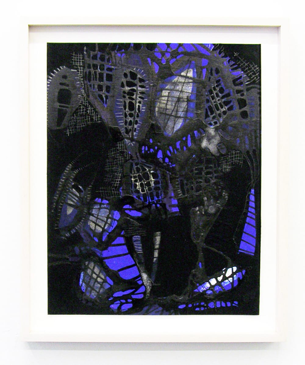
It made me consider the idea of ghost lines in a painting, as a starting point. Paintings sometimes start as documentations of little moments, but the end result might be illegible. I will have a quote in my head, but when it moves from my head to the canvas, it’s the painting gesture that drives it and articulates it.
I like to imagine that it is the way a baby would write out words before they’ve learned how to spell and form letters – the unadulterated, early stage of gesture. That accounts for my reverence of the CoBRA artists, like Karel Appel and Pierre Alechinsky.
JS: Does street art come into play in your work as an influence, considering you use spray paint and text?
ER: When I moved to New York in the late 1980s, the street art was beautifully raw. I wanted that kind of grit in my own work. I thought of it like some of Dubuffet’s paintings – how he incorporated dirt or tar to get those surfaces. I think about being “of the earth” and how there is beauty in urban dirt too. When I’m using the spray paint, of course that evokes graffiti, but I want to push it back into the painting as a first scrawl, like a cave painting, then build more layers to be excavated.
JS: You also use a combination of materials, like tape, shellac, oil paint, Guerra acrylics. Can you talk about how these materials interact and some of the accidental things that happen with the paint?
ER: Yes, when I do pours, or put shellac down, or spritz the painting, and come back the next day, it does not look the way I had planned. That’s why I do it. It forces me to relinquish control. If I fixate too much on the painting, I get focused on correcting things.
There are all kinds of ways one can try to relinquish control – like drawing with your eyes closed, or painting in the dark. Listening to music is another way of getting outside of the painting a bit. Now, when I look at some of the paintings, I remember which album I was tuned into fifty times in a row, because now it’s part of the painting’s DNA.
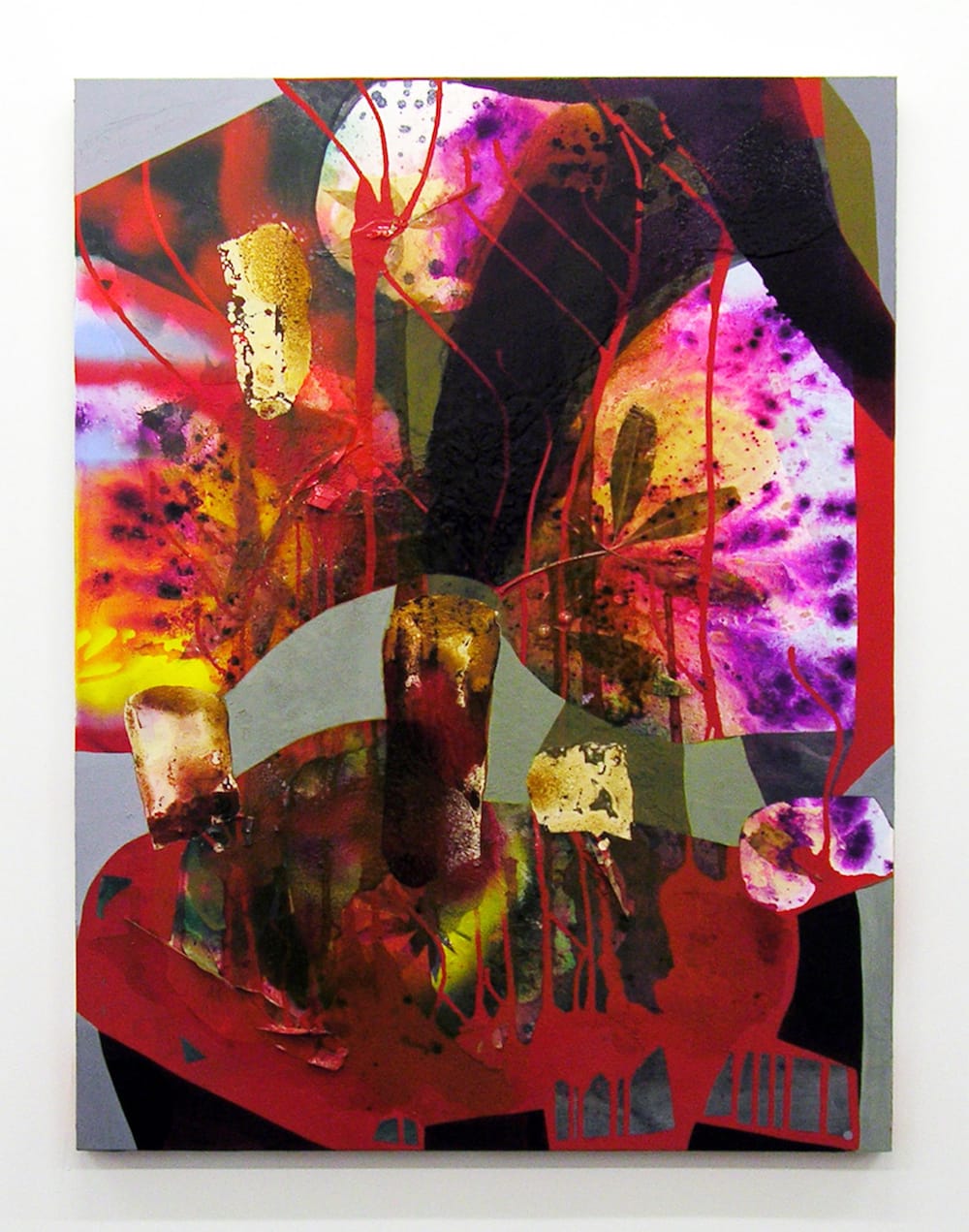
Some of these paintings read like a big figure stretched out to the edges, filling up the space. But I often have the urge to cut into that solid form. I’m discovering that when I’m uncomfortable with the image, it’s usually a sign that the painting is done.
I use watery washes of acrylic and go over them with thin layers of shellac. The water and oil combine to create a crust surface. I often think about preservation as it applies to my work. The amber color evokes the natural amber that had captivated me as a child. As I build layers, I’m thinking about the interplay between materials, and histories. I can pull tape off and leave the remnants of it. The shapes become a history of that. The histories build up. Sometimes you don’t even see it, and sometimes you open a window onto it. The painting always pushes back.