Hurricane Frank: Rhetorical Abstraction in the Age of the Incidental Viewer
If Frank Stella’s ambition and insatiable visual voracity were exhilarating at first, the paintings’ often overbearing size and physicality also left the viewer, time and again, with the unsettling feeling of being wrestled to the ground.

Last winter, Frank Stella’s retrospective took the Whitney’s fifth floor by storm, an extraordinary career unfolded on an epic scale. It made clear from the onset that Stella is a contemporary icon, a historic monument, and that such monuments make monumental works.
Thanks to a non-linear installation devised by the artist, the exhibition presented his highly prolific development through unexpected juxtapositions, which also highlighted its uneven character in ways that would have been otherwise difficult to grasp. Stella, the visitor was forewarned, has become a much more complex artist than his early, often simplistic Minimalist statements (such as the famous “What you see is what you see” from 1964) would have led one to believe. In the late ‘70s and early ‘80s, he jettisoned, one by one, all of the principles that had sustained his previous work. His career is thus marked by major about-faces and spectacular backtrackings, reversals that only such a magisterial artist could afford critically, let alone survive market-wise.
If Stella’s ambition and insatiable visual voracity were exhilarating at first (his titles reference such a wide range of fields that they endow his undertaking with a universal flavor), the paintings’ often overbearing size and physicality — somehow the smaller versions are not as convincing as the larger works (size matters!) — with each ranking as a formalist “tour de force” in its own right, also left the viewer, time and again, with the unsettling feeling of being wrestled to the ground (vestigial remains of his wrestling days in high school?). A vocal admirer of Hans Hoffman, Stella seems to have reversed the terms of that painter’s famous theory of spatial push and pull and applied it to his physical relationship with his viewers: first pulling them in, only to better push them out, alternating attraction and repulsion in a peculiar game of puppetry, with the artist as puppet master and the viewer as puppet.
With his prescient focus on Theatricality in 1967, Michael Fried, an early supporter, placed Stella squarely in the center of the debate revolving around the status of the beholder in Minimalism. Absorption and Theatricality, the two tenets of Fried’s intuition, to some degree seem to merge in Stella’s work, and at the time Stella was claimed by both opposing parties. This ambivalent relationship with the viewer can be felt all the way up to his most recent work.
Until the mid-seventies, his paintings did not need a viewer to engage them other than phenomenologically — as a moving body sharing their physical space. Even though they comprise the body of work most often associated with Minimalism and Theatricality, the self-absorption implied by these paintings also associates them with the opposite tenet of Fried’s duality. Later, with the increasingly Baroque metal reliefs, Stella would need to bring the viewer back into the third dimension. He went to great lengths to explain himself in a cycle of conferences later published as Working Space (1986). The tacit pact of this uneasy alliance is that the viewer is allowed to get only as far into the work as Stella will let him go, which strikes a different chord from Diderot’s insistence on the viewer’s absorption as a precondition to the autonomy of an artwork’s space, or what we see much later as the work’s self-reflexivity.
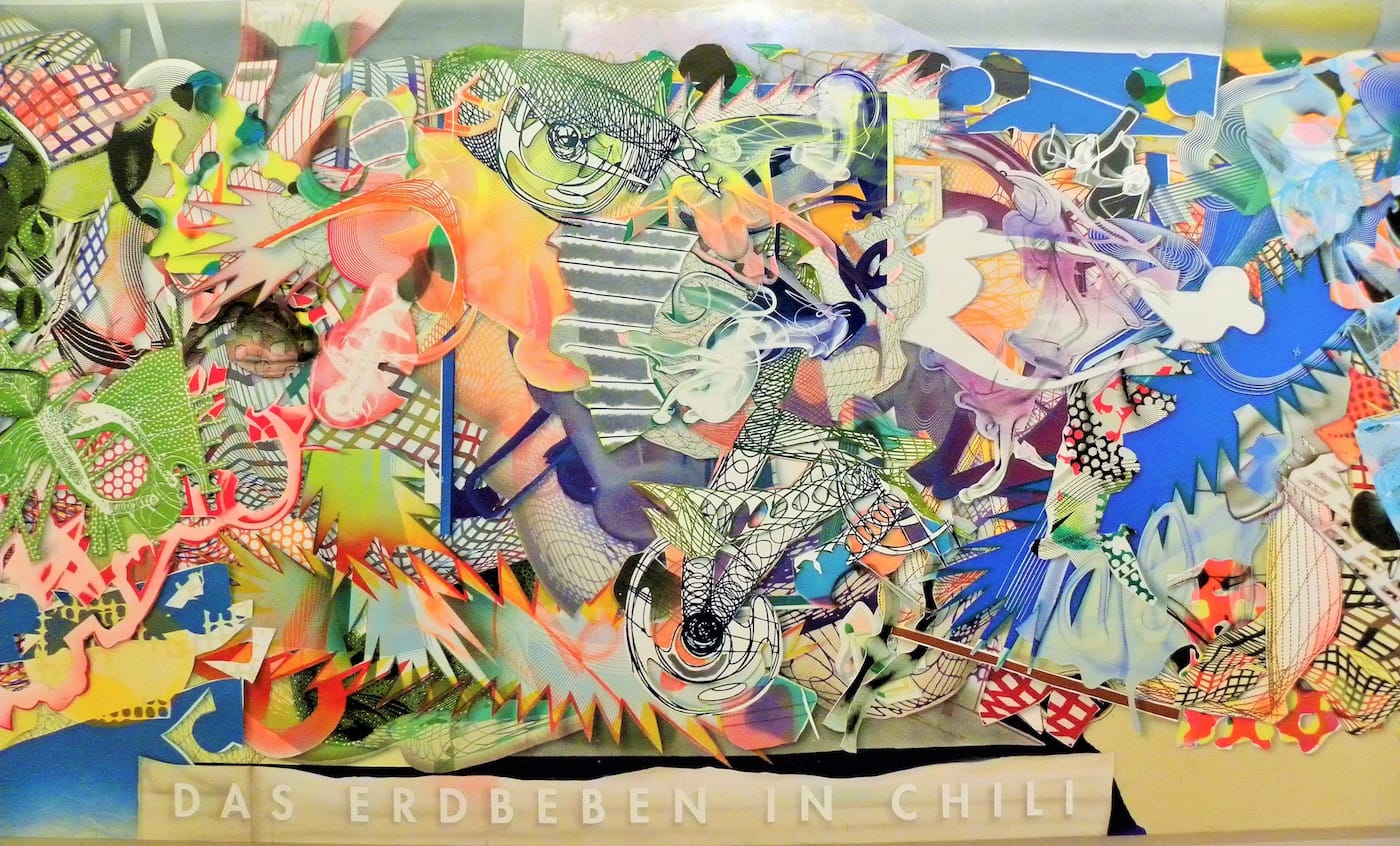
The exhibition seemed to be bookended by two kinds of catastrophes: one natural and one manmade. First, confronting the visitors as they stepped out of the elevator on the fifth floor, “Das Erdbeben in Chili“ (“The Earthquake in Chili,“ 1999), sets the tone for the rest of the display. The only painting in the show to flaunt its title on its surface — like a movie subtitle for a cinemascope-scale visual earthquake — it leaves the viewer groping to find firm ground. Then, towards the end of the exhibition’s “parkour,” as it may have to be called, “The Raft of the Medusa” (1990), as a reference to a 19th-century naval disaster and Théodore Géricault’s portrayal of it from 1818-19, offered a pointed echo of the natural catastrophe referenced in the show’s opener. It is hard not to read both works and their function within the exhibition as literal illustrations of Gilles Deleuze’s proposition that if modern painting did not go through the stage of the catastrophe, it would be condemned to cliché.
In the next room, the Black Paintings looked perhaps even more fascinating and relevant today than they were when first shown in 1959, their precociousness still mindboggling. With one foot still in the Abstract Expressionism of Ad Reinhardt, their inner drama tightly contained within the black color, the restraint of their gesture and the existentialism of their titles, they harbor an interior tension that is sorely lacking in the rest of Stella’s oeuvre. Anna C. Chave, in her 1990 essay on Minimalism and The Rhetoric of Power noted that the artist at some point considered using disaster titles for a whole series. One hesitates to assign the Black Paintings’ poignancy to the historical fact that such semiotic complexities would soon vanish in the service of a kind of Pop formalism. It is striking to see how Pop the Irregular Polygons and Protractors look today — The Protractors share more than they dare to admit with, for example, the underexposed Pop-abstract paintings of Nicholas Krushenick, especially when compared with the preferred gray of the austere Northern European Analytical Abstractionists of that era (such as Alan Charlton, or the Gerhard Richter of the Gray Paintings) — and how close to they are to Andy Warhol’s ideas on the importance of the superficial and the irrelevance of the self.
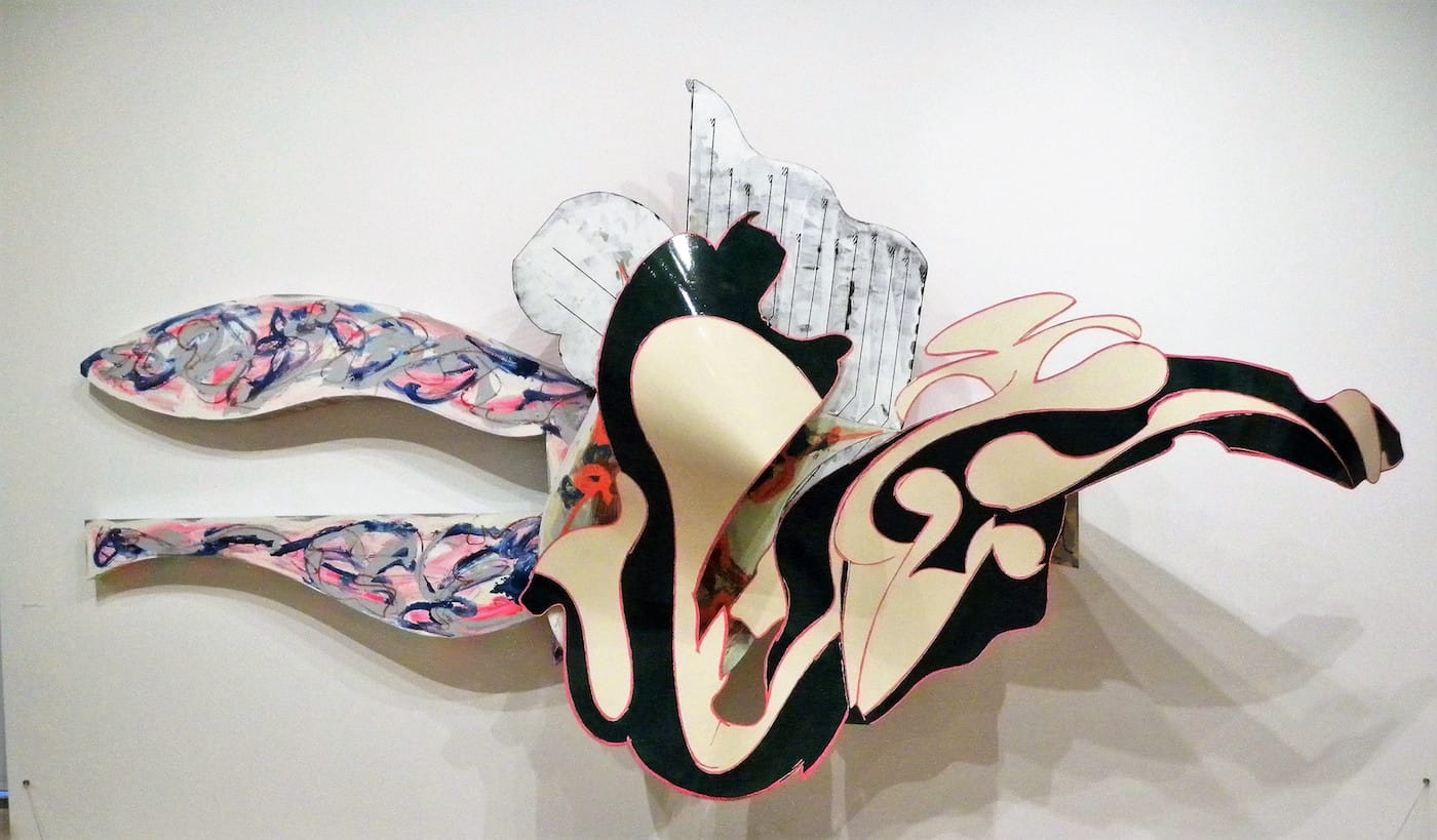
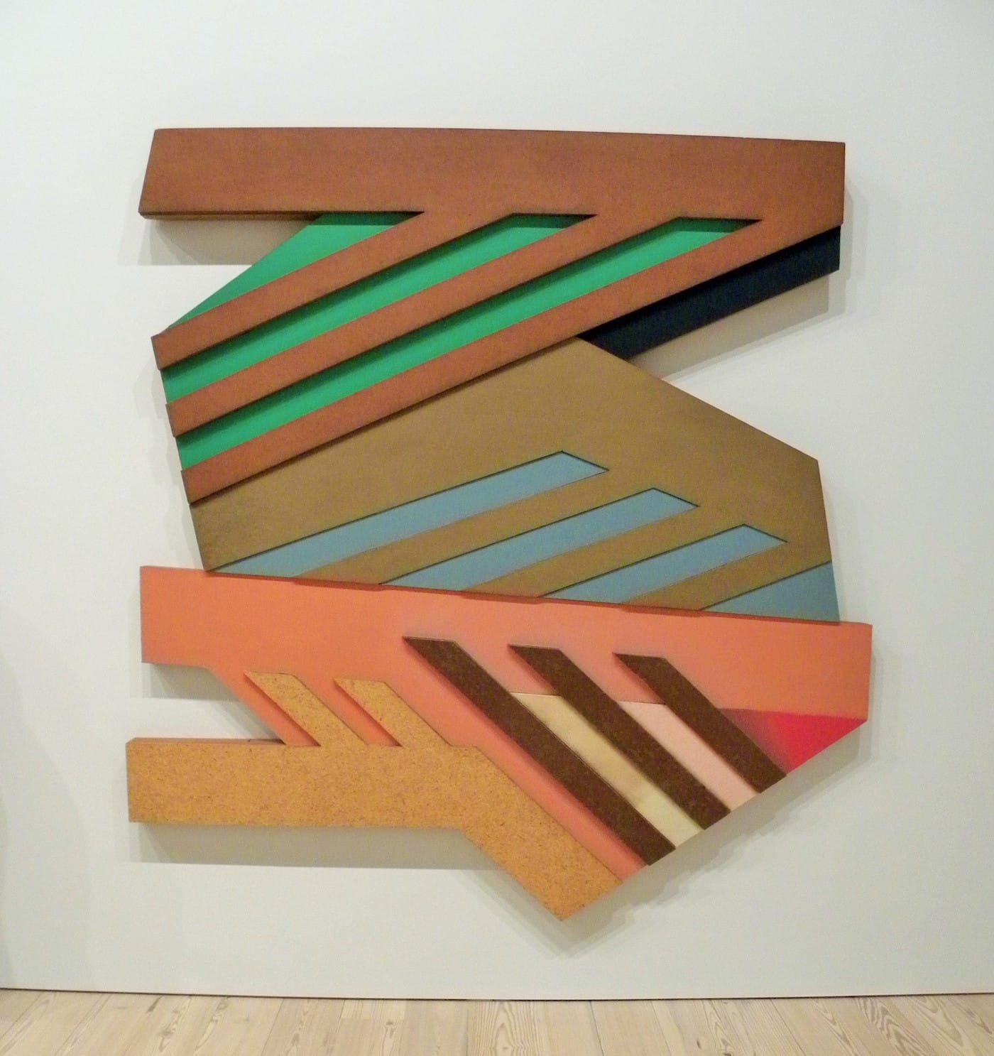
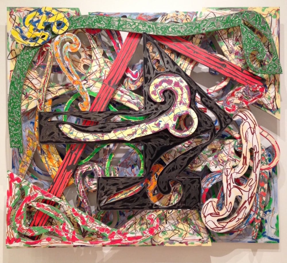
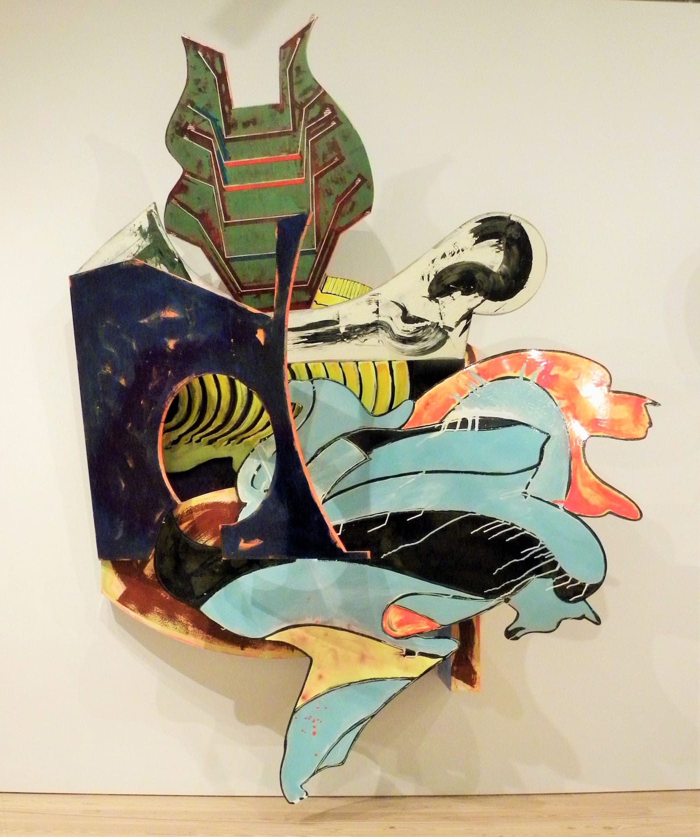
Jerry Saltz quite justly assessed the Polish Synagogues series (130 pieces over three years) as the apex of Stella’s career. It opened up a path to the use of ready-made color, which Stella unfortunately failed to recognize and explore, opting instead, with the following series, for a Neo-Expressionist mode in tune with the latest trends of the times. These fake Expressionist brushstrokes are still puzzling because they appear so counterproductive. They flatten the painting and interfere with the otherwise quite interesting interplay of the different planes, to the point of making them unreadable. Why would the artist go to such an extent, and financial expense, of physically deconstructing the picture plane only to undermine his own best efforts, and restore its unity with ironic brushwork? Was it because the flat paint application used so far was deemed insufficient to maintain the status of the new wall reliefs as paintings? Was the the boost of an exaggerated gesture needed to deflect their potential perception as sculpture? This contradiction remains at the heart of more recent pieces, such as “’In Sainte Luze!’ (Hoango)” (1998). The metal wall reliefs also seem to usher in a period of self-indulgence and arbitrariness in stark contrast with the economy of means and the clarity of purpose of the previous Minimalist period.
Starting with the 1976 Exotic Bird series, Stella’s growing interest in Baroque space seems like a Modernist displacement of the Baroque gesture, which originated in 17th-century theater and was all about theatrical emphasis. One wonders whether Stella was in fact looking for a particular space in which such a rhetorical gesture could be sublimated as spatiality via Modernist formal codes, allowing him to both draw the viewer in and at the same time maintain the theatrical distance previously established in his minimalist work.
Baroque painting and Minimalism share the control of a seduced and subdued audience, a control that oversize paintings, dominating the space they inhabit, only reinforces. In hindsight, this shift to the Baroque might not be as improbable as it first appeared. Both styles are “power trips” of sorts.
Curiously, a similar shift out of Minimalism and Post-Minimalism into the Baroque occurs in Robert Morris’ work, if for different reasons, at roughly the same time as Stella’s, which brings up the question of whether this style of Baroque is the darker side of the sunny Minimalist coin.
Never too far from the Baroque and its 18th-century offspring, Rococo, Stella sometimes seems susceptible to the temptation of kitsch. “Bechhofen” (1972), an unpainted Polish Synagogue piece featured in the Whitney retrospective, executed entirely in varnished wood, is an early example. The artist flirts more openly with kitsch again in two recent “star” sculptures installed on the museum’s outdoor terraces, and which were also available in miniature at the museum store as Christmas tree ornaments. “Black Star” (2014), especially, might remind one of a stranded movie prop straight out of Star Wars.
In his review, New Yorker critic Peter Schjeldahl pointed to the artist’s early doubts about Abstract Expressionism, quoting him in Working Space: “I sensed a hesitancy, a doubt of some vague dimension which made their work touching, but to me too vulnerable.” It is the very rejection of this vulnerability which would prove to be, to us a mock-mythological mixed metaphor, the Achille’s Heel of Stella’s Trojan Horse of an art machine.
Stella’s main argument boils down to this: How to make paintings that don’t lose the status of paintings by becoming objects — paintings that evacuate the subjectivity of both the painter and the viewer, and replace it with historical necessity? But, by rejecting expression, interiority and the vulnerabilities that accompany them, in favor of a formalist rhetorical abstraction, didn’t Stella throw the baby out with the bathwater? By equating expression with drama rather than interiority, and by choosing to ignore what Kandinsky defined as painting’s “inner-necessity” in favor of a supposed historical necessity, did he also end up denying his viewer’s own inner-necessity? And by reifying painting, did he also end up reifying his viewer? The question had already been raised by Barnett Newman in the late ‘60s, when he remarked that “those who emphasize the world of objects make man himself an object”.
Stella insistence on the primacy of space over every other aspect of the experience and process of painting was still directly in line with Clement Greenberg’s insistence on the primacy of flatness. With his 1964 “What you see is what you see” — eerily contemporary with Marshall McLuhan’s own tautological formula about the medium being the message — Stella brings Greenberg’s literal flatness to a metaphorical level: Painting is the message and metaphorical flatness is now achieved in painting by denying it any depth of content. With the Baroque metal reliefs, however, despite their apparent act of apostasy from Greenberg’s dogma, Stella clearly remained within the boundaries of the reductivist paradigm. Rather than confront the strictures of Greenberg’s Modernist tropes, he allowed them to endure by substituting three-dimensional space for flatness.But, come to think of it, when he speaks about space, Stella’s subtext is all about speed, or rather, of space as speed. Speed entered American painting as a latent concept with Barnet Newman’s “zips.” But it is worth remembering that Newman did not adopt Thomas B. Hess’s term of zip for his paintings’ vertical bands until 1966, fairly late in his career. Prior to that, he simply called them “stripes.” Even though today the term zip can’t help but connote the idea of speed, Newman was clearly on the side of slow art, with a rare, deliberate, and carefully pondered production of only 118 paintings over 25 years, versus the thousands of paintings that have poured out of Stella’s studios.
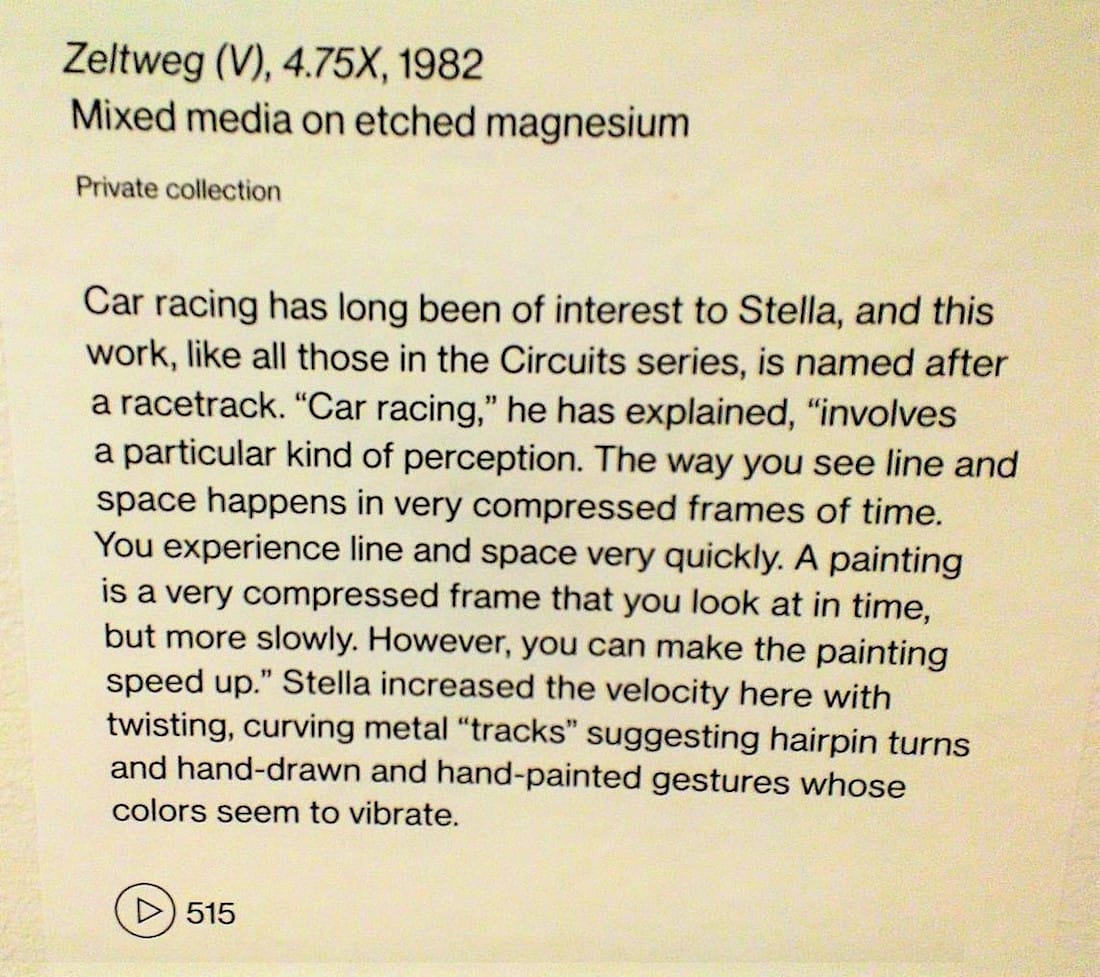
Speed came to play an increasingly important role in the artist’s biography as well, with his well-publicized fascination for fast cars. A wall caption next to “Zeltweg (V)” (1982), of the Circuit series, brings up the artist’s personal experience: “Car racing,” he explains, “involves a particular kind of perception. The way you see line and space happens in a very compressed frame of time. You experience line and space very quickly. A painting is a very compressed frame that you look at in time, but more slowly. However, you can make the painting speed up.” But speeding up the painting also speeds up its viewer’s experience and reduces it to something akin to glimpsing a billboard incidentally by the side of the road, pushing it into the category of works that, like advertising, visually asserting themselves but have little to say past their initial impact.
Stella’s gamble has been to turn painting, a slow art by definition — and in so many ways an act of resistance against our endlessly accelerating culture — into an “extreme sport” enterprise, in which speed, coupled with formal and financial risk-taking, have replaced the slow painter’s healthy agony over the work in progress.
The general impression is of an artist in a hurry, never pausing to digest what he has done before racing towards his next move — a kind of neurotic production hyperactivity (perfectly symbiotic with capitalism) desperately attempting to outrun existential demons. Time and again throughout the Whitney retrospective, this viewer pondered whether a particular piece would not look better this or that way, and if this recurring question is a function of overproduction or of a certain lack of self-criticism. In “The Blanquet” “1988,” for example, part of the overambitious Moby-Dick series (266 pieces over 12 years), the flowing dark green and white shape extending from the front to the right side of the piece is “balanced” on the left by a particularly uninteresting horizontal extension. It is easy to visualize how much more dynamic, and not as predictably symmetrical, that the piece might be without it. In his pursuit of eradicating drama from art, Stella appears to have become the assembly line worker of his own style. This is what may have led painter Elizabeth Murray, whose artistic formation was undeniably influenced by his work, to make the pointed distinction that Stella is a great artist, but not necessarily a great painter.
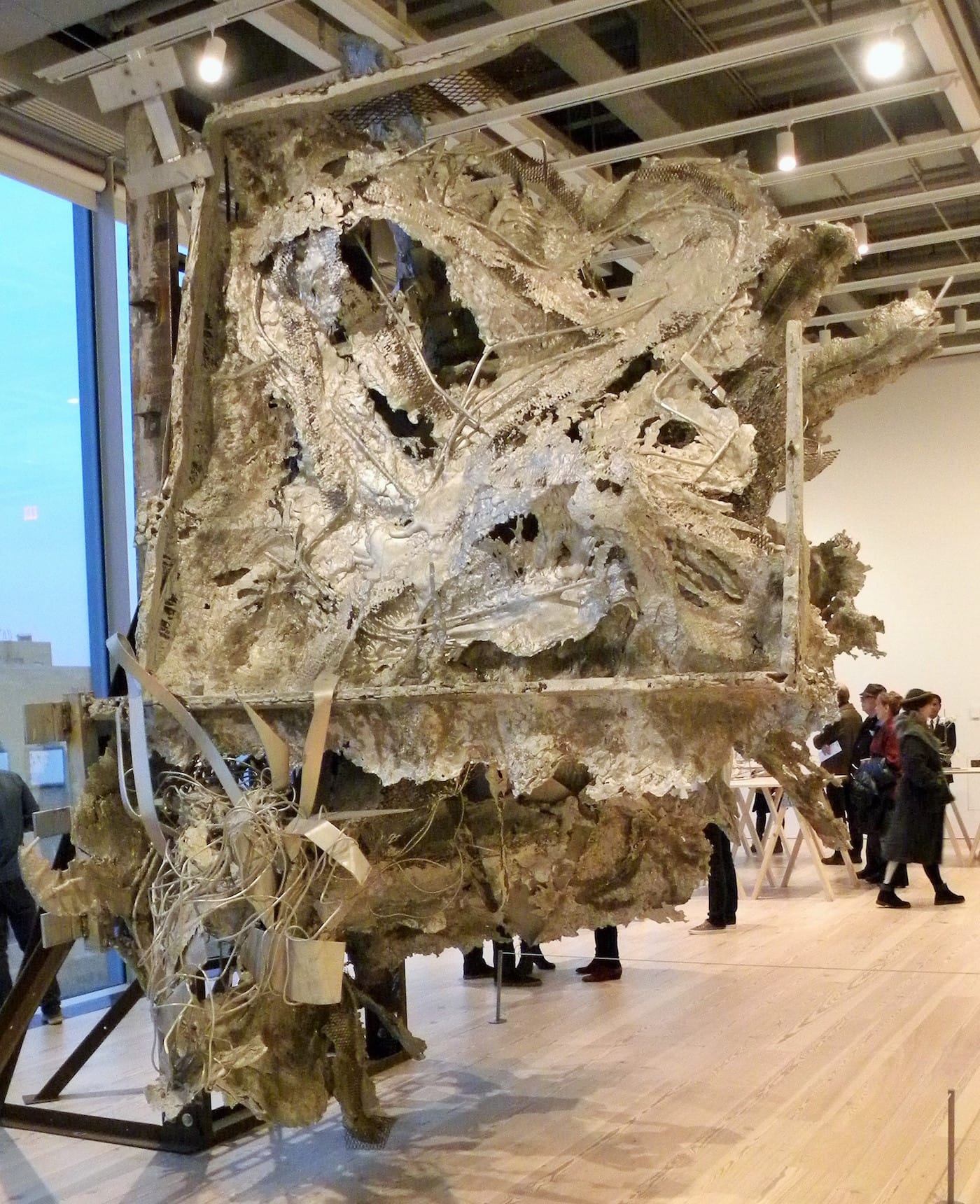
All of this onrushing energy seems to be culminating in the spectacular version of “The Raft of the Medusa” (1990), a contemporary take on Gericault’s masterpiece as a fragment of a plane crash, complete with molten aluminum and splintered wiring. “Medusa” is part of a large body of sculptures featuring other famous catastrophes, including the nuclear meltdown of Three Mile Island. The air disaster has replaced the sea tragedy. The epic slowness of the Medusa episode, survivors drifting for days on an aimless raft, has been replaced by the instant, matter-of-fact presence of the wreck: an almost too perfect illustration of philosopher Paul Virilio’s intuition of the accident as the ultimate aim of speed.
Perhaps the viewer’s unease about how painting functions for Stella might best be examined outside the boundaries of the medium, under the angle of another, possibly that of cinema. While Stella’s assumptions regarding Minimalism as well as contemporary abstract sculpture \ are based on the relationship between a moving spectator and a stationary object, cinema posits a moving image in front of a stationary spectator, reversing the terms of the equation,
There is a particularly cinematic dimension to Stella’s career, not necessarily in the specificity of the medium but in the speed of his artistic development. In the rapid successions of series after series, Stella seems to be less about expanding painting into three dimensions than objectifying a cinematic process, organizing his series in as many sequences as a movie has scenes. This retrospective could almost have been labeled “Stella: The Movie.” There is also a kind of manifest destiny to his career that plays well with America’s narrative about itself, in which the heroic may be transplanted from a singular gesture to the sprawling historic scale, ambition, and improbability of the entire esthetic enterprise.
Stella’s anomalous smoke ring photos, which occupy a narrow wall of the retrospective, are a telling example. Emblematic of a typical Modernist blindness to symbols, they evoke less a reckoning of fragility, of tempus fugit and earthly vanities, than a fascination with elusive, shifting shapes. They are the closest Stella ever came to the moving image and at the same time, though disguised as formalist explorations, to any kind of acknowledgment, however faint, of human mortality. Prefigured by the smoke rings, the more recent pieces from the Scarlatti series, his best efforts in a long while, have a welcome — if still a bit stiff — levity. It is in their insistence on lightness that these pieces reaffirm their allegiance to painting rather than to sculpture. They dare the viewer to join the artist in a weightless world where outer space metaphors have finally replaced those of earthbound space.
In many ways Stella’s work is still tethered to the powerful certainties that ruled abstract painting when he was a young man, and the force of his conviction and the depth of his resourcefulness to keep the dream alive are truly remarkable, but these certainties have long lost their sheen, leading to the unavoidable question: Does the world really need another piece by Frank Stella? In a disconcerting way, he remains relevant by being, like so many younger artists today, not necessarily a painter per se, but an artist who uses painting coincidentally, as one of many other potential mediums available at any time; a phenomenon which in itself would merit its own investigation.
Nonetheless his expansive and expensive objects escape less and less easily the Duchampian legacy of fetishism and narcissism that plagues the work of more cynical market players such as Damien Hirst or Jeff Koons, and their ambiguous status as trophies for the “enlightened” top one percent. Coming out of the exhibition, the viewer can’t help wondering what the real endgame of his brand of Modernism is. Would its manifest destiny end up being capitalism’s trophy? There would lie the real catastrophe. This is obviously a rhetorical question, but it is still quite troubling if it becomes the main takeaway from a retrospective of such a pillar of “Modernism.” From Deleuze’s argument positing the catastrophe as a precondition to Modernism, we could now return to Virilio’s and argue that catas-trophy might be the ultimate destiny of this kind of Modernism, just as the accident would be the destiny of speed.