Swarming Geometry, Floral Colors, and Technological Space
Berran’s new paintings manifest an arresting, congenial gregariousness — while also showing their fangs.

A few years ago, Patrick Berran’s paintings were dense, subtly mottled fields of sure but subdued color. Devoid of hard edges or distinct shapes, they nevertheless pulsated with understated but unmistakable nervous energy. Some of that haziness is still there in his current exhibition at Chapter NY, but it takes a back seat to swatches of crisp, precise pattern. Six largish paintings (and one tiny one) manifest this new idiom with an arresting, congenial gregariousness — while a couple show their fangs.
All works are untitled, done in acrylic and toner on panel, and dated 2017. The fine points of Berran’s complex technique are probably not relevant, but it may be helpful to know that the gel transfers and screen-printing involved yield surfaces that are almost completely flat and matte. Relatively little is lost in photographs of these smooth, even pictures; if anything, their fastidious seamlessness gains intensity with the aid of the camera.
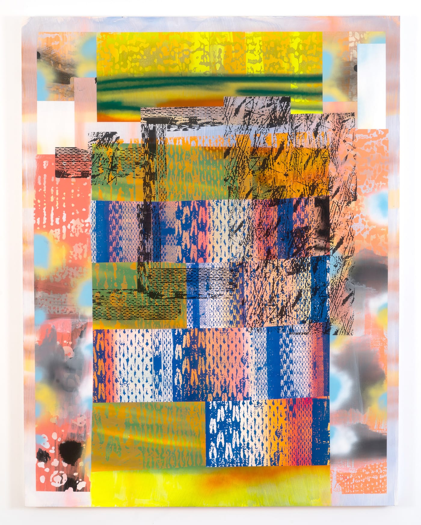
Berran’s palette combines full-throated primary and secondary hues with black, white and a range of grays. These colors are more or less opaque, but an illusion of transparency results from the visual porosity and interpenetration of the areas of pattern with the blocks of color behind them, rather than any actual translucency (of glazes, e.g.). These patterns bring the look and feel of photomechanical reproduction into the paintings’ space — particularly, one that appears on the surface to be rippled and pebbly, but is also much too smooth and regular to be derived from the tree bark or brain coral that it vaguely resembles. The imagery could be mistaken for a hundredth-generation photocopy of some arbitrary original. Another motif seems to be based on a magnified, high-contrast photo of knitted yarn.
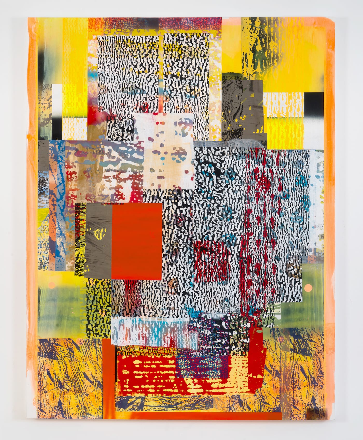
Of the five paintings that measure 60 by 46 inches, the one with a blazing red-orange rectangle just left of center is largely typical of the compositional structure Berran seems to favor, in which this swarming geometry is centralized. Floral colors dominate the palette, but for all its cheekiness, the painting is well mannered enough to keep its more aggressive visual contents fairly clear of its outside edge, concentrated within a margin consisting of an airbrushed haze in tints of marigold and tangerine. Thus contained, the painting is something like the front man in a loud band who, through a jangly, sweaty, but carefully crafted performance, doesn’t venture beyond his mark on center stage, keeping his distance from the theater’s “fourth wall” — more Buzzcocks than Iggy Pop.
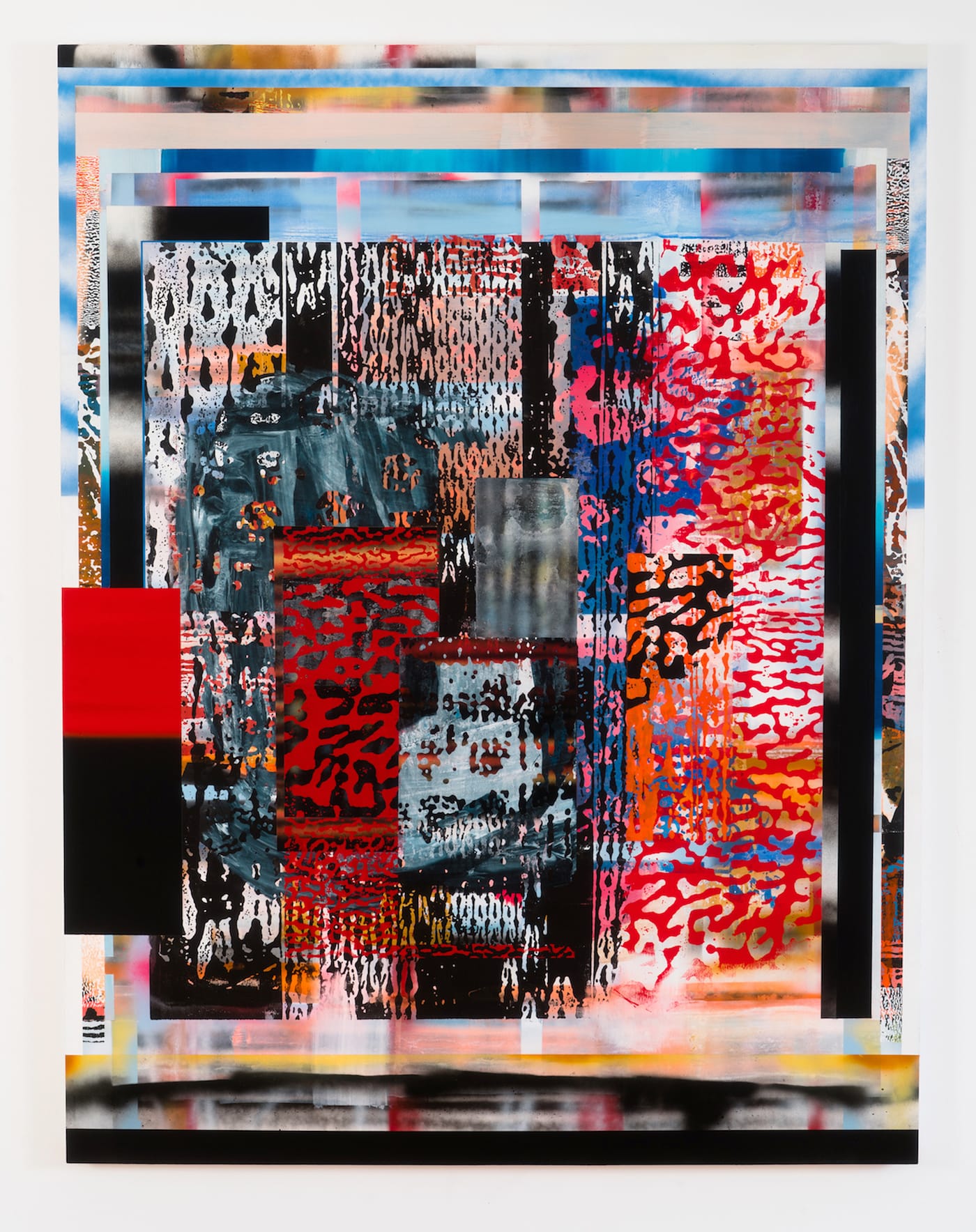
The other paintings in the show are of the same compositional type. (This is not in itself a negative judgment.) That red-orange — and a few lively variations on it — is teamed with black, deep blue, and bits of hot pink in another 60-by-46-inch work, in which the human touch, in the form of scraped and/or rubbed areas, is more prevalent than elsewhere. In this context, however, the gestural mark seems calculated to contrast stylistically with the overtly artificial ones, but without evoking any sort of ideological dilemma. The artist strikes a clanging blue/green/scarlet color chord in another painting, one in which an underlying grid is strongly implied and a central configuration, relying on cobalt blue, resembles a backward F.
Berran’s work relates to that of several other painters using color to construct what might be called “technological” space, such as Patrick Wilson and Ryan Crotty. Clearly defined rectangles aligned with the canvas’s edge and dispersed across an agitated, soupy ground will always remind this viewer of Hans Hofmann’s mature work; Jackson Pollock’s pre-drip “Male and Female” (1942) also comes to mind, with its blocky, totemic personages crowding the foreground of an otherwise deep landscape space.
Most striking is the resemblance of Berran’s paintings to those of Irene Rice Pereira, especially her work of the 1950s. Pereira (who was influenced by the Bauhaus and Constructivism, and was briefly Hofmann’s student) set perpendicular blocks and bands, some of them L-shaped, against and within an atmospheric — you could say smoggy — volume of pictorial space; Periera recasts Hofmann’s “push/pull” into something like “emerge/recede.” (Berran’s spatial dynamics, in contrast, seems subject to a “bring to front” keyboard shortcut.)
At least two paintings do, however, hint at the psychological depths possible by way of Berran’s user-friendly operating system. Centered within a smaller (47 by 35 inches) painting that sports peach, rust, and pale blue, is a beautiful gray-and-black version of that rippled, pebbly pattern. A thin border of yellow surrounds this murky nucleus, isolating it and turning the rest of the painting into an elaborate frame.
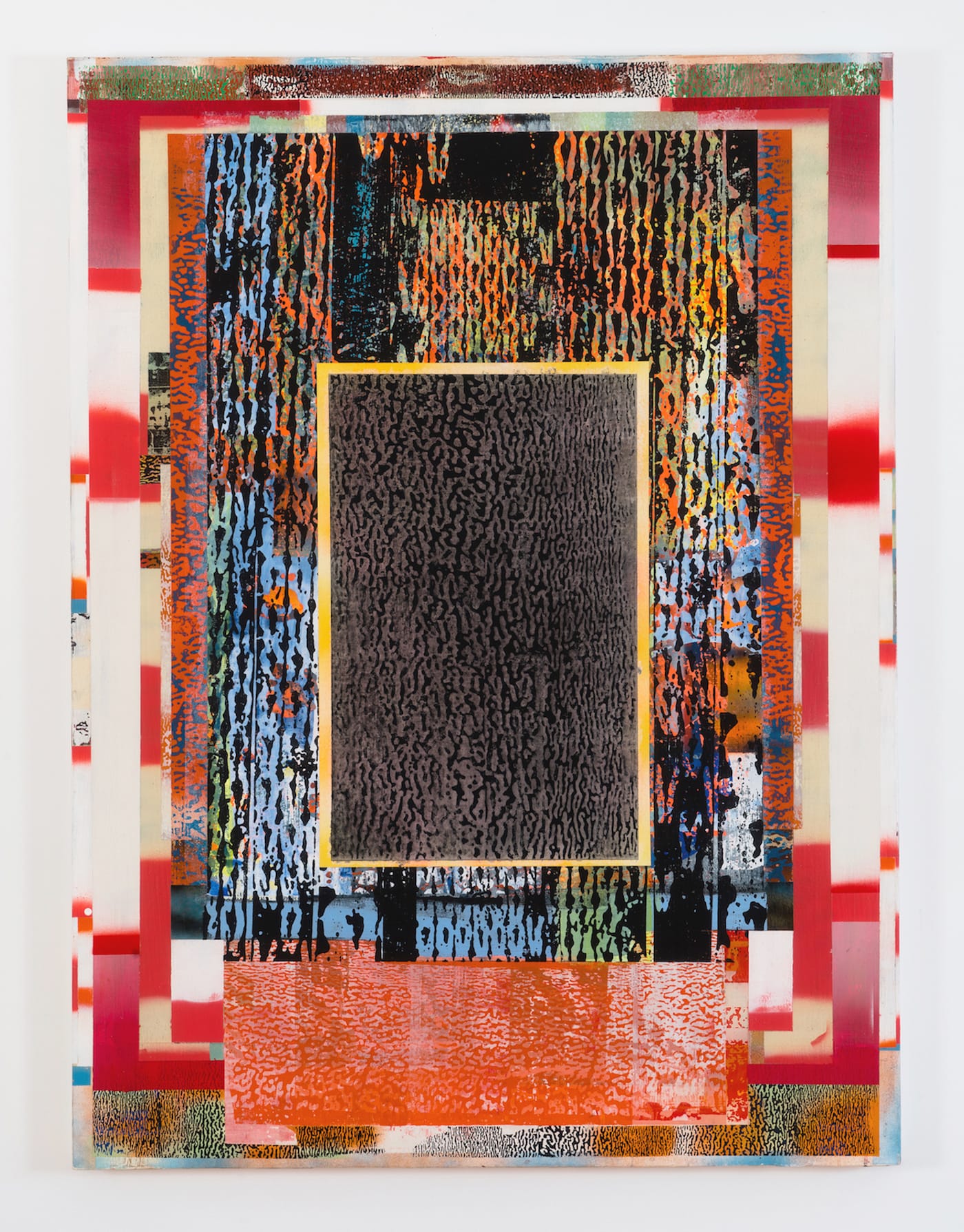
The most imposing work in the show enlists the illusion of gravity on the elements of the composition. The central screen or scrim (the knit pattern, in black), which rests on what looks like a horizontal base or plinth, flanked by clusters of blackish, post-and-lintel-like stripes, imperfectly veils mysterious passageways that seem perpetually shrouded in shadow.
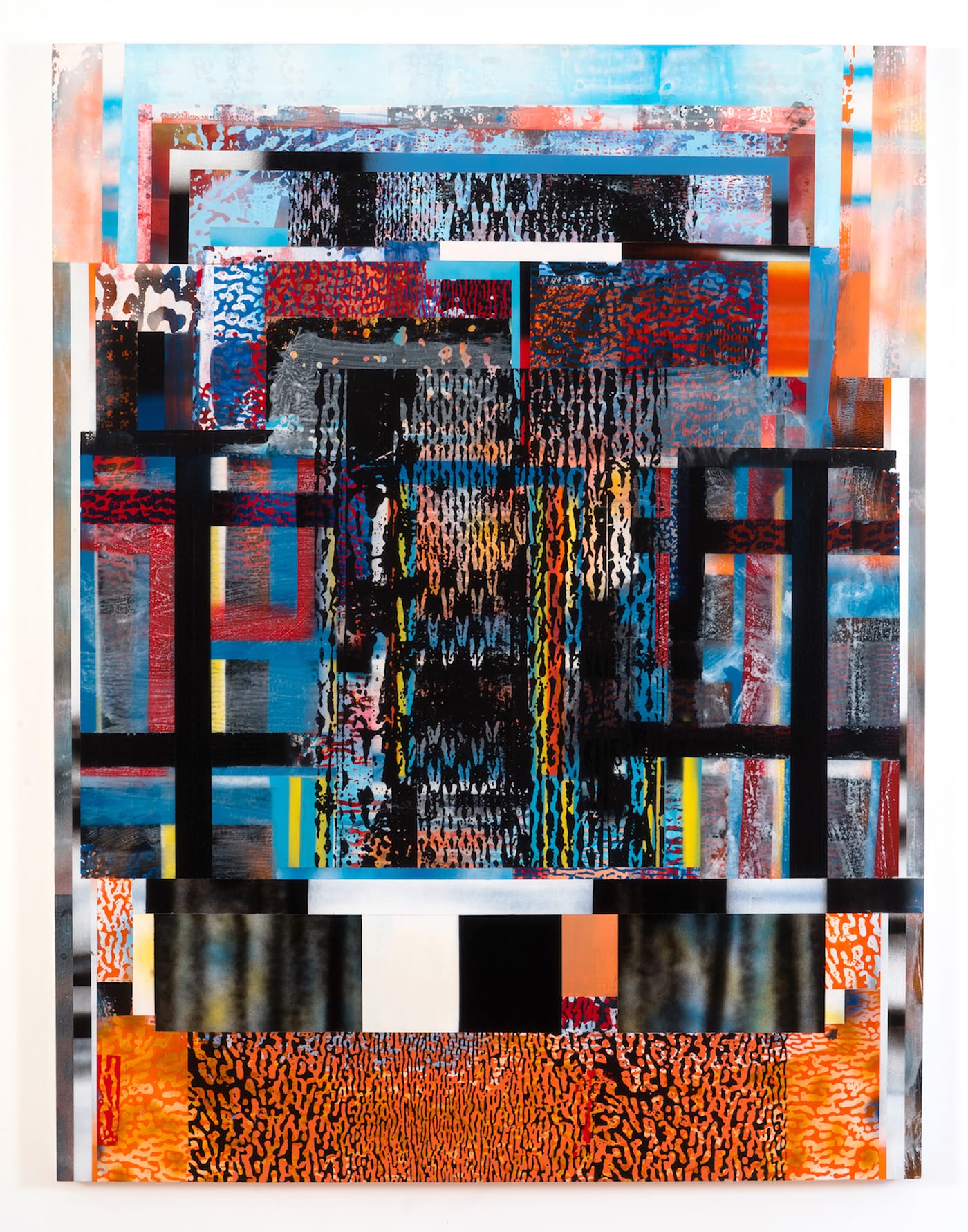
More than any of the other paintings, this one presses outward at the edges of the canvas, shrinking the margins to nearly nothing and becoming a bit intimidating, actually. Its architecture is menacing; with darkness at its heart, it made me think of Colonel Kurtz’s creepy temple in Apocalypse Now. If the fruitful contradictions in Berran’s attitude toward picture-making keep pace with his technical facility, he will be unstoppable.
Patrick Berran continues at Chapter NY (249 East Houston Street, Lower East Side, Manhattan) through October 28.


