Retooling Paint for the Digital Era
In his quietly dazzling New York solo debut, Ryan Crotty pushes post-painterly abstraction past the anxiety of influence.

In the introduction to his Complete Techniques, the chef Jacques Pépin writes, “There are no secrets or tricks, only feats of skill (tours de main) acquired with prolonged effort.”
In his quietly dazzling New York solo debut, painter Ryan Crotty demonstrates that the same is true of a certain strain of process-oriented abstraction, in which a refined (if idiosyncratic) technique is indispensable to the pictorial outcome. In so doing, he makes some of the most gorgeous paintings around town right now, and joins a cohort that’s retooling post-painterly abstraction for the digital era.
Crotty’s show is called Never the Less, and it’s on view through February 4. There are 11 small paintings, all in acrylic, gloss gel, and modeling paste on canvas, of which the largest is 30 by 24 inches. Seen at close range, as they necessarily are in this compact gallery, their transcendent luminosity is thrillingly at odds with their straightforward material presence. They are equally illusionistic and concrete.
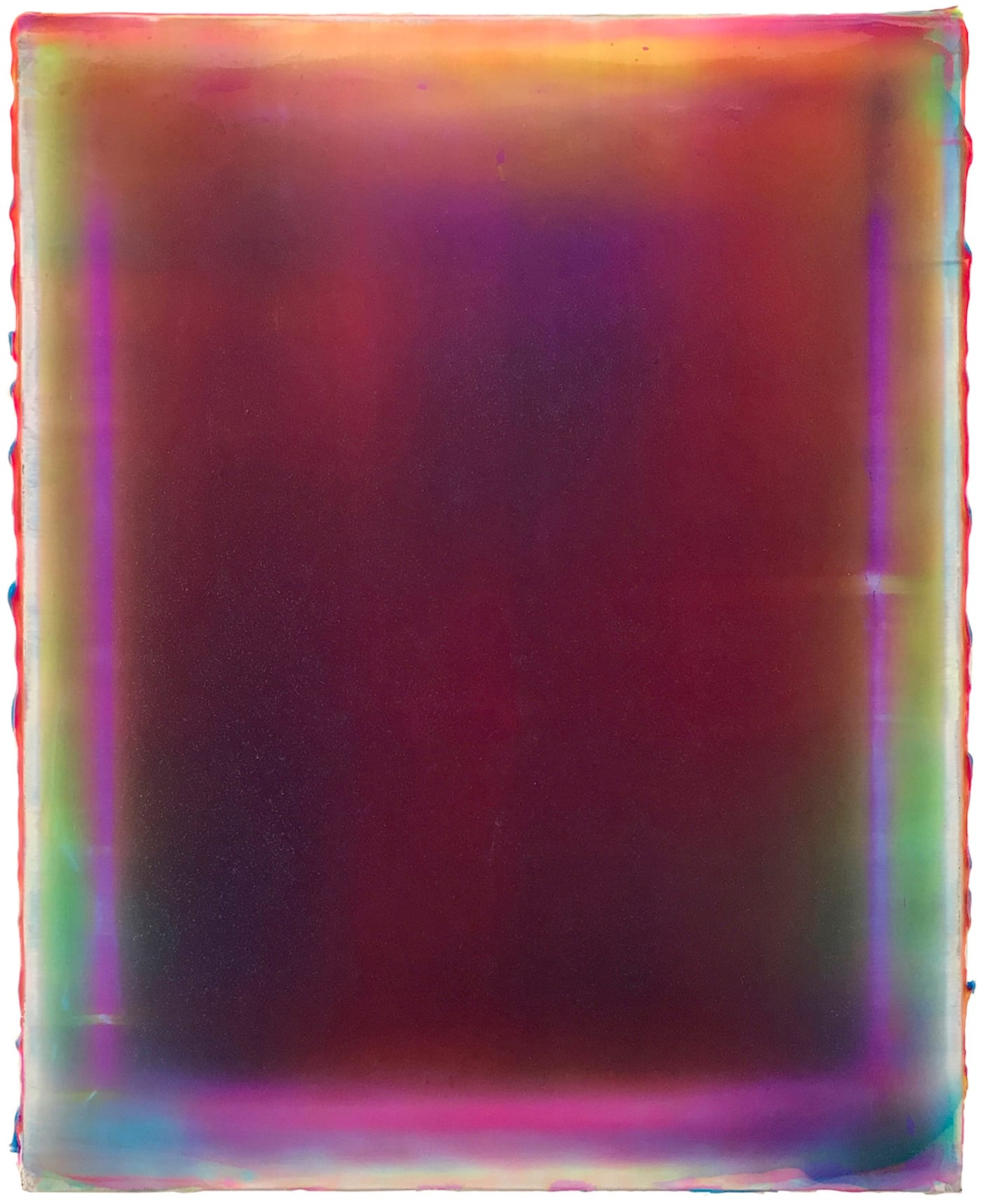
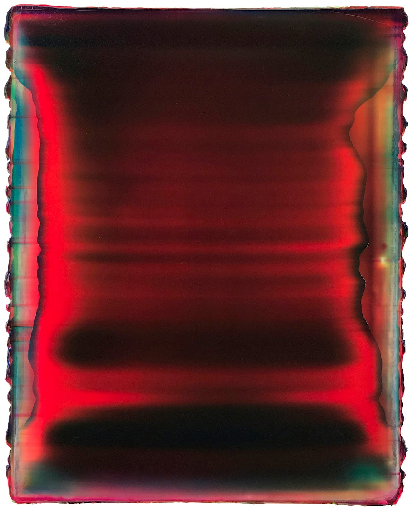
The aspect of paint application that the viewer is privy to involves a continuous swipe of some kind of scraper or blade edge across the entire surface of the painting, parallel to the longer side.
The paintings (and therefore also the swipes) are oriented vertically. In “Murmur” (20 by 16 inches, all works 2017), peripheral traces of emerald, amber and violet roughly frame a central region in which those hues mix and partly neutralize one another — a subtly shifting pool of variously concentrated colors, yielding tones approximately those of green tea, maple syrup and grape jelly.
As in all the works in this cohesive show, the pigments are suspended not only in the paint’s inherent polymer binder, but in a relatively enormous amount of clear-drying additives — gloss gel and modeling paste. Ambient light bounces off an underlying white primer and passes through this translucent pigmented layer on its way to the viewer’s retina. (Hence the luminosity.)
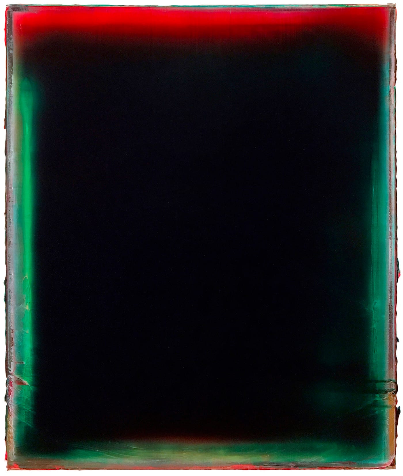
In some cases, that glow is limited to the edges, where the stretcher bars leave their imprint. Santa-suit red and holly-leaf green appear around the margins of “Light My Path and Lead Me Astray” (24 by 20 inches), blending in the maw of the painting’s center to a sooty, lump-of-coal black. Gallery owner Jared Linge, tongue in cheek, delights in calling it the most depressing Christmas painting ever, and it’s true that the seasonal associations of the palette survive even this treatment.
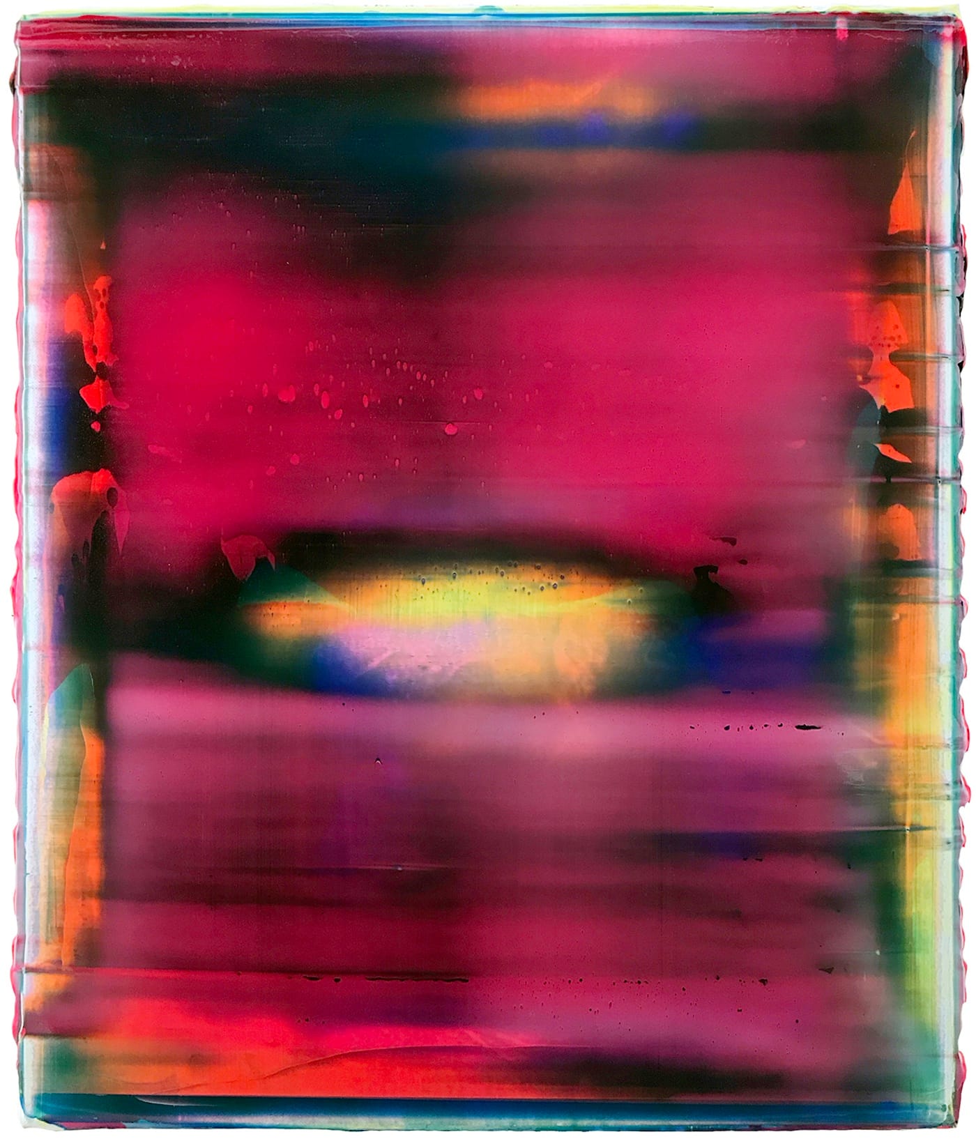
It’s nice when the scraper device meets a horizontal cross brace, dislodging a small patch of gel to reveal a soft-edged oblong blob of underpainting. In “I Like Me Better” (24 by 20 inches), that feature is lighter in value than the surrounding rust-colored field, a hot spot of yellow, orange and lavender that glows like a distant bonfire. Crotty lives and works in his hometown of Auburn, Nebraska; I’ve never seen the light of dawn breaking over the Great Plains, but “I Like Me Better” matches exactly my romantic, East Coast idea of what that looks like.
Evidence of manual involvement in the making of these paintings is ubiquitous; there’s that stretcher-bar frottage, and also the many little ridges and other interruptions that the scraper blade makes in the surface. The canvas’s edges are not taped off or tidied up, but left with clumps of paint clinging to them like a stiff, lumpy fringe. This bit of calculated crappiness, in particular, helps Crotty avoid the slick seamlessness that sucks the life out of so many pseudo-minimalist paintings, and gives reductivist pictorial strategies everywhere a bad name.
The inexpensive, off-the-shelf canvases Crotty uses immunize the paintings against any sense of heroic struggle. (But not of technical struggle — like Elmer’s glue, modeling paste is opaque when wet and dries clear, so the artist can’t tell what a painting really looks like until a day or so after he stops working on it.) Maybe if they were larger, their emotional temperature would be warmer and their sense of drama heightened. As things are, though, they seem quite at ease to assume the contrarian position that an abstract painting doesn’t have to be big to be ambitious.
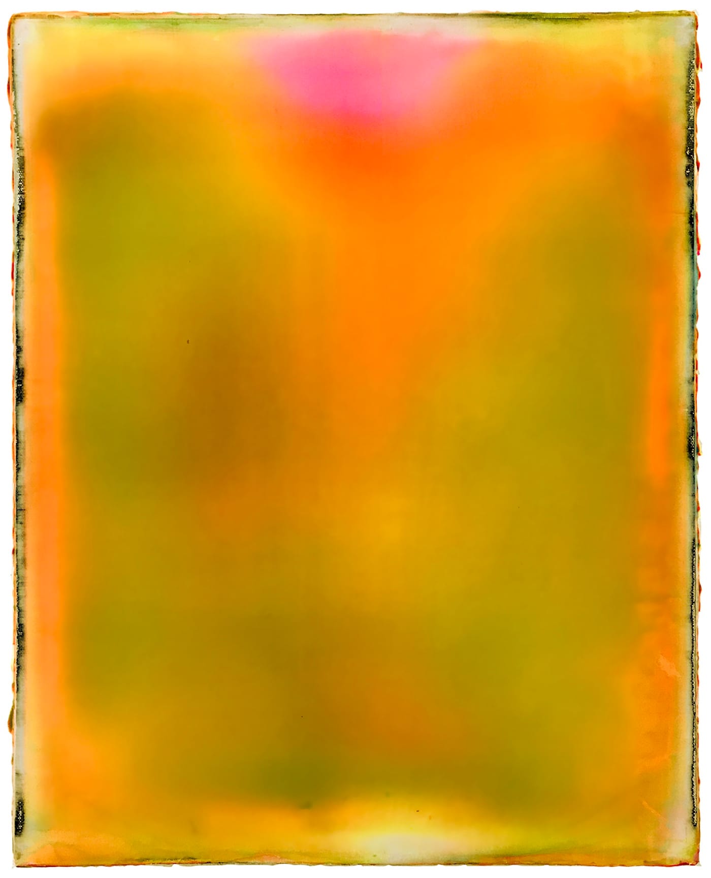
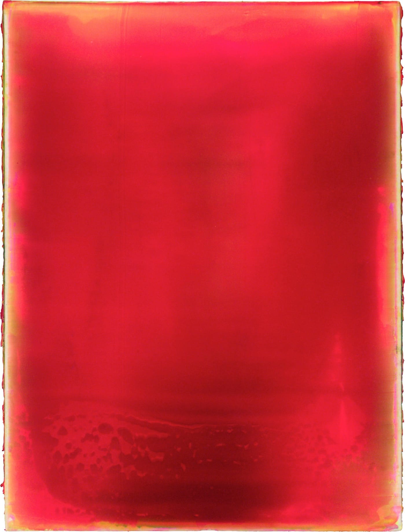
Ambitious, but not self-serious; take, for instance, “Mellow Yellow” (20 by 16 inches) with its melting-candy colors hovering between yellow-orange and yellow-green, with a hot magenta-pink spot like a small glowing cloud floating at the top. Then there’s “The Way We Shook” (28 by 23 inches; all works 2017). If this painting had a soundtrack, it would be an air raid siren. There’s something truly alarming about the smoldering red aura that seems to radiate from the central, mutilated-torso shape.
Figurative allusions are scarce in this show (and I’m not one to go around looking for them); more common are landscape references, inadvertent though they may be. It seems likely that the skittering streaks in “2 Cold 2 Hold” (24 by 18 inches), which resemble scattered clouds or sea foam, resulted from unpremeditated deposits from the scraper. But the deep, electric phthalocyanine blue and hot-wired quinacridone red color combo doesn’t appear in nature, as far as I know.
Gerhard Richter is just the most obvious example of an artist who relies on tools other than brushes to move paint around, though of course there are many who are keen to avoid the expressionistic or autographic, gestural mark. The viewer’s attention is then occupied by the painting, not the painter.
To the extent that Crotty’s work is about the fluid movement of color across the surface, it can be viewed in terms of Color Field painters such as Morris Louis and Helen Frankenthaler — whom Clement Greenberg championed in the 1960s — and of optical effects that are unabashedly “medium specific,” to use that critic’s phrase. It’s always satisfying to see a roundly reviled idiom reanimated by a visual intelligence keen enough to recognize that there’s more work to be done, and fearless enough to press ahead with it.
Or maybe it’s just that, in his mid-30s, Crotty doesn’t have the hangups about painting that we of an earlier generation have, with our anxiety of influence colliding with our appetite for uniqueness. He’s apparently gotten away from the geometrical subdivisions and patterning he experimented with for a few years, in favor of an all-over unity that the stretcher-bar ghosts bracket but don’t disrupt.
That’s good — there’s much going on in these moody drifts of light and pools of glowing murk. The paradox of vastness of scale expressed on physically small surfaces is plenty to deal with, in itself. By refining his technique and, as it were, limiting his topic, the artist can penetrate his approach more deeply. These paintings are smart, self-aware, direct and convincing. Bravo!
Ryan Crotty: Never the Less continues at High Noon Gallery (106 Eldridge Street, Lower East Side, Manhattan) through February 4.


