A Braille-Based Typeface Readable by Both Touch and Sight
A new typeface updates the nearly 200 century-old system by superimposing raised dots onto carefully configured letterforms, allowing it to be understood by both sight and touch.

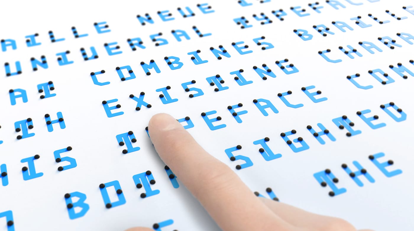
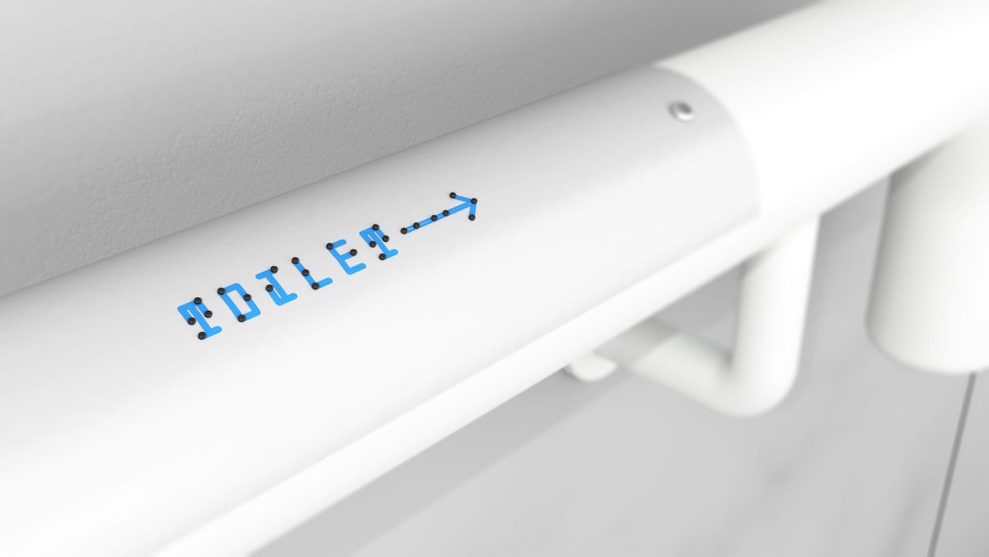
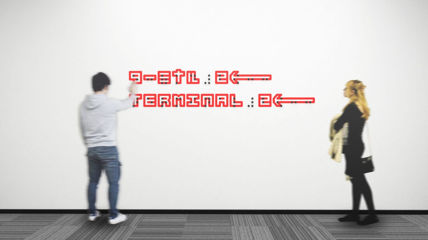
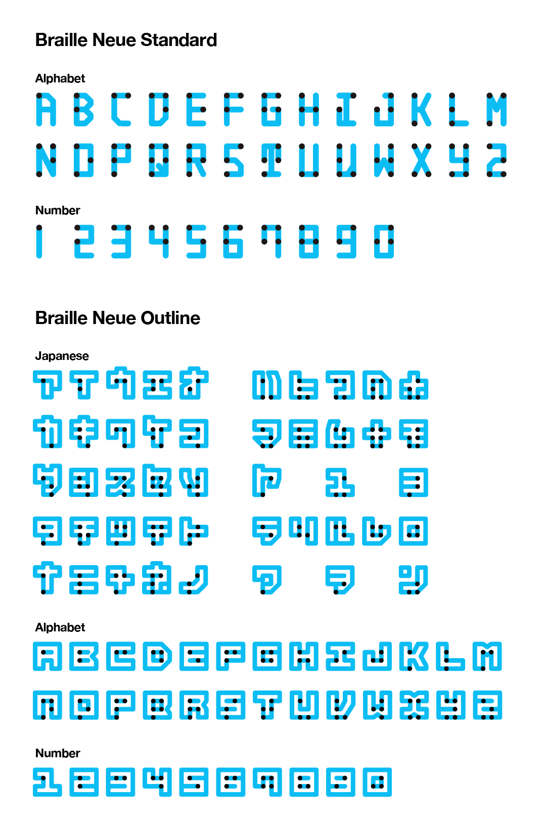
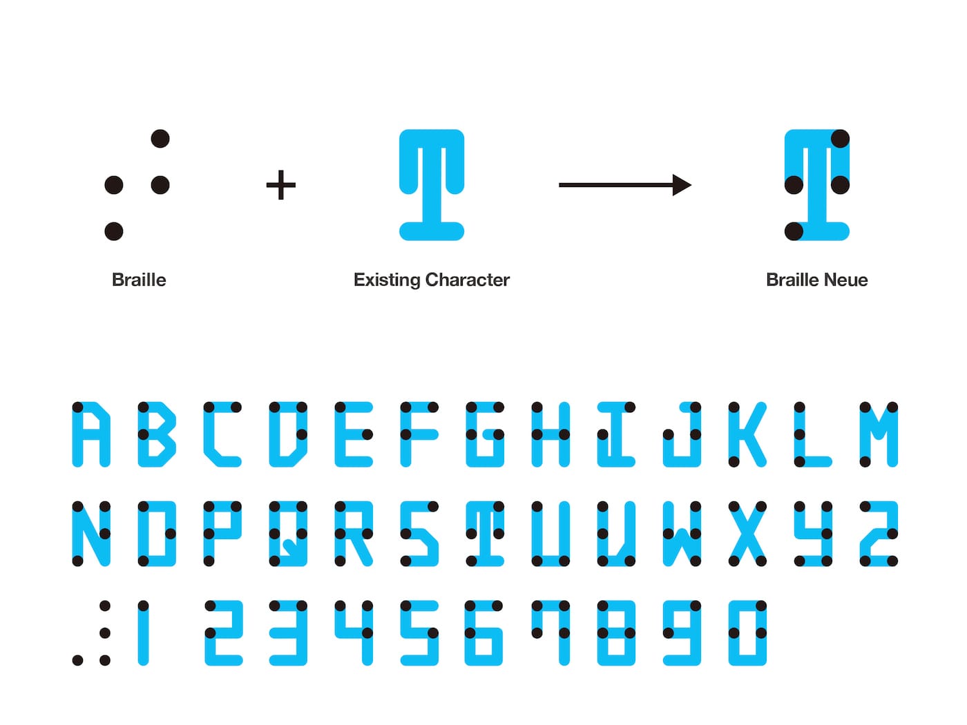
In an attempt to make braille more familiar and accessible, Tokyo-based designer Kosuke Takahashi has redesigned the tactile script to make it readable for both visually impaired and sighted individuals. His new typeface, Braille Neue, updates the nearly 200 century-old system by superimposing its raised dots onto carefully configured letterforms, allowing it to be understood by both sight and touch. Takahashi has created two versions, Braille Neue Standard, which incorporates the Latin alphabet, and Braille Neue Outline, which can fit both Japanese and Latin writing systems.
“It all started from the simple questions, ‘How can I read braille? Does it become a character if I connect the dots?'” Takahashi told Hyperallergic. “Even though it is the same ‘character,’ it felt incongruous that sighted people could not read it.”
Takahashi has been working on a braille-based typeface since September 2016, and was inspired after he visited an ophthalmology clinic in Japan. There, he observed how quickly people were reading braille and was amazed at the speed.
Making a typeface that negotiates English and Japanese characters with the braille grid was no easy feat, and Takahashi worked with a friend who uses braille to develop many prototypes. The final typeface presents a series of letters that are blocky, yet immediately readable to the eye and faithful to the arrangement of braille dots.
Braille Neue is not the first typeface attempting to improve how society engages with braille. After sharing this project with the public, Takahashi connected with many other designers who have also tried to combine braille with existing characters. Media designer Sean Donahue, for instance, has experimented with tactile typefaces in his publication, Touch Magazine, while the “Visual Braille” project by Christopher Heller, Michael Ruß, and Theo Seemann presents a standard braille font that combines lowercase letters in braille and uppercase letters for visual reading. Takahashi has been compiling these related projects on his website.
“Through the contribution of increasing the variation of typeface that combine braille with existing characters, I believe we can create an inclusive society where using braille becomes commonplace,” Takahashi told Hyperallergic.
He believes his main contribution to such a society will be his creation of a Japanese typeset. As his city plans to host the 2020 Summer Olympics, Takahashi is hoping to connect with the Olympic Committee to implement Braille Neue Outline into the event’s signage. Existing designs, he said, can be altered by simple adjustments of the kerning — and are small steps to take towards an inclusive future.
“Currently, we rarely see braille implemented in the public space since it takes up additional space and sighted people consider it not important,” he said. “By spreading this typeset I believe more people will get acquainted with braille.”