It’s Official, Classic Blue Is the Color of 2020
"Classic Blue brings a sense of peace and tranquility to the human spirit, offering refuge," says Pantone.

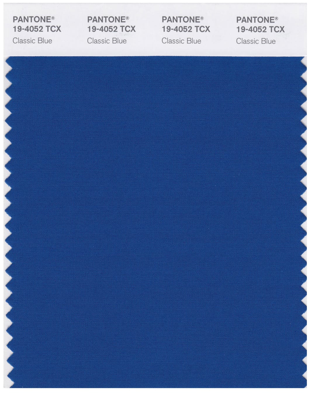
From on high, word comes that the Oracle at Pantone has spoken! The paint company’s pick is in for 2020, and the news is blue — specifically “Classic Blue,” or in company parlance, PANTONE 19-4052. The choice seems grounded in an association with this mellow, rich blue and a sense of peace and dependability.
“Instilling calm, confidence, and connection, this enduring blue hue highlights our desire for a dependable and stable foundation on which to build as we cross the threshold into a new era,” says Pantone, in the color profile accompanying the announcement of 2020’s hue du jour. “Imprinted in our psyches as a restful color, PANTONE 19-4052 Classic Blue brings a sense of peace and tranquility to the human spirit, offering refuge. Aiding concentration and bringing laser like clarity, PANTONE 19-4052 Classic Blue re-centers our thoughts. A reflective blue tone, Classic Blue fosters resilience.”
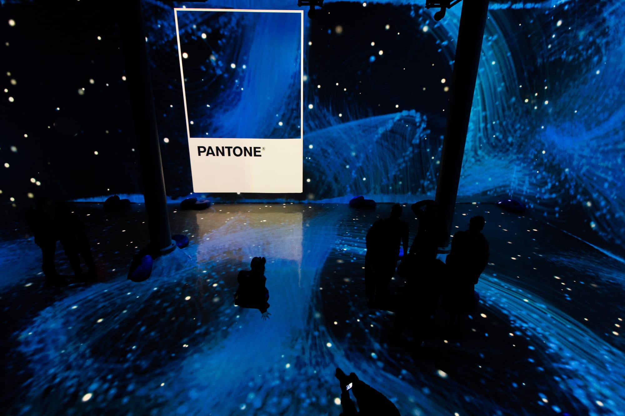
A gallery of all PANTONE Color of the Year reveals that blue has never strayed far from the collective consciousness — the inaugural Color of the Year, in 2000, was Cerulean (Pantone 15-4020). Blue scale colors account for 7 of the 22 total CotYs, including a two-way tie in 2016 between Rose Quartz (Pantone 13-1520) and Serenity (Pantone 15-3913). To ensure a well-rounded approach to this all-too-crucial decision, Pantone hosts twice-yearly summits in a European capital for a secret meeting of representatives from various nations’ color standards groups. After two days of presentations and debate, they choose a color for the following year.
According to the company’s website, Pantone Color of the Year selection process requires “thoughtful consideration and trend analysis.” Color experts at the Pantone Color Institute comb the world looking for new color influences, which may include “the entertainment industry and films in production, traveling art collections and new artists, fashion, all areas of design, popular travel destinations, as well as new lifestyles, playstyles, and socio-economic conditions.”
Leatrice Eiseman, Executive Director of the Pantone Color Institute, says of the 2020 selection: “We are living in a time that requires trust and faith. It is this kind of constancy and confidence that is expressed by PANTONE 19-4052 Classic Blue, a solid and depending blue hue we can always rely on.” One imagines any Democratic hopeful might insert their name in place of the Color of the Year, and take that endorsement on the road under a Classic Blue banner!

But whether what’s at work here is a true global theory of color, a subtle political agenda, or simply a massively successful marketing ploy to sell Pantone products by garnering major annual news coverage of a paint chip, we can all rest a little easier knowing that the outlook for 2020 has been determined, and everything is coming up blue!


