The Art World Needs Some Shock Therapy
It all started with a write-up on the Gallerist blog about Jordan Eagles’s new show at the Krause Gallery where his blood paintings are currently displayed. I immediately cringed when I went on a journey following all of his press, posts about him on Facebook and Twitter, and real life opinions with

It all started with a write-up on the Gallerist blog about Jordan Eagles’s new exhibition at the Krause Gallery, where his blood paintings are currently displayed. I immediately cringed when I went on a journey following all of his press, posts about him on Facebook and Twitter, and real life opinions with real life people (I didn’t know that could still happen, either). Everyone seemed to be so in awe of paintings made out of blood, finding it so shocking that someone could use such an “unusual” and “disgusting” material to create something so beautiful. All I could do was roll my eyes.
It’s a trope that permeates the art world now and again: not simply the use of bodily fluids or other abject materials to shock an audience, but basing an entire work and its merits (or, more aptly, its notoriety) on shock value. Have we as an audience actually become so jaded that we’ve been catapulted 180 degrees back to childish naïveté? Is shallow spectacle all we need now to get our pants moist over something?
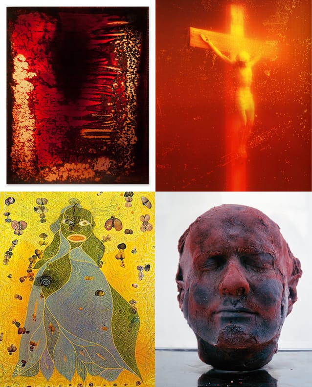
The paintings have a certain calming and ghastly aesthetic quality, mainly because they look like something a teenage goth Mark Rothko would make in his parents’ basement. The novelty of his newly invented process of encasing the blood in Plexiglas and UV resin to preserve its natural qualities wears off quickly, as does his grad school student habit of sticking “Hemo-” in front of any word for the titles.
Of course the implementation of spectacle is as old as art itself, and bodily fluids have been a staple for centuries, though not always for shock value. Medieval stained glass windows used to use urine as a pigment, and congregants just thought it was the light of God shining down on them.
More recent periods have witnessed the use of bodily fluids to assault audiences or make political statements. Andres Serrano naturally comes to mind with “Piss Christ” (1987), as do Chris Ofili’s “The Holy Virgin Mary” (1996) and Marc Quinn’s “Self” (1991–). But those works used the scatological materials in tandem with provocative subject matter, utilizing shock in part for spectacle, but also to enhance the meanings of the works. Now it seems people will just jizz onto a canvas in two minutes and give a nine paragraph spiel on what it means.
Bodily fluids certainly have a place in art, and always will (of course), but we’ll have to suffer through juvenile attempts to simply shock audiences before something really moving made out of blood comes our way.
Eagles’s paintings are pretty, I guess, but also pretty lame. I don’t know why I’m not shocked.