Cartoons of Paintings Which Aren’t Cartoons After All
Tom Burckhardt’s current exhibition of paintings done on cast plastic molds expands upon the show he had at Pierogi in 2011. It is not a huge change, but it is a significant one as it further clarifies the artist’s intention.

Tom Burckhardt’s current exhibition of paintings done on cast plastic molds expands upon the show he had at Pierogi in 2011. It is not a huge change, but it is a significant one as it further clarifies the artist’s intention.
This is from an interview that I did with Tom Burckhardt for The Brooklyn Rail in 2011.
John Yau: The whole support is cast from plastic. And the surface, it should be pointed out, isn’t smooth — it’s bumpy and uneven. You are not evoking the pristine, gessoed, linen surface that has been sanded umpteen times. At the same time, in your thoroughness, you put fat black dots around the painting’s edge as if they are thumbtacks holding inexpensive canvas to the wooden support, which might serve as the catalyst that propels the viewer to ask, what’s real and what’s not real? One of the thoughts I had about these paintings when I saw them for the first time in your studio some months ago has to do with that very question, but in a larger context — what’s real and not real is a deep part of our culture now, and it is embedded in every strata of our everyday life. You can use the word “organic,” and that means one thing, while “natural ingredients” means something altogether different. Everything we encounter is graded and gradated to some degree.
Tom Burckhardt: I do like the idea, like I said, of embedding this doubt. I also think that in a way it makes them from the beginning, yeah, fake in a certain way. They’re kind of like a representational sculpture. And then from that fake, false beginning, maybe they’re a little bit like masks, somehow. It’s my job to wrestle them back into integrity with the painting. I was thinking that the early work squashed something down to the ground and then they grew up; and, to me, these come out laterally into a point of integrity. You know, I really love painting, but I also want to make fun of it. I want to have that full range of experience. I don’t want to be a true believer, and wear blinkers about it. I want to acknowledge its absurdity, that’s the thing. I think the key word is “absurdity,” and I always thought that “absurd” is a lovely, generous word about a relationship to something.
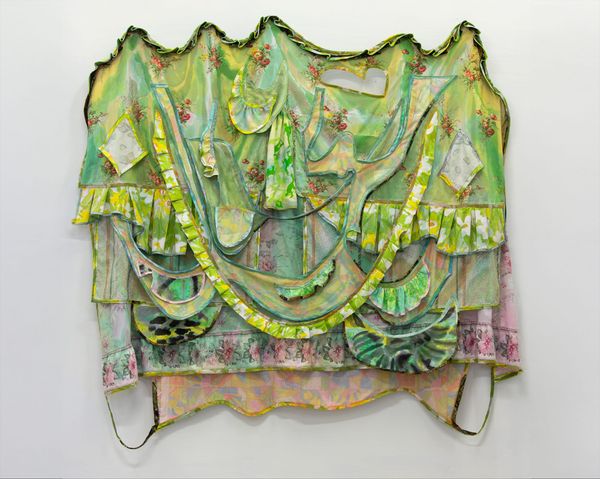
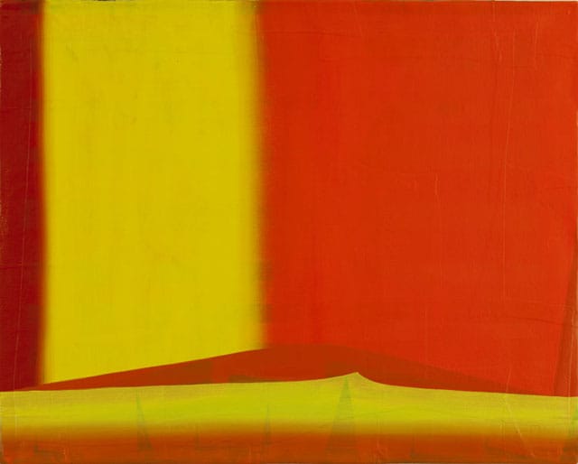
In contrast to the first time Burckhardt exhibited his paintings done on cast plastic molds, where they were all the same size, there are two different sizes in his most recent exhibition, 16 x 20 inches and 32 x 40 inches. Burckhardt orients them either vertically, (like a portrait) or horizontally (like a landscape). The other change — and this warrants commentary — is Burckhardt’s willingness to go where the painting takes him. While it is obvious that the same person painted these works, all of them have distinct palettes and vocabularies, and they all simultaneously embrace the abstract and representational.
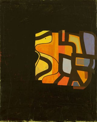
The actual plastic supports are relatively thick, and in keeping with the earlier work, on each of their sides the artist has painted a row of thick black dots, suggestive of nails holding down canvas that has been stretched over the frame. The surfaces are uneven, with certain areas raised. Looked at from a raking angle one can make out various raised shapes, as if the artist glued something (a strip of canvas?) to the surface. This unevenness suggests that the painting’s surface needed to be repaired, but that concealing the fix was either undesired or impossible to do. At some point, I was reminded of two things — Frankenstein and Philip Guston’s late paintings, particularly the ones in which a teapot or some other homely thing has been patched or bandaged.
The comparison to Guston also extended in another direction. I was reminded of his paintings within paintings. In “Story” (1978), a hand with two fingers extended, a cigarette between them, points at a small, squarish painting of a green sun floating in a white sky above a red landscape. Depicted in perspective that reveals the thickness of the painting’s stretcher bars — Guston wants the viewer to know it is a thing, after all, not an image — along with a row of fat black dots (tacks) on the right side.
With their painted “thumbtacks,” Burckhardt’s paintings became cartoons of paintings. They seemed to have leapt out of Guston’s paintings and — in the process of doing so — become Burckhardt paintings, occupying a domain all their own. This is no small thing. As Burckhardt suggested in the interview, there is an “absurdity” to them.
* * *
The comparison to Guston ends at the most important place — the painting’s surface. Burckhardt owes nothing to Guston in terms of painting handling or subject matter.
There is no evidence that he scrapes down the surface. I can’t imagine that the uneven plastic surface is conducive to that kind of process. Instead of scraping down, Burckhardt’s surfaces are additive; and his paintings consist of several layers of thinly applied paint.
In “Lie Detector” (2012), the last thing Burckhardt seems to have done was cover most of the painting with black, which resulted in a shape hovering in the middle of the painting, with part of its right side abutting the panel’s right edge. This is in turn crisscrossed by curving black bands suggesting that the viewer is looking at part of a jigsaw puzzle: still, even if the whole thing were visible the subject would nevertheless remain elusive. This tension seems to me to border on metaphysical speculation, folding another layer of meaning into the work.
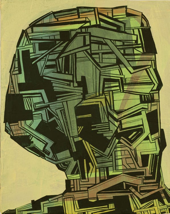
In “Mini Moog” (2012) — the painting’s title brings to mind Robert Moog, inventor of the Moog synthesizer — the interior of a head-like form is filled with abstract geometric shapes that shift between flatness things and jumbled perspective. Again, a jigsaw puzzle comes to mind, but one made from mismatched puzzle parts forcefully jammed together. At the same time, the abutting and seemingly overlapping sections suggest an aerial view of piles of collapsed houses or cross-sections of same. The head-like shape seems robotic and remote, as well as wounded and covered with patches. At his best, Burckhardt is able embrace both the abstract and the representational is such that we must read the paintings in different, often contradictory ways without ever reaching a conclusion.
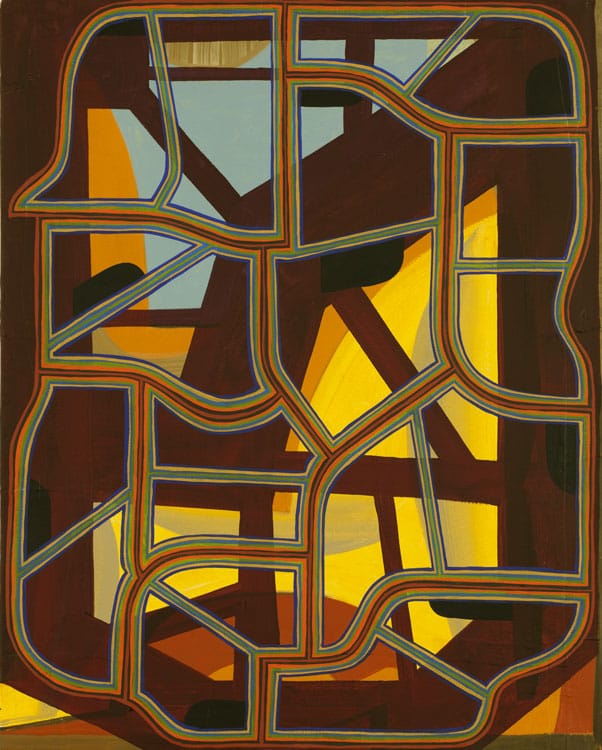
In “Economy Skeleton” (2012), Burckhardt has layered together overlapping configurations of shapes, varying from wide to thin, light to dark, and from yellow to dark brown. The final layer is a skeletal framework made up of thin, curving lines of different colors, including orange, green, blue, and umber. If we take the title, “Economy Skeleton,” at its word, its competing layers could be seen as underscoring the constant tension between contingency and independence running through American political discourse.
By establishing contradictory possibilities, Burckhardt echoes both his love of, and disbelief in, painting. He refuses to be either nostalgic or cynical. With this show I got the feeling that the artist is moving slowly but steadily towards a body of work that will have a major impact.
Tom Burckhardt’s Pretty Little Liars continues at Tibor de Nagy Gallery (724 Fifth Avenue, Midtown, Manhattan) until November 24.