Who’s Afraid of Hot Pink, Canary Yellow, and Midnight Blue?
Color is frightening. From the color of one’s skin to the color of a painting, it can stir up unlikely obsessions: all kinds of irrational responses tend to explode without provocation. Barnett Newman and Mark Rothko have two things in common: wide expanses of color and the proclivity for people to


1.
Color is frightening. From the color of one’s skin to the color of a painting, it can stir up unlikely obsessions: all kinds of irrational responses tend to explode without provocation. Barnett Newman and Mark Rothko have two things in common: wide expanses of color and the proclivity for people to deface their paintings more than any other Abstract Expressionist work.
Take Barnett Newman’s series of paintings, “Who’s Afraid of Red, Yellow and Blue,” which has provoked vandalism on more than one occasion. In 1982, Josef Nikolaus Kleer, a 29-year-old veterinary student, attacked “Who’s Afraid of Red, Yellow and Blue IV” (1969–70), which was hanging in the Nationalgalerie, Berlin, with one of the plastic security bars intended to separate viewers from the painting.
In 1986, Gerard Jan van Bladeren — a self-described schizophrenic and psychotic — attacked Barnett Newman’s “Who’s Afraid of Red, Yellow and Blue III” (1967) with a blade in the Stedelijk Museum in Amsterdam. Eleven years later, van Bladeren attacked Newman’s “Cathedra” (1951) in the same museum.
One reason Kleer gave for attacking “Who’s Afraid of Red, Yellow and Blue IV” was because he was afraid of it. Another reason was because it was a “perversion of the German flag” (which is horizontally divided into black, red and gold).”
According to his lawyer, Kleer attacked the Newman painting because he felt his intervention would complete it. While it is true that the viewer completes the work, as Marcel Duchamp pointed out, I don’t think destruction of this sort was what the Frenchman had in mind.
2.
Two exhibitions have recently closed: Sanford Wurmfeld: Color Visions 1966 – 2013 at the Hunter College Art galleries (February 15–April 20, 2013), which was curated by the renowned art historian William C. Agee, and Richard Anuszkiewicz: New Work 2003–2012 at Loretta Howard (March 7–April 20, 2013). And just before they closed, two distantly related exhibitions opened: Paul Behnke: An Awful Rainbow at Kathryn Markel (April 18–May 18, 2013) and Stanley Whitney: Other Colors I Forget at Team Gallery (April 11–May 12, 2013).
For a few days it seemed as if New York was awash with color, and that both the scientific and improvisational sides of the conversation were ably represented, perhaps for the first time in many years. Even though these four artists are engaged with the structuring of color, each attains a distinct state in his work. Both Anuszkiewicz (who studied with Josef Albers) and Wurmfeld, whose exhibition I reviewed on April 14th, make optically dazzling, hard-edge paintings that owe something to the scientific, research-driven engagement with color that goes back to Georges Seurat, the study of optics and the rise of color theories. Behnke and Whitney are improvisers who owe something to Hans Hoffmann, John Hoyland and Ed Clark (who were German, English and African American respectively) and other artists connected to Abstract Expressionism.
Despite the very real differences among them, one of the animating forces in all of their work is the vibrancy of color juxtapositions, which embrace the poles of light and materiality. Whether rooted in research (Wurmfeld) or process (Behnke), the paintings of these artists convey exuberance and longing, a desire to break free of the containing boundaries. One senses that they believe that the viewer’s engagement with color can achieve the euphoric state most often associated with the visceral insistence of music.
3.
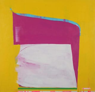
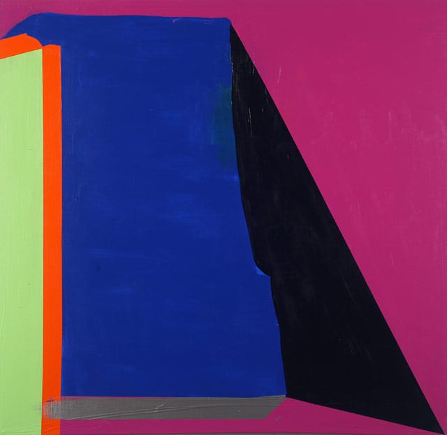
Behnke, who works on square formats, repeatedly layers and scrapes away acrylic. He embraces different states of paint, from thin to gloppy, with the outer edges of the canvas often containing few or no layers. In “Blue-Green Bow Street” (2013), a thin band of largely unpainted canvas runs along the top and left edge, with traces of magenta and green visible on the primed canvas. Compositionally, the painting shifts rather jarringly from the narrow bands to the black ground occupied by a large green square and a smaller blue rectangle. The painting’s right edge crops the blue form while the left side of the green square about the unpainted vertical band. The thin unpainted bands abetted by the scraped magenta form protruding into the blue rectangle from the painting’s right border, shatter the calm promised by the geometry. It’s as if these uneven sides are fighting for our attention, the large and solid versus small but insistent.
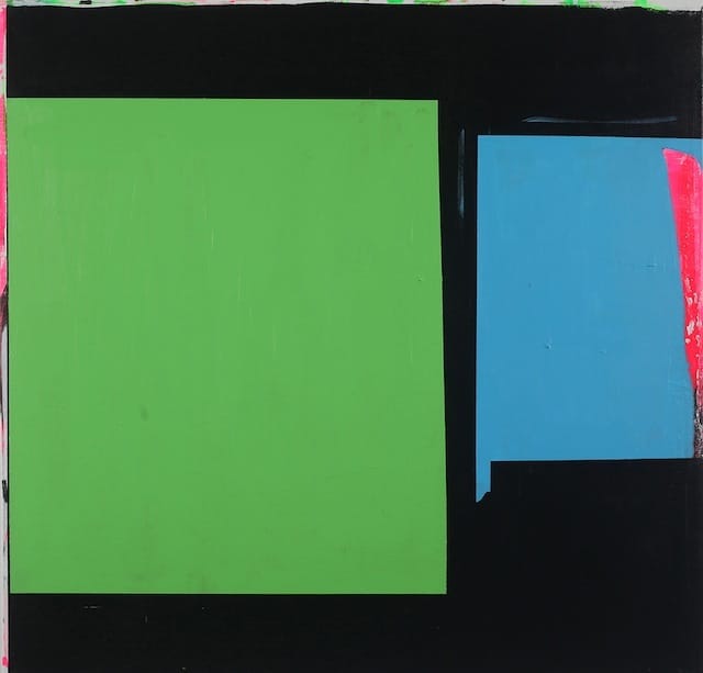
In Behnke’s best paintings, our focus shifts between dissonance and order, large and small, solid planes and scraped “unfinished” areas. Where an earlier layer has not been painted over, its color punches through the hole and grab us. Hot and cool colors abut, as well as complementary ones. You have the feeling that Behnke is trying to pull out all the stops, that he wants structure and chaos to coincide.
The paintings feel distinctly urban, evocative of the flashes of things glimpsed at the periphery while looking at what’s ahead, a red paneled truck or the painted-over outside wall of a corner store. Both the pleasure of looking and the necessity of vigilance — a state of concentration familiar to every urban inhabitant — jostle with each other, like boxers psyching one another out at the beginning of a match.
4.
Stanley Whitney also works on square formats, with the smallest measuring 48 x 48 inches and the largest 96 x 96 inches. Compositionally, he divides the painting into a grid consisting of four rows of irregularly sized rectangles, with the smallest ones running along the bottom edge. At various intervals, he paints a horizontal band from edge to edge, usually dividing one row of rectangles from another. There is a loose order to the paintings, a sense that everything was decided on the spot. This endows his work with an openness that is rare in contemporary abstraction, even in the case of so-called provisional paintings, which generally look “unfinished” and suitably arty.
With Whitney, you never get the sense that the completed painting has been locked down; it seems to remain malleable, as if the artist could come back and do something else to it, cover a rectangle with a different color or even start over. I think he realizes that the balance he achieves in his paintings — where every color announces itself without subduing those around it — is the result of choices that he might not make again. At the same time, there is nothing arbitrary about the decisions he made.
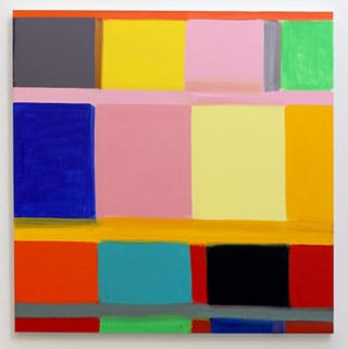
In his current show, Whitney extends his gamut, going from thin, crackled surfaces, to washy, translucent layers exposing painted over shapes, to solid planes of color. And he might suddenly paint wet into wet, suspending brushstrokes of maroon in a green rectangle. Clearly, there is little or no plan when he begins with one color and moves to the next. It is comparable to writing a poem word by word, rather than line by line.
“My Tina Turner” (2013) underscores the subjectivity of experience when it comes to music and popular culture. Despite the claim that we all drink Coca Cola, as Andy Warhol was fond of saying, we do not all have the same experience of it. Whitney is a longtime reader of innovative poetry and has made friends with many poets, and so it is not farfetched to suggest that Susan Howe’s My Emily Dickinson, a landmark book in contemporary literature, might have inspired Whitney to make a similar statement about Tina Turner.
Whitney’s pairing of painting and title runs counter to the idea that there is an agreed upon way of reading (or experiencing) certain events or, in Turner’s case, forces of nature. The prevailing viewpoint implies that anyone who buys Turner’s CDs becomes the owner of her raspy, sexy growl, and, by extension, of her, which is hegemonic thinking. In reality, there is not one Tina Turner whose persona can be consumed en masse by her fans; rather, each member of her audience creates a customized version speaking to his or her own emotional life. There are as many Tina Turners as there are listeners. Look at Whitney’s painting and think of the colors you might associate with Turner. He chose two pinks, three greens, two yellows, a midnight blue and a gray. Do you associate Turner with dusky pink or canary yellow? This is definitely Whitney’s Tina Turner.
5.
For these artists, color is a palpable thing and an abstract event. It stirs us up in ways that we cannot easily name. Their work does that one thing that Wallace Stevens thought was essential to art: It must give pleasure, which is certainly true of the work of Wurmfeld, Anuszkiewicz, Behnke and Whitney. And each of them offers us a different pleasure, a different kind of looking, and a different, optically rich space in which to reflect upon that act.
Paul Behnke: An Awful Rainbow is on view at Kathryn Markel Gallery (529 West 20th, Suite 6W, Chelsea, Manhattan) through May 18.
Stanley Whitney: Other Colors I Forget is on view at Team Gallery (83 Grand Street, Soho, Manhattan) through May 12.