Capturing the Graffiti Impulse Without the Cliché
From hard-edged, angular, and zig-zagging lines inspired by graffiti tagging styles to thick, swooping curved lines reminiscent of calligraphy, Opera Gallery's Saber & Rostarr exhibition sets up a fascinating and fruitful comparison between two artists who combine street culture and aesthetics with

From hard-edged, angular, and zig-zagging lines inspired by graffiti tagging styles to thick, swooping curved lines reminiscent of calligraphy, Opera Gallery’s Saber & Rostarr exhibition sets up a fascinating and fruitful comparison between two artists who combine street culture and aesthetics with more traditional abstraction.
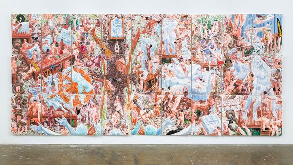
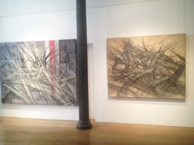
While both Saber and Rostarr are innovative artists in their own right, the strength of the Opera Gallery’s exhibition seems to be the dialogue created between these two distinct artists’ bodies of work that share a dual interest in strong lines and the streets. Looking at the Saber and Rostarr together, I was particularly struck by how both Saber and Rostarr referenced street culture without resorting to mimicry of art on the street. Remaining primarily within abstraction, neither Saber nor Rostarr relied on collage, cartoon-like figures or clearly legible graffiti tags to represent the urban environment.
His second exhibition with Soho’s Opera Gallery, graffiti writer and street artist Saber was born in Los Angeles where he began writing graffiti when he was ten. As a graffiti writer, Saber became famous, or infamous in the eyes of the LAPD Vandal Squad, for painting the largest football field-sized graffiti piece. Developing his artistic talent on the walls of Los Angeles rather than in art school, Saber is perhaps best known to the public for his American flag paintings, particularly after FOX News attacked Saber’s work as a “desecration” of the stars and stripes.
Looking at Saber’s paintings in Opera Gallery, I realized that Saber creates some of the best graffiti canvases I have seen. Most graffiti-inspired art on canvas still suffers from too much literal emphasis on the artist’s tag or cartoon-like characters, making it impossible to differentiate between art on the street or on the canvas. However, Saber’s painting depicts the essence of graffiti without resorting to these clichés.
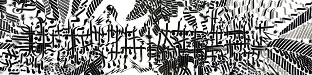
One of my favorite works of Saber’s and perhaps of the entire show was “Base Elements,” which illustrates his difference from most other graffiti-inspired artists. Rather than representing actual graffiti lettering, Saber captures the angles, agility, movement, and finesse of a wild-style piece while continuing to paint in the language of abstraction. Activated by Saber’s lines, the viewer’s eye dances along the canvas, tracing Saber’s hand as if reading graffiti on the city streets.
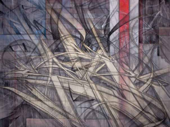
Even though not represented literally, Saber also references the layers of decay, deterioration, and art piled on the walls, bridges, and riot gates of urban space. In works such as “Beautiful Outbreak” through color choices, deft line-work, and use of the American flag, Saber represents the landscape of city walls, as well as the American origin of graffiti. Through the continual layering of lines, colors, and forms, Saber evokes the chaotic yet beautiful atmosphere of the urban environment.
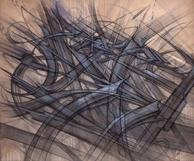
Like Saber, Rostarr’s main interest and major talent lies with the uniqueness and strength of his line. Born in South Korea, Rostarr, whose full name is Romon Kimin Yang, moved to New York with his family in 1989. In contrast to Saber, Rostarr, who attended the School of Visual Arts, comes from a more traditional academic art school background.
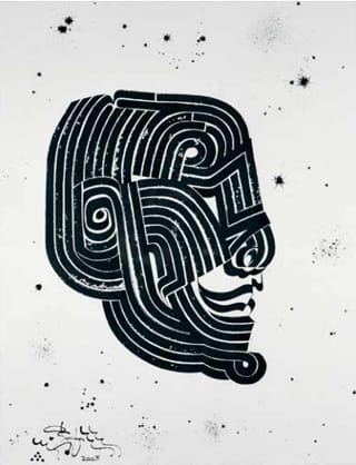
With his sweeping, curved lines and often black and white or gold color scheme, Rostarr’s works are cleaner, more studied and structured than Saber’s gritty canvases. Constructed spontaneously, Rostarr’s lines curl and twist in repeated patterns, which entice the viewer to distinguish a representational form within them. Some of Rostarr’s drawings like “Head Master I (Cabeza Principal)” (2005) actually form an almost tribal-influenced rendering of a head.
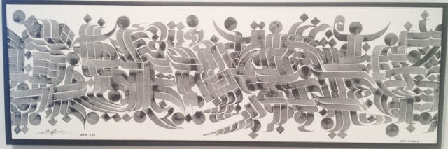
Illustrating Rostarr’s interest in Arabic and Asian calligraphy as well as street culture, his long horizontal works such as “Fireworks Song” (2008) resemble ancient scrolls. Created with sumi ink on handmade paper, the calligraphic style of Rostarr’s lines in “Fireworks Song” (2008) appears as if it could be calligraphy written in an unknown language. With small explosions of ink on the paper, Rostarr represents the experience of watching fireworks through basic black lines.
While I approached the Saber & Rostarr exhibition expecting to relate more to Saber’s graffiti-inspired canvases since I am often drawn to graffiti art, I found Rostarr’s art, particularly the scroll-like horizontal drawings, to be just as riveting. Breathing new life into graffiti and street-influenced art, Saber & Rostarr provides a dynamic and engrossing example of the power of the seemingly simple line.
Saber & Rostarr will be at Opera Gallery (115 Spring Street, Soho, Manhattan) until May 11, 2013. The catalogue is available for download online as a PDF.