Katherine Bradford and the Bigger Picture
I left Katherine Bradford’s first museum show, August, at the Bowdoin College Museum of Art, Brunswick, Maine (June 29 – September 1, 2013) wishing for an in-depth survey. As it is, there are eight paintings ranging from 10 x 10 inches to 68 x 80 inches — a sumptuous sampling — exhibited in one gall

1.
I left Katherine Bradford’s first museum show, August, at the Bowdoin College Museum of Art, Brunswick, Maine (June 29 – September 1, 2013) wishing for an in-depth survey. As it is, there are eight paintings ranging from 10 x 10 inches to 68 x 80 inches — a sumptuous sampling — exhibited in one gallery. While the curator, Joachim Homann, and the museum are to be applauded for making this show happen, they should also be chided for appearing to hedge their bets. Bradford deserves more, much more. A second room and eight more works would have been a good start.
Bradford has taken the unlikely genre of marine painting and transformed it into a densely packed, metaphorical realm that is simultaneously abstract and representational — which should clue the viewer in that one of the artist’s themes is a belief in choice. By refusing to fall into the either/or conundrum and instead openly embracing both possibilities, Bradford defers conclusion in favor of exploration. This is why her paintings of ocean liners — including one titled “Titanic Orange Sea” (2012) — are so apt.
Like sailing ships — a subject the artist has painted, none of which are included in August — paintings are made of wood and canvas. And like a ship, a painting carries its contents (or meaning) into the future. The difference is that ships have destinations, while paintings float somewhere on the continuum of past, present and future, always vulnerable. They are at the mercy of time – a consequence they can (but don’t always) acknowledge.
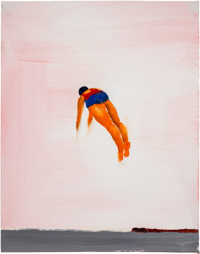
“Diver Blue/Red” (2012), which is on the cover of the brochure accompanying August, depicts a woman hovering in the sky, which is a lightly brushed pink, above a strip of gray sea. Her long, diagonal orange legs suggest a kinship with frogs. Her placement in the middle of the canvas’s largely empty, vertical rectangle raises a number of questions — where did she jump from? How does she defy gravity and get so high in the air? At once daring, calm and accepting, Bradford’s image overcomes any possible anxiety by exposing it. She is taking the plunge knowing that painting — at least the kind that is done by hand — is a performance that reveals one’s flaws and strengths, among much else.
2.
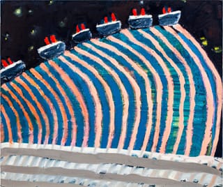
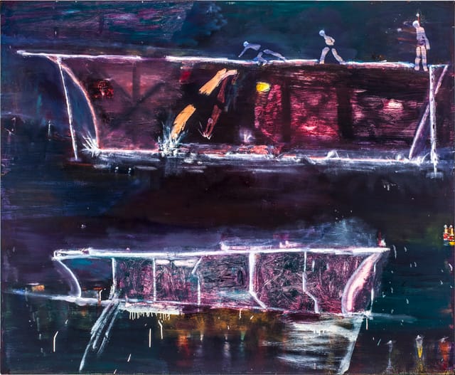
“Ship in Blue Harbor” (2011–12), is one of the two largest paintings in the exhibition (the other being “Night Divers,” 2012). The ship is a sharply foreshortened pentagon, which evokes supertankers, Minimalist sculpture and H.C. Westermann’s death ships. It is both a thing and an abstraction, a ship and a geometric plane. Bradford applies the paint freely with fingers, hands and brushes. One sees in the water and sky evidence of the underpainting, of what had to be covered over in order to arrive at the final image.
The kicker in “Ship in Blue Harbor” is the receding grid of round white shapes in the foreground, bobbing on the blue-over-red water. Joachim Homann characterizes them as “rows of glowing bathing caps,” which adds a mystery that he doesn’t further comment on. If they are rows of bathing caps, is this an aquatic musical starring Esther Williams? Might they not be something else?
At the same time, the trapezoid can be read as a minimalist sculpture sitting on water (or less than solid ground). Stability, Bradford seems to be suggesting, is an illusion. What about the juxtaposition of the dark plane of the ship and grid of glowing orbs, solidity and evanescence? By bringing together these different possibilities, and using a variety of ways to apply the paint, the work becomes a series of investigations and considerations, with the final outcome being the painting in front of us.
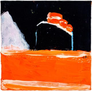
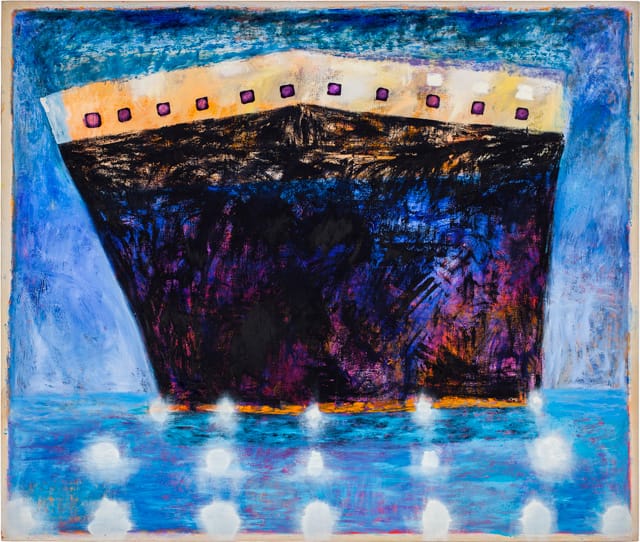
In “Titanic Orange Sea” (2012), Bradford does something counterintuitive and inexplicable; she makes the sea a thickly painted orange rectangle with a diffuse stroke of white paint spanning both the top and bottom, turning the painting into a monochromatic abstraction on which both a ship and iceberg (an unavoidable collision and disaster) sit. At the same time, the cropped iceberg on the painting’s left side resembles a pyramid, recalling the ones at Giza as well as Philip Guston’s painting “Pyramid and Shoe” (1977). Bradford’s orange sea is closer to the desert than to water. Although “Titanic Orange Sea” is a mere 10 x 10 inches, it feels much bigger.
3.
Even as I unpack these possible meanings from Bradford’s paintings, I recognize that others — such as “Mile High Liners” (2012) and “Sunbathers” (2012) — are both immediate and opaque. She seems to believe that painting need not be subservient to or domesticated by language. I get the feeling that Bradford finds the painting as she paints it — and that, as the underpainting visible in the large works suggests, she has no idea where she will end up when she starts out. The real strength of her work is that she seems to be willing to accept the outcome without necessarily knowing what it means.
In her ability to be simultaneously abstract and representational, Bradford shares something with Dana Schutz, Judith Linhares, Kyle Stavers, and other painters, who, without fanfare, have disengaged from the patriarchal narrative that embraced the death of painting and deskilling, along with other sexist viewpoints disguised as criticism. Both as an individual and a member of a larger group, Bradford is an important figure in an alternative history that has yet to receive the attention it deserves.
Katherine Bradford: August continues at the Bowdoin College Museum of Art (245 Maine Street, Brunswick, Maine) through September 1.