The Roman Empire Visualized in Infographics
A new book uses graphic design as a way to tell the story of Roman conquests, economy, and culture.

It has become fashionable to compare the United States’ current disarray to that of ancient Rome. The parallels are easy to make — both are powerful empires, nominally operating by the rule of the people, with hefty engineering and military might to back up their conquest. Harder to appreciate is the fact that what we imagine as “Rome” is often just one sliver of a 2,200-year-old history, lasting from approximately 753 BCE to 1453 CE, with the fall of Constantinople. If the United States is at risk of following the path of Rome’s fall, this nation-state of nearly 250 years has quite a bit further to go.
One of the challenges of understanding the Roman Empire is its scale. Such is the nature of empire that scale can be measured in multiple ways at its height — the geography (5 million square kilometers), the population (46 million), the number of magistrate levels (26, from Emperor on down to the Curator of Public Works and Curator of Roads). But there are other measures that could be easily overlooked by those who’ve never managed an ancient empire, like the distribution of grain (as much as 500,000 tons per year) or the relative sources of income (40 million sestertii from Egypt and the Gauls, and a whopping 340 million from taxes, war, and customs).
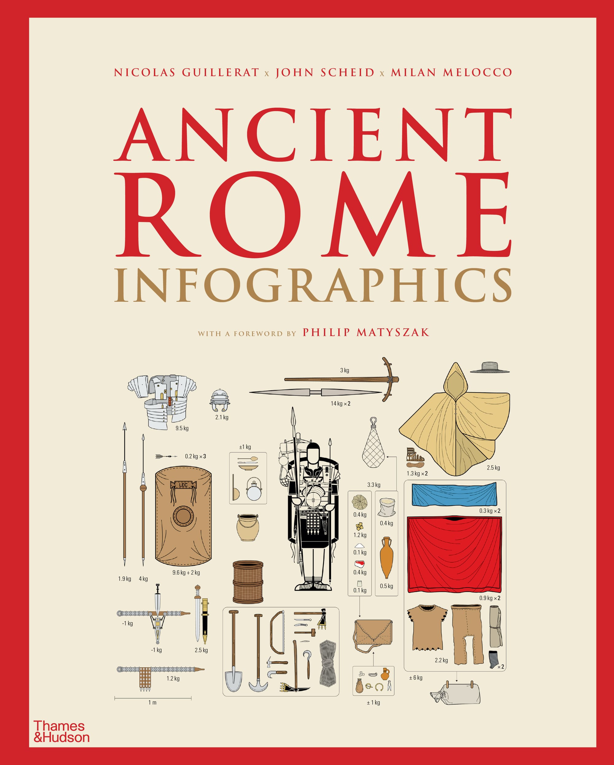
These and many other facts are illustrated and explained in Ancient Rome: Infographics, a new book by Nicolas Guillerat, John Scheid, and Milan Melocco. “It was a tribute to the Roman genius for government,” they write in the introduction, “that by the 5th century CE, the empire ruled by Rome had become an empire of Romans, in which free citizens from Egypt to Wales all considered themselves Romans, members of the same body politic,” even while remaining citizens within their own communities. This created the template for an empire of city-states at once local and Roman, a template that would inform Western empires to come.
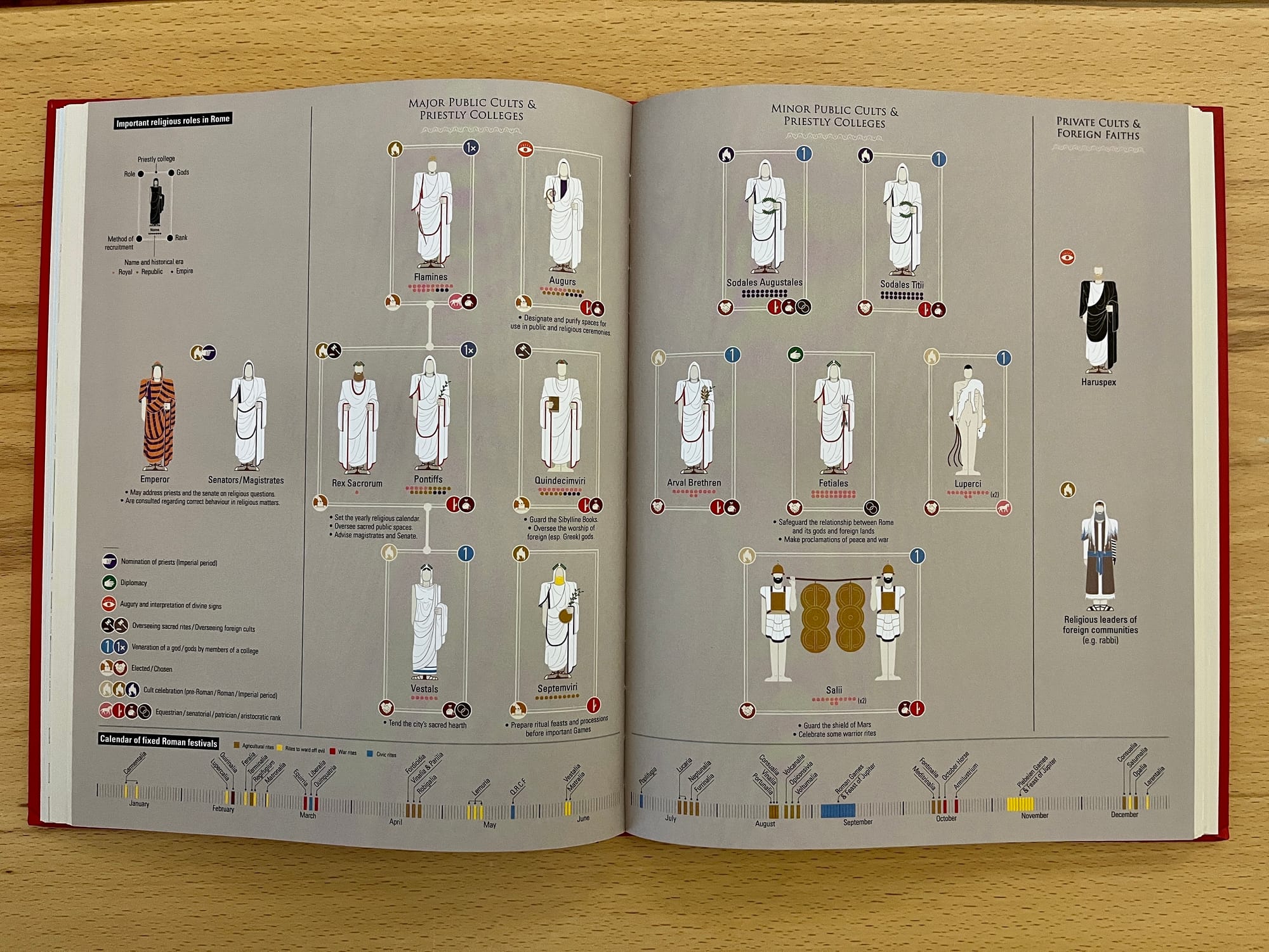
The book takes as its focus the Western Empire, which ended in 476 CE, and offers infographics through three major lenses: land and people; government, worship, and social needs; and the military. The infographic approach is best seen as a complement to more usual ways of perceiving Rome, as in art, literature, architecture, and film. Where those mediums give us a sense of grandeur, culture, opulence, and violence, clean information design helps us understand the grand logistics of empire.
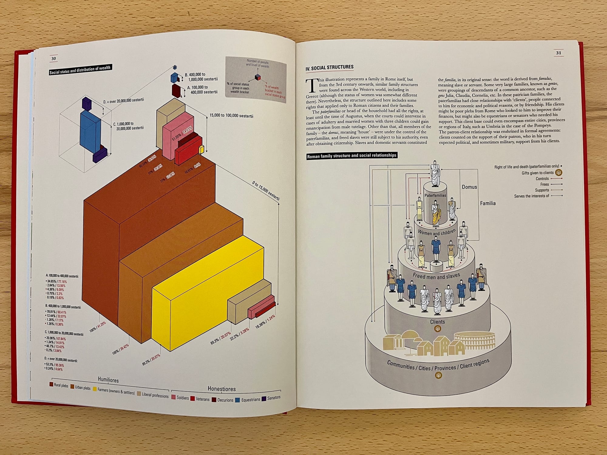
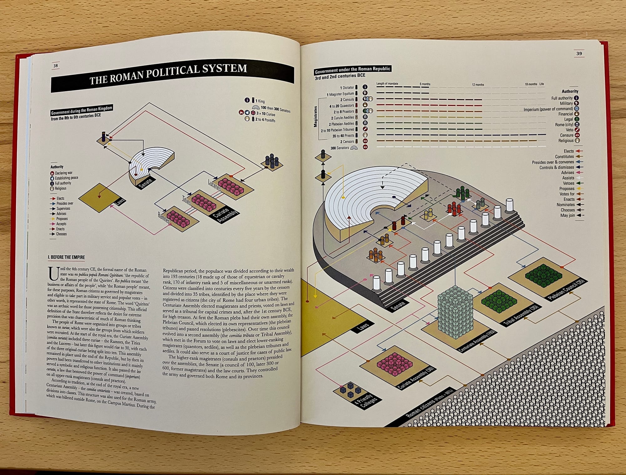
Some of its most insightful visualizations depict the development of these measures across time, helping us see Rome as a growing, evolving entity with many layers of management and operations. For example, in one section on the Roman people, the authors take us through the evolution of Roman Gaul from conquered territory to province, as its population grows from 3.75 million to 7.5 million in the span of some 500 years. We learn about the supply chains of grain, the distribution of budgets, and the rights and roles of men, women, soldiers, and enslaved people.
Other visualizations, like a map of the legions of the empire, suffer from too much density of information, trying to cram in details like the number of legions, the date of their deployment, the number of campaigns they waged, using a mix of colors, icons, and sizes. More useful are diagrams for the Punic Wars, which show the range of attacks between Rome and Carthage, a powerful state in its own right. Clean and dispassionate infographics convey a sense not of a simple conquest but of genuine struggles over the course of three major conflicts.
“The Roman Empire itself was basically a well-disguised military dictatorship,” the authors write, and their visualizations leave little doubt as to the efficiency of the empire’s precise approach to conquest and subjugation. It’s fitting, then, that the book ends with the story of Spartacus, the famous leader of a slave revolt in 73–71 BCE. At the rebellion’s peak, as the infographics show, Spartacus led more than 150,000 men up and down mainland Italy. Legions dispatched by the Roman Senate, the wealthy Crassus, and the proconsul of Macedonia all swooped in to quell the uprising, as the more battle-hardy legions were otherwise engaged in Spain and Asia Minor.
The book mentions the uprising leader’s killing but, strangely, not the thousands eventually crucified along the Appian Way. I’m not sure what an infographic for that moment would look like, but after reading this book, I’m certain that Roman torture and execution, too, required their own supply chain, budgetary constraints, operational infrastructure, and managerial oversight.
Ancient Rome: Infographics by Nicolas Guillerat, John Scheid, and Milan Melocco (2021) is published by Thames & Hudson and is available online and in bookstores.