Art
For the Love of Paint
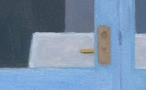
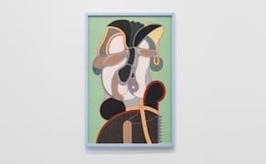
Ambition has nothing to do with scale. The largest painting in Eleanor Ray: paintings at Steven Harvey Fine Art Projects measures 10 x 8 inches.
John Yau is an award winning poet, critic, curator, and publisher of Black Square Editions. He has published over 50 books of poetry, fiction, and art criticism.

Art
Ambition has nothing to do with scale. The largest painting in Eleanor Ray: paintings at Steven Harvey Fine Art Projects measures 10 x 8 inches.
Art
What do Roger Brown, Sarah Canright, Jordan Davies, Ed Flood, Art Green, Philip Hanson, Richard Hull, Jin Soo Kim, Jim Nutt, Ed Paschke, Christina Ramberg, Suellen Rocca, Barbara Rossi, William Schwedler, Rebecca Shore, Chris Ware, Karl Wirsum and Mary Lou Zelazny have in common?
Art
According to the wall text in the not-to-be-missed exhibition Martin Puryear: Multiple Dimensions at the Morgan Library & Museum, the artist was in “the Peace Corp in Sierra Leone, West Africa” from 1964 to '66.
Art
When I first wrote about Mary Heilmann for Artforum (January 1987), one thing I had in mind was the strong impression that her first great painting, “Save the Last Dance for Me” (1979), had made on me some years earlier, when I saw it at the Holly Solomon Gallery.
Art
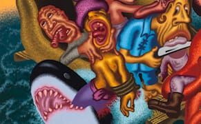
Peter Saul has an uncanny ability to seamlessly combine the hilarious and the hideous to great effect. In the middle of chortling at one of his wacky, indecorous paintings, you are apt to suddenly notice an odd and even disturbing detail.
Art
What do Richard Diebenkorn and John Walker have in common? When they sink their teeth into something, they aren’t likely to let it go.
Art
Squeak Carnwath’s exhibition, What Before Comes After, at Jane Lombard is the artist’s first with the eponymous gallery (formerly Lombard Fried) and her first in New York since 2000.
Art
The exhibition Alberto Burri: The Trauma of Painting, currently at the Guggenheim Museum, is the first large-scale survey of this artist’s work in America since the museum’s previous survey in 1978.
Art
There are five artists among the Chicago Imagists who did reverse paintings on Plexiglas between the late 1960s and the mid-70s: Jim Nutt, Gladys Nilsson, Ed Flood, Karl Wirsum and Barbara Rossi.
Art
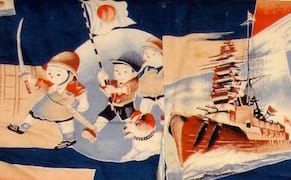
In a letter dated July 23, 1938, sent by the Japanese modernist poet Yone Noguchi to the Nobel Prize winning author Rabindrath Tagore — the first non-European to receive the award — Noguchi wrote the following justification for his country’s invasion of China, effectively ending their friendship:
Art
McArthur Binion’s exhibition, Re: Mine, currently at Galerie Lelong stirred up a swarm of associations while I was looking at it, and the buzz did not die down after I left the gallery and decided to walk home amidst the late afternoon din of Manhattan traffic and people in a rush to get home.
Art
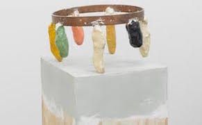
It has been two years since Patrick Strezelec had his first exhibition of sculptures in New York in more than a decade.