Art
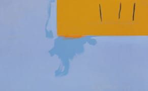
Jessica Rohrer’s View of the Heaven on Earth Club
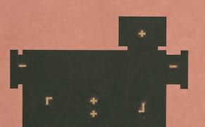
“Something strange is creeping across me.” The first line of John Ashbery’s poem, “Daffy Duck in Hollywood,” came to mind while I was scrutinizing the modestly scaled, seemingly benign works included in Bloomfield, Jessica Rohrer’s latest exhibition of paintings and works on paper at PPOW.