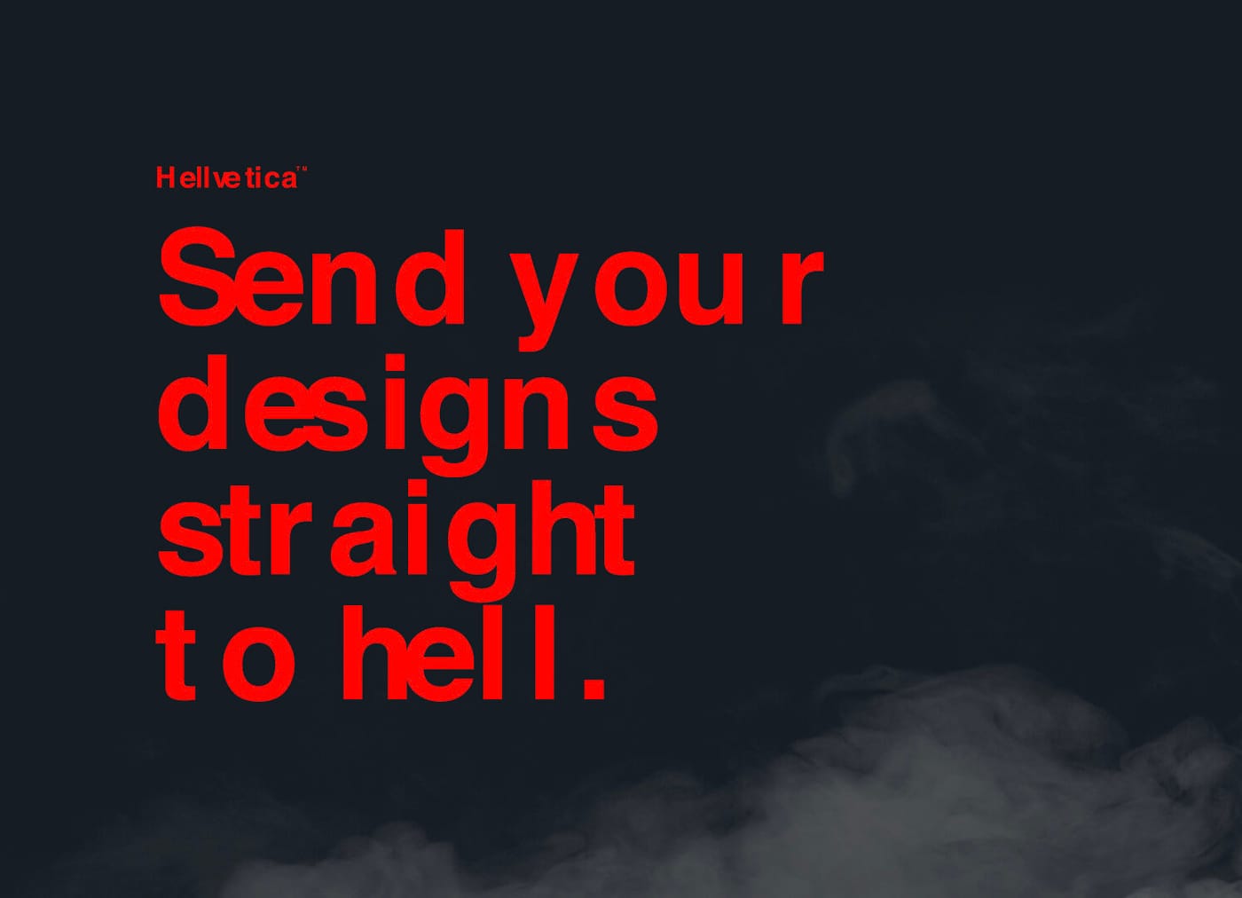
Welcome to Hellvetica, the Only Typeface You Need This Halloween
This new font is designed to keep editors and graphic designers up all night, rocked by terror and unable to sleep.

For some people, it’s slasher films, and for some, it’s corn mazes, but on this spookiest day of the year, everyone deserves to experience a little terror. For the graphic designer in your life, there’s Hellvetica, a heart-stopping typographic experience from Zack Roif and Matthew Woodward, associate creative directors at the international advertising agency R/GA.
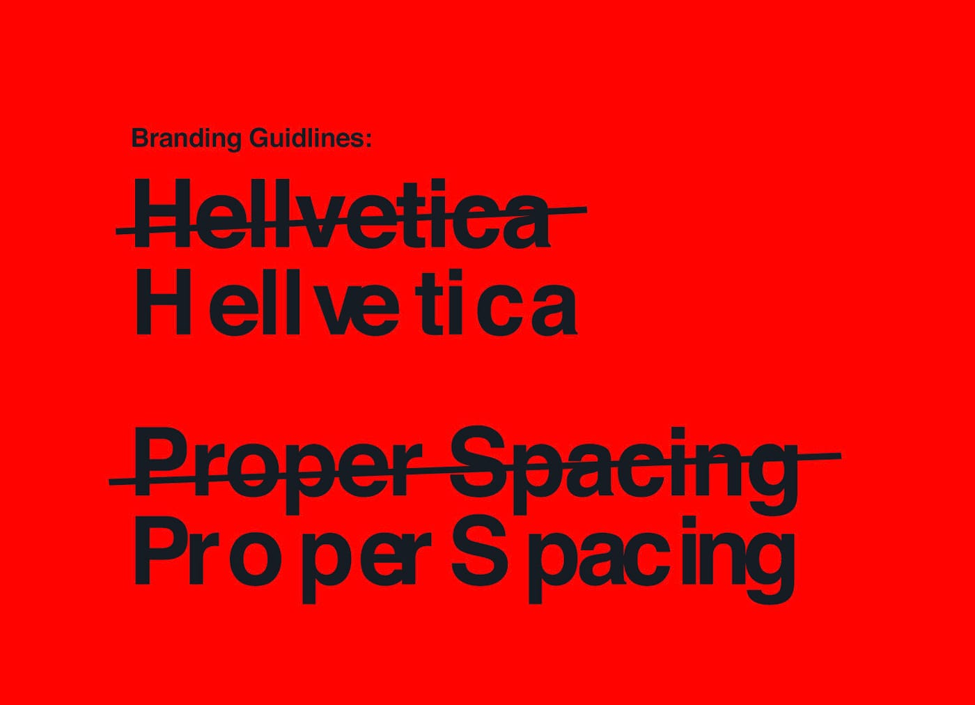
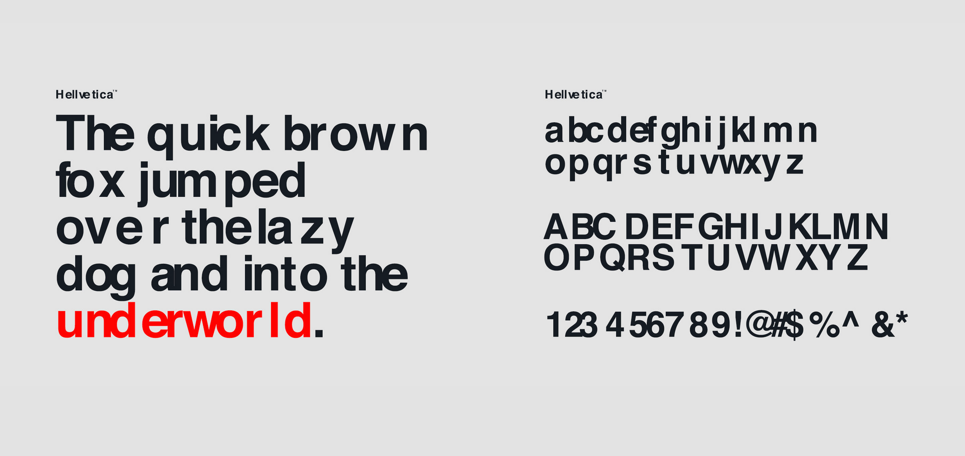
“Flipping what is widely considered to be the most iconic ‘good design’ font of all time on its head is about as evil as it gets in the design world,” Roif said, in an interview with Fast Company on this gory kerning massacre. Otherwise identical to its clean, sans-serif namesake, the Hellvetica font is designed to intentionally create jarring and irregular spacing between letters, sure to keep editors and graphic designers up all night, rocked by terror and unable to sleep. Spooky fun indeed!
“Hundred percent break the rules,” Roif told Fast Company. “Don’t listen to your gut. Forget your training . . . and make that logo kern in hell!” One suspects that over at R/GA, the art department missed a deadline somewhere, and Roif and Woodward have taken bloody revenge. Just one more way to bring the spirit of the season, in deed and word, a little too close for comfort!
Hellvetica is available for free download now from R/GA. Happy Hellveticaween!!