Art
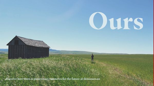
Satirical Corporate Website Brands Ecofascism
Samuel Marion’s satirical corporate website shows how the far right might leverage environmentalism to justify white supremacist agendas.
Art
Samuel Marion’s satirical corporate website shows how the far right might leverage environmentalism to justify white supremacist agendas.
![Old Navy Says Don't Aspire to Be an Artist [UPDATED]](https://storage.ghost.io/c/51/f8/51f871d8-b6be-4a73-b958-0ca4fff0110a/content/images/size/w600/hyperallergic-newspack-s3-amazonaws-com/uploads/2015/12/cxbxshhvaaabnui-1.jpg)
In Brief
Throw out your art supplies and dive into into engineering and policymaking instead because being an artist isn't worth it — or at least that's what Old Navy suggests with a line of T-shirts.
Art
Before the 1950s, most advertising was just copywriting paired with an image with little thought to the overall company or visual identity.
News
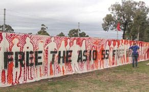
Five artists have announced their withdrawal from the Biennale of Sydney, ArtsHub reported today, the latest in an ongoing controversy over one of the Biennale's major sponsors, Transfield.

News
A group of artists have threatened to boycott the Biennale of Sydney in protest of one of the exhibition's major sponsors, a company called Transfield, which contracts with the Australian government to manage mandatory detention centers for asylum seekers on Nauru and Manus Island in Papua New Guine
News
Getting a cease-and-desist letter from a major corporation pretty much sucks, but it can’t exactly be a huge surprise if you’ve been using, say, the name Coca-Cola, only slightly modified.
Opinion
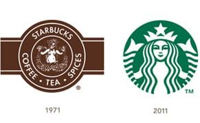
Global coffee retailer Starbucks is turning 40 this year and they've announced a new logo to coincide with the occasion. Looking at the sweep of logos from the original topless two-tailed mermaid — though the company often calls it a siren — that appeared on cups at their first store in Seattle's Pi