Art
Mapping 13 Centuries of English Metaphors
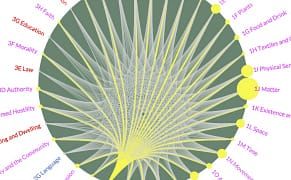
A three-year project from the University of Glasgow's School of Critical Studies mapped 13 centuries of metaphors in the English language.
Art
A three-year project from the University of Glasgow's School of Critical Studies mapped 13 centuries of metaphors in the English language.
Art
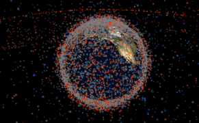
While humanity has only been launching huge payloads into outer space since the 1950s, with Sputnik breaking into orbit in 1957, a lot of human-made debris and technology now circle the planet.

Art
Interpreting the data of 94,526 paintings created between 1800 CE and 2000 CE, Martin Bellander, a PhD student at Karolinska Institutet in Sweden, discovered that blue has increased in art while orange has become less common.

Art
Back in 1974, a curious construction-style chart of cocktails was made by some employees of the US Department of Agriculture Forest Service.
Art
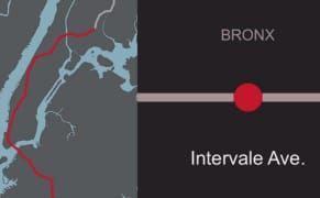
As the 2 train travels from Brooklyn through Manhattan up to the Bronx, it journeys along 49 stations of neighborhoods as varied as Flatbush, the Financial District, and Wakefield.
Books
From the amount the potential tax revenue from legalizing drugs worldwide to disappearing seed varieties, data journalist David McCandless transforms abstract information into engaging visuals.
Opinion
An interaction design student has started a project he calls "Location-Based Light Painting," for which he maps geotagged photos of public spaces that are available online, thus turning our obsession with photography into something tangible.
Art
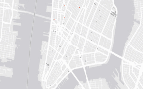
Last year, the City of New York released a huge trove of tax data to the public. Called Property Land Use Tax Lot Output (PLUTO), the information might not seem terribly thrilling, a dry assortment of building dates, square footage, and property value, but for those looking to map the city's history
Art
From charts that show how swearing in public has changed over time to a graph tallying the crimes that have put people behind bars in New York, a new site is aiming to make data visualization more accessible and shareable.
Books
While data visualization can seem like a modern design focus, it really has its roots in the High Middle Ages when a sudden rise in information and population resulted in the need to convey ideas in an accessible way.
Opinion
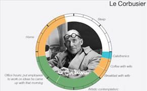
The question of how our creative forebears organized their time makes for fascinating fodder. This is the subject of Mason Currey's 2013 book Daily Rituals: How Artists Work, which RJ Andrews, of Info We Trust, has now mined to create data visualizations of the daily routines of a number of historic

Art
As much as data can tell us about our planet, rattling off the numbers can often sound like static. An exhibition at the British Library in London is showing how art and design are essential to conveying scientific ideas and statistics.