At Play in the Fields of Paint: Russell Tyler’s “Analogue Future”
There’s something about Russell Tyler’s new paintings that just shouldn’t work. Elements reappear, with minor adjustments, from canvas to canvas, suggesting that the artist assembled his compositions according to a set of rules instead of entering each new process free of preconceptions. And yet, de

There’s something about Russell Tyler’s new paintings that just shouldn’t work. Elements reappear, with minor adjustments, from canvas to canvas, suggesting that the artist assembled his compositions according to a set of rules instead of entering each new process free of preconceptions. And yet, despite their apparently imposed uniformity, or perhaps because of it, the paintings do work, and for the most part they work splendidly.
Tyler, who was born in 1981, is an up-and-coming painter whose work has been catching my eye in group exhibitions over the past couple of years, but until now I haven’t had the opportunity to see it in any kind of depth. His current show, Analogue Future at DCKT Contemporary on the Lower East Side, is his second solo in New York; the first was at Freight + Volume in 2010, but the images available on the gallery’s website — loosely rendered paintings of cartoonish monsters, including Christmas trees sprouting human legs — could be, if not for the thickness of the impasto, the work of a different painter.
His subsequent exploration of abstraction, however, continues to maintain an appreciable foothold in the pictorial. The gray-scale bands and black squares that frequently turn up in his recent work relate to blank TV and computer screens, which explains why their fluid but rigorous geometry always seems to harbor allusions of functionality.
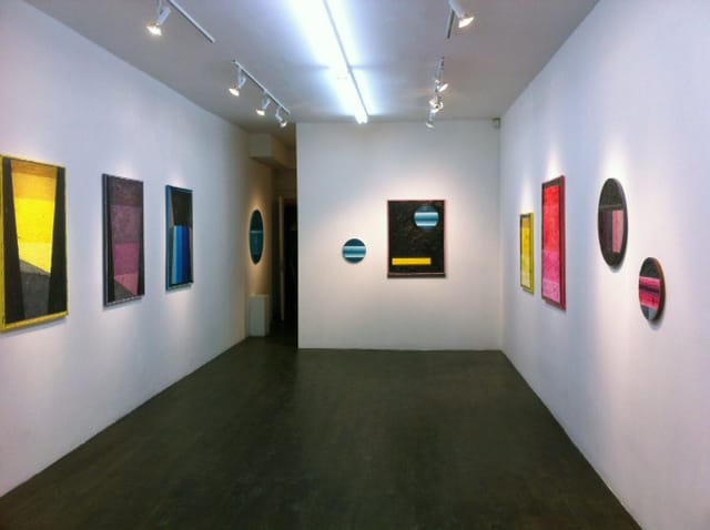
The thickly painted, brightly buzzing circles, rectangles and trapezoids in Analogue Future — which includes conventionally rectilinear canvases as well as several tondos — derive from the 8-bit graphics of primitive computer programs and video games. From a conversation with Ken Tyburski, one of the gallery’s two directors (the KT of DCKT), I learned that Tyler, whose generation was among the first to grow up in front of computer screens, wanted to evoke the games he played as a child, which struck me as key to understanding his use of repeating elements.
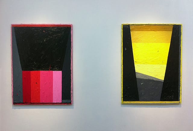
The most pronounced of these are two different framing devices: lines of paint squeezed out of a tube along the perimeters of the rectangular works, and a swath of carefully removed paint around the circumference of the tondos. Also, the side edges of the canvases and wood panels are all carefully painted, most often with a color that is featured on the surface.
These devices lend a family resemblance to an otherwise diverse body of work. Tyler has hung eight of the fifteen paintings on display in related pairs; the other seven are two single tondos, one on the gallery’s east wall and another in the back office, and five corresponding canvases grouped together on the south wall.
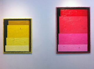
Of the pairs, one set features a large rectangle atop four stratified bands; in another, a dense, imposing form (yellow in one painting, pink in the other) rises like a staircase made up of stacked, gradated rectangles; and between those pairings, two tondos are mounted like portholes, with the smaller of the two hanging lower than the larger.
The most unusual set in terms of iconography is on the gallery’s north wall, where a canvas containing a narrow yellow rectangle and a blue/green-banded circle is hung alongside a tondo painted to be the circle’s near-twin (down to a splotch of turquoise paint in the lower right quadrant of each). The realness of the tondo in contrast to the artifice of the circle underscores the objecthood of all of the paintings in the show, an effect enhanced by the framing devices and the colored edges of the supports.
The five paintings hung together are vertically oriented (as are all the rectilinear canvases in the exhibition), and each feature an intensely colored central form squeezed between achromatic (black or gray) borders. The imagery of these works, titled “TGL,” “R-DOCK,” “YGP,” “PGP” and “B-DOCK” (all 2013), come from the artist’s imperfect recollections of various video games.
A quote from Tyler in the gallery press release emphasizes the indeterminate and liminal aspects of his paintings:
I see my interaction with the picture plane as not unlike my relationship with the screen. There is a sense of the hypothetical; the paintings could be settings for actions that will never take place. They are blurred memories of the technologies I grew up with.
While the works in this show, at first glance, come off as paint-as-paint, the longer you look at them, the more their evocation of memory and lost time deepens their impression, even if you are unaware of their origins. I would even go so far as to say that their origins serve to validate their repetitive elements, since one of the primary pleasures of play is in its repetition: starting anew, following the rules, reaching a foreseeable conclusion.
Tyler, it seems, is reenacting this journey with each painting, but that in itself wouldn’t be enough to bring us along with him. Rather, we are convinced by his muscular, heavily worked surfaces, his experiments with tonal/chromatic, sweet-and-sour color, and his drive to make each painting a potent three-dimensional object.
On a broader stage, Tyler is casting his imagery along the lines of artists such as Nicholas Krushenick, Richard Artschwager and others who approach Pop and abstraction not as a dichotomy but a synthesis. And yet unlike comics and the movies — the demotic visual languages, still very much with us, that have fed art since Picasso — the crude, semi-abstract motion graphics that Tyler excavates possessed a markedly abbreviated shelf life. More sophisticated programs quickly superseded the quaint simplicity of games like Pong with ever higher degrees of verisimilitude, not to mention a hard turn toward meticulously rendered violence.
In this light, Tyler’s paintings are as much about lost innocence as they are about lost technologies, which is one reason why this work is more effective, and affecting, than Cory Arcangel’s electronic repurposing of similar materials in his forgettable 2011 Whitney show. Tyler’s transfer of childhood sensations from a digital past to an “analogue future” in paint (which is where, according to Tyburski, the exhibition’s title comes from) is an acceptance that experience cannot be relived, and an assertion of painting as a repository of the irretrievable.
Russell Tyler: Analogue Future continues at DCKT Contemporary (21 Orchard Street, Lower East Side, Manhattan) through January 26.


