When Painting Was an Unreasonable Vocation
In our times, the sincerity and passion of Ab-Ex look pretty good again, especially when the formal strengths of the work add up to more than just stylistic adventuring. Elizabeth Harris Gallery’s current show is a case in point.


You could say that art history is the documentation of periodic fatigue. Fatigued by academic art, the 19th-century public warmed to Impressionism. Tired of sunny Impressionism, 20th-century art-lovers turned to the rigor of Cubism. And in the early 1960s, the histrionics of Abstract Expressionism gave way to the cerebral coolness of Pop and Minimalism.
In our times, however, the sincerity and passion of Ab-Ex look pretty good again, especially when the formal strengths of the work add up to more than just stylistic adventuring. Elizabeth Harris Gallery’s current show is a case in point. The 30 paintings by Pat Passlof (1928–2011), all produced in the 1950s, impress for their frankness and fervor; the best are truly remarkable for their conviction of form.
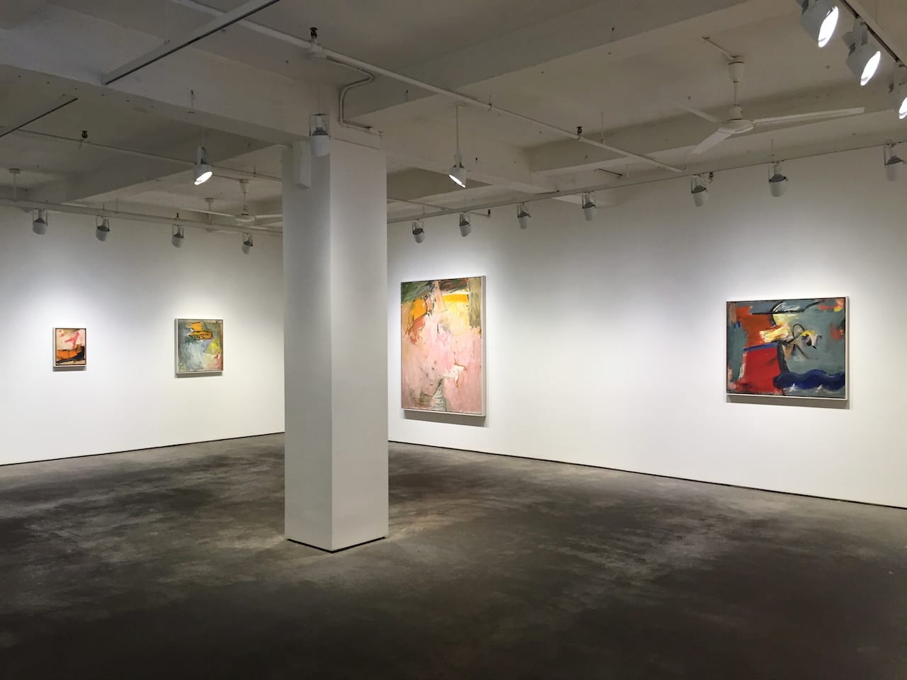
Passlof faced the challenge of all women artists in the testosterone-fueled scene of the postwar years. (Even the critic Clement Greenberg was a barroom brawler.) She was particularly close to two willful men: Willem de Kooning, with whom she studied, and Milton Resnick, whom she married. One early untitled painting in the show, dated circa 1950s, strongly recalls de Kooning in its cadenced, whiplashing shapes. But Passlof, still in her 20s, increasingly found her own voice. Among the smaller paintings, “Sutbury 2” (1957) is notable for its muscular breadth, with an expansive central blue compacted by a fiery red and slivers of hot yellow and livid green. “Spire” (1958) stands out for its powerful evocation of space — not just as movements forward and back, but as the resolute locating of forms across the canvas; its airy, angular movement of ochres and bluish tints culminates, along one side, in a clamber of reds, blues, and a final, teetering black.

A few paintings, their surfaces divided among equally weighted elements, appear less dynamic to my eye. But almost all the largest ones in the exhibition impress with their resonant self-possession. If the perennial risk of the Ab-Ex aesthetic is the descent into mere diaristic scrawling, a painting like Passlof’s “Promenade for a Bachelor” (1958) seems charged by a powerful, inner discipline — an intuitive hierarchy in which dominant forms unfold into secondary ones. Heavy, back-and-forth brushstrokes impart a sturdy presence to a central vertical mass, setting it against a startlingly spacious backdrop of yellow-oranges ranging from earthy to brilliantly vacuous. A single scarlet horizontal near the canvas’s lower edge anchors the vertical’s launching point. Its upper extremity, palpably above our eye level, resolves as spreading dark green flicks. Equally extraordinary is “Score for a Bird” (1958), in which a canvas-wide flood of modulated pinks — a fleshy carpet — descends the surface, practically spilling before our feet. A deep yellow hangs above, distantly framed by hovering notes of pinkish and grayed ochres.
Such paintings take us back to a time of romantic expectations about art, when it was more of an impassioned calling than a reasonable vocation. In Passlof’s works we experience firsthand the moment-to-moment grappling with paint, but even more so her triumphs in turning it into a rigorous journey of color and form. The word “fatigue” does not apply.
Pat Passlof: Paintings from the 1950s continues at Elizabeth Harris Gallery (529 West 20th Street, Chelsea, Manhattan) through December 20. The exhibition will also be on view January 2 and 3, when the gallery reopens after the holidays.


