Judging Galleries by Their Pens: Chelsea Edition
Join me as I wander the streets of Chelsea and bring you the first in an as-yet-only-theoretical series of gallery pen reviews.
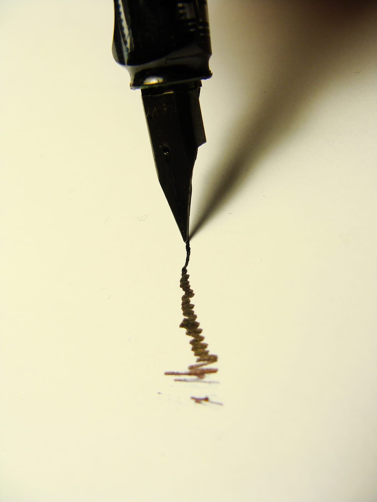
Because I am a writer, this confession may not shock you, but here it is anyway: I am extremely picky about pens. I silently judge people when they use dull, crappy ones, and I admire those who clearly take pride in their writing utensils. I am in fact so picky about pens that I only buy a certain kind, in packs from a store that I otherwise never visit, for more money than I tell myself one should logically spend on pens.
So, naturally, I notice the pens at the front desks of galleries — how they feel in my hand, how they roll on the paper when I sign my name in the guest book. These pens are the galleries’ first foot forward, their way of presenting themselves to the world … or at least to me: a woman obsessed with stationery who also happens to be an art critic.
Join me, then, as I wander the streets of Chelsea and bring you the first in an as-yet-only-theoretical series of gallery pen reviews.
Andrew Edlin Gallery
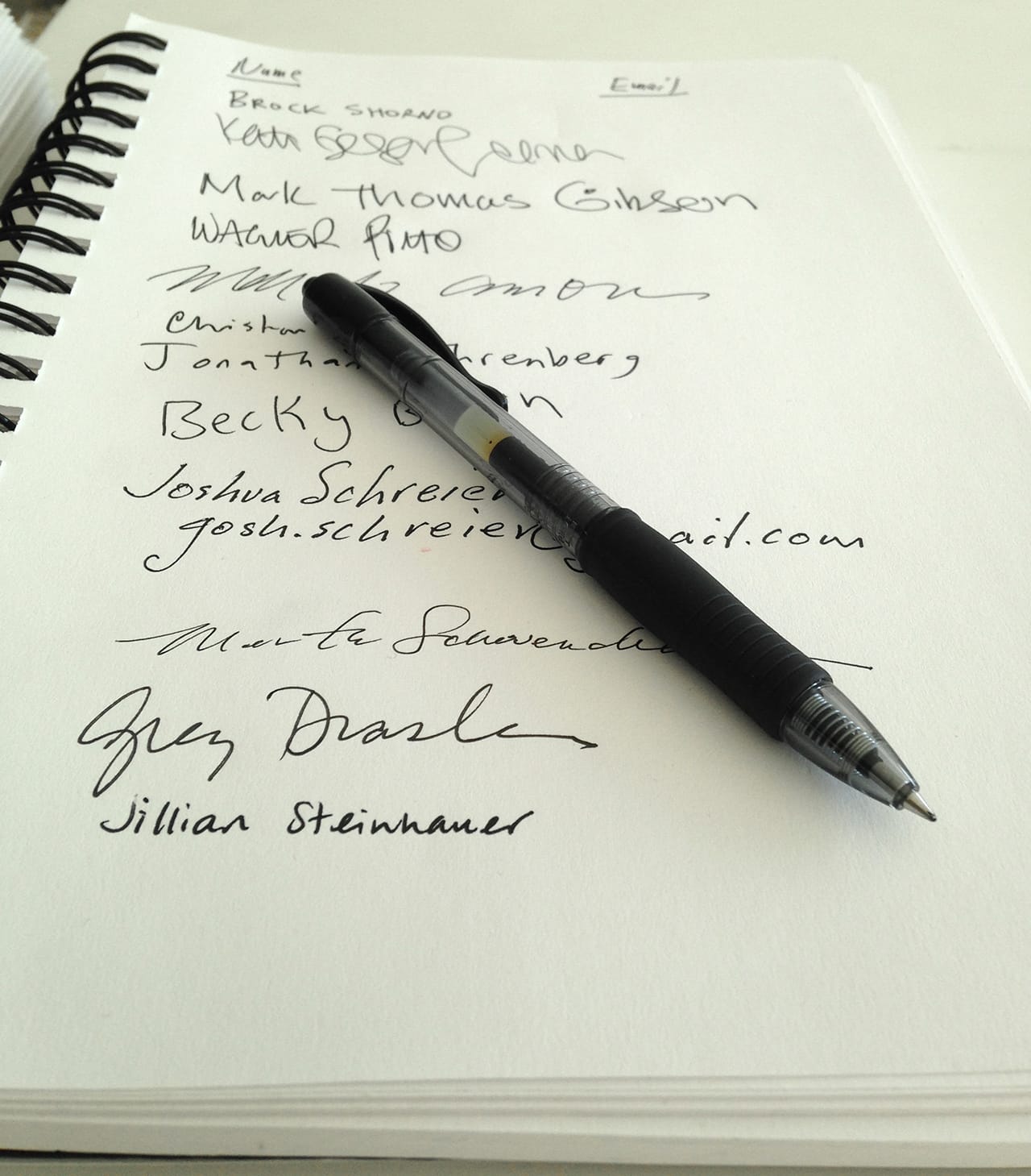
This gallery mostly focuses on “outsider” and self-taught artists, and so I hoped its pen might have some unique or unusual qualities, like being homemade. It doesn’t. In fact, it’s sort of the opposite of special: your classic black, inky gel pen that rolls smoothly and writes well. The importance of use value shouldn’t be overlooked, of course, but as far as pens go this one is pretty boring. Probably the most exciting thing about it is that all of its identifying features have been rubbed off, giving it the mysterious air of a favorite utensil used compulsively for a project that no one except the maker has ever seen.
Zieher Smith & Horton
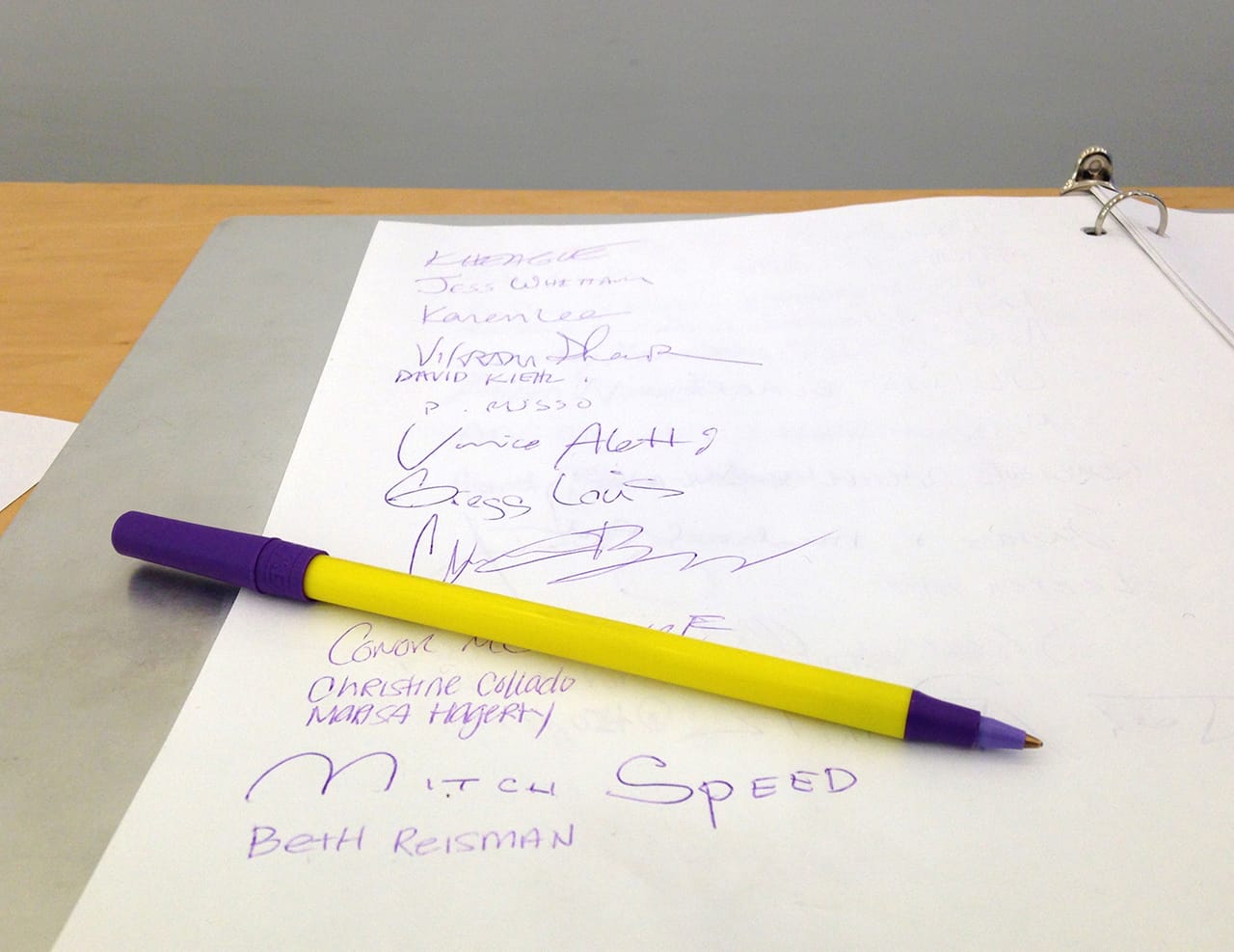
Well, this is unexpected. The gallery whose name sounds painfully like that of a law firm has a purple pen up front — with a yellow stick, no less! Zieher Smith & Horton gets major points for having, by my completely unofficial estimation, the most colorful pen in the neighborhood. Unfortunately, it’s also sort of a shitty pen — your standard ballpoint that requires you to flex your arm muscles and press fairly hard to get anything going. Like so much contemporary art, this pen jumps out at you and makes you notice it, only to disappoint on closer inspection.
Jack Shainman Gallery, 20th Street
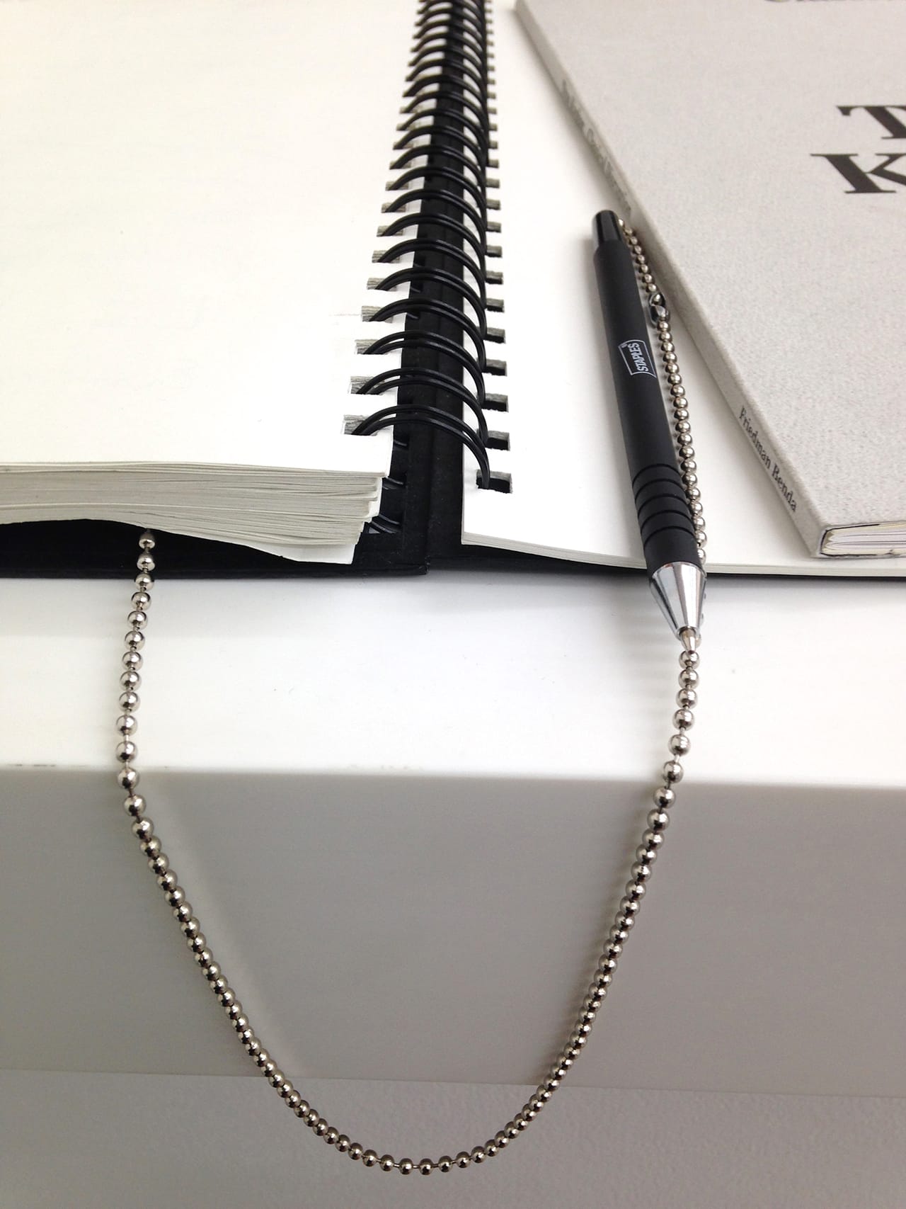
Jack Shainman Gallery uses a pen from Staples. Let’s all take a moment to let that sink in, because I found it pretty shocking upon discovery. I’ve always seen Shainman as the cool kid on the block, but the kind of cool kid who’s approachable rather than conceited; the gallery threw the only fun party I’ve ever attended during Art Basel Miami Beach. Notably, it was a party without a list, and maybe that gets to the heart of it: there’s a subtle message of accessibility and populism happening here, which is reinforced by the branded but pretty damn basic pen from Staples. It says: you too can have a gallery with a guest book up front. The chain is an odd, slightly pretentious choice, though, because let’s be real — who wants to steal this pen?
David Zwirner Gallery, 20th Street
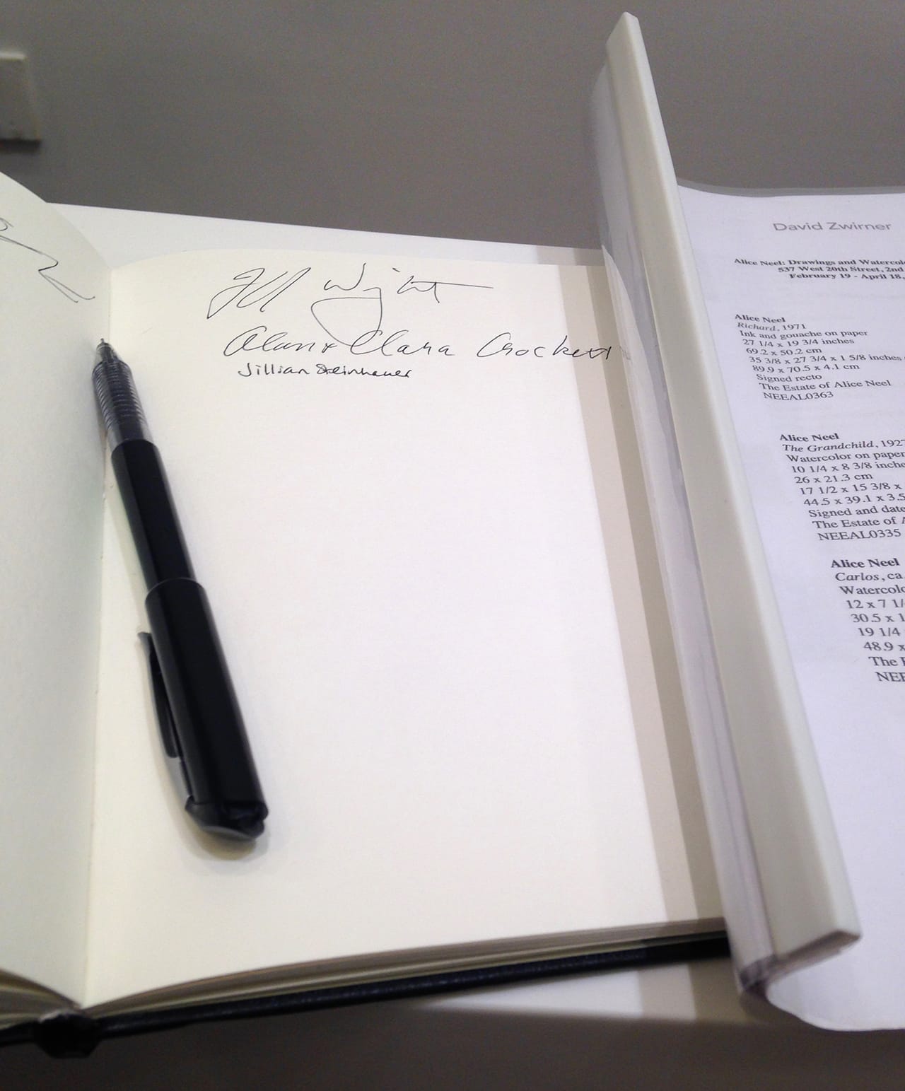
Every time I visit David Zwirner’s newest space in Chelsea — which boasts 30,000 square feet over five floors — I can’t help but think it looks like a boutique hotel. Which is to say it doesn’t have much character, but it’s certainly very nice. And considering this is a man who’s been on ArtReview‘s Power 100 for more than a decade straight, he certainly knows from nice things. The pen here is no exception; it’s got just the right touch, flowing well but not too heavily. Not only that, but Zwirner’s 20th Street space was the first commercial art gallery to receive LEED certification, and this is a BeGreen pen, made from almost 90% recycled content. Leave it to Zwirner to show up everyone else on the block.
Leslie Tonkonow Gallery
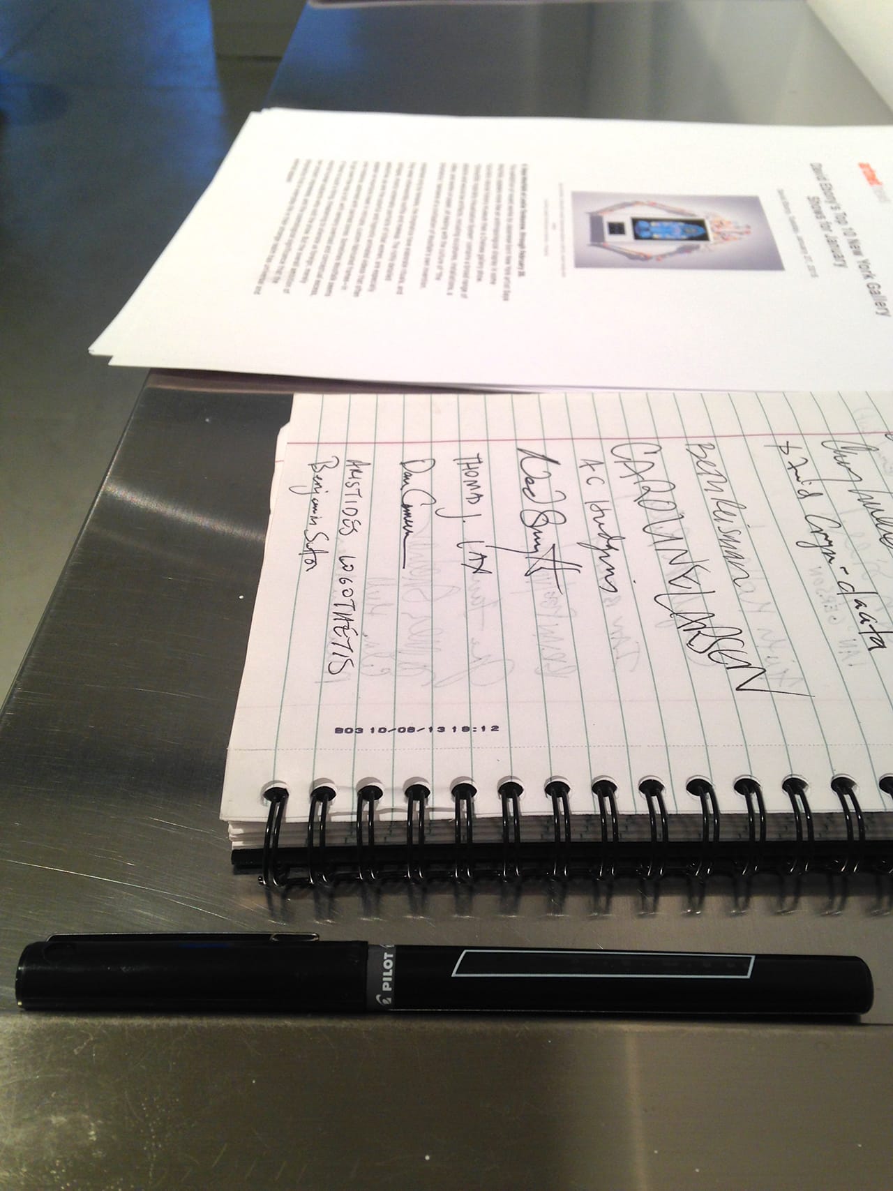
I have to admit: I expected more from you, Leslie Tonkonow. You’ve got a strong gallery program, representing an almost equal number of men and women artists, including such standouts as Agnes Denes, Laurel Nakadate, and Saya Woolfalk. But this pen did not roll out smoothly like one of your exhibitions — despite being a rolling ball pen. This, I suspect, is one of those pens that looks nice, that’s supposed to make people think you’ve spent time and money investing in a quality utensil, when in truth it doesn’t actually function very well. You’re better than this, Leslie Tonkonow, and we both know it.
PPOW Gallery
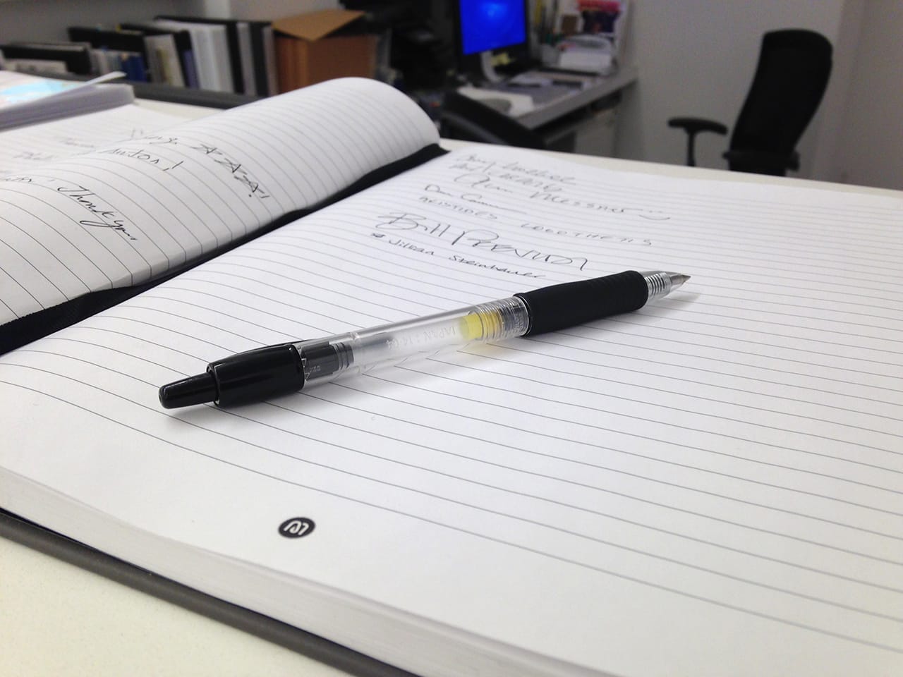
The ordinariness of this pen belies its awesomeness. It’s just a Pilot G2 retractable gel ink roller, one of the most popular nice-without-being-too-nice pens on the market — but there’s a reason for that: it writes really well. This pen is tried and true, and you can say the same of PPOW, the gallery whose guest book it sits on: been around since before I was born, weathered three different neighborhoods, and still mounting consistently great shows.
Note: Is this the same pen as Andrew Edlin’s? Does context change everything? Am I the most inconsistent critic ever? Maybe.
Driscoll Babcock Galleries
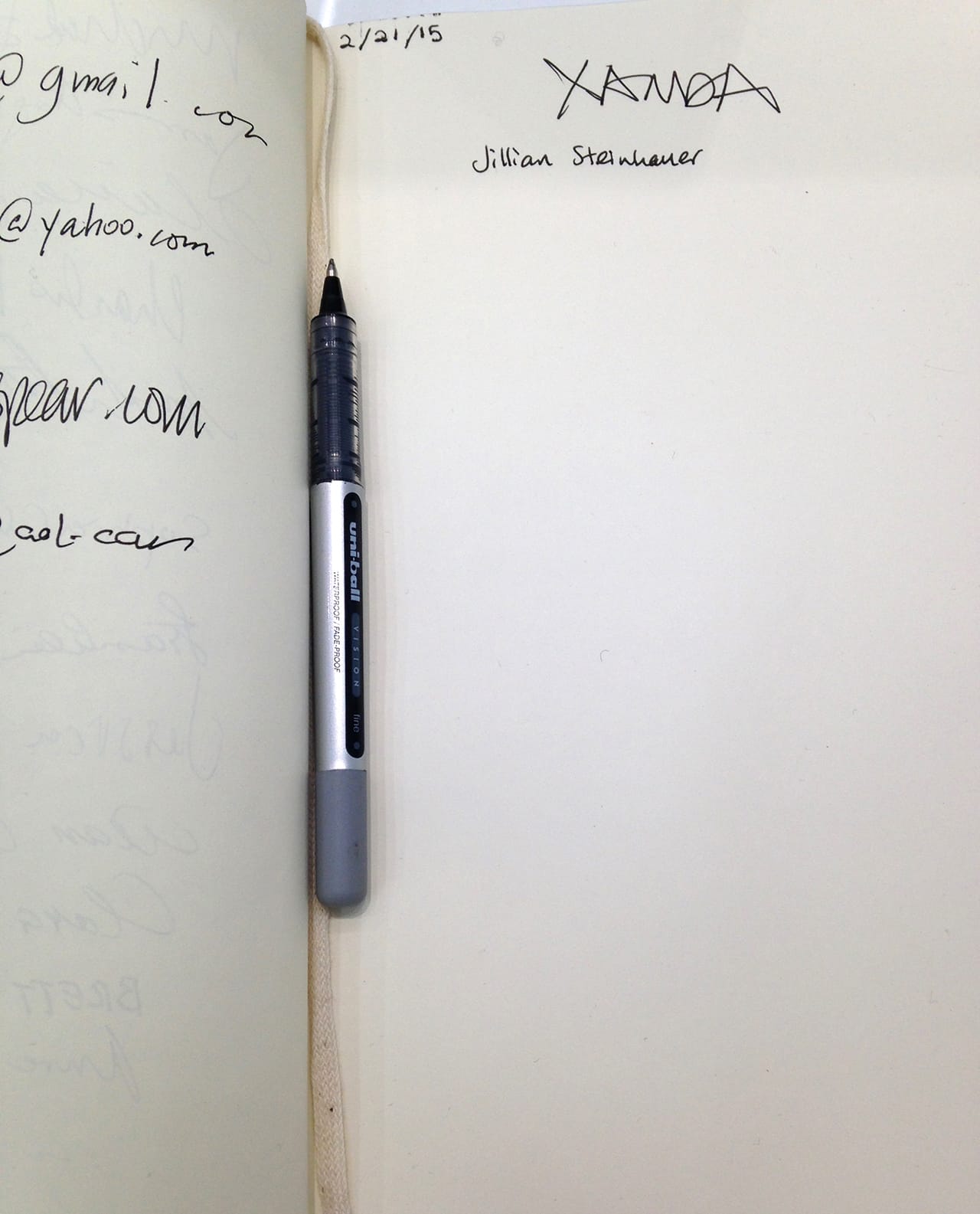
The uni-ball Vision rollerball is as ubiquitous as the Pilot G2, but it’s definitely a step up: more inky, more luxurious, a smoother flow. Although it’s not exactly an original choice — if you wanna surprise me, shell out for the uni-ball Vision Elite Designer Series, or a brand I’ve never heard of — it certainly writes the best of all the pens I encountered on this mission to Chelsea. Fitting that the gallery that bills itself as New York’s oldest and focuses largely on historical, modern work also has the nicest pen. I guess the classics are the classics for a reason.

