Tales from the Darkside: Narrative Drawings at the Hunterdon Art Museum
CLINTON, NJ — To the Best of My Recollection is a rich, nasty and spirited show of works on paper by four Brooklyn-based artists in one of the most idyllic spots in western New Jersey.

CLINTON, NJ — To the Best of My Recollection is a rich, nasty and spirited show of works on paper by four Brooklyn-based artists in one of the most idyllic spots in western New Jersey.
The venue is a 180-year-old grist mill nestled on a bank of the South Branch of the Raritan River, just off Main Street in the historic town of Clinton. The stone-walled building, formerly known as the Dunham-Parry Mill, was converted into the Hunterdon Art Museum in 1953.
The exhibition, curated by video artist Noah Klersfeld, is an exploration of visual storytelling, although only one of the four artists, Alex Gingrow, explicitly incorporates a narrative device into her work. The others — Carlos Rodriguez, Frank Magnotta and Michael Scoggins — are more elliptical, applying an associative form of storytelling rather than a linear one.
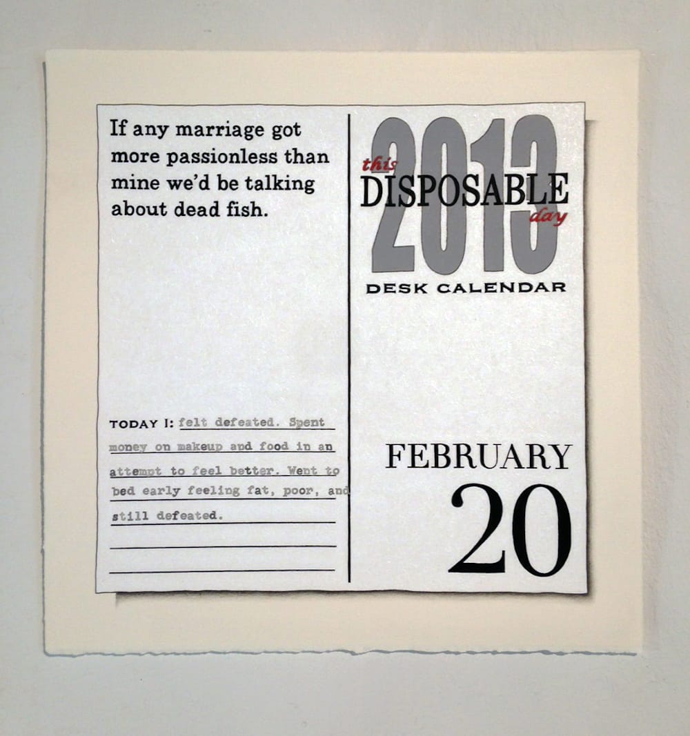
Gingrow presents enlarged facsimiles of pages from a 2013 desk calendar, meticulously rendered in graphite, ink and acrylic on paper. The artworks employ a sort of faux-trompe l’oeil: the images are exacting duplicates of the calendar’s visual information, but they are also unmistakably made by hand. The white of the page is too white; the lettering is too crisp and ever so slightly off-kilter; the surface is creamily tactile.
The effect is a material density fused to a self-conscious hyperrealism that comes off as whimsically surreal. On most of the pages, to the left of the date, there are one or two sets of texts — an often gnomic phrase in the upper left corner and “typewritten” notes underneath that pithily recap the artist’s day (in response to the prompt “Today I:”).
These notes can be quotidian, if a little peculiar (“Today I: got my nails done, saw a bunch of old friends, and walked from Schenectady to Scotia.” “Today I: wore high heels and ate a lobster the size of my arm.”), or puckishly cryptic (“Today I: saw my husband for the first time in forever. Had great conversations, met new people and had more great conversations. And then I threw up.”).
The phrases in the upper left often seem too bizarre for a mass-market desk calendar (“Structured integrity is a cultural paradigm.” “Bitter as an unripened persimmon.”) and evidently they are entirely fictitious, with the giveaway coming on March 2, 2013, with references to the Viennese gallery director Ernst Hilger in both the upper phrase and the note below it.
If the calendar pages embody time’s passage as a procession of discrete, equally sized and weighted intervals, the abbreviated non sequiturs written on them register the vanishing moments of our lives as ambiguous sensations of unease.
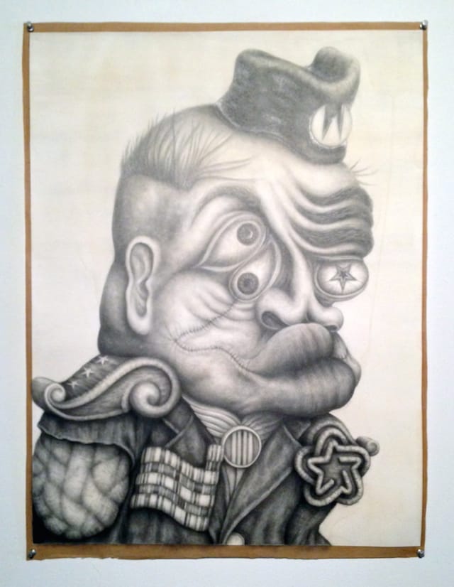
Frank Magnotta’s finely rendered grotesques invoke the spirit of the great iconoclast Peter Saul and such Hairy Whos as Karl Wirsum and Jim Nutt. The conceptual hook, however, is that Magnotta, according to Klersfeld’s curatorial statement, “uses famous corporate logos from his childhood as a base element in his twisted and exaggerated portraits of fictional characters.”
While I have no reason to doubt this account of Magnotta’s process, I was unable to detect traces of any bygone logos in the four drawings on display, which leads to the conclusion that the artist purposefully obscured within the portraits’ details. By plumbing the Baudelairean depths of childhood, Magnotta, who was born in 1970, has germinated images that cast acidic commentary on his generation: coming of age in the Reagan era, these multi-eyed freaks are the spawn of the shift toward the total corporatization of American life.
By taking a logo as an image’s genetic determinant and allowing it to grow unchecked in the petri dish of the picture plane, Magnotta has fabricated 21st-century descendants of the monsters produced by Goya’s sleep of reason. It’s a clever premise, but one that doesn’t wallow in its own cleverness; rather, it manifests in appropriately appalling terms the cravenness, stupidity and greed of a culture that defines human beings by what they consume, and that decimates democracy with simplistic notions of personal rights at odds with the common good. The faces of these creatures are the inversion of the neoplatonic ideal epitomized in Leonardo’s Vitruvian Man: a chaos of discordant features delineating a persona corrupted by vanity, aggression and materialism.
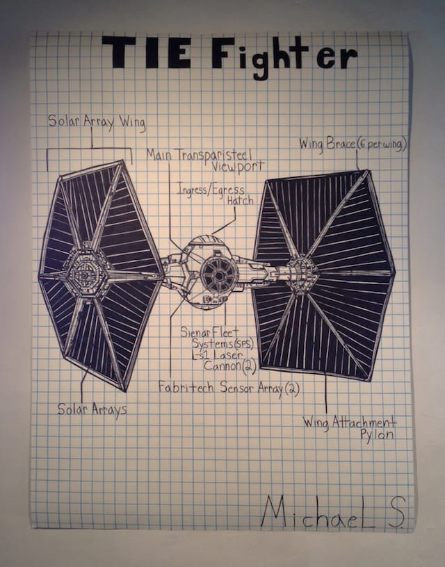
Michael Scoggins presents the flip side of the same Baudelairean channeling of childhood, otherwise known as regression at the service of the ego, but toward a more innocent and wide-eyed arena. His artwork takes the form of scaled-up drawings and handwritten texts by a child who signs each piece “Michael S.”
Michael S., according to Scoggins’ page on the website of the gallery Freight + Volume, “both is and is not Scoggins himself; he’s a fanciful idea of a child, one whose blunt ideas challenge our position as a viewer.” That Scoggins is not positioning himself as an art brut outsider, but as an artist playing a role, relates his work to the sophisticated identity-swapping suggested in Gingrow’s diaristic calendars, which may or may not be based on her own experiences.
Scoggins’ Michael S. is an embryonic artist in thrall of image-making and the power it bestows on the maker. These drawings, despite their use of text, engage in neither direct nor (as with Gingrow’s calendar pages) indirect storytelling; rather, like Magnotta’s logo-generated portraits, they chronicle a different kind of story. In Scoggins’ case, we are presented with glimpses of the pride, devotion, egotism, energy, sensuality and barely-suppressed violence underpinning a particular aesthetic evolution.
The images are rough-hewn and immediate, with an easy graphic appeal that can at times feel ingratiating, but a work like “TIE Fighter” (2012), depicting a weaponized spacecraft from a 1994 Star Wars-based computer game, is forcefully articulated in high-contrast blacks against the blue grid of an oversized sheet of graph paper, and imparts its pre-adolescent creative-destructive impulses with freshness and verve.
Carlos Rodríguez’s “Horse Sense (1 to 15)” (2010) is an exercise in wordless autobiography. A text written by Rodríguez and printed on the wall label explains that the series was “inspired by the circumstances of [the artist’s] arrival to the U.S.” from Puerto Rico in 2004. Having no place to stay, he was “dealing with [his] own impermanence and [his] fresh colonial baggage” at the height of the U.S. wars in Iraq and Afghanistan.
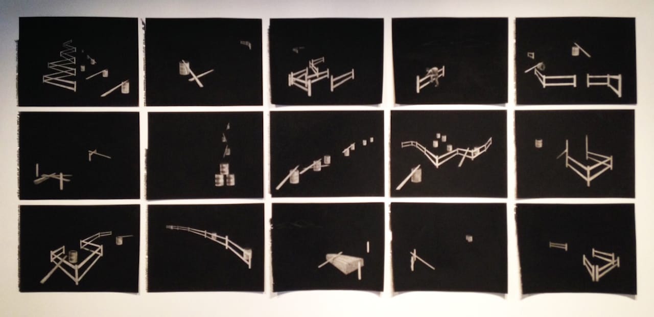
Rodríguez’s drawings, which are as black as pitch and as dense as felt, are made through erasures on charcoal-coated paper. They depict oil barrels and planks of wood that, from one drawing to the next, can become fences or corrals or, in one sheet, a box resembling a coffin. In another, a figure carrying a backpack climbs over a fence — a border jumper — who is the only living thing featured in the fifteen drawings mounted in a three-by-five grid.
There is a real beauty in the precision of their placement (the arrangement is apparently reconfigurable); the angles and curves formed by the fences and oil drums interact with each other in the individual drawings as well as from sheet to sheet. Most poignant, though, is the sensation conveyed by the artist’s creation of positive space through erasure — an act of voiding the void, as it were. These tiny presences never quite escape their carbon-rich origins in the charcoal coating the surface: they feel simultaneously a little too clean and soiled around the edges.
These diminutive shapes, emerging from encroaching darkness into an indeterminate field, expresses the idea of uprootedness much more incisively than the symbolism of a figure doubled over a fence. Their narrative contains the power of a story left unspoken.
To the Best of My Recollection continues at the Hunterdon Art Museum (7 Lower Center Street, Clinton, New Jersey) through September 6.


