Finding Fulfillment in Images of Empty White Rooms
PARIS — The silence of Seton Smith was significant.

PARIS — The silence of Seton Smith was significant. On September 21 at a special event at the Columbia Global Center in Paris, “In Conversation: Artist Seton Smith and Curator Ami Barak,” Barak did all the talking. He explained and historicized Smith’s photographic work in terms of the punctum as defined in Camera Lucida, a short book on photography published in 1980 by the French literary theorist and philosopher Roland Barthes. The book develops the twin concepts of studium and punctum: studium denoting the cultural, linguistic, and political interpretation of a photograph; punctum denoting the wounding, personally touching detail that establishes a direct relationship with the object or person within it.
Smith sat attentively on stage next to Barak, but uttered no words of intention, explanation, or contradiction. Though warm and charming in her presence, she outdid mute Warhol there. I suppose everything she had to say about her work was in the images that she produced for her Parisian comeback show, Second Mark, curated by Barak and currently on view at Galerie Sisso.
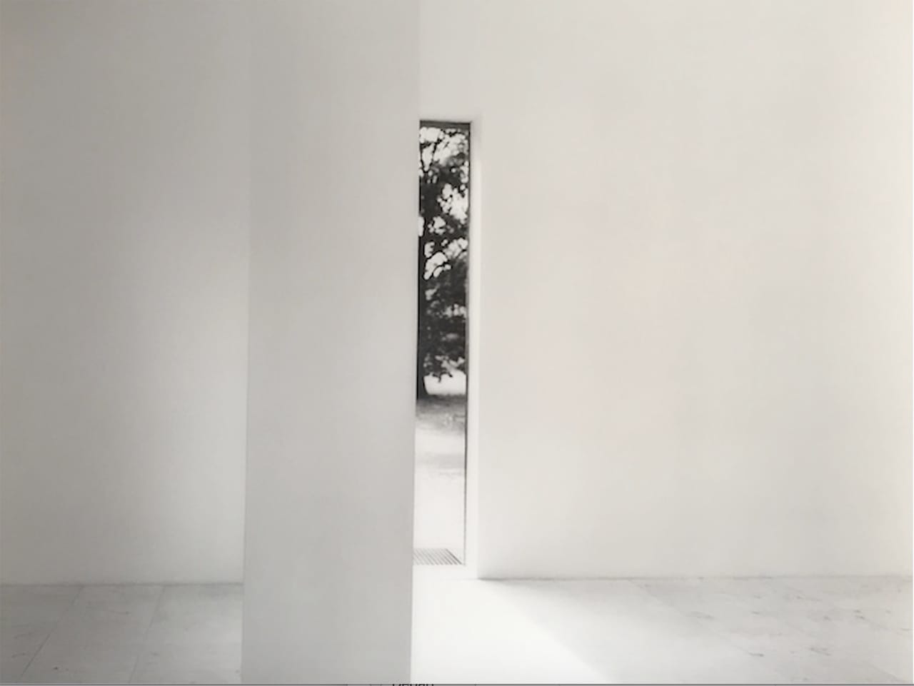
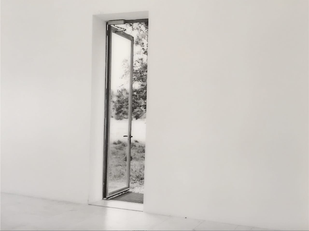
Smith’s large photographic images of places devoid of human presence are mounted on a stiff support and mercifully left unprotected by reflective glass. More like a painting than a photograph, they hover just a bit off the white walls of the gallery. Their delicate surfaces, which resemble paintings in scale, are left exposed, and this adds much to the aching feelings engendered by them. Through this exposure, they invite a search for a “pure” opticality, an issue essential to formalist minimal painting back in the 1970s.
Through this sweeping, delicate opticality, Smith creates subtle tension. The surface materiality of her smooth, technically produced images is put into slight contrast with the smoothly painted white walls on which they are hung. This close textural continuity draws our attention into an expanded, subtle field of white light that, for me, has mystical implications. A comfortable luminosity radiates out from her dominantly pale photographs and onto the white gallery walls that present them to us — walls that have come to represent modernist ideals of purity and neutrality.
This radiance is most evident in the engulfing diptych “Secession and in Vienna – Second Mark Dyptique” (2007), from which the show takes its name. For me it is angelic and quixotic. The whiteness of the diptych uses the whiteness of the gallery walls to lend the images a numinous quality. The hazy white optical field in the work spills out over the confining edges of the diptych to fill — symbolically — the entire wall and space (and even us). Certainly the white room and the art images are unified in flowing feeling. The walls become a part of the work, and by blurring the difference between photo and wall, Smith extends our consciousness into an expanded situation that suggests angelic, virtual bodies in relationship to yawning space and light. Moreover, by allowing us to see through the eye of her unfocused camera, she offers us the possibility of imagining ourselves hovering behind her as she works. We can imagine ourselves as a quasi-material body that cannot be circumscribed by place or endowed with an exact position. That is very much the point of this body of Smith’s work, a point that has suddenly regained prominence in our market-driven art world with the publication of Charlene Spretnak’s The Spiritual Dynamic in Modern Art: Art History Reconsidered, 1800 to the Present.
In “Secession and in Vienna – Second Mark Dyptique” I also detect a certain American exuberance in contact with a generally refined (even restrained) French sophistication and ennui. (Smith, an American, has lived on and off in Paris for two decades.) Taken together, the two halves of the diptych produce in me a hypersensitive image of something hovering above distinctions. I also could easily imagine tipsily dancing in the spaces they depict, achieving a state of lightness or blurred being suggestive of ignudo spirto, a type of out-of-body-ness typical of the virtual.
By Smith placing “Insel #1” and “Insel #2” (both 2013) next to each other, she and Barak invite us to imaginatively tumble into a lush minimalism based on the beauty of negative space. Like in the masterful films of Yasujiro Ozu, Smith’s images here have the effect of placing us in the middle of a vacant scene, or inside the head of an imaginary cinematographer or architect. Here we are judging, appreciating, and playing with the emptiness of space as space. As such, the images speak to the broad poetics of space and its powers of latent liberation in an almost apocalyptic fashion. Where have all the people gone? Yet unlike post-nuclear visions of devastation, Smith’s empty and silent style renders images of human absence eloquent, sometimes ravishingly beautiful. Like Ozu, Smith is a master of the ellipsis, often represented fleetingly in text as “…” — the narrative device of omitting a portion of events so as to allow us to fill in a narrative gap.
That absence of human presence in our narcotic selfie age is more than refreshing; it is revitalizing visual art on the basis of the abstract formal principles pioneered by 20th century greats, like Florence Henri — for example her “Fenêtre” (1929). Like Smith, Henri too applied a few of the formalist problems of painting composition into the technological possibilities of a new photography based on the idealization of light.
Smith is from a family of internationally renowned artists, the daughter of the sculptor Tony Smith and sister of Kiki Smith, but unlike the work of her contemporary Nan Goldin, there are no heroes (or villains) in her pictures. Smith is probably better known for her innovative blurry technical style and almost minimal, Zen composition than for her humanist, narrative content. Far from bleak, the absence of any figures in her images suggests a post-human spiritual stance that offers a model for thinking about androcentric humanist values in a technological age where art is caught up in the spinning machine of the global economy and its digital infotainment environment.
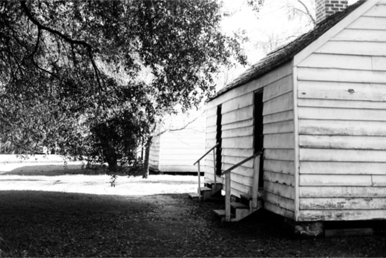
“Leeds Series – Two Trees Before House” (2012) and “North Dakota Series #0016” (2014) are more sharply focused and more conventional, recalling the objective/conceptual photographic work of Bernd and Hilla Becher. “Charleston Series – Slave House #17” (2015) has some of that too, but is sad, inward, and taciturn, mining the negative depths of the Deep South. With “Charleston” I somewhat missed the blurriness of her earlier work, as I think it might have provided a sense not of virtual angels, ghosts, dreams, or drink, but of seeing through a haze of anger or a veil of blood. Its inclusion in the show, with its downbeat memories of human brutality, creates a pensive section that punctuates with counterpoint the ephemeral, soft, angelic, Zen photographs. It thereby amplifies their silent tenderness.
Seton Smith’s Second Mark continues at Galerie Sisso (90 rue de la Folie Méricourt, 11th Arrondissement, Paris) through October 31.


