Bushwick Basel, a Very Small Art Fair
Despite Bushwick Basel’s tongue-in-cheek name, the title suits this new art fair, as it is an art fair, albeit a very, very small one. Bushwick Basel, which consisted this year of 11 local galleries, is the kind of fair you could imagine Nada or Pulse being like when they first began — a fair that f

Despite Bushwick Basel’s tongue-in-cheek name, the title suits this new art fair, as it is an art fair, albeit a very, very small one. Bushwick Basel, which consisted this year of 11 local galleries, is the kind of fair you could imagine Nada or Pulse being like when they first began — a fair that features fresh work made by young artists, presented by small galleries in a somewhat casual fashion. Standing in Bushwick Basel — the real studio and impromptu gallery of the French-born, New York City–based painter Jules de Balincourt called Starr Space — you can also imagine this fair growing exponentially, if it continues in subsequent years.
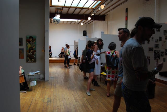
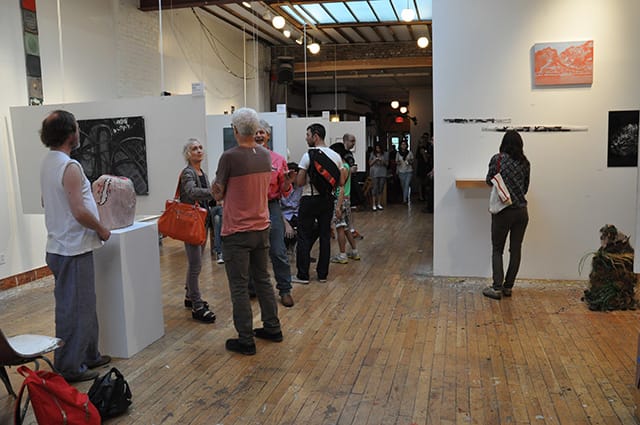
Bushwick Basel seems to be making a statement against the idea of art fairs as grandiose events where the top-grossing galleries from around the world come to congregate. And yet, Bushwick Basel could follow along a similar, albeit more localized, trajectory. Balincourt, the 39-year-old successful artist and creator of the fair itself, has said that Bushwick Basel is “kind of a parody, but kind of not.” Each gallery, selected by Balincourt, was given a 10-by-12-foot space in which to curate its own show. Although Balincourt encouraged them to show only one or two artists, many chose to pack their booths so full that it was hard to pay attention to any of the artwork. The gallery spaces, divided by curtains that made them feel intimate, were so small that two bodies inside them at the same time made them feel crowded.
At 2 o’clock on Saturday afternoon, Bushwick Basel was filled with families, children and artists. In contrast to the pristine, almost austere environment at most art fairs, Bushwick Basel felt like some kind of large, alumni gathering, where recent art-school grads reunited to share thoughts about their new work, life after school and the New York art scene. I overheard a fair number of conversations that began with, “What year did you graduate?” and “What kind of studio do you have?” It wasn’t exactly refreshing to feel like I was back in the hallways of my old art schools, looking at work I was going to have to critique later, but it brought a smile to my face nonetheless. Choosing between young Brooklyn artists and the stuffy collectors, dealers and patrons found at the real Art Basel, I welcome the young, arty crowd.
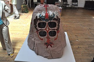
The work shown at Bushwick Basel, though arguably of a less mature level all around than is usually seen at art fairs, did exceed my expectations. I expected it to be messier and more self-indulgent. Although too many of the galleries put together exhibitions that left you scratching your head and wondering why they chose to show a sculptural monster with a mechanical head or foam sculptures of butt cracks, there were a few impressive standouts. The art itself ran the usual gamut found at art fairs: some stood out as relevant and provocative, some fell more into the “aesthetically interesting” category and most reminded me of something I saw or made in undergrad.
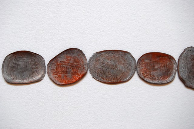
Among the best galleries were the ones that chose a single artist and displayed a variety of that artist’s work well. Nurture Art, showing Brooklyn-based artist Daniel Bejar, created one of the most engaging and three-dimensional installations in a back corner of the fair. Gold keys stacked in a line and placed on a pedestal, copper pennies flattened by a freight train and mounted in a line along on the wall and posters of the slogans of past presidents created a compelling installation addressing political and economic concerns. Bejar explores the issues currently on everyone’s mind in subtle and visually interesting ways, thankfully avoiding clichés.
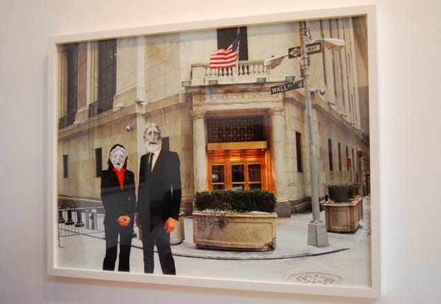
Momenta Art, featuring the work of video artist and photographer Chelsea Knight, showed a series of pictures that treads closer to politically overused imagery. Knight’s photographs depicting masked figures standing near a Wall Street sign, a bald eagle enthralling children at the zoo and a replica of the Grecian woman of freedom atop the Capital Dome all represent very real icons of American capitalism. They question the icons that we, as a society, take for granted as representations of power, strength and liberty. Knight suggests that these same icons can mean greed, captivity and a false sense of freedom.
In the more aesthetic realm of work shown at Bushwick Basel, Parallel Art Space displayed the paintings of Clinton King, a Williamsburg-based abstract artist whose canvases remind me a little of Rothko, as King also uses large fields of color and hazy shapes. The installation of his paintings — some grouped tightly together, others stacked vertically, rising almost to the ceiling — made his emotive and nonrepresentational work more interesting. Extra canvases stacked face down on the floor give the booth a studio-like feel that I enjoyed.
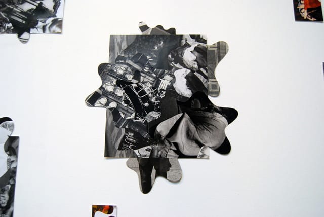
The most polished showing at Bushwick Basel was the exhibition by Studio 10, which presented the collaged photographs of Brooklyn-based artist Tim Spelios. Working with his own photographs as well as found materials taken from contemporary and vintage pop culture, Spelios creates entirely new, unexpected images — layered, often abstract collages of odd shapes and unlikely pairings. Searching for recognizable objects within his images, it’s exciting to find the face of someone unknown or spot the recognizable corner of a map. His photographs are mysterious, inviting you to linger in front of them in the hopes of deciphering their imagery. They have a retro, playful feel, like smart advertisements or surrealist experiments, and they embody a kind of Dadaist absurdity. Of his own work, Spelios says, “it’s a visual stream of consciousness with a pinch of free jazz and blurry eyes.”
All told I enjoyed the vibe of Bushwick Basel, and I wouldn’t mind if it takes itself a little more seriously in the future. It might help the local art scene by appearing again next year with more galleries, a better space and a less flippant attitude, as Bushwick Basel seems to have the promise to become something more interesting than it was this year — a different kind of art fair, one that is really about the artists and the artwork.
Bushwick Basel ran June 2 to 3 as part of Bushwick Open Studios.


