Is Mark Bradford the Best Painter in America?
I didn’t expect to write about the new show from Mark Bradford, who has been called by Guy Trebay of The New York Times “if not the best painter working in America today then certainly the tallest,” when I walked into Sikkema Jenkins on Tuesday morning. Despite the whimsy of Trebay’s “best/tallest”
I didn’t expect to write about the new show from Mark Bradford, who has been called by Guy Trebay of The New York Times “if not the best painter working in America today then certainly the tallest,” when I walked into Sikkema Jenkins on Tuesday morning.
Despite the whimsy of Trebay’s “best/tallest” assertions, a credible case can be made for the former. My first in-person exposure to his work was in 2008 at the otherwise execrable Unmonumental exhibition that inaugurated the New Museum’s Bowery building. At the time, I wrote:
[… Nancy] Spero’s work, along with Mark Bradford’s “Helter Skelter & Helter Skelter II” (2007), can be considered not merely the finest in the show but quite possibly the best contemporary art on view anywhere in New York. Bradford’s behemoth collages, stretching across another 70-foot wall, with their silver paint over torn-up advertising posters lacerated by networks of fluid, incised lines, are as tough as the street and just as resistant to simple answers or unearned beauty.
Since then, Bradford has remained pretty much in his comfort zone while making occasional forays into installation and sculpture, which is why I didn’t think I would find much to write about. His trademark mixed media collages, often created on a very large scale, tread a line between map-like patterning and text-based abstraction. His work is consistently masterful, and for that reason risks becoming expert — reflexive instead of revelatory.
Not that the new work, almost all of which was made this year, is any different, and in fact the piece in the gallery’s anteroom is a little disappointing. Titled “Promise Land” (2012), its palette is dominated by an eager-to-please combo of pink, red, white and yellow, and its repeating rows of words (presumably grafted, as with all of Bradford’s collages, from its billboard source material) can be read as “LIVING SOBER” or “SOBER LIVING” — a theme the artist has used before.
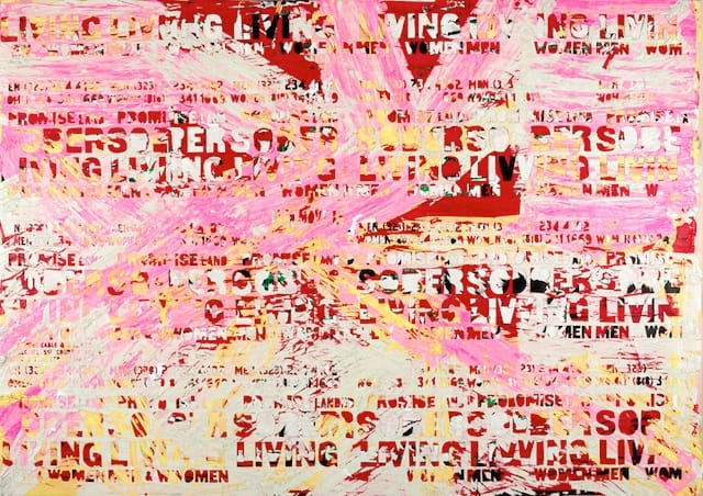
I should admit that I generally find Bradford’s use of text a distraction when it is as baldly articulated as it is here. It too-bluntly engages the eye, forcing the negative shapes around it into a subservient role as a busy backdrop. Without a countervailing visual exponent, the painting’s resonances are sharply circumscribed.
The rest of the current show employs text minimally or not at all. Since Bradford’s modus operandi has changed little over the past seven or eight years, these paintings may seem like more of the same, but nothing feels shopworn unless, like “Promise Land,” it doesn’t quite match the achievement of the others.
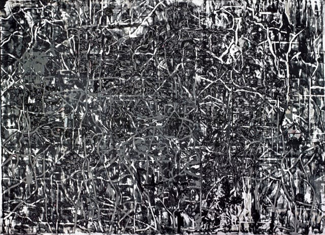
There are only a few that fall into that category. For all their familiarity, Bradford’s new works are almost all undeniably great paintings. I am especially partial to “Silver and Blue” (2012) and “Ghost and Stooges” (2011) in which the graphic and painterly elements wrestle each other for dominance. The surface of “Silver and Blue” is gashed by a swath that starts at the right edge and reaches two-thirds of the way across the canvas to reveal a network of bold, squirming black lines. In “Ghost and Stooges,” the lines have taken over the entire painting, wriggling like snakes around a deeply layered field of asphalt black and muted silver.
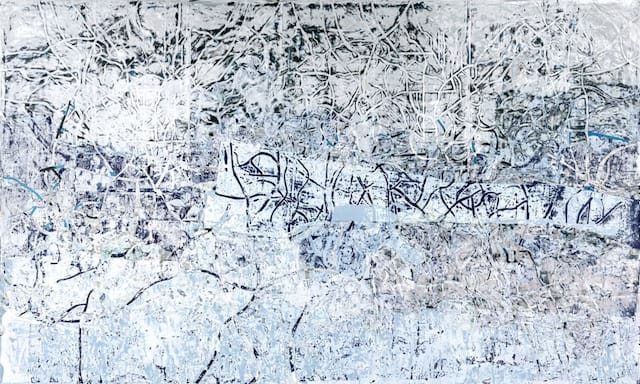
I would guess that Bradford hasn’t changed his approach simply because there is so much left to do in the one he’s got. In each work – whether it is the shimmering pastel-blue field of “Fuhgitfulness” (2012) or the diagonally oriented grid of vertical cuts and late-Monet coloration of “Father, You Have Murdered Me” (2012) or the scarlet threads lacing their way through the icy blacks, whites, blues and purples of “We May Be Running Out of a Past” (2012) — there is always a fresh shift in emphasis on what will go into a painting.
And what will go into a painting isn’t necessarily paint, which is the telling factor of Bradford’s postmodernism. Wade Guyton may have made it to the Whitney for inventing a new take on process and execution, but Bradford has already rethought the making of a painting in a far less flashy and far more labor-intensive way.
Bradford’s appropriation and manipulation of billboard advertisements recycle visual pollution into stunning condensations of urban life — transit systems, electrical grids, topographical maps and demographic charts splayed out in thrumming layers of color and line. By hewing so closely to the formal qualities of classical abstraction, his collage elements — drawn from local environs and pop culture through a vintage form of mass media — become blows against the influx of preciousness in the high-art temple.
But more importantly, their surfaces — accreted through improvisation and accident – are dense with the authority of their own thing-ness, resolving themselves around the colors, textures and shapes inherent in their materials. Perhaps that is why I have a problem with the text paintings, which foreground verbal signifiers over visual signification; the words seem to encumber the process while feeling superfluous to the meaning.
Beyond their formal inventiveness, there is another, more speculative reason why Bradford’s work has yet to get old. Curiously, it is not dissimilar to the way Mantegna would paint a Tuscan village in the hills rising behind the Crucifixion. By abstracting the stuff of everyday life — rather than treating as an object of irony or ridicule — Bradford is in a very real sense exalting it. Like Mantegna, he is folding his own time into a sacred space.
Mark Bradford will continue at Sikkema Jenkins & Co. (530 West 22nd Street, Chelsea, Manhattan) through December 22.


