Ken Price’s Time
I was very happy to see the exhibition, but I was not surprised that Ken Price (1935–2012) had to wait until he was safe in heaven dead to have his first museum show in New York, Ken Price Sculpture: A Retrospective, at the Metropolitan Museum of Art, New York.

1.
I was very happy to see the exhibition, but I was not surprised that Ken Price (1935–2012) had to wait until he was safe in heaven dead to have his first museum show in New York, Ken Price Sculpture: A Retrospective, at the Metropolitan Museum of Art, New York.
Nor was I thrown by the fact that the installation felt a tad crowded in places, suggesting that the museum was reluctant to give Price’s modest-sized sculptures more space. In fact, I found it perfectly in keeping with long held policies and biases that the show — curated by Stephanie Barron, who is chief curator of modern and contemporary art at the Los Angeles County Museum of Art, Los Angeles, with assistance from Lauren Bergman — went to the Met (June 18–September 22, 2013) from LACMA (September 16, 2012–January 6, 2013), and not to the Museum of Modern Art, the Guggenheim Museum, or the Whitney Museum of American Art — three institutions which have all but openly declared their hostility toward the craft tradition to which Ken Price, who worked in ceramics, clearly belongs.
In fact, it is apparent to me that all three museums continue to embrace an old and destructive prejudice. As the art historian T. J. Clark has pointed out, painting also belongs to the craft tradition, which is one reason why New York museums have a pretty bad track record when it comes to supporting or examining anything contemporary made by hand, particularly if craft rather than deskilling is involved. They don’t want to break with the protocol set in place by Clement Greenberg, who was fond of the phrase, “as stupid as a painter.” If you apply that attitude to the question of what he would have thought of a sculptor working in clay, you’ll get a pretty good idea of what Price was up against in New York: How can you be intelligent (much less, conceptual) if you want to stick your hands in that stuff?
This kind of thinking suppresses the fact that our connection to clay is primal — it evokes our first childhood attempts at making something out of dirt, sand or snow. It seems that we have become ashamed of our origins. And, as a first world nation in a global economy, it is preferable to have other people get their hands dirty for us, as a sign of, if nothing else, intellectual and economic superiority (some critics seem to think that they go hand-in-hand). No wonder Price — as well as Robert Arneson (1930–1992) and Peter Voulkos (1924–2002), Price’s mentor — have largely been ignored by the New York art world. They worked with their hands and invested time and labor in their art. It seems that you can’t get much dumber than that.
2.
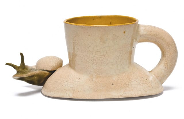
Not only does Price have an exhibition of his sculptures at the Metropolitan, but an additional retrospective survey, Slow and Steady Wins the Race, Works on Paper 1962–2010, curated by Douglas Dreishspoon, was recently at The Drawing Center (June 19–August 18, 2013), and will travel to the Albright-Knox Art Gallery, Buffalo, New York, (September 27, 2013–January 19, 2014) and the Harwood Museum of Art, Taos, New Mexico (February 22–May 4, 2014). Despite these two long overdue exhibitions, I was left wishing that more attention had been paid to Price’s sculpture. For one thing, I wanted to have a fuller experience of his mythical “Happy’s Curios,” a store-like installation full of ceramic pieces, which finds the artist riffing off of Mexican folk pottery.
According to Price:
[I saw this ] really great Mexican pottery that this guy had up in his attic. It was made in the 50s and came from Tonala and Oaxaca. I got turned on and thought I would make a tribute to Mexican pottery in the form of a curio store. It was kind of a fantasy. It was supposed to be a small store with some billboards outside, and a storefront window, and inside would be this bombardment of images and color. I figured it would take me about a year, maybe two, to make it. It took about six years, and ultimately I really couldn’t pull it off because I hadn’t really thought it all the way through. I hadn’t realized that in order to make this thing I would have to buy a store and build it in. So what I ended up doing was breaking it up into these units. These units are groups of pieces or cabinets holding groups of work. I had a show with some of the units and drawings and some weavings at LACMA [in 1978]. This stuff has humor in it, but it wasn’t meant as a parody. It was actually meant as an homage to Mexican pottery.
While Price felt that he didn’t “pull it off,” he did something ambitious and astounding — he elevated ceramics to the level of installation art. At the same time he defined the environment in which his work was to be seen an ensemble rather than a single example.
Price seems to have known more about the history of pottery — both as art and as commercial production — than any of his contemporaries. In addition to paying homage to Mexican pottery, he made tributes to Cubism and Constructivism. At other times, he seemed to be channeling the “mad potter of Biloxi,” George Ohr, or reimagining the weird forms of the cartoonist and religious fanatic, Basil Wolverton, or improvising on the biomorphic shapes of Hans Arp, or remembering the animated sexually-charged, abstract paintings of his friend John Altoon, for whom he named a piece, “Altoon” (2005). It didn’t matter what he was looking at or thinking about, the objects were all unmistakably his.
3.
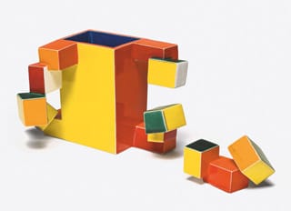
While the installation at the Metropolitan progresses in reverse order — going from his last works to his earliest — I felt that it blurred or ignored the transitions he made as he went on. At each point in his career Price was doing something interesting — there never seemed to be a down period or a moment when he wasn’t trying something fresh. And while the cup (or something built around a void) is a touchstone for him, he is able to pull this form into the realm of abstraction.
There is a show to be done about artists working with clay who make abstract sculptures. (It would include Jun Kaneko, Norbert Prangenberg, Mary Heilmann, Arlene Schechet, Joyce Robins and Joanne Greenbaum). Or you could shift the focus and consider what Price did with the cup (this show would have to include Kathy Butterly and Schechet). What I am getting at is that Price may not have been considered either central to or even part of an important movement, but he was both an inspiration and influence for many artists.
4.
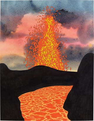
One of the things that struck me after I saw both shows, his drawings and sculptures, was that he always seemed to know where he was going in the drawing, but he was seldom as sure in his sculpture — something that becomes increasingly true, starting in the mid-1980s, when his work becomes more abstract. There is something stiff and flat-footed about the drawings, which I am sure Price was aware of, but which didn’t deter him from drawing every day. The fact that he was unembarrassed by his draftsmanship goes a long way toward explaining how adventuresome he could be, especially in clay.
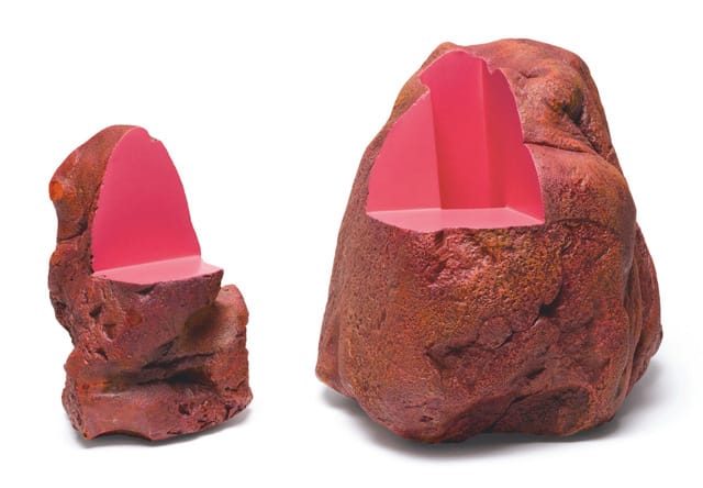
Price’s abstract sculptures occupy a unique place in the annals of late 20th-century and early 21st-century American art. They are visual paradoxes, seeming to exist between permanence and change, the smooth and the scarred. Using a painting technique associated with surfboards, Price covered his forms with layers of monochromatic color, which he then sanded. The result is a surface that calls to mind millefiori glass gone haywire, or the worn surface of an often-painted object, or something seen with a spectroscope.
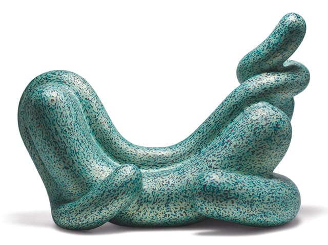
At times I forgot that I was looking at a sculpture because I got lost in the vacuoles of color-within-color swirling in a bright field. The experience is visually intense, almost hallucinatory, as I focused on the surface and lost sight of the object. This is about as close as you can get to tripping without taking drugs.
At other times, the pieces seem so other that they appear to have come here from some distant galaxy or were something formed in one of the volcanoes that Price liked to draw. In their bright reds, and metallic sheens, they embody the heat of the kiln and the volcano, at once creative and cataclysmic. With their openings and voids, they refused to disclose themselves, becoming occult. Surface — they sing out, loud and clear — is not all. Shaping time, even as you know that you will eventually succumb to it, is a pleasure worth the labor.
Ken Price Sculpture: A Retrospective continues at the Metropolitan Museum of Art (1000 Fifth Avenue, Upper East Side, Manhattan) through September 22.
Ken Price: Slow and Steady Wins the Race, Works on Paper 1962–2010 was on view at The Drawing Center (35 Wooster Street, Soho, Manhattan) from June 19 to August 18.


