Julian Schnabel’s Formula for Greatness
Since Julian Schnabel first gained attention with his broken plate paintings in the 1980s, he has been predisposed to working on found surfaces – animal skins, velvet, corduroy, sail cloth, tarpaulins, canvas flooring from boxing rings, wallpaper, navigation maps, flags, Kabuki theater backdrops, an

Since Julian Schnabel first gained attention with his broken plate paintings in the 1980s, he has been predisposed to working on found surfaces — animal skins, velvet, corduroy, sail cloth, tarpaulins, canvas flooring from boxing rings, wallpaper, navigation maps, flags, Kabuki theater backdrops, and photosensitive canvases — which help disguise the fact that he can’t draw in paint and doesn’t really have much feel for paint’s potentiality. What he does possess is a sumptuous, decadent sensibility mixed with what Alison M. Gingeras calls “a drop cloth aesthetic.” This tasteful combination has carried him a long way and gained him a number of followers and imitators, in part because distressed surfaces evoke the bohemian make-do aesthetic. At the same time, by making large works, Schnabel appeals to those who want everything done on a grand scale. Whoever said that you couldn’t have your cake and eat it too was lying.
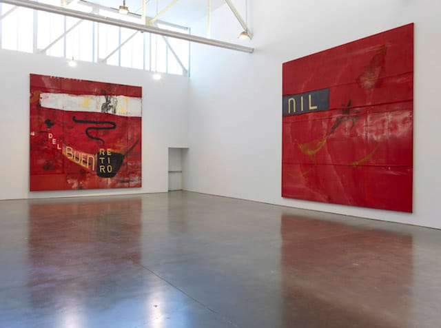
In his current exhibition, View of Dawn in the Tropics: Paintings, 1989-1990 at Gagosian Gallery (April 17–May 31, 2014), which revisits the end of the decade that brought him worldwide attention, Schnabel is showing works on tarpaulins, velvet, burlap and sailcloth. The paintings range between 10 and 15 feet high and between 9 and 18 feet wide. Clearly, Schnabel belongs to the “bigger is better” school, which some have seen as a sign of his excessiveness, egotism and self-importance, all of which probably apply, but these things do not necessarily make him a weak or bad artist.
In addition to working on found and, often, previously used surfaces, Schnabel also exposed their surfaces to the elements and dragged them across the ground. When he joins two large sections of velvet or drop cloths together, he makes sure the seams are visible. If the support can’t be stretched tightly, this is proof of some kind of authenticity. Sometimes he applies just enough paint to produce an imprint from the stretcher bars. Paw prints are another sign of casualness. This calculated offhandedness tempers the pretentiousness, as it activates the surface upon which the artist will deposit the paint, gesso, resin and other things.
While Schnabel works on an immense scale, as with “Ozymandias” (1990), which is done on a sailcloth measuring 156 x 216 inches, everything in the composition — the letters, paint marks and collaged elements — fits comfortably within the overall schema. He wants the viewer to see the painting and everything in it all at once, to get it, because there is nothing more to see after that first glance. The paintings have no internal dynamics, no shifts. There is no need to refocus. Schnabel’s tasteful paintings are large lavish signs of nostalgia, the expression of an adolescent longing for that moment of freedom as embodied in the mass media’s dumbing down of Jackson Pollock and Charlie Parker.
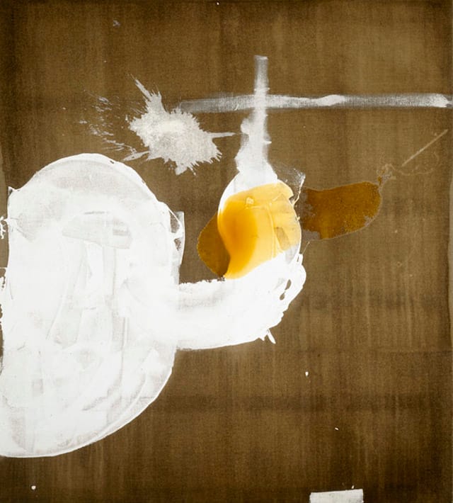
In another group of untitled paintings done on burlap, Schnabel employs two large gestural forms — one in white gesso and the other in amber resin — evocative of bodily discharges. The white form starts in the painting’s lower left hand corner and rises diagonally toward the center, usually ending in a splatter. Overlaying the white form is a pour of resin, which starts near the corner on the lower right hand side. Together, the overlaid gestures form an X. Elsewhere in the painting is a cross, which is derivative of Antoni Tapies. In fact, if I didn’t know these were by Schnabel, I would assume they were made by someone with the express intention of mimicking Tapies.
What this exhibition makes clear is that Schnabel had worked out his signature formula — unrestrained, oversized gestures and words across large, ragged but opulent surfaces — by the end of the 1980s. Part of his popularity is due to how well he joins shabby chic to the clichés of Abstract Expressionism. Basically, Schnabel injects steroids into his versions of Cy Twombly, Antoni Tapies, and Robert Motherwell, and, in that regard, should be seen as a fifth-generation Abstract Expressionist.
The problem with Schnabel’s work is that his marks and actions are made by someone who is easily satisfied by everything he does, which makes what he does an inadvertent parody of genius. Some artists, like Matisse, will work very hard to make everything look easy, while others believe that, thanks to their innate gifts, everything is easy. Schnabel falls into the latter camp, while a painter like Pat Steir, who also applies layers of brushed, poured and splattered paint, is in the former. Her trust in chance isn’t about mastery, though it results in exactly that.
Another contrast is the work of Joan Mitchell, who was a champion figure skater as a teenager. For Mitchell, rigor and expressiveness are not mutually exclusive activities. The strict discipline of competitive figure skating taught her that repetition — which for her was manifested in drawing and the painterly use of line — could help her attain an animated eloquence. She had muscle memory, or what has also been called the sixth sense, at her command.
Schnabel, on the other hand, knows little more than rote gestures and marks. He lives in a very different domain, where its mostly white male members believe that the grand tradition is their birthright. They know they are the true heirs of Tintoretto and Titian, Barnett Newman and Jackson Pollock.
Schnabel’s oversized additions to his lavish surfaces do not cohere into a painting, but appear like decorations, signs of hyper-masculinity (white gesso) splashed onto a copious, previously stained ground. There is something cornball about Schnabel’s project. He seems to have misunderstood the well-known dictum by Jasper Johns: “Take an object. Do something to it. Do something else to it, etc.” Instead of doing anything to (or transforming) the object (the burlap or Kabuki theater backdrop), he has reduced it to a two-step process. The additions do not convert the abundant picture plane made of velvet or sailcloth into a singular event, a unity. He cannot make the additions bond with the surface, as he did in his plate paintings, where — for a few years — he transformed the pairing into something fresh.
Perhaps this is why Schnabel is so acclaimed. In an age when originality is dead and authenticity is considered a relic of the past, his paintings are Romantic throwbacks – bigger, more comforting versions of the real thing. We know he is serious because he writes “Ozymandias,” the title of a sonnet by Percy Bysshe Shelley, across a huge canvas. In this much-anthologized poem Shelley writes about how art outlasts men and empires, which are destined to fall into decay. You can’t argue with that sentiment.
A funny thing happened when I asked for images to go with this review. A gallery assistant emailed me, asking me who was writing the review, and told me that “Ozymandias” was not for press use.
Two things occurred to me. First, Gagosian is being hypocritical by opening its doors to the public. Really, the gallery is only for those who can afford what they show, and they should be honest and admit it. Second, some galleries and artists will never be interested in discussion or debate. All they want is what is due them: obsequious praise. Ahh, Shelley — cited and ignored once again.
View of Dawn in the Tropics: Paintings, 1989–1990 continues at Gagosian (555 West 24th Street, Chelsea, Manhattan) through May 31.