
Kurt Perschke’s ‘RedBall Project’ in Portland, Oregon (2007) (image via Wikimedia)
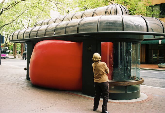
An advertising campaign for Shell featuring a giant red ball has one artist feeling blue. The Guardian reported that Kurt Perschke is alleging the petrochemical giant lifted the idea for their recent campaign from his RedBall Project. Big balls are Perschke’s bailiwick: the man has been depositing his sanguine spheres in public places the world over for 13 years, with the effort documented in photographs posted on his website.

The Shell advertisement (click to enlarge)
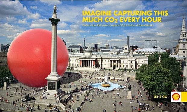
Shell denied the similarities were tantamount to theft, or even inspired by the artist’s work. Through a spokesperson, the company told the Guardian that their “campaign uses imagined illustrations of a red sphere in iconic locations. They are not actual or physical installations of red balls, which is the focus of the artist’s installations.” The company further pointed out that the use of inflated spheres to represent carbon dioxide is a common practice.
But Perschke is adamant that the advertisement in question, which is set in London’s Trafalgar Square, is derivative, even following on the heels of his work’s recent appearance in the city. “They could have done it a lot of ways, it could have been a balloon or a kickball or a football or whatever but it’s not, it’s spot on and because we were in London so recently it is frustrating and disheartening,” he told the Guardian.
The courts have sided with Perschke in the past: Last year, the Guardian notes, Perschke successfully obtained a settlement from French logistics company Edenred over their apparent copyright-infringing use of red balls in ads. (That case was filed in New York’s Eastern District court; it’s unclear if Perschke has access to a jurisdiction in which he could file against Shell.)
A small critical footnote: If you make art that is easily duplicated as generic corporate messaging, you should worry more about the possibility of your art being terrible and less about getting ripped off in an advertisement.
I think Hyperallergic could do a better job reporting on creative theft and have more impact by going directly to the source.
This problem, while Shell’s, ultimately comes down to the art directors at JWT London who sold the campaign to them (and run Shell’s global efforts). Art directors, also known as “creatives” in the ad world, know exactly where they steal ideas from when they’ve got nothing better to offer their clients. The clients have no clue where the ideas come from.
http://www.adweek.com/news/advertising-branding/shell-expands-its-jwt-relationship-145000
http://jwt.co.uk/
I completely agree with the above comment. Why would Hyperallergic leave out the critical mention of the “creative” agency? I guess its easier just to write “Big Oil” = Stolen Art. **just a “small critical footnote” if you write articles that lack complexity, effort, and reinforce overtly obvious binaries you are wasting everyone’s time
Now someone has copyright on red balls. That’s great! Oh, sorry, it’s art!
I find the footnote is really snarky, jaded, and annoying — I feel Pershcke’s red ball project is pretty good; I find a social poetics in it that people seem to be engaged by. Look at the photo in Chicago of the child reaching up to the ball and captivated by it. I like the familiarity of seeing something personal and domestic (an abandoned ball stuck somewhere) but enlarged to make us rethink it and make the personal/domestic important — Mona Hatoum had a good series of objects that revolved on this. Or Charles Ray’s toy firetruck. I think those are very successful pieces, albeit Perschcke’s project adds interesting reproducibility issues into this strain of production. Also, I think pretty much anything can be ripped off by corporate advertising.
I had the same reaction: what a tacky, low blow, out of nowhere oh btw remark. If you are going to review Pershcke’s work, review it. Don’t do a drive by shooting.
So you dislike this opinion so much you’d like 1,500 words of it?
Did you really read my comment? I don’t care about his opinion. I care about, as I said, the tacky tone and drive by remark.
What was tacky about it? It sounds like how people I know talk about art. I see this represented online very infrequently.
I’m also not really clear on what makes it a drive-by; is there a minimum length to opinions? Is that minimum length determined by how negative your opinion is? Who decides these things?
Wow, that footnote really just flies in the face of your tagline and presumed mission, “Sensitive to Art and its Discontents.” I work in advertising, and I find this shameful.
It’s good for the artist really. I never would have heard of him.
It’s not terrible art. I love this type of whimsical absurd stuff, but at the same time, it seems kind of brandy. I would never want to be the red ball guy.
That footnote was really uncalled for.
i see a new lawsuit against both of them coming soon, from Kramerica
http://seinfeldism.com/kramer-darren-and-a-giant-ball-of-oil/
More like foot in mouth note. WTF? That’s not criticism, it’s just assholery. If you’re going to critique then at least spend a few brain cells doing it.
I, for one, think that was a very good footnote. If an artwork is intended to communicate something to me, and I can’t tell if that something is “Yay slightly fewer carbon emissions from Royal Dutch Shell” or not, then it has failed to communicate and is not a good artwork.