Mapping Lunar Beauty
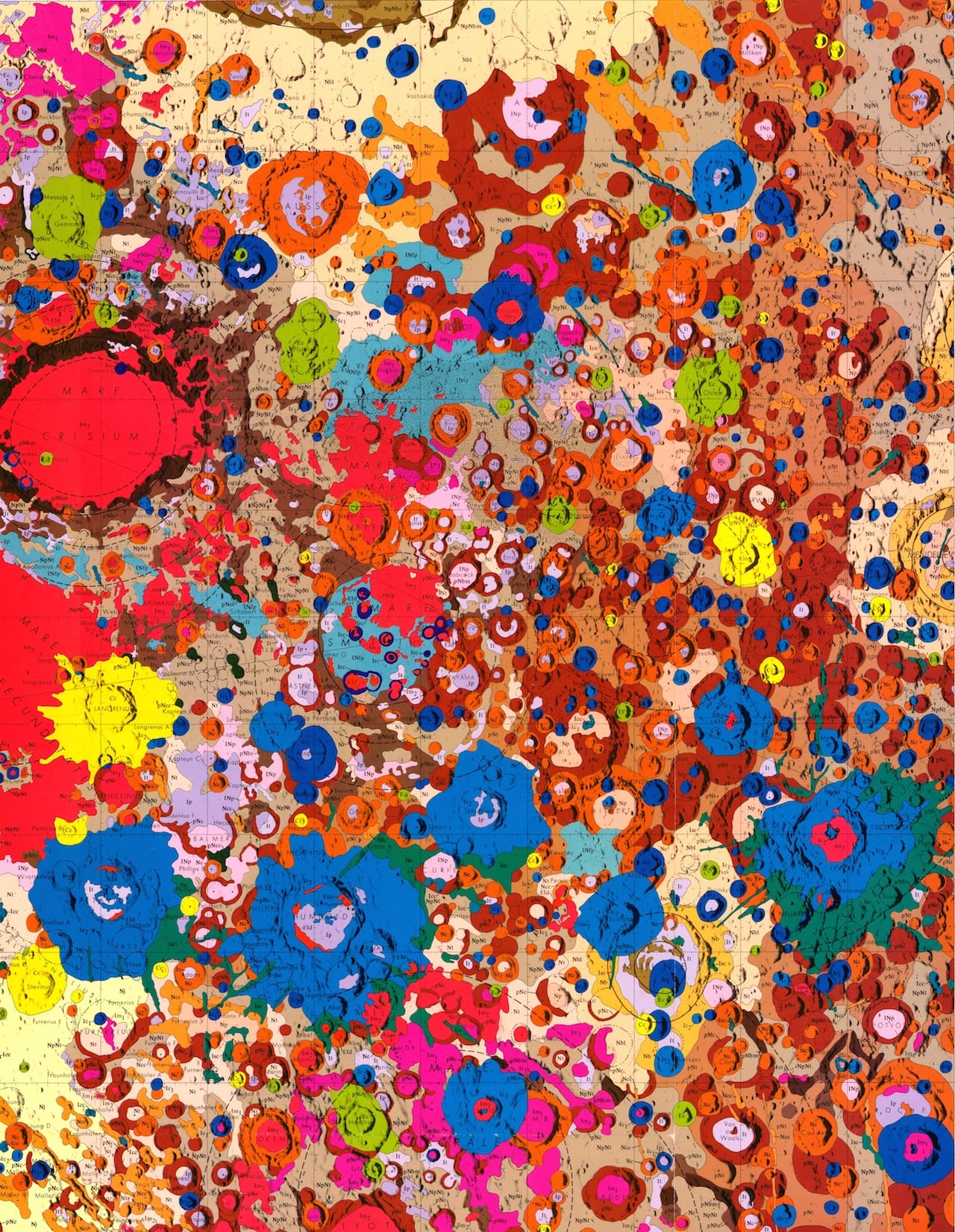
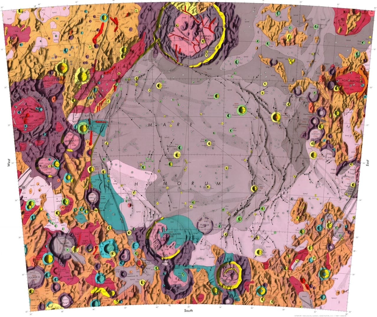
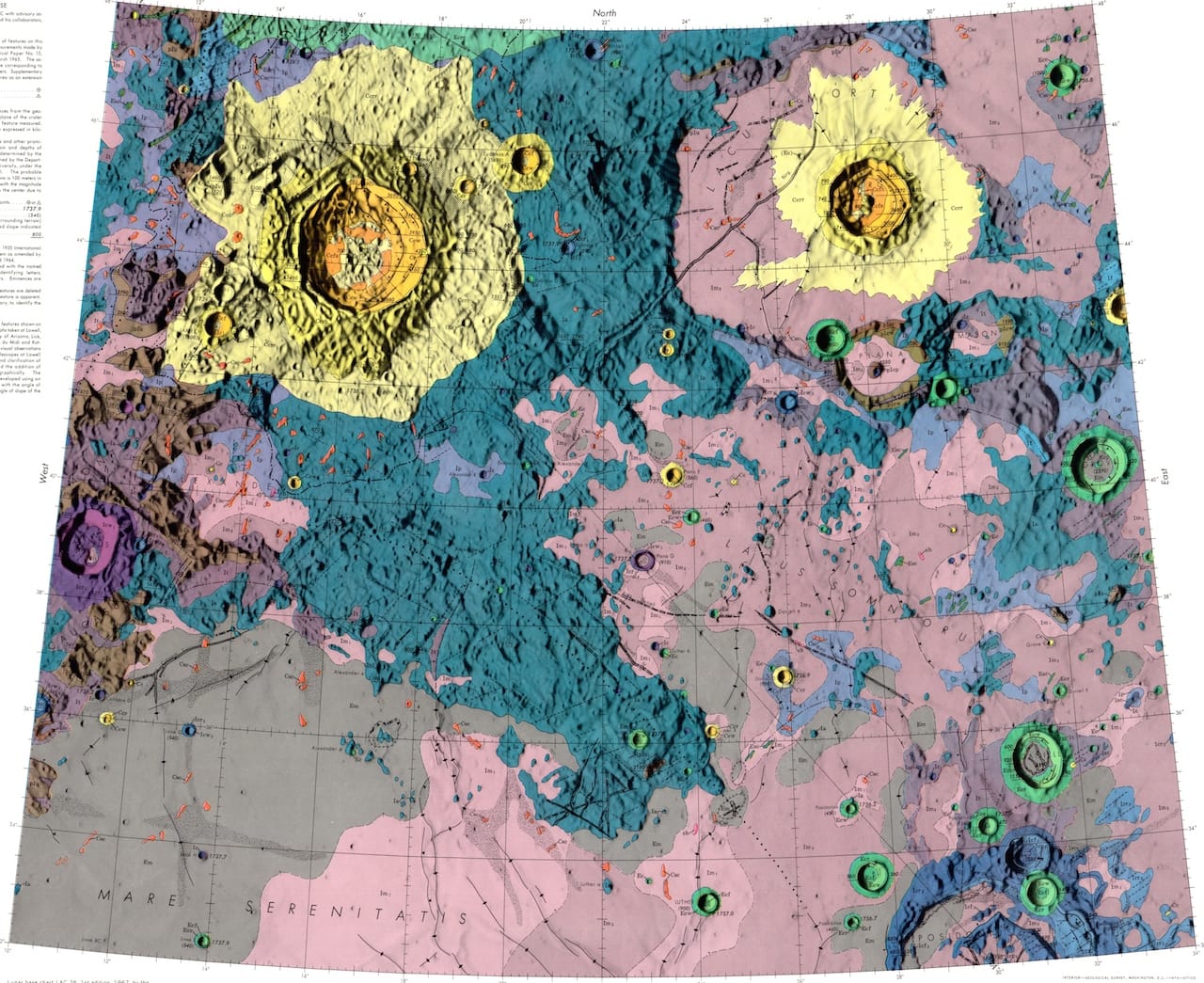
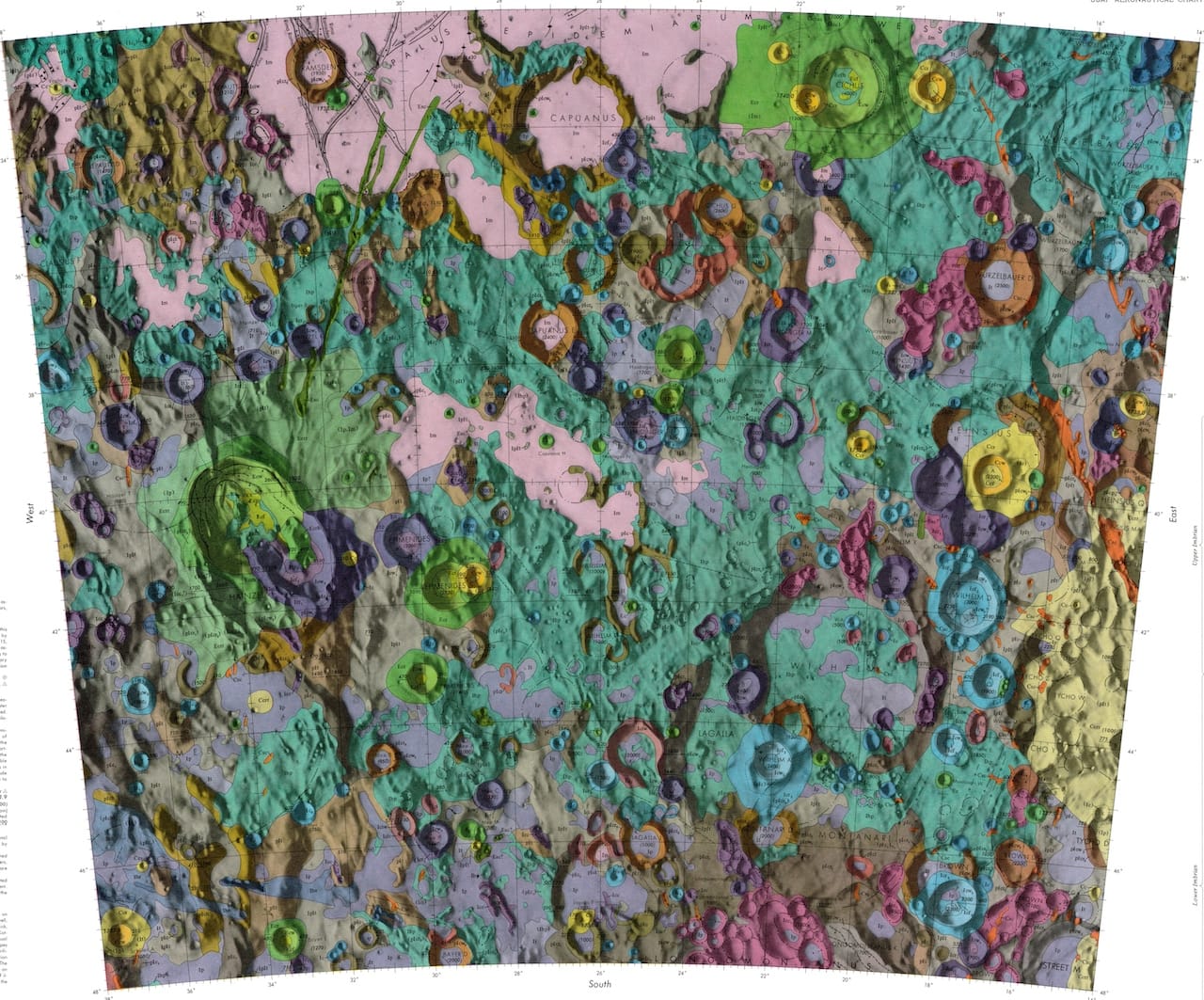
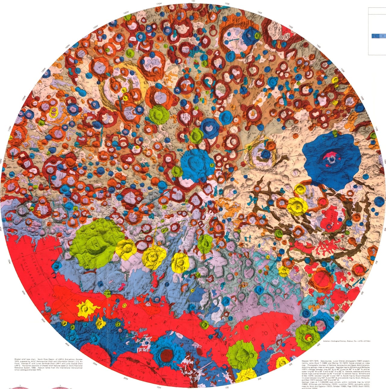
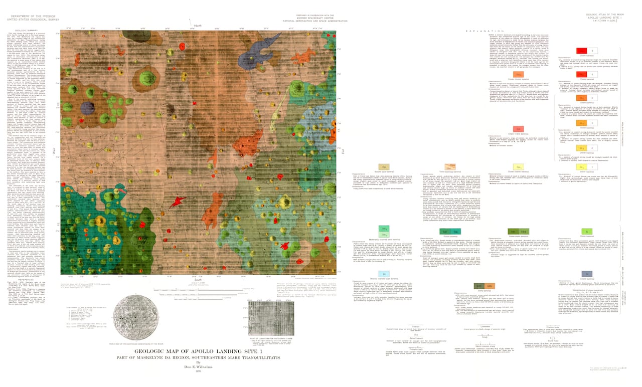
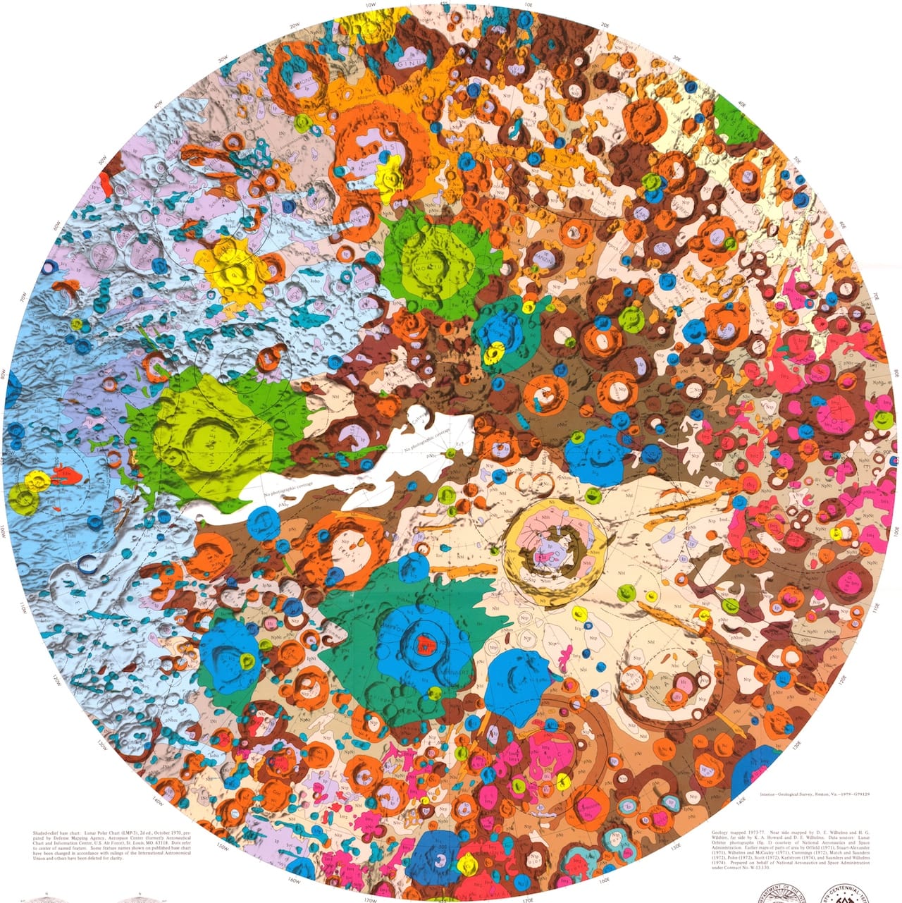
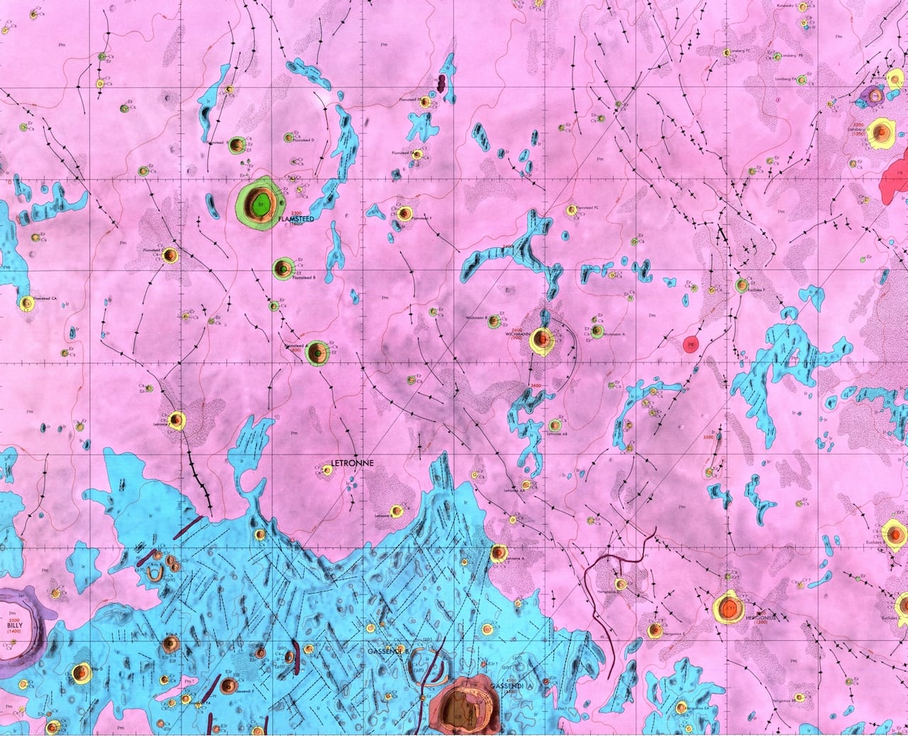
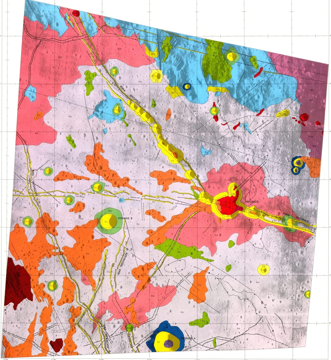
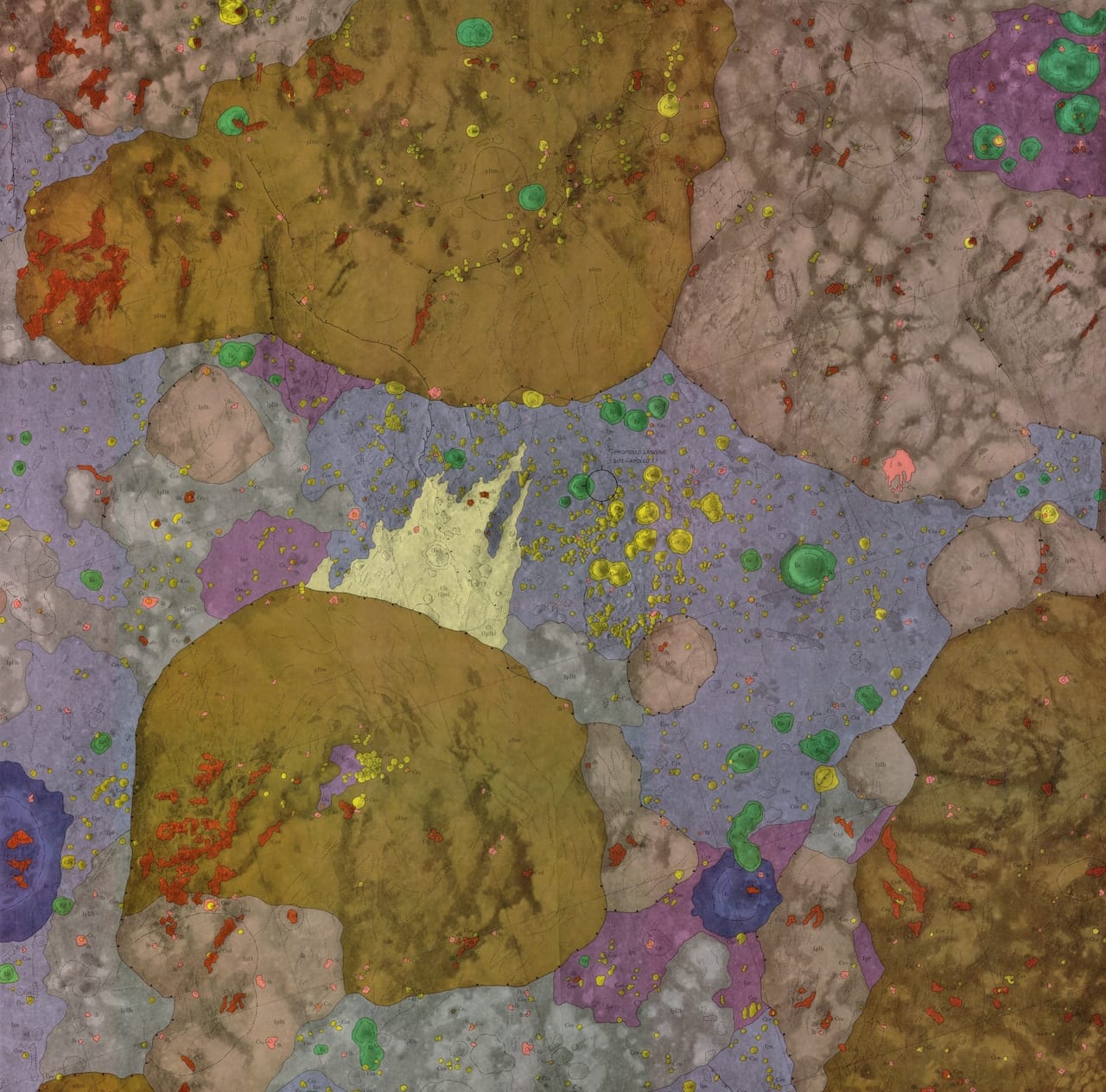
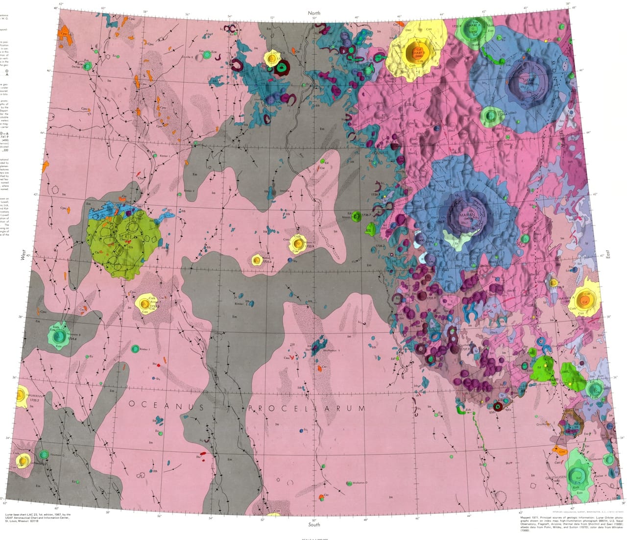
Maps made by the US Geological Survey offer a vastly different visual depiction of the Earth’s moon, using the full color spectrum to denote differences in topography and geology.

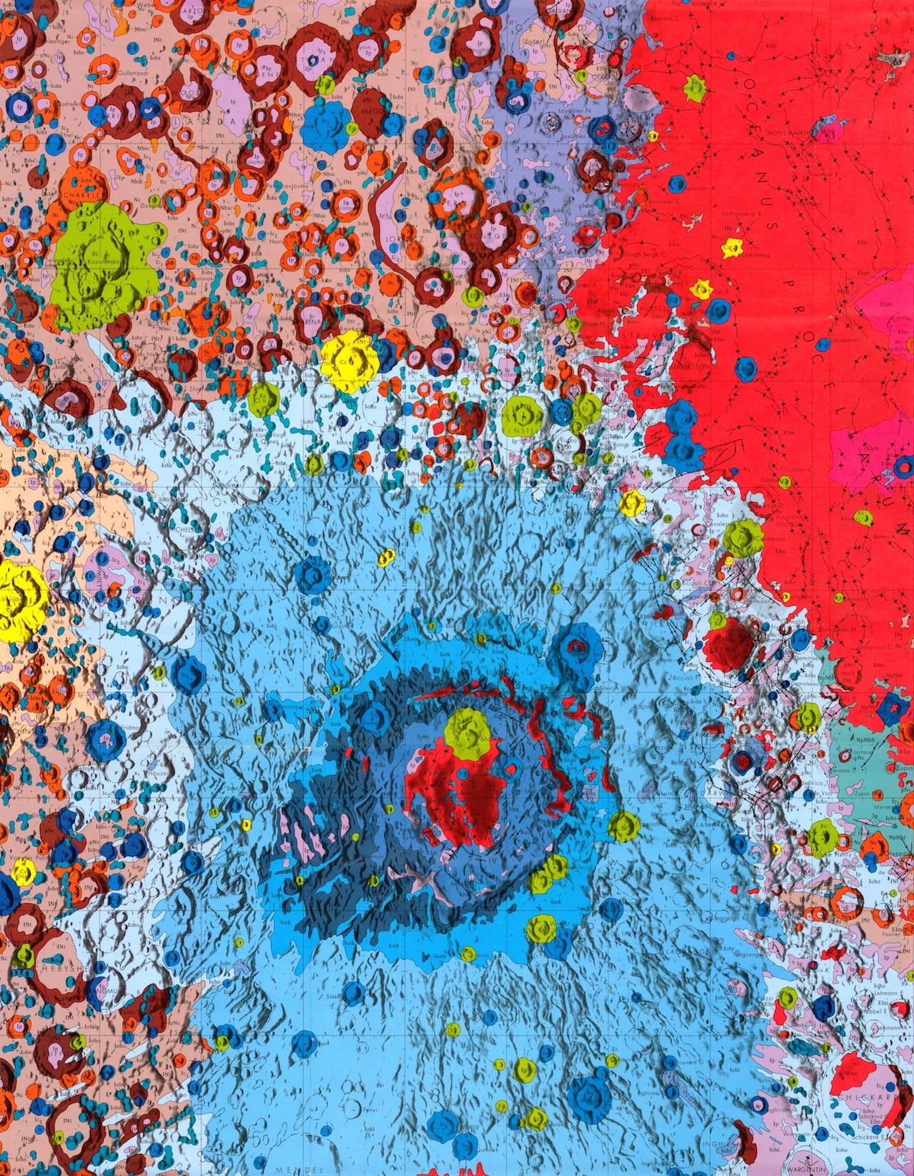
Seen from Earth, the moon glows a pure off-white, its craters sometimes visible in light gray shadow. When the moon hangs low on the horizon, molecules in our atmosphere filter blue and green light, causing the moon to appear yellow. Maps made by the US Geological Survey (USGS) offer a vastly different visual depiction of the Earth’s moon, using the full color spectrum to denote differences in topography and geology. The resulting images look like breathtaking abstractions.
The geologic moon atlas maps use a color-coding scheme to refer to different types of terra, mare, crater, and other materials. Each image records a specific portion of the moon’s surface. The maps vary in scale from 1:5,0000 to 1:5,000,000, and some of the smaller ones function as zoomed-in versions of larger ones. All hail from the 1960s and 1970s, and their focus betrays the concerns of the era: six maps from 1970 portray the variety of landing sights considered for the Apollo moon landing of 1969.
If one can attribute artistic qualities to visuals not created with artistic intent, the compositional logic behind these maps might be understood as an inversion of process art: Pollack’s abstractions were created by pure impulse, these works by immutable pairings of specific hues with geological substances. The results are gorgeous meditations on color, especially moving for the way they upend our usual understanding of the moon’s surface as cold, monochromatic, and distant.