Beer with a Painter: Jason Stopa
Jason Stopa stands a head taller than most of us and shares some strong ideas about contemporary art with a calm, intellectual confidence. His work, too, is raw, but the delivery system is mellifluous – a world of familiar references and a range of intimate painterly touches.

Jason Stopa stands a head taller than most of us and shares some strong ideas about contemporary art with a calm, intellectual confidence. His work, too, is raw, but the delivery system is mellifluous — a world of familiar references and a range of intimate painterly touches.
We met in his Gowanus studio, and after a couple hours of intense conversation, I stood up to leave, taking one last look around. Without thinking, I ran my fingers down the edge of a canvas, along which bottle caps were attached. Stopa’s work — and his writing on art— pushes us to react to the tactile and sensate, in a world where virtual experience trivializes it.
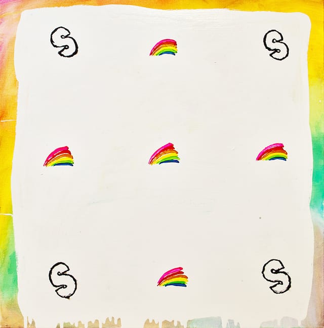
His paintings deconstruct the signified object — M&Ms, a watermelon, a basketball hoop — into the painterly, the felt, the tasted. His marks run the gamut from loopy, gestural strokes, to wiry ropes of paint tracing geometric forms, to small illusionistic details. They reference ubiquitous brands as well as private narratives.
Stopa received his BFA from Indiana University and his MFA from the Pratt Institute. He is currently the subject of a solo exhibition at Hionas Gallery, on view through April 25th. He has also had solo exhibitions at Novella Gallery (2014), John Davis Gallery, Hudson, New York (2013), and Kent Place Gallery, Summit, New Jersey (2013). Stopa is also a curator and a frequent contributing writer for Art in America, The Brooklyn Rail, and Whitewall Magazine. He teaches at Pratt Institute and the School of Visual Arts.
* * *
Jennifer Samet: I remember reading about your background — that it was a wild story. Can you tell me about it, and how you started making art?
Jason Stopa: I had a complicated childhood. My parents were hippies. They married in the late 1970s. And their parents temporarily disowned them for being an interracial couple. When I was in kindergarten they joined the Church of Jehovah’s Witnesses. I officially left their church when I was 22, and was subsequently shunned, which I had known was part of their practice. But it was a long time coming.
As a teenager, I started to have terrible arguments with my parents — not unlike most teens, but these were due to religion. We moved from New Jersey to the Midwest when I was sixteen. They were deep in the church by that point, and I was into punk rock, hard core, and hip hop — nothing about conformity. I had watched my parents change from very open individuals to very conservative ones.
Between the ages of ten and twelve, I started getting interested in drawing. Art was definitely a place of refuge for me. I was in love with the landscape. I saw it in this romantic way; I wanted the image to be an image of my soul. I can look back at it now and laugh. I still like work that has an emotional effect, but if that’s all the content is, I find it too navel-gazing. I don’t want my work to be read purely in an autobiographical way.
JS: You studied at Pratt Institute. Was there a dominant aesthetic at the school that influenced your work?
J.Stopa: Pratt is a traditional school in that the program asks you to consider basic formal issues. I love that conversation, so it was the right school for me. In fact, for me as an artist, that is actually the only conversation. All other things are tangential to what you are making. We could sit here and have a conversation about my politics or my religious beliefs, but those concerns are not explicitly about the work. The work is about its own making.
The way I view artwork is that it should tell me everything that it is about. Whatever else it happens to be about was obviously not important enough to be in the image. Visual images have their own language. Those linguistics are line, form, color, texture and space.
JS: What led to this series of paintings, which is candy and soda-themed?
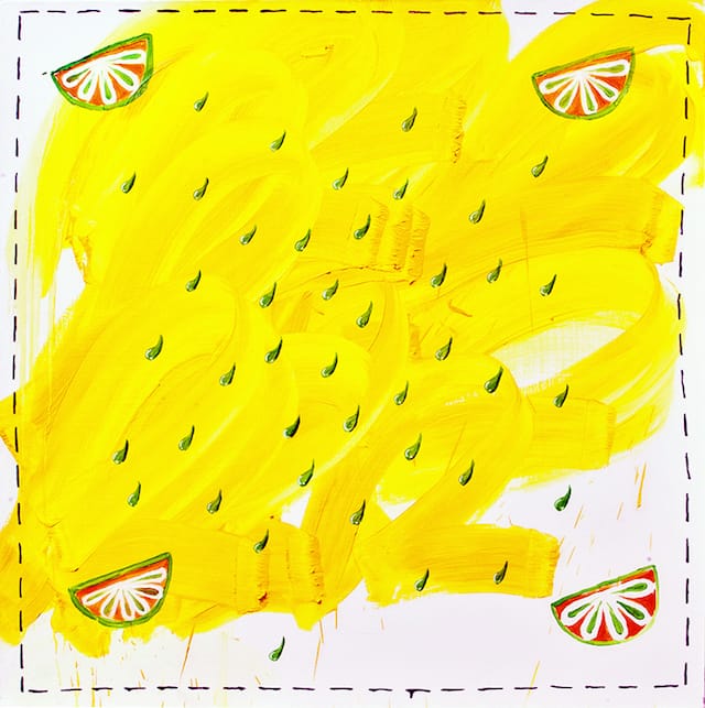
J.Stopa: I started this series last year and I call it “High Fructose.” Before this, I made a series of paintings called “Brooklyn Zoo,” which included a painting of a watermelon — “Watermelon with KB #2” (2013). I thought about how I could talk more about food. I wanted the paintings to be accessible enough that a kid could understand the reference, but that another conversation, for people interested in the arts, was also happening. The series was borne out of that mash-up.
It is a way of getting at nostalgia. Children are so uninhibited; they don’t really care what others think. As adults we start to create rules for our behavior, what are appropriate and inappropriate displays of affection. I’m interested in making images that reference an innocent way of looking at the world, but which are coming from an adult’s perspective, so they incorporate intellectual and formal concerns.
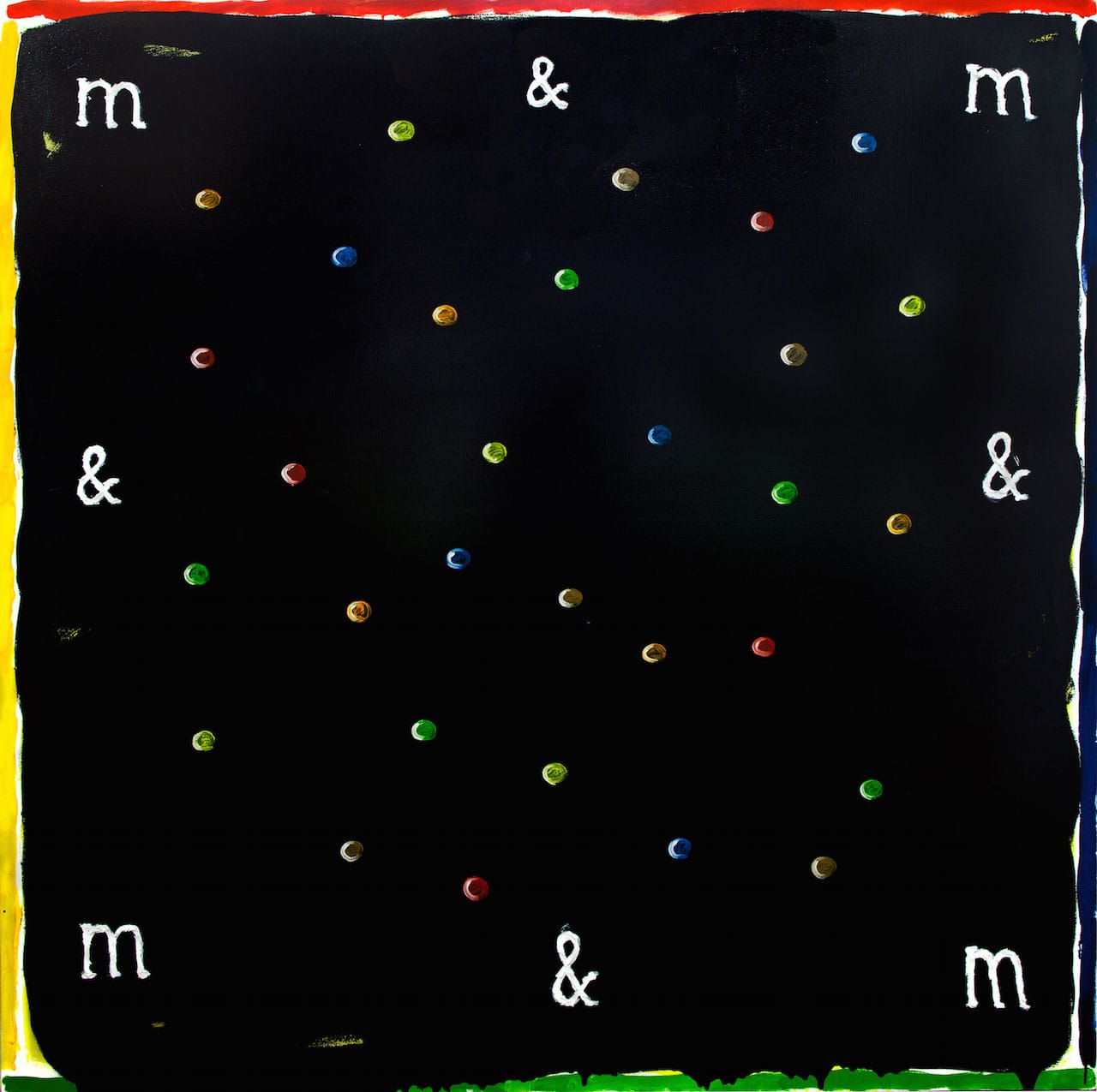
We don’t give children enough credit as far as their capacity to understand images. In fact, kids usually understand images better than adults do because of their receptivity to the world. I try to maintain this, and it is hard. I don’t expect children to understand my conceptual project, but it relates to their own experience. They know what 7-Up is and what M&Ms are.
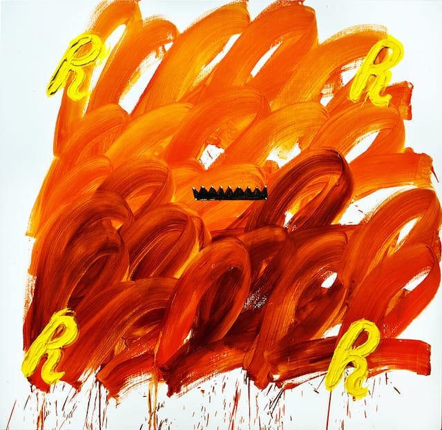
JS: I was noticing how the paint in “Buttercup” (2014) feels like the substance of chocolate and peanut butter in a Reese’s peanut butter cup. Is that what you are after?
J.Stopa: Yes, I was considering how I could pull the subject matter apart and abstract it. The Cherry Coke painting is about drips, whereas in the Reese’s painting, the paint feels like gooey peanut butter. These brands and the packaging are so slick that they conjure the item, and embellish it. Considering that sensation through branding became part of the work.
Branding is this thing that everybody seems to be doing now — from individual artists to big corporations. I have mixed feelings about it, of course. It tends to be a shallow way of packaging and dressing something up. So, what happens when I take away the context of that stuff that is dressed up?
We are at a stage now in which American capital and the privatization of everything is determining significance in art. That is a dangerous thing to happen. It is simply not true in terms of things that offer themselves as having inherent value, like literature, music, and visual art, which are attempting to speak beyond those parameters.
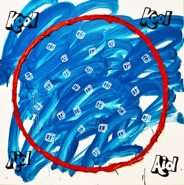
In the Kool-Aid painting, “Red Cup, Ice” (2014), there is a circle and rudimentary ice cubes, which read as blocky, modular forms. You can hopefully suspend disbelief enough to see it as a cup with ice cubes, but that does not satisfy the desire to complete the image. That is exciting to me — the middle ground. Is it the abstraction or the representation of the thing taking precedence?
Another question I was posing in this work was, “How do I make something formally where play is involved?” I think that play is important so that we are not too pigeonholed into ideas. There is always a disconnect between what we think we are up to and what we’re actually up to.
JS: The use of framing devices and geometric forms within a square or rectangle play a big role in your work. Why is that?
J.Stopa: I am very interested in Howard Hodgkin. He is a controversial figure for some people, who may think the work looks too easy. But I am interested in those framing devices that stem from a European painting tradition. So many painters, like Josef Albers, have been fascinated with that. A frame mimics the way the eye works. You look at the peripheries, then zoom into the center, and then return to the peripheries. That is such a basic property of perception, and I am stuck on that. You can keep re-inventing it.
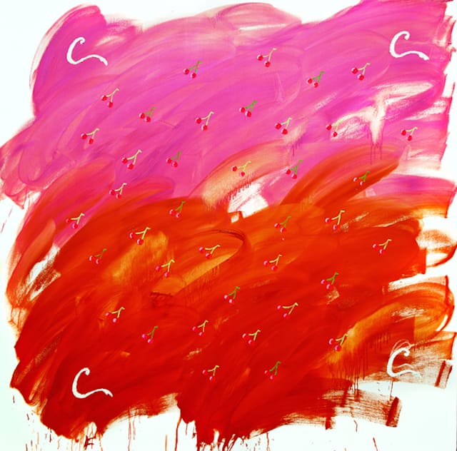
In some of the newer work, I wanted it to feel loose. In “Cherry Coke” (2014), the letter “C” in the corners makes a very loose frame. But, without it, the whole painting falls apart, and becomes just the gesture and the image of the cherries. I like that a simple and basic element can anchor the painting.
There are bottle caps on the sides of two paintings. In some sense, I am interested in them becoming sculptural or installation-based. They are talking about the space inside the painting, they are talking about their perimeter, and they are talking about the space they inhabit.
JS: Do you want them to function in a sociological or interactive way? Even though you discuss the formal as primary, you mention branding as a concern and the bottle caps makes me think of Felix Gonzalez-Torres.
J.Stopa: There are other artists I’m referencing in a subtle way. David Hammons did Kool-Aid paintings, but he actually used the Kool-Aid. He was raising socioeconomic and racial issues with the images. In “Buttercup” (2014), the crown of the Reese’s can also be seen as homage to a Jean-Michel Basquiat crown.
At the end of the day I am most interested in them being read as formal images. I am less interested in images that are solely based on ideas. I do not accept the idea that language prescribes how we are supposed to see a thing. I think it is the opposite. When you go back in history, language comes out of the visual. It comes out of people making marks — symbols that become metaphors, allegories, narratives. I think that we understand and respond to things first on a sensory and somatic level. Then we place conceptual and philosophical ideas on what we have seen.
This is anathema to a lot of Western thinking, though, which is rooted in the idea that language creates the world and its structures: politics, the financial sphere, religion. Many Eastern, Aboriginal and Native American traditions are the opposite — the visual has precedence. Images are considered to have sacred power. Images are not just representations of things, but can act as a guide or talisman, or a way of being in the world.
I’ve become fascinated with the anonymous Tantra paintings that Hudson used to show at Feature Inc. There are also painters like Alfred Jensen, who strikes me as an artist who was trying to construct work that acts almost like a vehicle. We are supposed to interact with it and it will guide us in some way.
I am interested in basic forms like the circle in the square, and the chevron shape within a square. Those forms come up again and again in mandalas, and become representations for the sun, heaven and the earth. It’s fun to play with even though I don’t consider my paintings literally a representation of heaven. There is a Pop and graphic sensibility in my work too, a tongue-in-cheek humor which offsets it. After all, I live in New York City, which is not a quiet place for spiritual introspection.
A lot of contemporary art rejects the idea and legacy of images carrying power. A popular sentiment of the time is that there is nothing left to discover. Much of contemporary art is about taking from other work, cutting it up, and reformulating it. I find that a nihilistic place to come to, philosophically. It comes out of that post-Nirvana generation, where it is cool to be disaffected.
However, all it means is that it is really tough to do something interesting. It doesn’t mean that everything is done and nobody cares. I think that micro-moves are just as valuable — artists who are adding one little dimension, like Keltie Ferris, Trudy Benson, Wendy White… the list goes on. A subtle personal twist makes it exciting again.
JS: You touched on some of these issues in an essay for this magazine: “The Line is a Circle: Painting at the Threshold.” What was your goal in that essay?
J.Stopa: That was a conceptual piece, where I was discussing some of these issues. I was discussing how painting had fallen out of favor for a myriad of reasons. I mentioned a group of contemporary painters like Katherine Bernhardt, Katherine Bradford, and Peter Gallo, but also people who were actively painting in the 1980s — like Mary Heilmann.
The 1980s scene was very focused on youth culture and attitude. When I was young it made a lot of sense to me, but now it looks one-dimensional. Basquiat’s work, when it was shown in 2013 at Gagosian, felt dated, by and large. If he had made those paintings as a 50-something, you would be hard pressed to take them seriously. But, his trajectory was also a result of career sabotage. The art world’s obsession with youth culture is a scary thing. It is a cool wave to ride if you’re in it, but you might burn out.
Painters like Howard Hodgkin and Jonathan Lasker and Stanley Whitney who were also painting in the 1980s, but weren’t as hot names, seem more interesting to me today. It proves that fashion and art world trends pass. The thing you don’t understand as a kid is that you are part of a history and language of some 30,000 years of image making. We get wrapped up in certain kinds of ideas and images for a time. Then we outgrow some of them. I think about the things that stick around, the things I keep coming back to in another person’s work. That is what holds life.
In another interview in this series, Rebecca Morris talked about how “provisional painting” is only possible for people to make at the end of their careers. At that point, you have absorbed enough vocabulary to set up conditions where you can make quick, off-handed things as images. I agree with that. Our relationship and perception of the world is built up in our sense of touch and accumulated over our lifetimes. The same hand you use to paint— to make a gesture, a square, or a triangle — is the same hand you use to brush your teeth, comb your hair, and touch your girlfriend. It finds its fruition in the image.