Scott Kiernan's Faux Nineties Xeroxes
Scott Kiernan’s canvases want to be underestimated. Their initial impression is bland, but the longer one gazes at these pictures, the weirder and more fascinating they become. At his NURTUREart exhibition Once around the block (twice), Kiernan’s art reveals itself more slowly, doesn’t care if you o

Scott Kiernan’s canvases want to be underestimated. Their initial impression is frankly anodyne and bland. But the longer one gazes at these pictures, the weirder and more fascinating they become. Some art might blow you away from the moment you see it. But at his NURTUREart exhibition Once around the block (twice), Kiernan’s art reveals itself more slowly, doesn’t care if you overlook it, and eventually impresses you by contradicting its first impression.
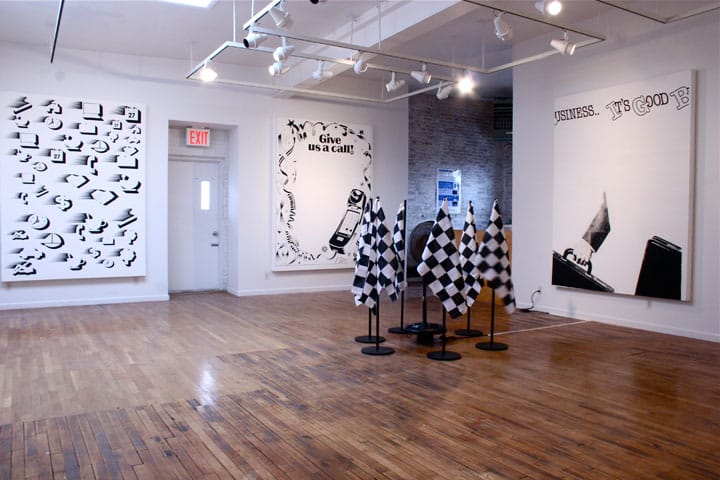
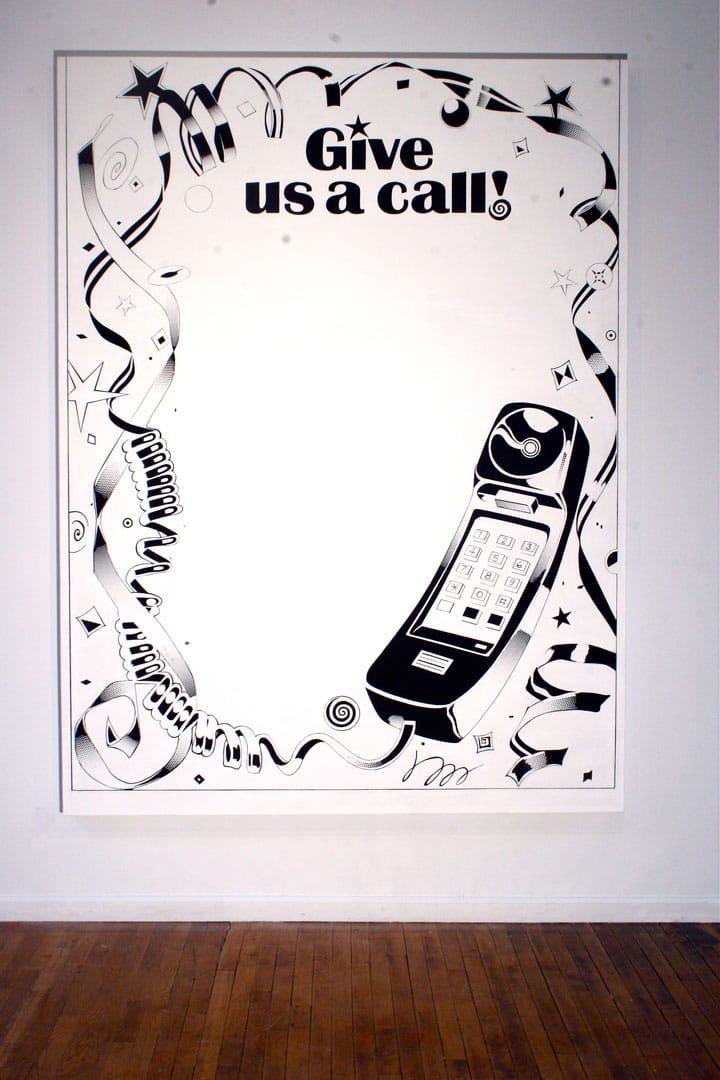
A 1991 book of royalty-free stock images is the source for the artist’s appropriations, though the images’ original function was as homemade signs and advertising for mom and pop shops with shoestring production budgets. Kiernan enlarged the images with minimal tweaking into the large canvases on view at NURTUREart. The thin flash vinyl paint lays flat and doesn’t reflect any light. There is no evidence of Kiernan’s brushstroke, which emphasizes a mechanistic style more akin to clip art.
If the style’s first impression is crude, it’s because 1990s stock imagery was severely limited by technical challenges. It was an era when color printers were rare and color copies cost $1 each. The market understandably favored black and white. Far more primitive photocopiers would discombobulate any photo, so it was important to keep graphics simple. The effect of a botched Xeroxed photo is actually memorialized in one of Kiernan’s works in the gallery.
A simple black and white image with basic shapes was just about all that old copiers could handle. The resulting style of simplistic black lines, dots, and cross-bars caught the artist’s eye as he flipped through a dusty book in a junk shop. Today’s diet of web images is a lot flashier and more colorful than it was previously — this visual vibrancy also reconfigures how we see the past. Suddenly this forgotten crudeness now looks exotic and exceptional.
Vacancy is a major aspect of each of the source clip art and Kiernan’s artworks, both stylistically and symbolically. Each image leaves a wide amount of open space for the user’s customized message, the area that clip art users would fill in with their own information.
Meanwhile, the page-border area is left for formal play. And the cross hatching in the bricks of 2010’s “One More Time Around the Block”, the dots on the phone of 2010’s “Give us a Call,” or the speckles of trees on a hill in a distance in 2010’s “How About a Breath of Fresh Air” all at first flew under my radar. But after some careful observation, these clever formal strategies for cobbling together images with such a limited formal arsenal become more and more fascinating. The pictures do more with less.
Pop art usually appropriates advertising imagery that uses a tight, packaged message to persuade the viewer to buy. The strategic vacancy of clip art, awaiting the customizer’s adaptations for its meaning, is unusual. These images are intentionally versatile and can be taken in multiple directions. Such blank, malleable and open-ended signs are semiotic curiosities. Unlike most images, clip art embraces its destiny to be altered, twisted and mediated.
Once around the block (twice) runs at NURTUREart (910 Grand Street, East Williamsburg, Brooklyn) through April 2.