MoMA Hits the Streets With Newsprint
After stopping in to Hyperallergic's local coffee shop one morning, I noticed something interesting in the newsstand next to the Village Voices and L Magazines. I took a closer look. MoMA's logo? On a newsprint publication? The Museum of Modern Art is refreshing an old form of advertising to get the

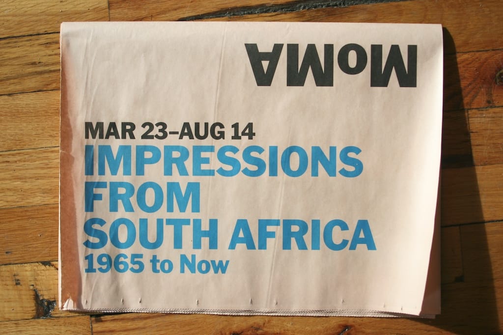
After stopping in to Hyperallergic’s local coffee shop one morning, I noticed something interesting in the newsstand next to the Village Voices and L Magazines. I took a closer look. MoMA’s logo? On a newsprint publication? The Museum of Modern Art is refreshing an old form of advertising to get the word out about two print exhibitions — the printed broadsheet. This two-sided newspaper publicizes the museum’s Impressions From South Africa: 1965 to Now and German Expressionism: The Graphic Impulse with an eye-catching combination of information and print reproductions. Even better, the broadsheet presents the exhibition’s prints in their native multiple format.
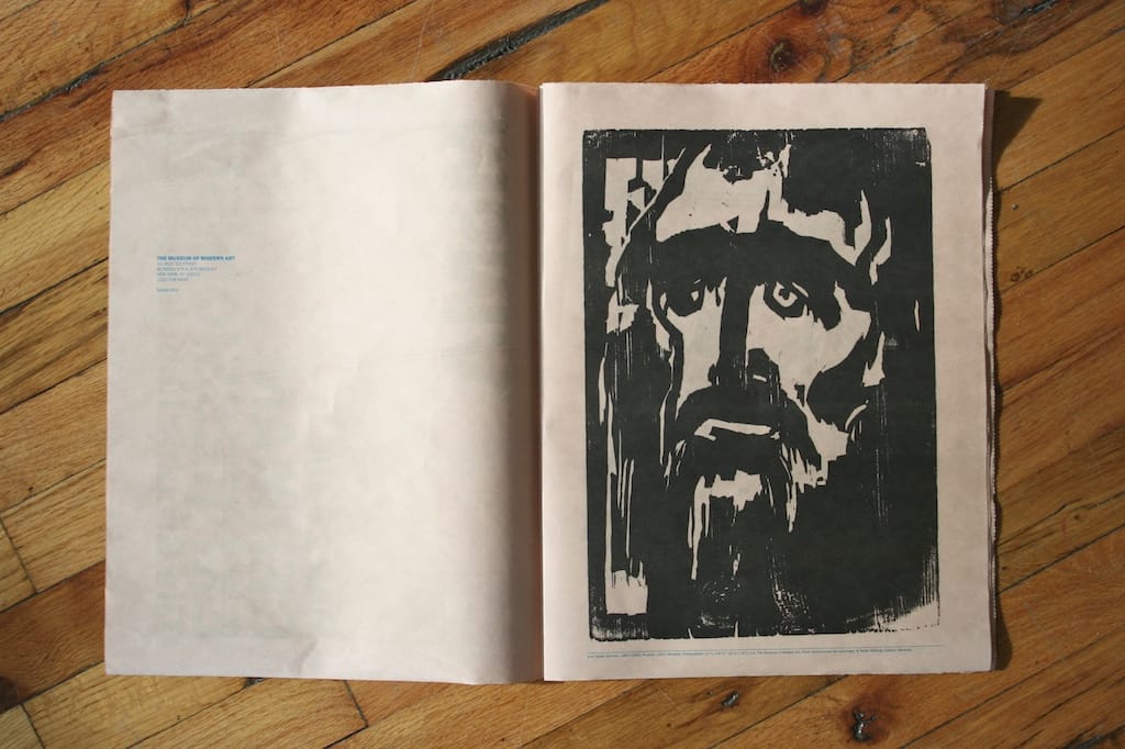
Pick up MoMA’s broadsheet and you’ll first have to pick a side to open it from. Where you start determines which exhibition you’ll see; do it wrong and you’ll be looking at the prints upside down. The German Expressionism side kicks off with an iconic image: Emil Nolde’s “Prophet” from 1912. Reproduced on the broadsheet’s newsprint, the imperfections of the woodblock print — bare spots, scratches, wood grain — pop out even more, like Nolde had just pulled the sheet off an inked block. It also helps that the prints are reproduced at close to original sizes as well; every detail is crisp and clear.
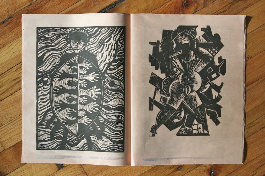
In the center of the broadsheet are full page spreads of exhibition information, event listings and print description. “The Expressionists’ stark, vibrant works reflect a period of intense social and aesthetic transformation in Germany,” the page describes, “Common themes include an uncompromising approach to the body and sexuality; a focus on urban experience … and the devastating experience of World War I.” That promise is followed up on by Otto Dix’s “Apotheosis” woodcut (1922), a chaotic image cut through with the silhouettes of soldiers and ghostly grasping forms surrounding a central female figure, mostly nude, perhaps pregnant and grabbed, it seems, from the cabaret stage. Yet her face is another death mask. The print remains a chilling, impactful image.
The South African artists featured also used prints as a way to respond to their social and political context. “Printmaking, with its flexible formats, portability, relative affordability, collaborative environment and democratic reach, was a catalyst in the exchange of ideas and the articulation of political resistance,” we learn. This functionality is exactly what MoMA broadsheet emphasizes — the publication itself plays into the same ideas of portability and reach, not to mention ease of production. It’s a potent combination of medium and content.
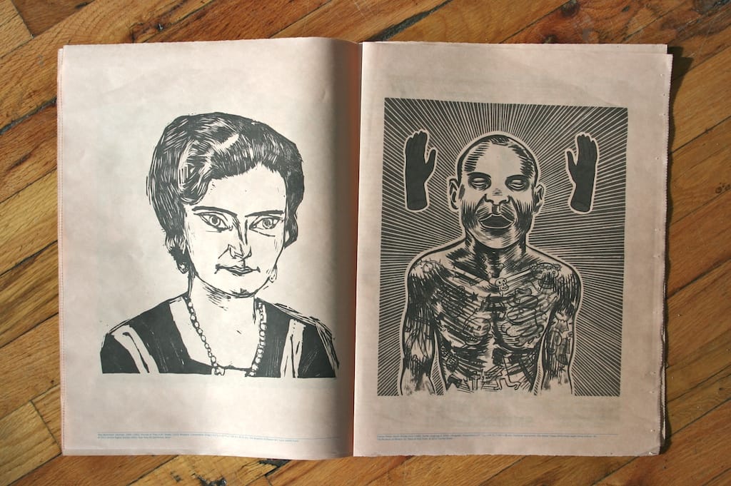
Impressions From South Africa‘s broadsheet section features a striking selection of prints from the exhibition, beginning with Sandile Goje’s “Meeting of Two Cultures” (1993), a two-page spread linoleum print with an anthropomorphized African shaking hands with a more western dwelling. The rough outlines and cross-hatching of the print’s forms relates strongly to the German prints featured on the other side of the broadsheet. “Secret Language II” by Conrad Botes presents a front-on view of a male human figure covered in tattoos, flanked on either side by disembodied hands. It’s a sneakily strong print, a confrontational visage made more immediate by the ephemeral quality of newsprint and the contrast of dark on white.
Produced on recycled pink paper and printed in bright blue and black, the broadsheet is both attractive and functional, a combination most museum publications fail at (brick-size exhibition catalogs and cardboard pamphlets, anyone?). You can stuff MoMA’s newspaper into a backpack or fold it up to fit inside a briefcase. The broadsheet is a retro medium that actually becomes refreshingly direct and personal in our era of email press releases and cardboard postcard mailings. What better way to make an exhibition truly publicly available than by reproducing it, and placing the reproduction where people are likely to pick it up of their own accord? MoMA’s print pamphlet combines medium and message in a way that few print publications approach, enlisting the best qualities of print to publicize a print exhibition.
Impressions From South Africa: 1965 to Now runs at the Museum of Modern Art (11 West 53rd Street) through August 11; German Expressionism: The Graphic Impulse is on display through July 11.


