In Paris, Andy Warhol's Works Are Shadows of Their Former Selves
PARIS — With electronic digital simulacra, there is no longer a spent nostalgia for natural semblance: Warholian reproducibility is the fundamental logic and code of our information society.

PARIS — With electronic digital simulacra, there is no longer a spent nostalgia for natural semblance: Warholian reproducibility is the fundamental logic and code of our information society. I have long idolized Andy Warhol’s early work for how it captures stardom’s need for repetition, but unfortunately the current Musée d’art moderne de la Villa de Paris show, Warhol Unlimited, is just a bland and banal Warhol primer show that leaves out the edgier, ghastly stuff. The show focuses on work based on the repetitive quality inherent in photographic film. The crass irony of being forbidden to photograph the show (except the climactic “Shadows” room) did not escape me.
“Shadows” (1978–79) is Warhol’s huge painting mural made up of 102 silkscreened canvases in 17 different tones. The mural is over 426 feet long, every swank inch fragrant with memories for me. In 1979 I was at the opening of Shadows at the Heiner Friedrich Gallery in New York (Heiner, along with Philippa de Menil and Helen Winkler, established the Dia Art Foundation in 1973, where I worked in my youth) and I have seen it since a couple of times at Dia:Beacon. So this is its third context for me, and the main attraction of this show.
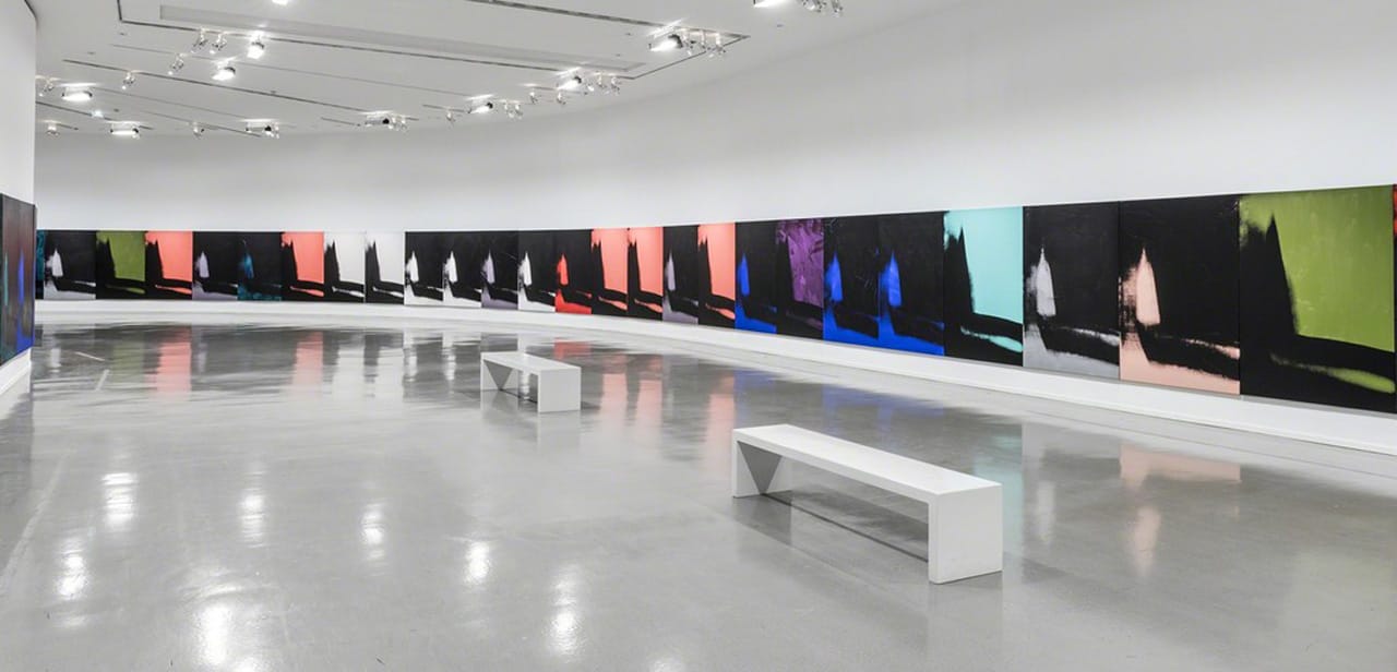
What once looked bold and monumental now looks boring and glutinous. The first two architectural settings in which I encountered this piece were large, rectilinear rooms that the paintings ringed. Both galleries had warm wood floors that set off the mural’s largely cool, black presence. One would enter and be surrounded by the mural in an immersive fashion, reading it in its entirety in one sweeping view. Here, the paintings flow down a long, shinny, gray-floored hall that bends to the left. Much more attention is called to the actual individual paintings or small groups of them. This is a disaster for this piece because the paintings are clearly uninteresting on an individual basis, or even as pairs or triptychs. To glide past them is to fall into their total emptiness. They lack what Warhol once did so well, which was to make symbolist art that took reality into its scope in an emblematic way.
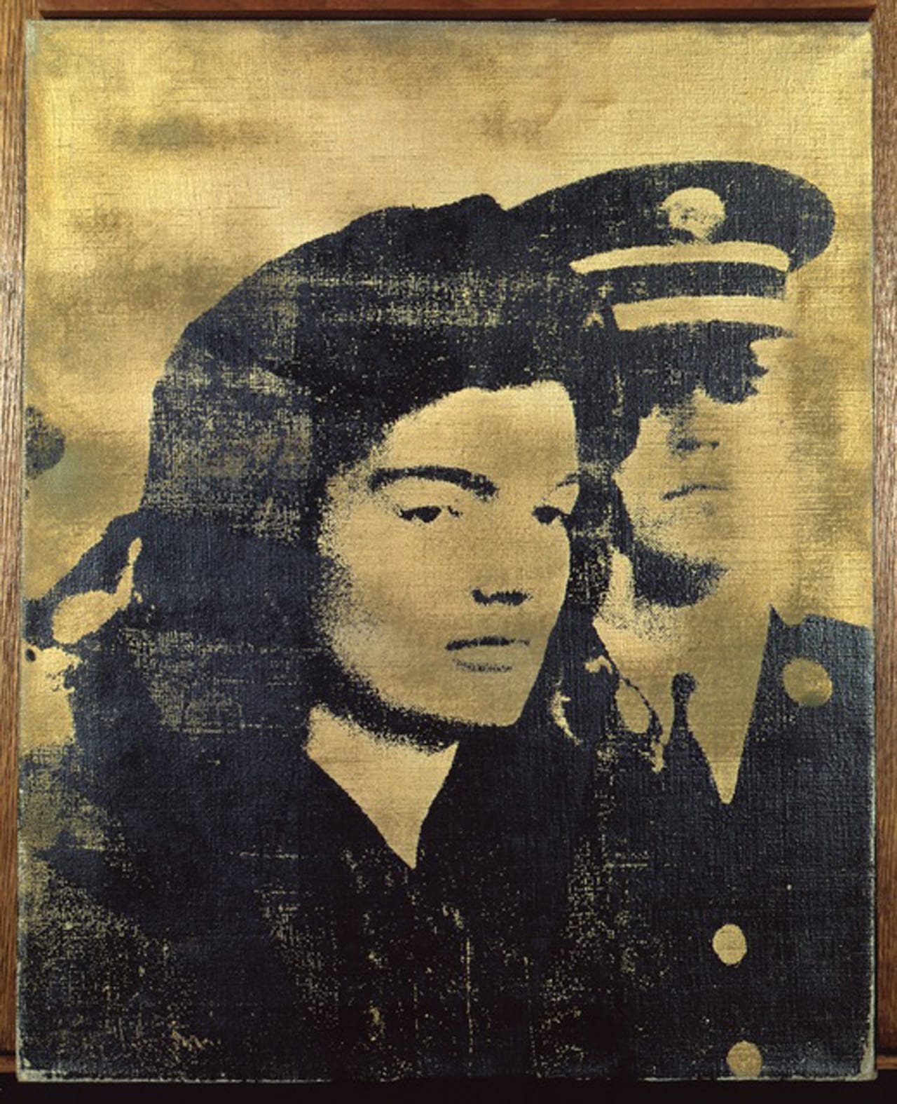
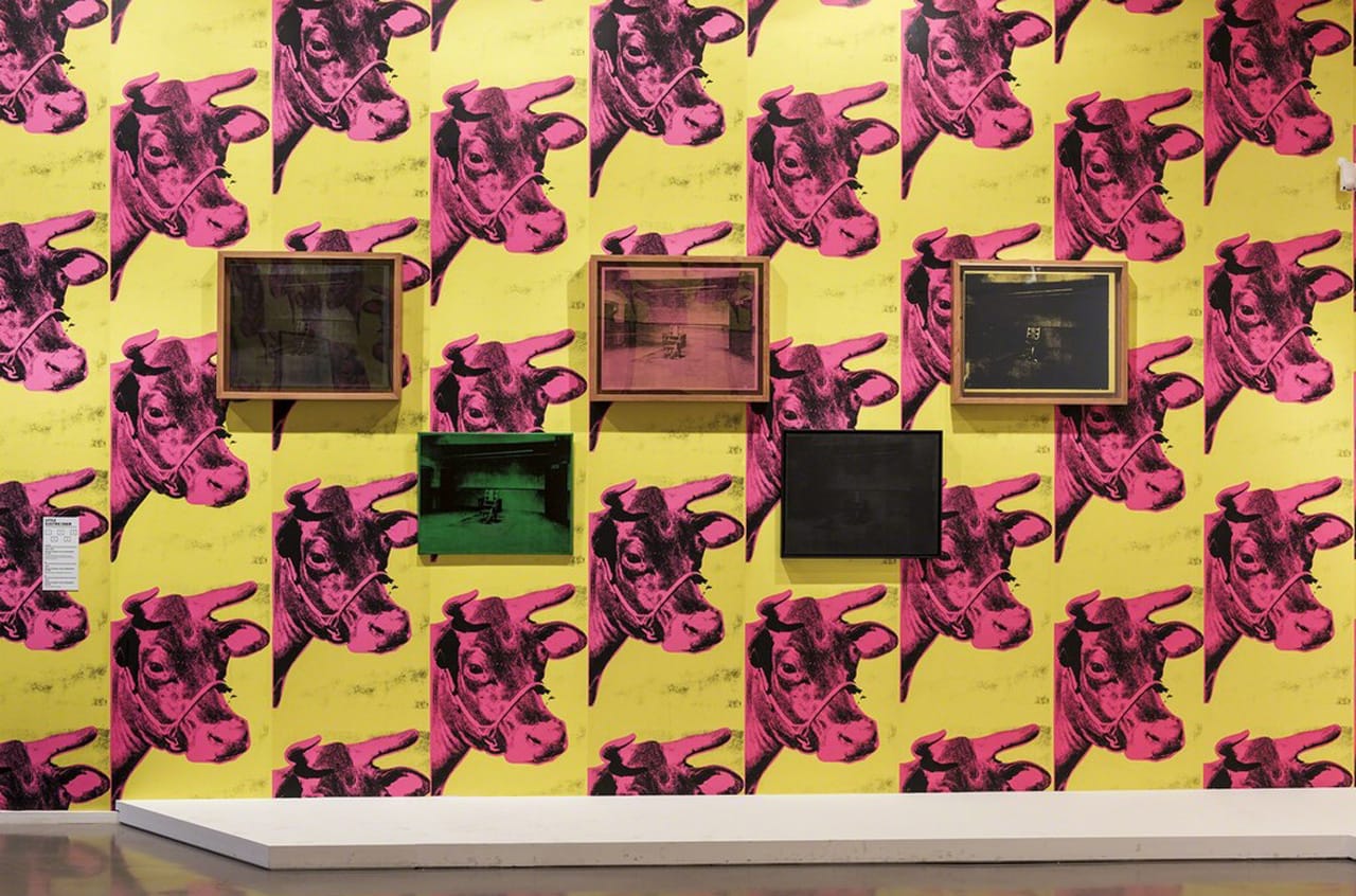
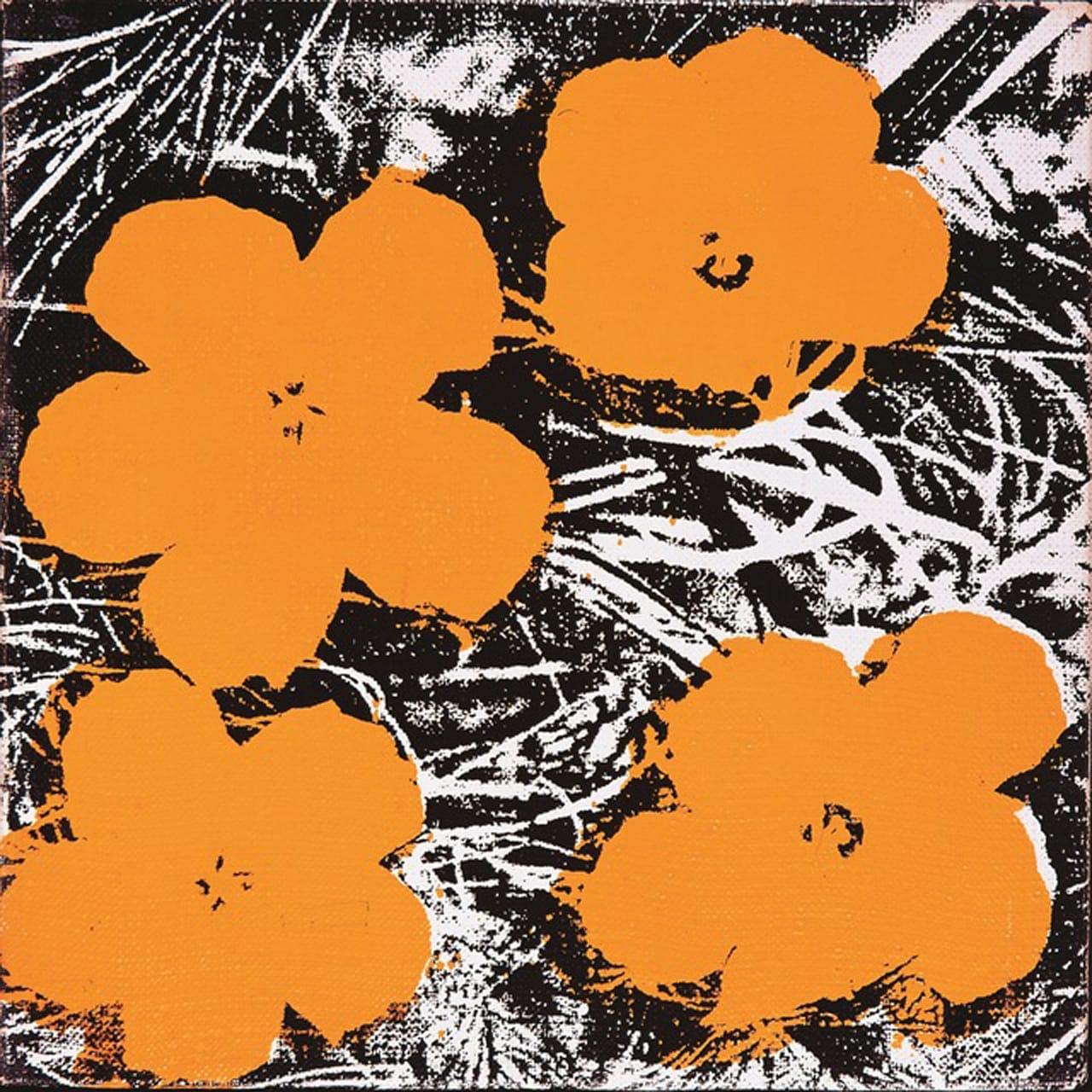
To get to “Shadows” one first needs to plow through the iconic (read: numbingly boring) “Self-Portraits” (1966–67, 1981) and the too-familiar Screen Tests (1964–66). I only paused briefly at some of the Electric Chairs series (1964–71) hung atop of the “Cows Wallpaper” (1966) and at some pleasing “Jackies” (1964). But I always stop and look closely at the “Brillo Boxes” (1964), wondering how I failed to convince my philosophy seminar professor, Arthur Danto, that the history of art does not come to an end with them. He found the “Brillo Boxes” basically visually indistinguishable from the Brillo boxes in the grocery store. Looking again here, I wondered how could he have gotten them confused? The surface qualities of the wooden Warhol boxes do not look the same as those of the smoother, commercial cardboard. After that long pause, I raced by the vastly overrated “Flowers” (1964–65) and the room full of stern “Maos” (1972–73) — if only Warhol’s history, at least, had ended with the “Brillo Boxes.”
The show picks up energy with a room devoted to Warhol’s art-music happening project, the Exploding Plastic Inevitable (EPI) (1966), which eventually became just the Velvet Underground. EPI created a striking sensorium, as the audience and the performers were all embedded in a light, sound, and film show that dominated the space and stirred the consciousness of those watching (or dancing).
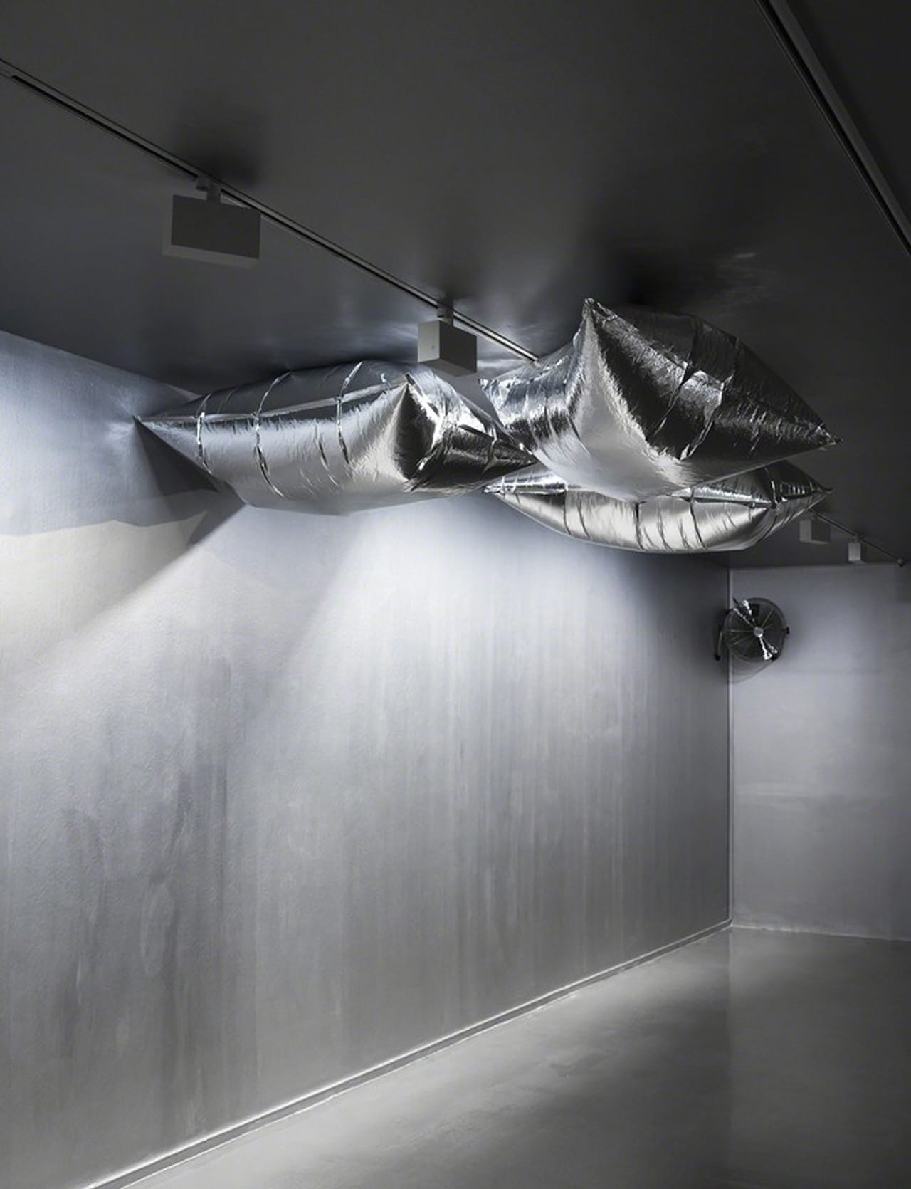
The EPI happenings were first performed in the spring of 1966 at Polsky Dom Narodny, a Polish dance hall on St. Marks Place in New York City. Warhol rented the Dom (home) from two artists who sculpted with light (Rudi Stern and Jackie Cassen) and painted it white so that movies and slide projections could be cast on the walls in wallpaper-like fashion. Five movie projectors were utilized along with five carousel-type slide projectors that could each change an image every 10 seconds. The slides were projected directly atop the films, whose soundtracks would sometimes be played, blending in with the live music and general hullabaloo. Mirror-balls, spotlights, and strobe lights contributed to the visual cacophony. The happenings aimed to achieve a dazzling ontological restructuring of consciousness. The installation of the EPI material as a surround space, using multiple large screens and loud sound, nicely transmitted something of the immersive splendor of the clubbing experience Warhol helped to establish. This hot, pulsating installation is followed by a chill-out installation consisting of the delightfully calm and playful “Silver Clouds” (1966), a silver painted room where silver pillows float about.
What was desperately missing from this show was anything from the Death and Disaster series or from the Hollywood star period, like the work seen here recently in the American Icons show. That exhibition had stunning works, like the silver chefs-d’oeuvres “Silver Marlon” (1963) and “National Velvet” (1963) — flickering, glamorous, almost devotional images that I just love. Seeing these, there is no question that Warhol did his best work in the early 1960s and rather cruised downhill after that.
Leaving the show, I was reminded of what Gene Youngblood said about Warhol in 1970: that with his work’s incursion of low content into high art, we rediscovered art in the ancient, Platonic sense, in which there’s no difference between the aesthetic and the mundane. That is no longer the case, if it ever was. If Warhol demonstrated that the beauty of aesthetics could be found anywhere that we set our sights, in anything, why not set our sights higher or deeper? Average Warhol aesthetics have become anesthetic to an Olympian degree. The works’ numbing regularity lacks any semblance of its former petulance.
Warhol Unlimited continues at the Musée d’Art moderne de la Ville de Paris (11 Avenue du Président Wilson, 16th arrondissement, Paris) through February 7.


