Solid and Perilous
Gary Petersen’s skewed geometric paintings call forth analogies to music and architecture, a realm of vertical intervals and diagonal supports spliced into a precarious balance.

Gary Petersen’s skewed geometric paintings call forth analogies to music and architecture, a realm of vertical intervals and diagonal supports spliced into a precarious balance. I was reminded of a child determinedly stacking one block on top of another until the whole thing topples over. Something of that impish delight can be found in the current exhibition, Gary Petersen: Back There Behind the Sun at McKenzie Fine Art (September 7–October 16, 2016), his first with this Lower East Side stalwart.
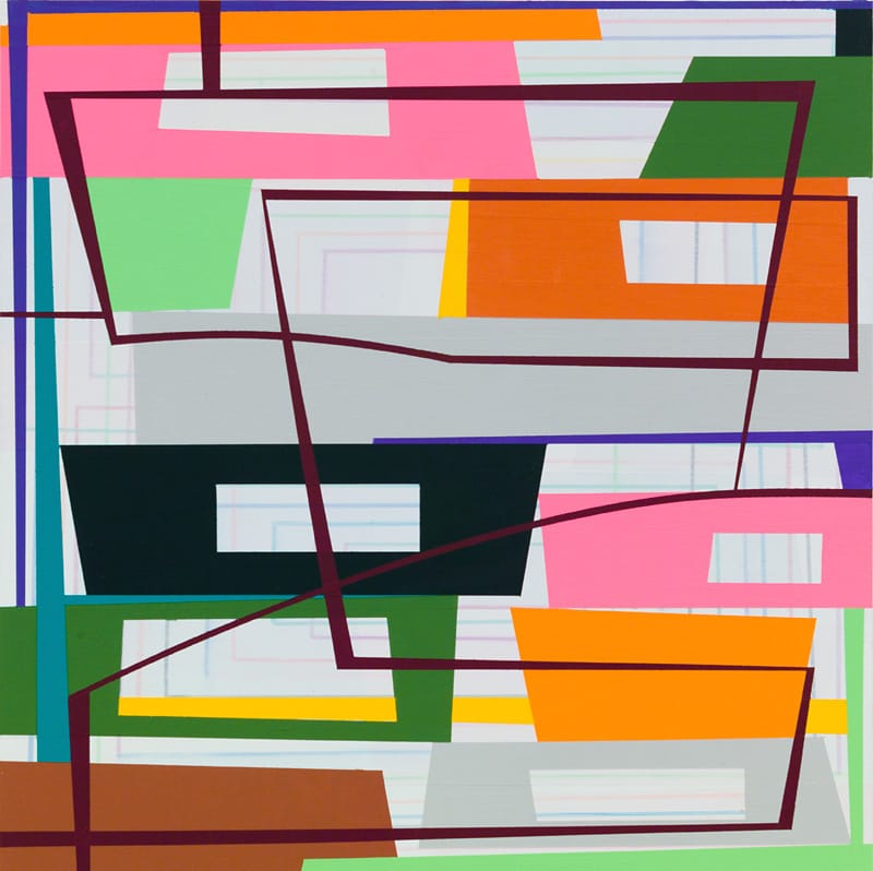
Petersen is a hard-edge geometric painter whose groupings of color and stacked forms seem inspired by Ellsworth Kelly, Al Held, and Nicholas Krushenick — distilled shapes, impossible arrangements, and a welcome dose of vulgarity. His off-center, stacked shapes have a decidedly urban feel to them. Like the girders, granite slabs, and rebar piled up at a construction site, the piled shapes come across as simultaneously secure and unstable. And yet, in wonderful counterpoint to the drab and somber colors we associate with municipal construction, Petersen’s palette is a mixture of holiday cheerfulness and artificial tones.
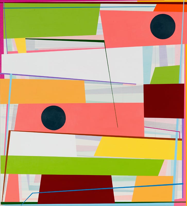
Although it was likely not his intention, in this body of work Petersen seems to have established a dialogue with Held’s late works. In contrast to the older artist’s open, brightly colored, linear forms, which carve out chambers of deep, contradictory pictorial space reverberating with cosmic overtones, Petersen’s flat, geometric shapes — some perforated with openings, others festooned with dark, opaque circles — are placed over a pale ground marked by muted vertical bands, creating an ambiguous sense of depth. Held’s structural forms zoom swiftly back into space, while Petersen’s stacked-up planes rest a hair’s breadth away from the picture plane.
The comic calm with which Petersen’s shapes accept their rickety situation holds our attention. In counterpoint to the wobbly stacks, he uses color as a scaffold to hold the forms in place, while infusing them with a rhythmic musicality that is both harmonious and dissonant.
He will sandwich an olive green between two Easter-egg pink geometric shapes, or place a turquoise green shape next to peach-colored rhomboids. His palette seems to be a meeting of Romper Room and Pontormo, resulting in geometry with a sense of humor. Humor and geometry seem unlikely partners, but they are integral to Petersen’s paintings.
Another body of work that Petersen’s paintings seem to address is Frank Stella’s idiosyncratic wall constructions. Petersen has everything you see in one of Stella’s flamboyant wall pieces, but none of the macho overkill and slapped-on coats of paint. His skewed planes, circles, and linear structures imply depth but are made of paint, “good as it was in the can,” to quote Stella’s own goal as a painter. The juxtaposition of the planes against the pale ground and muted bands imply depth but are not illusionistic. There is no attempt to fool us. Instead of making three-dimensional works for the wall or slopping paint on a broken surface, Petersen accepts that a painting is a flat surface and, in these works, rectangles. These states don’t become constraints but challenges to work with and against.
In “Slip/Spill” (2016), the balance of monochromatic rhomboids feels temporary, with some of the linear bands acknowledging the painting’s edge while others appear to extend beyond. We are getting a partial view that is also complete, a sense that what we are looking at is conditional: everything in the painting needs everything else. What the view also conveys is Petersen’s delight in trying to make it hold together, to imbue the painting with a logic that seems to arise from the work itself. Rather than appearing willful, the composition seems to suggest that Petersen had made a pledge to make do with what he had.
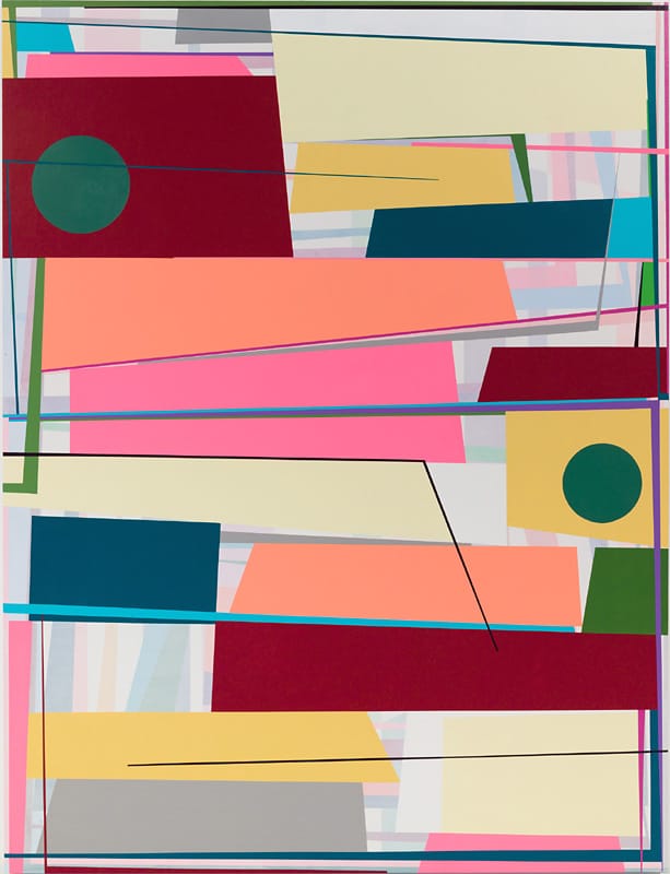
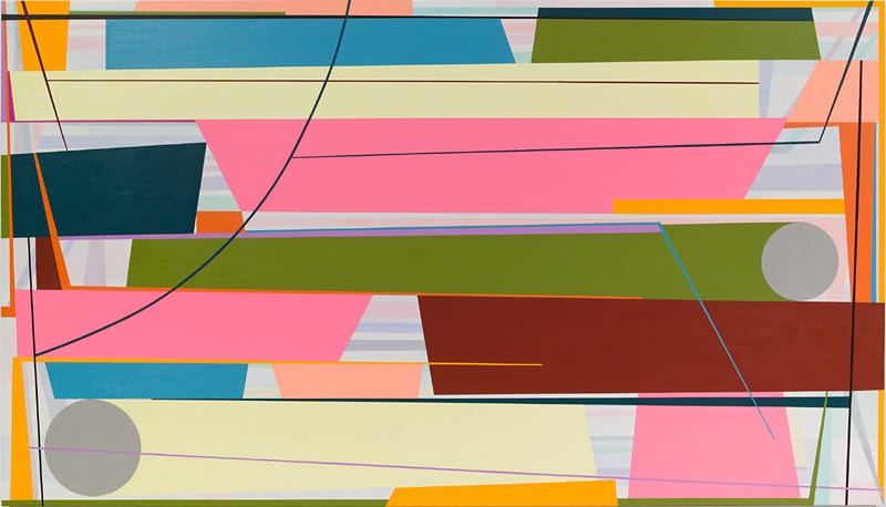
Starting from the bottom edge, the whole edifice seems to be balanced on two relative small blocks of color. The slanting sides of the pedestal-like green trapezoid inflect the painting with unpredictability. Perhaps we are finally past the idea that a painting’s outward shape determines what’s inside. Perhaps once Stella squeezed space out of a painting, painters didn’t have to think about that any more and could go on to other possibilities. Complementing his sense of structure, Petersen possesses an exquisite sense of how color can advance, or recede, or hold the plane. When he places the same umber within two different hues of green, it’s as if he is riffing off Josef Albers but with a more off-beat effect.
Petersen has stayed true to painting without succumbing to the threats and judgments it has had to endure since the 1960s when, as Douglas Crimp gleefully announced in his well-known academic treatise, “The End of Painting” (1981) it had entered a “terminal condition,” and painters “one after the other […] abandoned painting.” Petersen doesn’t appropriate or parody, and he doesn’t try to come off as the latest savior or “genius.” He isn’t trying to appease the authorities, which adds another level of meaning into his precarious structures. He doesn’t mind changing up his method: while his work is usually vertical in format, “Spin Out” (2016) is a horizontal that is nearly twice as long as it is tall. Having put together a vocabulary of forms and mastery of colors, such as pink and bright yellow, that might be considered feminine or tropical, Petersen is clearly trying to extend his possibilities. There is a solidity to this achievement that deserves all the attention it gets.
Gary Petersen: Back There Behind the Sun continues at McKenzie Fine Art (55 Orchard St, Lower East Side, Manhattan) through October 16.


