Remixing Six Centuries of Iconic Graphic Designs
In a new book, Phaidon considers the unexpected and deliberate connections between 500 of our most recognizable images.

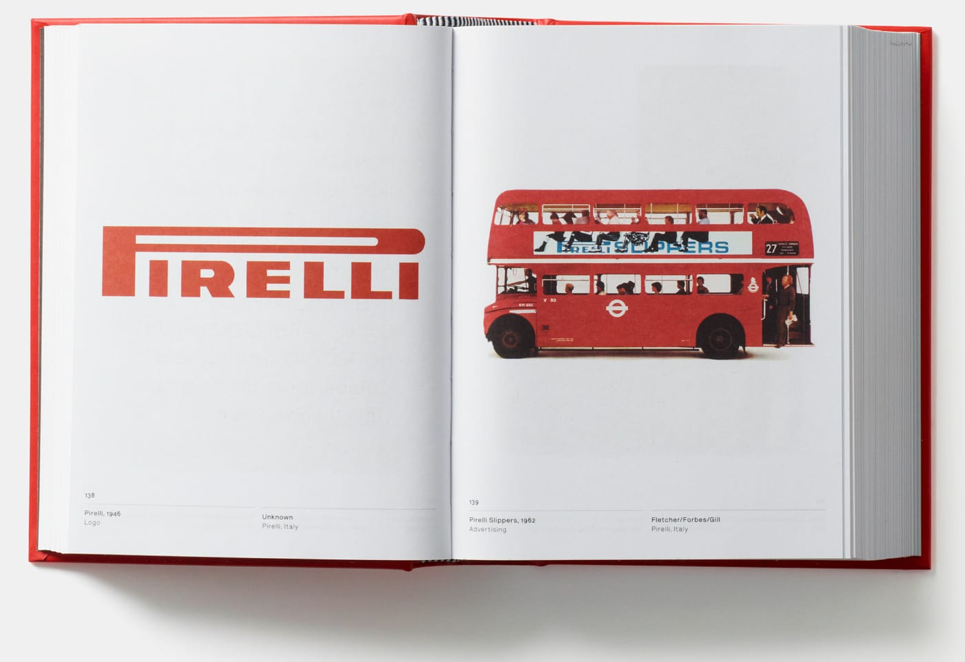
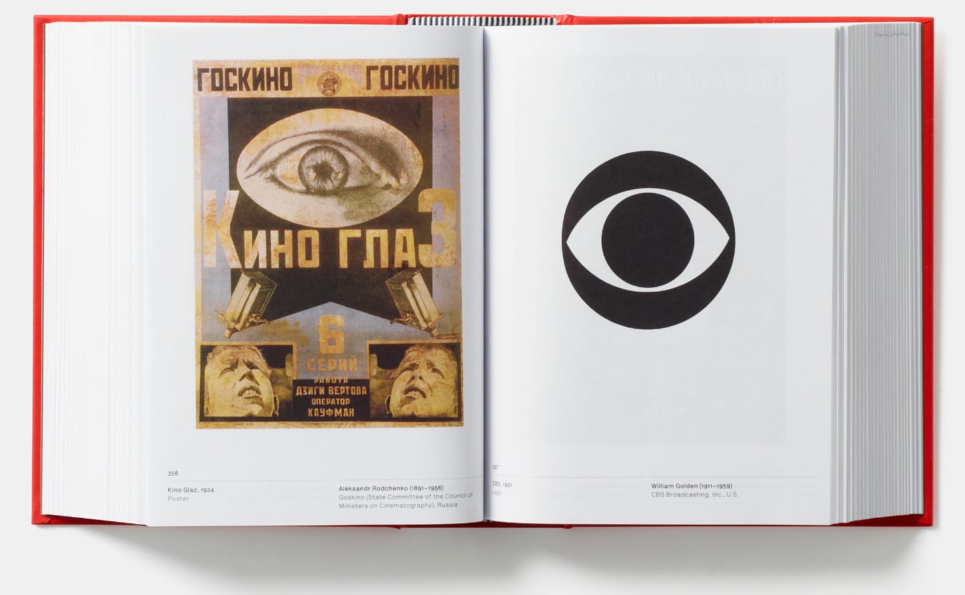
In Graphic: 500 Designs that Matter from Phaidon, the McDonald’s red and yellow 1962 logo faces off against an equally blaring 1924 Constructivist poster by Alexander Rodchenko, with a woman yelling through a cupped hand. On another spread of pages, the flat, red cover of the 1900 Michelin Guide is compared to a different form of guidance, the 2000 Common Worship service and prayer books adorned with crossed titles by Derek Birdsall and John Morgan. The recently released book remixes 600 years of graphic design to encourage a fresh look at its most iconic visuals through unexpected connections of color, shapes, patterns, and themes.
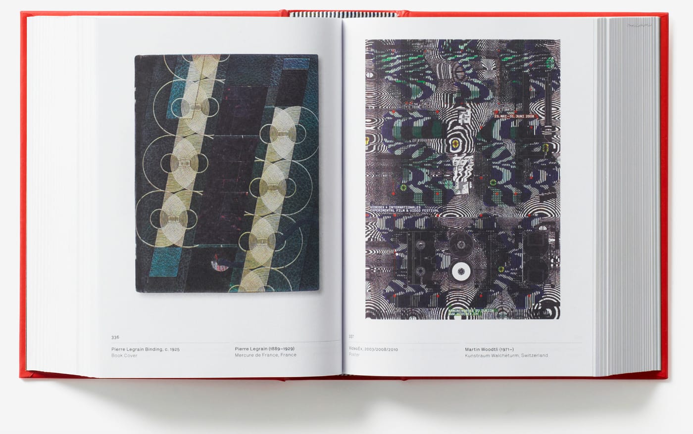
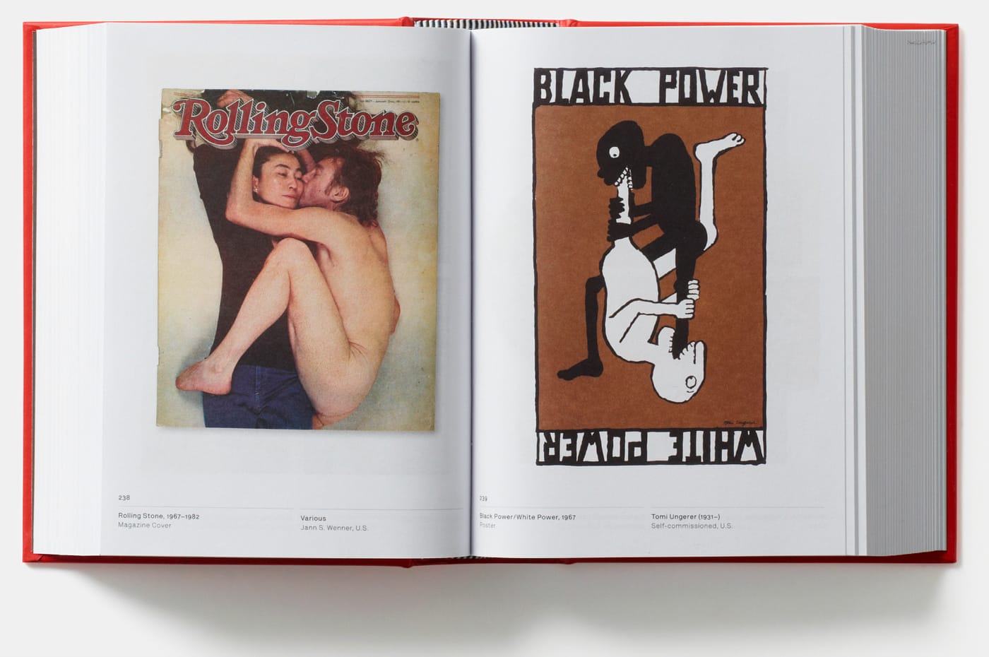
The material is derived from the 2012 Phaidon Archive of Graphic Design, offering a more compact, affordable history of graphic design (although it’s still a stout tome). It’s also very much a visual book. While there is a timeline with details on each entry at the end of Graphic: 500 Designs that Matter, the text is a bit small for reading straight through. Instead, it’s best approached by opening the book to any of its over 700 pages, and contemplating what the two images, which may be made decades apart, have in common. And they are diverse, and sometimes not as familiar, with magazines, advertisements, flags, typefaces, logos, album covers, books, newspapers, and posters from around the world.
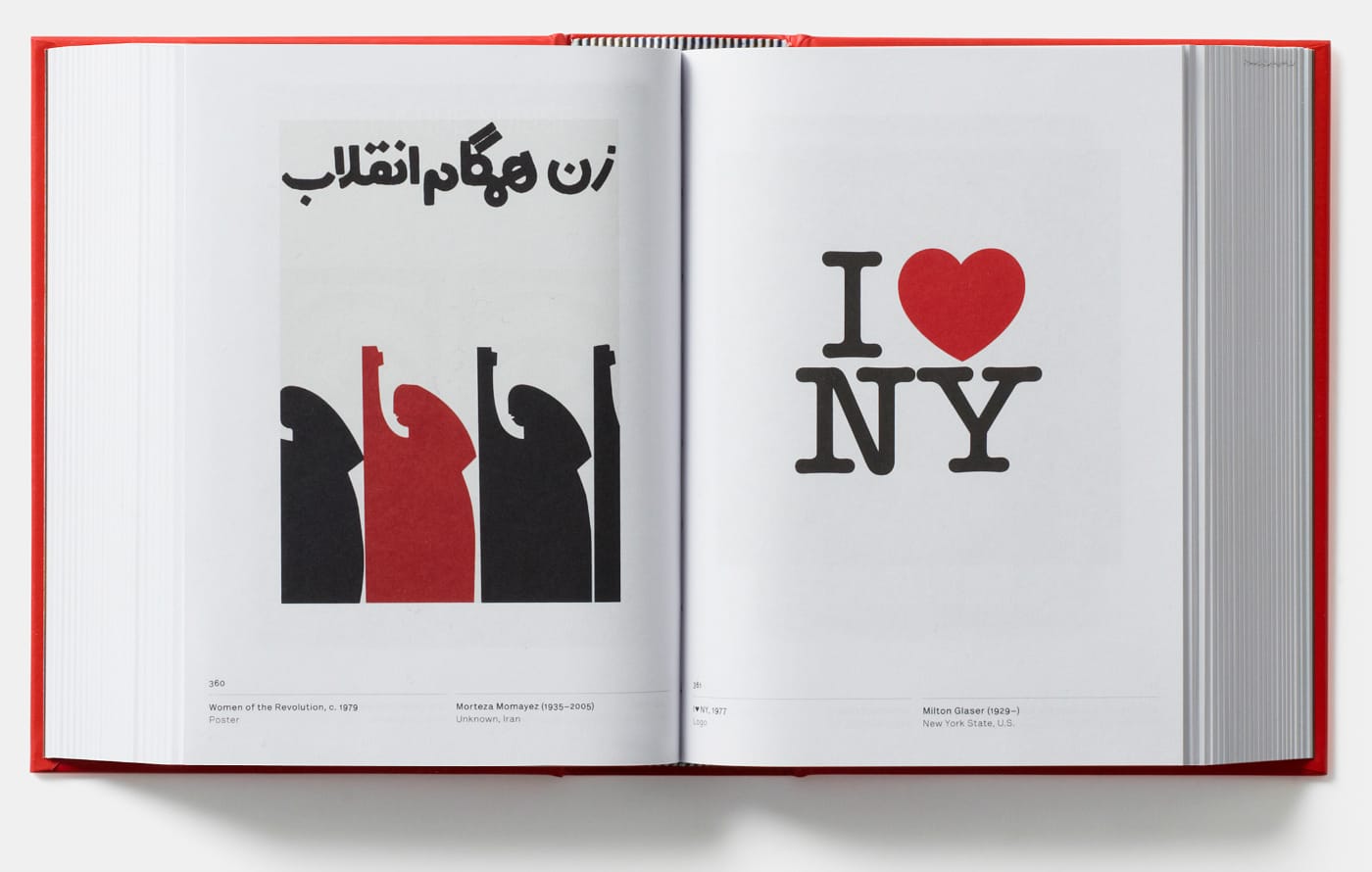
The oldest example is the 1377 Jikji, a South Korean Buddhist text that is the earliest known book printed with moveable metal type. It’s joined with Paul Rand’s 1947 Thoughts on Design, its consideration of order and beige colors resonating with the historic manuscript. John Venn’s 19th-century diagram of interlocking circles, itself following medieval symbols of the Holy Trinity, reappears on the 1997 album art for Spiritualized’s Ladies and Gentlemen We Are Floating in Space. Other pairs are less visual and more thematic. Oliviero Toxcanin’s controversial 1982 United Colors of Benetton advertisement with a photograph of AIDS patient David Kirby is contrasted with the somber lines of Gerald Holtom’s 1958 symbol for the Campaign for Nuclear Disarmament. Based on the “N” and “D” semaphore signals, it was widely adopted in the 1960s as the peace sign. Some reveal influences, like a 1920s Bauhaus poster alongside MoMA’s bold red logo designed by Ivan Chermayeff and Matthew Carter. The publication is a broad compendium of nonverbal communication, and all the intentional and haphazard collisions on the way.
Graphic: 500 Designs that Matter is out now from Phaidon.