The Man Who Harmonized Form, Function, and Friendliness in Corporate Design
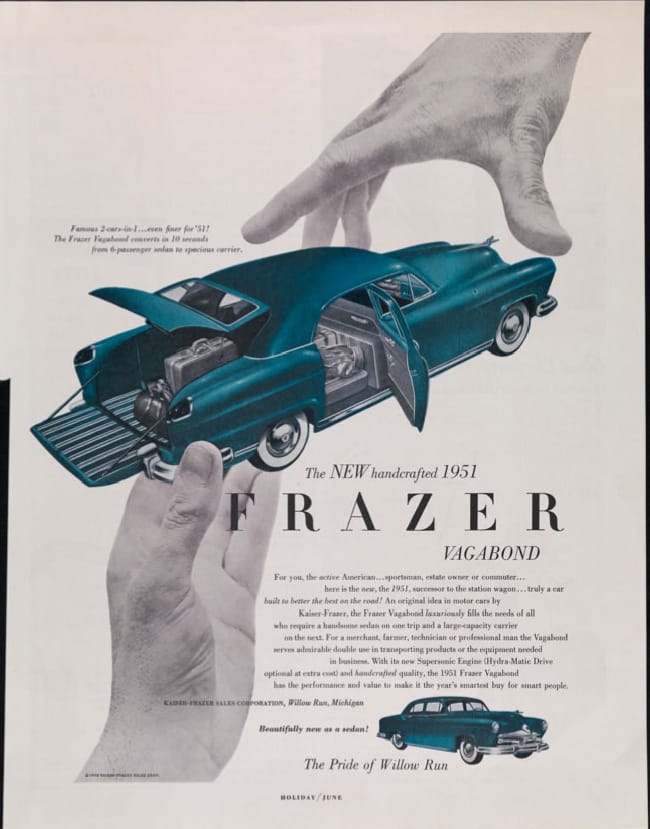
Before the 1950s, most advertising was just copywriting paired with an image with little thought to the overall company or visual identity.

Before the 1950s, most advertising was just copywriting paired with an image with little thought to the overall company or visual identity. That’s the world Brooklyn-born Peretz Rosenbaum, who reinvented himself as Paul Rand to avoid anti-semitism, entered as a young graphic designer in the 1940s.
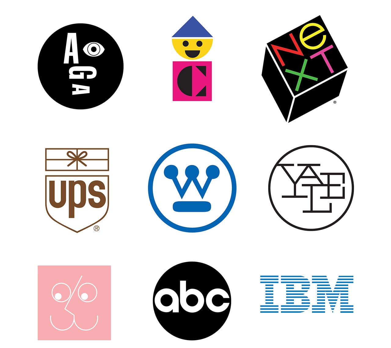
Drawing on the Bauhaus influence of Europe and the colorful abstract forms of artists like Paul Klee, Pablo Picasso, and Joan Miró, Rand became a major force in rethinking the visual impact of post-WWII advertising, and on the way he designed iconic logos for IBM, ABC, NeXT, Westinghouse, UPS, and other corporations that endure decades later.
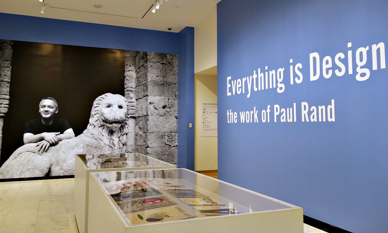
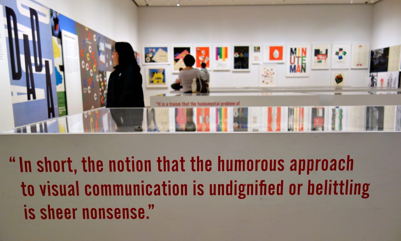
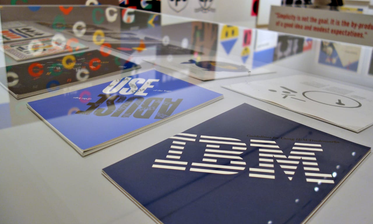
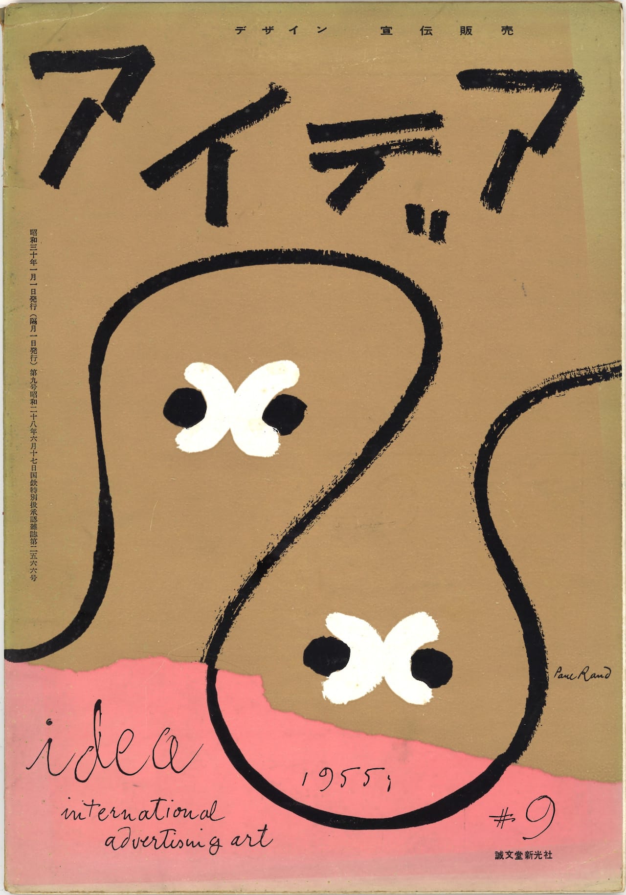
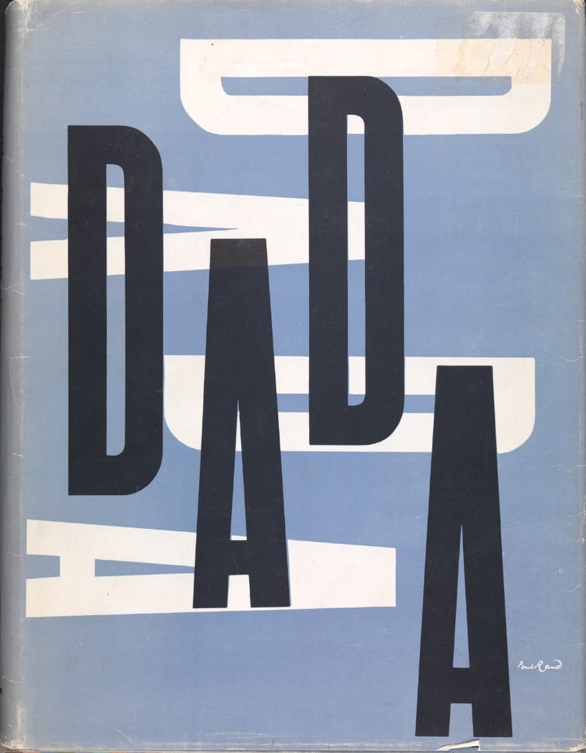
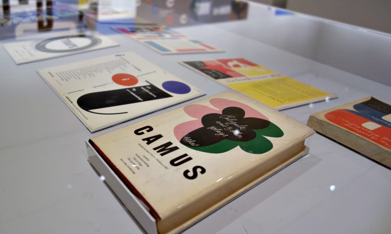
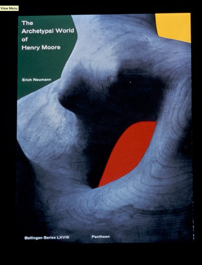
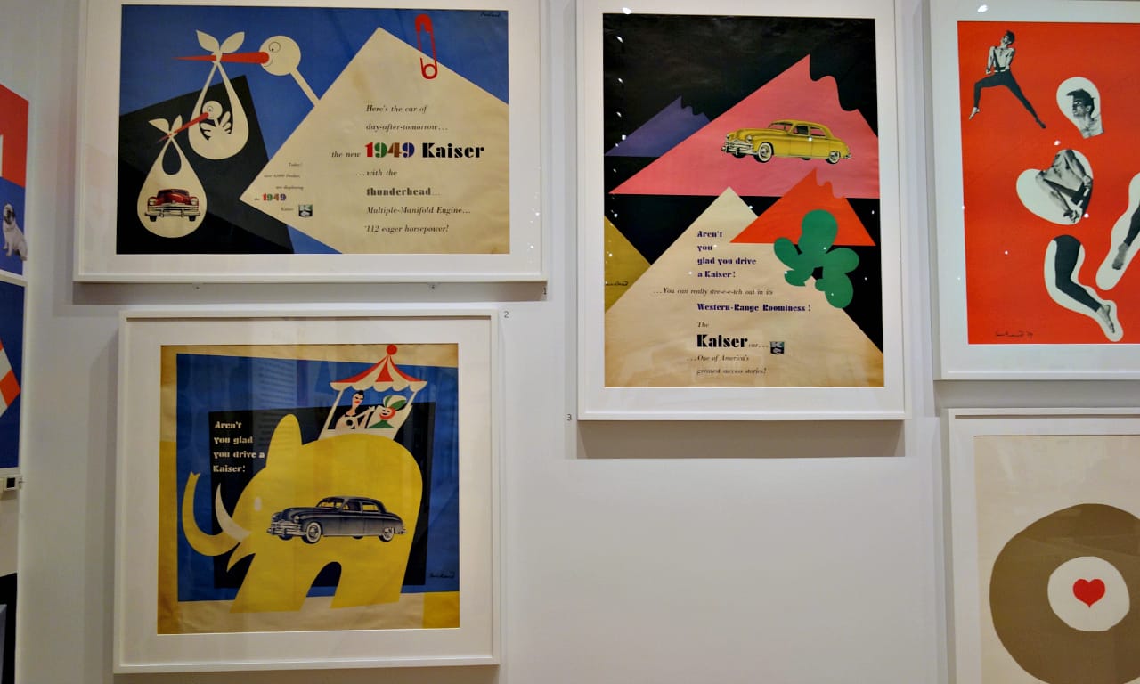
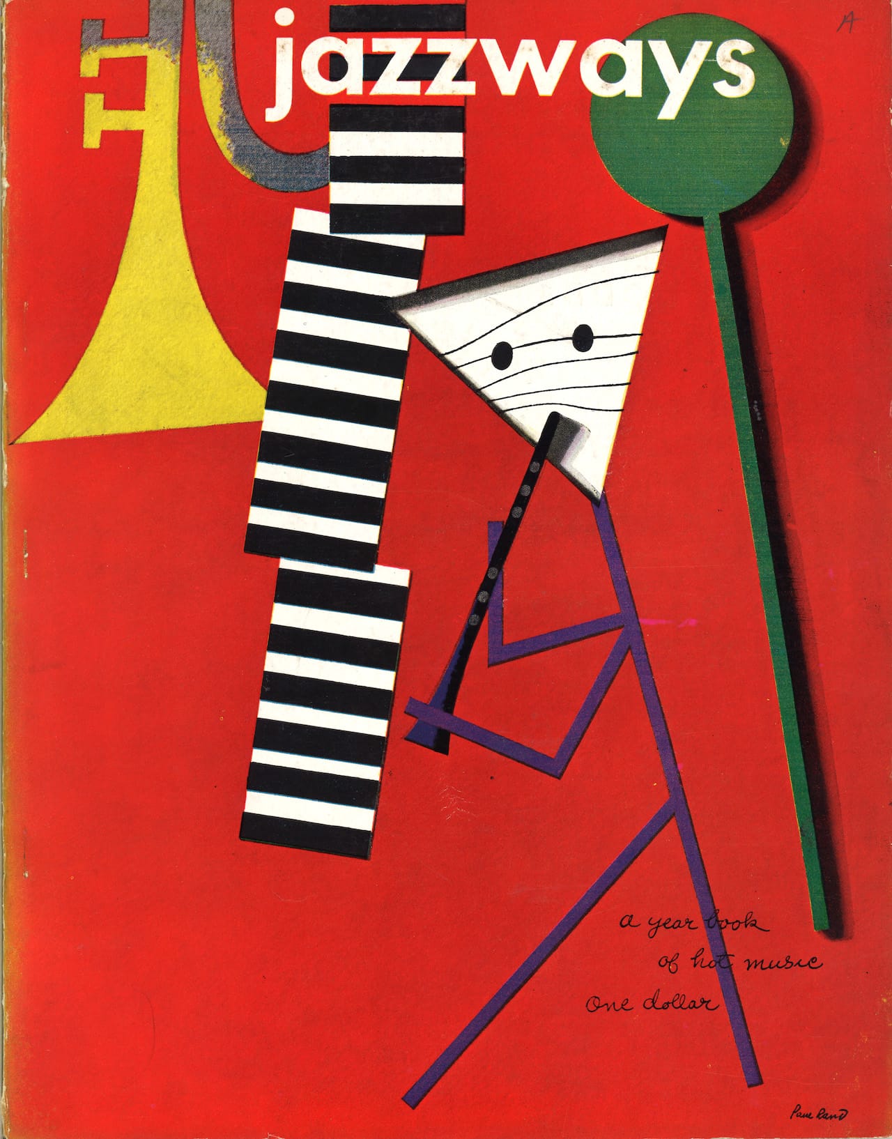
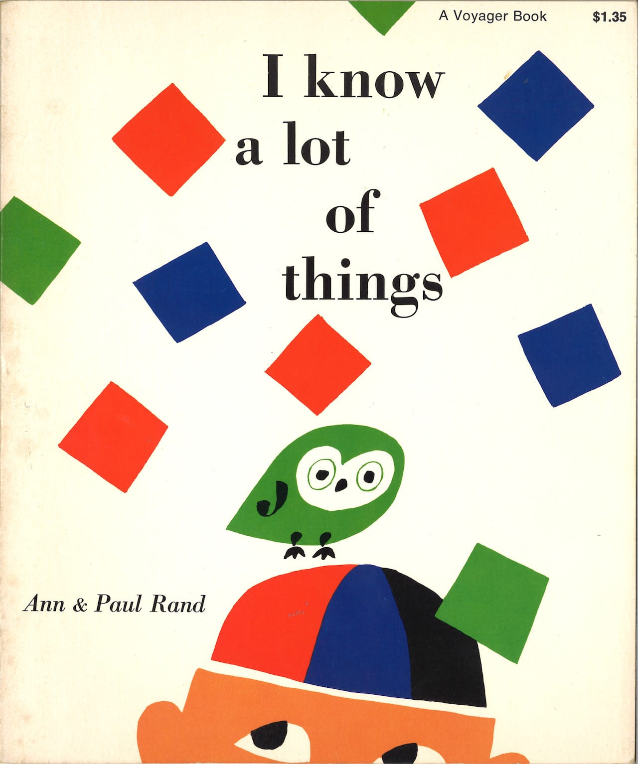
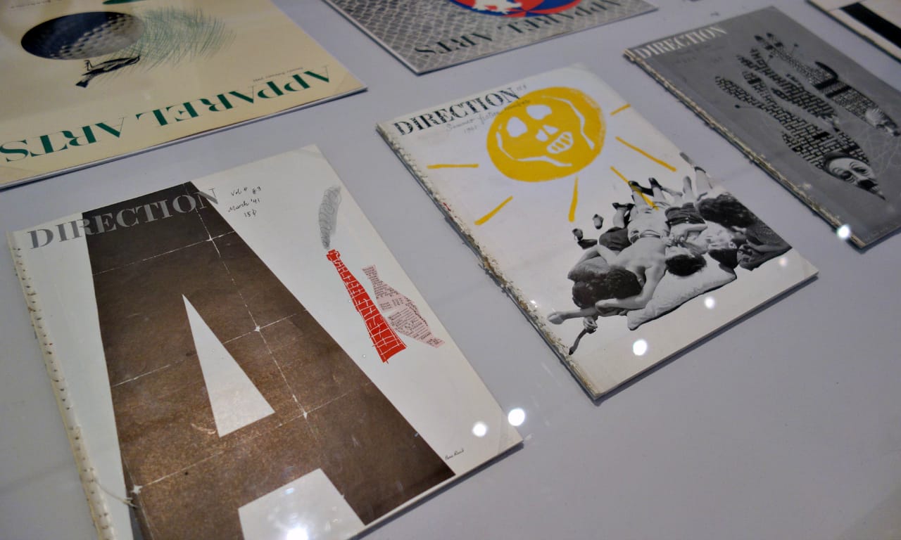
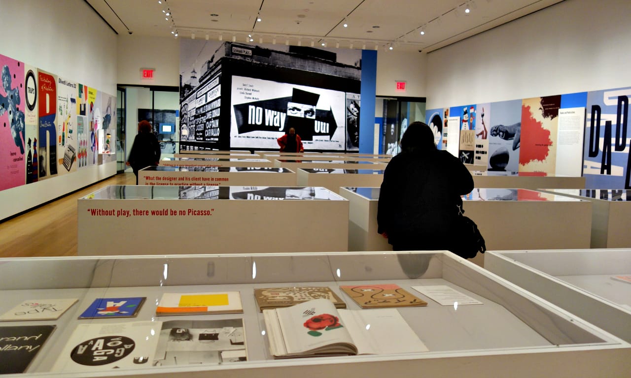
Everything Is Design: The Work of Paul Rand at the Museum of the City of New York fills one large gallery with glass-topped vitrines showcasing over 150 objects from a six-decade timeline of Rand’s work. Starting with the early 1940s, Direction magazine covers have a collage style of images juxtaposed with sparse text, often in Rand’s own light, looping handwriting. The exhibition progresses through his career as a Madison Avenue art director and eventually a popular teacher at Yale University and author of design books for the masses. In one of those — Thoughts on Design, published in 1947, revised in the 1970s, and reissued last year by Chronicle — he wrote:
Visual communications of any kind, whether persuasive or informative, from billboards to birth announcements, should be seen as the embodiment of form and function: the integration of the beautiful and the useful. In an advertisement, copy, art, and typography are seen as a living entity; each element integrally related, in harmony with the whole, and essential to the execution of the idea.
Our world is now encased by overly designed advertisements, and companies like Apple consciously embed a consistent visual identity in their products. It’s hard for us to imagine the impact of ads of the 1930s with their blocked text and disorderly logos, which don’t feel contemporary. One of the downsides of Everything Is Design is that it doesn’t offer this context which would make Rand’s work feel as startling as it must have been in its era. However, in a limited space Donald Albrecht, the museum’s curator of architecture and design, organized an exhibition that hopscotches through highlights of Rand’s witty and well-organized design, showing a designer conscious of the need for advertisement to engage the viewer as much as visual art.
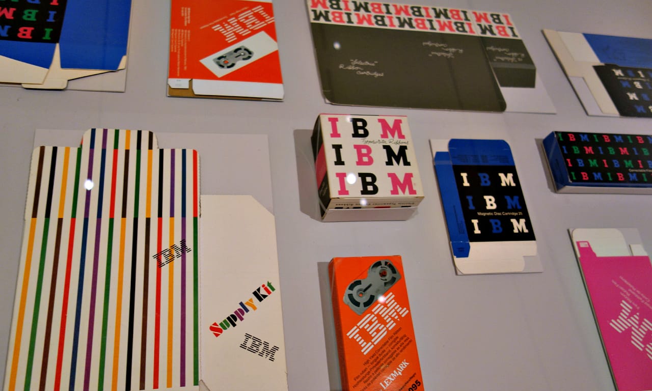
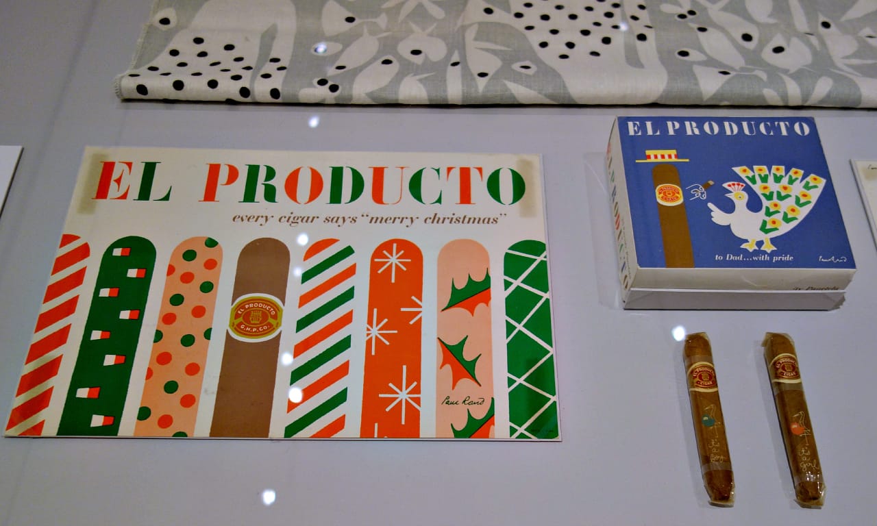
While Rand worked on cigar packaging, textiles, film posters, book jackets, children’s books, and all sundries of advertising, he was a master of the logo. In Thoughts on Design, he called the symbol “the common language between artist and spectator,” and each of his logos was simple, confident, versatile, and distinctly friendly.
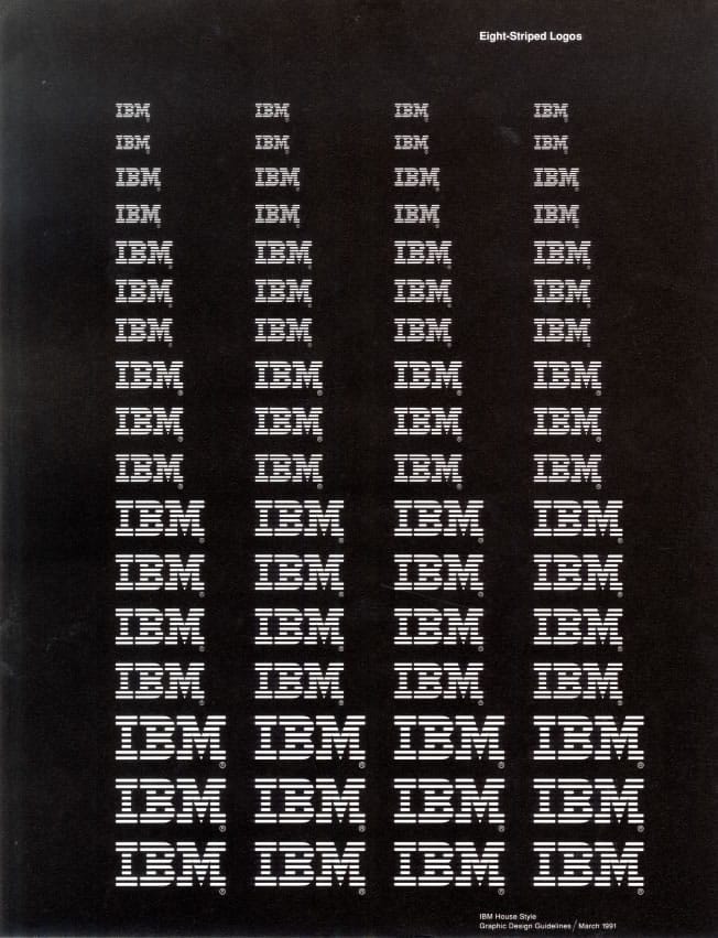
In the 1950s, he redesigned the branding of IBM, opening the company’s letters into dynamic horizontal lines, a logo which the company uses to this day. At the time, IBM also hired Eero Saarinen for their architecture and Charles and Ray Eames for their offices and exhibitions, an unprecedented corporate makeover by a high profile team that may not have influenced whether IBM’s computer sales were a success, but majorly impacted the strength of their brand. Later it was Rand’s dimensional black box with colored letters that Steve Jobs, ousted from Apple, commissioned for his new computer company NeXT.
Everything Is Design has a limited focus on Rand himself, without examples from his contemporaries or influences, and it doesn’t delve into whether a man who designed both Jean-Paul Satre book covers and Enron logos ever felt conflicted about politics in his work. Yet there aren’t heaps of retrospectives on graphic designers, and it’s revealing to examine our visual culture from this advertising perspective. It’s also essential to note that Everything Is Design isn’t at the Cooper-Hewitt design museum or the Museum of Arts and Design, both institutions that normally grapple with the graphic arts, but it’s taking place at the Museum of the City of New York, which emphasizes the fact that the city and its powerful Madison Avenue advertising industry were just as influential in the field of visual communication as the designer himself.
Rand died in 1996, and nearly two decades later we still see his work almost everyday, whether it is the ABC television logo with its inviting circle and demure lowercase letters, or in any design that considers the harmony of form and function without limiting the joy of color and shape.
Everything Is Design: The Work of Paul Rand continues at the Museum of the City of New York (1220 Fifth Avenue, East Harlem, Manhattan) through July 19.


