The Dazzling Sweep of the Hunter Color School
Radiant Energy is the first exhibition to feature paintings by Gabriele Evertz, Robert Swain, and Sanford Wurmfeld, key members of this influential group.

SUMMIT, NJ — Radiant Energy is both the title and the most succinct descriptor of the exhibition bringing together, for the first time, the paintings of Gabriele Evertz, Robert Swain, and Sanford Wurmfeld, key members of the Hunter Color School.
As John Yau wrote in these pages back in August about a show at the Dumbo gallery Minus Space that featured the work of Evertz and Wurmfeld:
While the Washington Color School [which included such artists as Morris Louis, Gene Davis, Kenneth Noland, Hilda Thorpe, and Paul Reed] is by now a well-known chapter of postwar American art history, there is another, lesser known though no less accomplished group of abstract artists who developed a meticulous approach to the phenomenology of color. Working in New York since at least the mid-1970s, these artists, who are centered at Hunter College, where they taught and, in some cases, continue to teach, have never been fully recognized.
Someday — hopefully sooner than later — an enterprising young curator will organize an exhibition in New York under the rubric, “Hunter Color School,” which will include Doug Ohson (1936–2010), Robert Swain, Vincent Longo, Joanna Pousette-Dart, and others who have taught there.
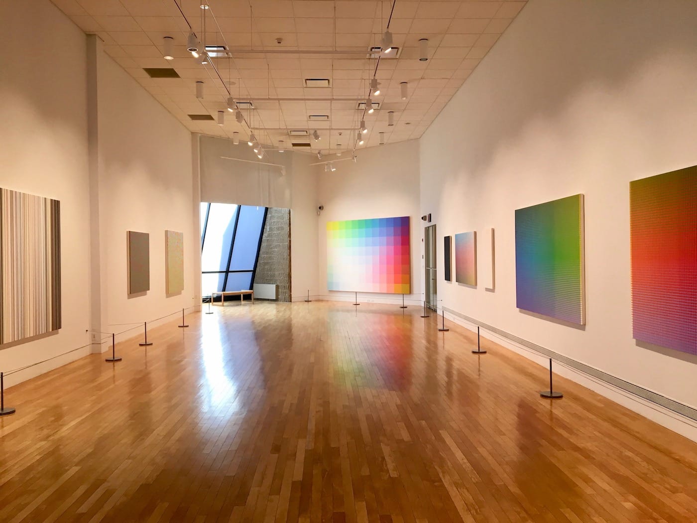
The current show, curated by Mary Birmingham at the Visual Arts Center of New Jersey, is a big, beautiful step in that direction. The exhibition is presented in two parts, paintings on canvas in the main gallery and works on paper in an auxiliary space. The unconventional, boat-like layout of the main gallery, with angled walls on the far end from the entranceway, pairs a large, canted window covered in frosted, translucent film with Robert Swain’s grid painting “Untitled, 8 x 12 – Green” (2017) — an appropriate match, given the number of instances in which light seems to emanate from the paintings themselves.
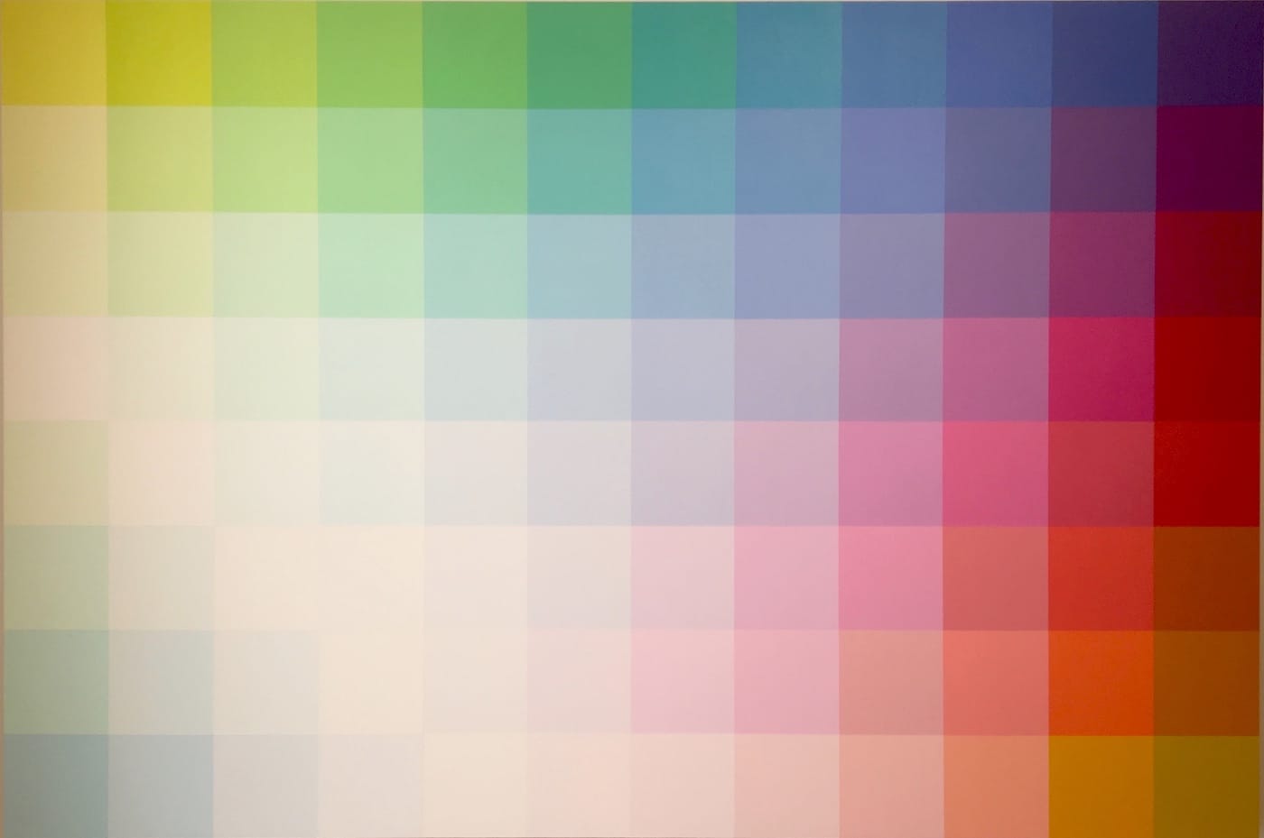
“Untitled, 8 x 12 – Green,” according to Birmingham, was made for the exhibition, and fits perfectly within its allotted space. Reflecting the artist’s procedural approach to imagery, the title informs us that he is using an 8-by-12 grid, and that the first cell, in the top left corner, is painted lime green. The interaction of color from row to row and column to column is dazzling in its complexity, as green squares leach yellow in an incremental march toward cobalt and plush violet, and violet turns coppery red on its way to yellow ocher, the last cell on the bottom right.
Others desaturate and fade ineluctably to white, or regenerate as bright pastels. Along the bottom row, a square of sky blue seems to travel through the clouds to the earth, albeit horizontally, as it turns white, sandstone, and finally yellow ocher. From across the room, the painting comes off as a giant color chart (each cell of the grid is a foot square) — another way that it sets the tone for the show — but soon you begin to realize how lyrical and quirky it is.
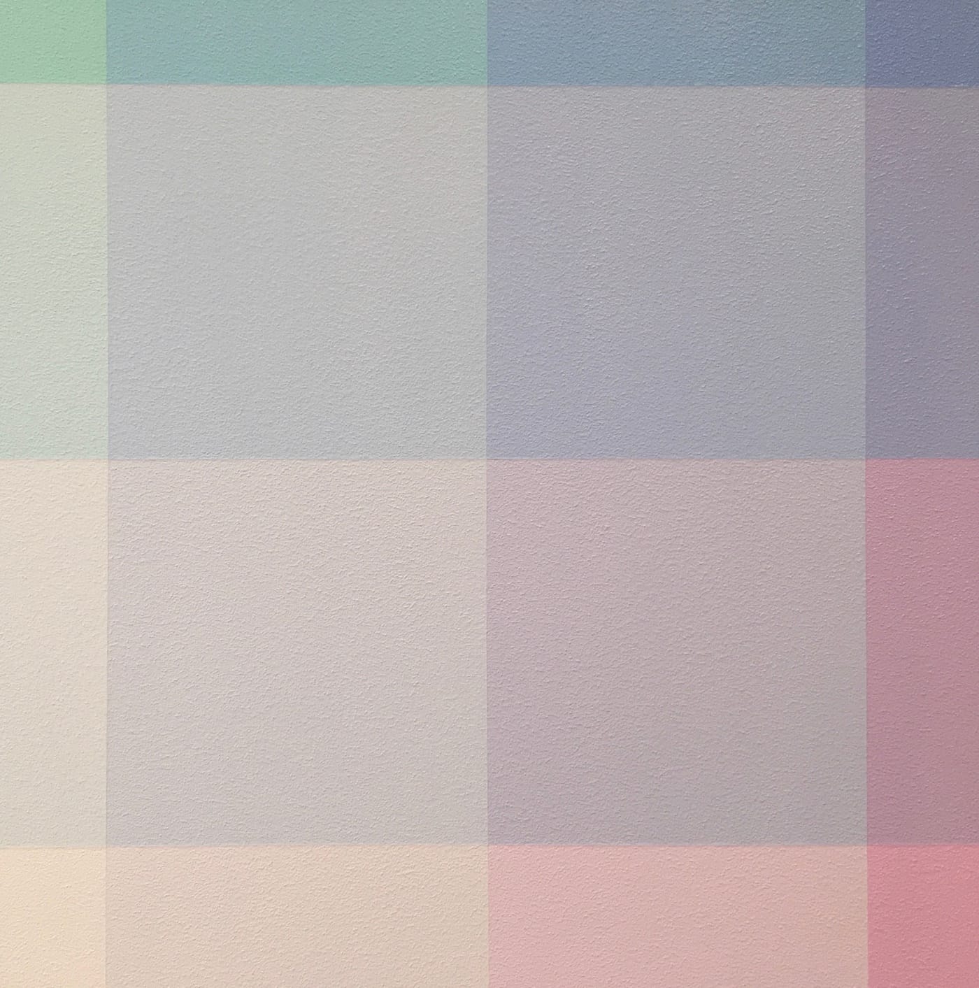
Even more fascinating is what it does to your brain: standing six or eight feet away, I was all but convinced that the color in each of the cells was gradient, with a left-right shift from dark to light, which also caused the squares to appear concave. Only after moving within a foot of the surface could I attest that the cells were flatly painted, and that the optical bleed was a Doppler effect, which became even more pronounced in other ways the closer I got — such as the shimmering, sharply desaturated patches at the border between two colors. I was also able to discern the hair’s breadth of raised paint that forms a sliver of a wall where the edges of the cells meet — a virtuosic move any way you cut it.
In his essay for the show’s catalogue, Matthew Deleget, the co-director of Minus Space, which represents all three artists, writes, “At its core, color is a three-dimensional problem. Each painting in this exhibition began as an investigation into color’s three distinct attributes: hue (a single, pure color), value (the lightness or darkness of a color), and saturation (the relative purity or intensity of a color).”
Color is also a three-dimensional problem in its ability to create space, as demonstrated by the seemingly concave cells of Swain’s grid. His other two works in the show, “Untitled, 3-15-8/17-15-5/29-15-7” (2011) and “Untitled, 3-23-6/13-23-7/27-23-7” (2012), constitute an abrupt departure from “Untitled, 8 x 12 – Green,” in that each painting is composed of three colors laid down in camouflage-like, free-floating brushstrokes ranging from sinuous, overlapping curls to buzzing clusters of tiny dabs.
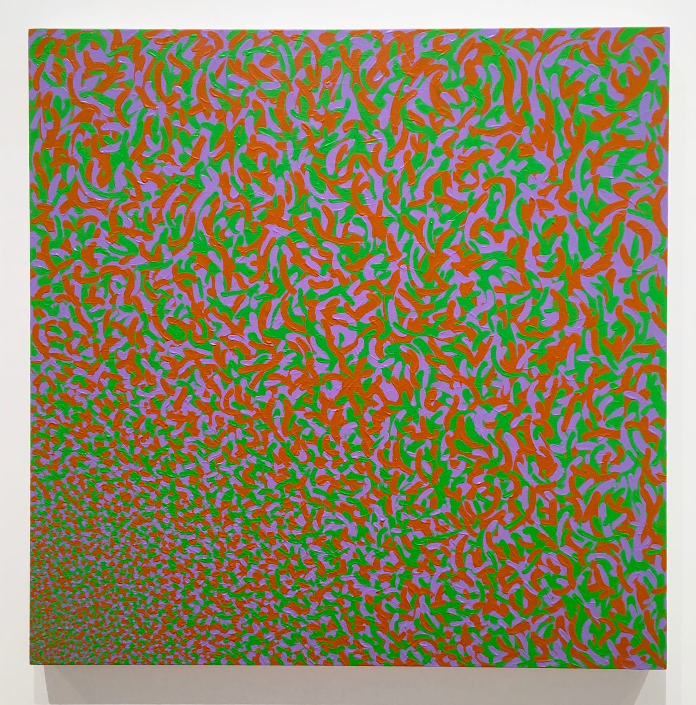
Because the colors he uses in these “brushstroke paintings,” as he terms them, are of equivalent intensity, they appear to advance in front of the surface or recede behind it, depending on which one you fix in your focus. At the same time, the progression from large strokes to small — in both canvases the marks diminish in size as they squeeze into the bottom left corner — creates a perspectival illusion that clashes with the insistent two-dimensionality of the color patterns, further ramping up the surface tension.
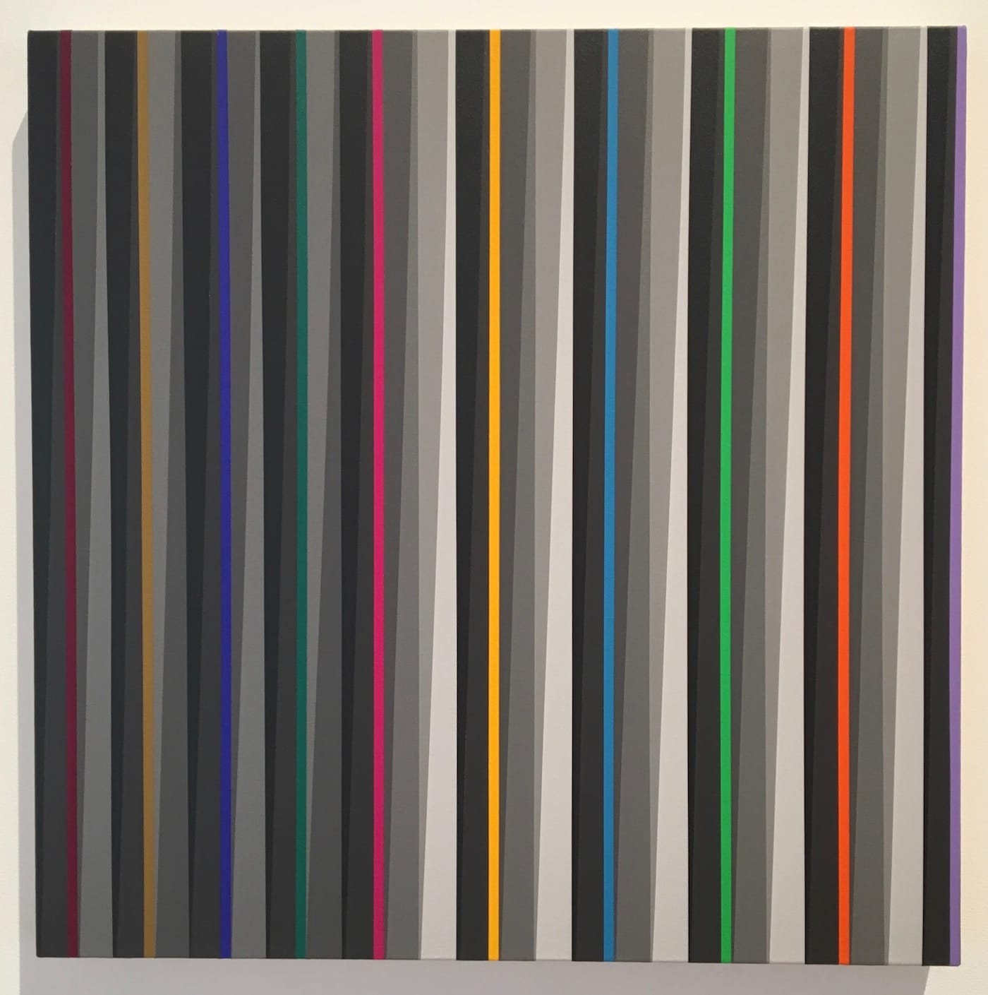
A similar surface tension, created by very different means and to a very different effect, pervades the paintings of Gabriele Evertz, which are composed of thin vertical bands and narrow, tapered bars contained within a horizontal format. In a review of the group exhibition Breaking Pattern at Minus Space, I described Evertz’s “Grays and Metallics (Aedicula), The Black Room Series” (2014) as:
[…] a series of vertical stripes arranged in what appear to be two layers, one achromatic, with varying shades of gray, white and black acrylic, and the other chromatic, in gold, silver and brass-colored metallic paint. The dark-to-light-to-dark progression of the acrylic stripes become an illusionistic grille, as the metallic paint, laid out in thin lines, floats on top.
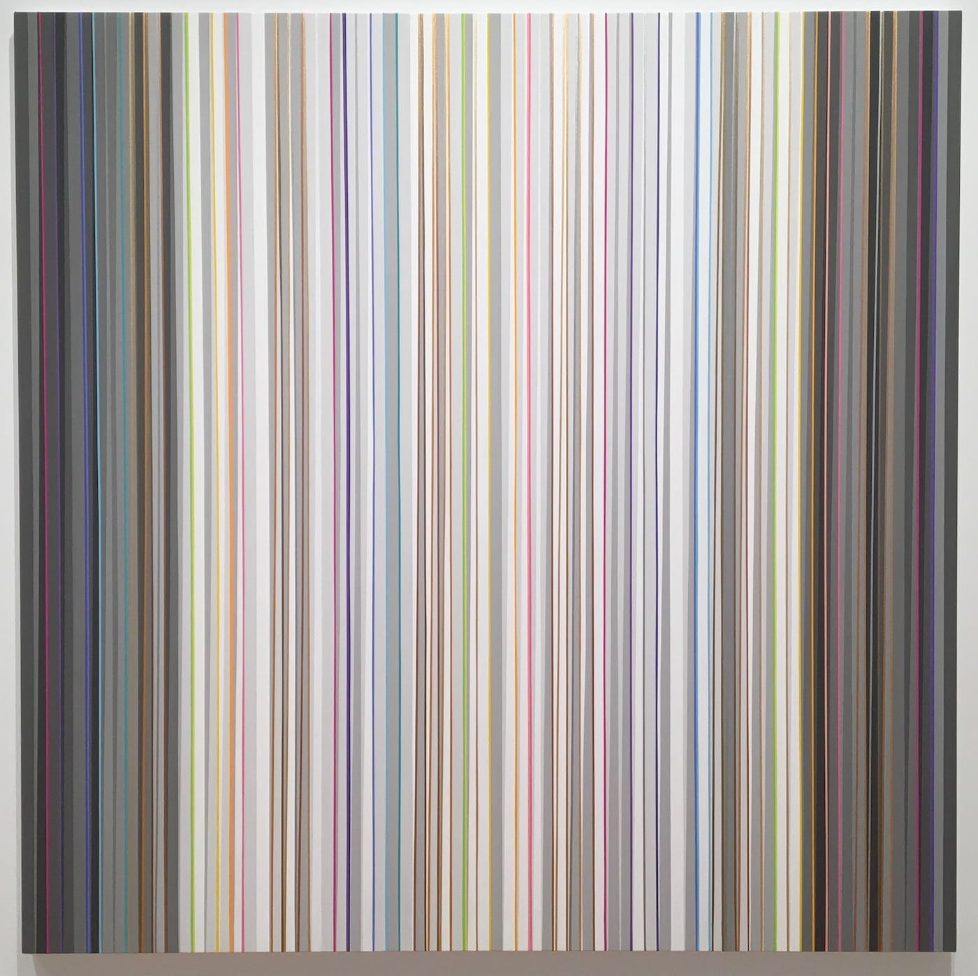
There are three paintings by Evertz here, and one of them, “Messenger” (2012), like “Grays and Metallics (Aedicula),” includes an achromatic layer of tapered bars, but instead of brass, silver, and gold, the thin vertical bands are shades of magenta, deep yellow, soft blue, bright green, orange, and violet. In a shift toward illusionism, a curtain seems to have been drawn across the left third of the painting, plunging the achromatic substrate as well as the brightly colored bands into deep shadow, leaving you to wonder whether the messenger of the picture’s title brings good tidings or ill.
With the more recent “Clearing / Lichtung” and “WhiteLight” (both 2017), as the titles imply, that curtain has been parted. The blacks and darker shades of gray have been pushed to the sides, leaving the whites and light grays of the substrate glimmering in the center. The thin metallic bands have returned, along with sober (but not somber) color counterparts — earth tones and navy blues — with the occasional pink or chartreuse thrown in like a dash of chili powder.
Curator Birmingham has written a catalogue essay in which she compares the work of the three painters to examples out of Western art history. In Evertz’s case, the connection is more direct: the artist specifically based “Clearing / Lichtung” and “WhiteLight” on an unusually Rococo painting by Anthony van Dyck in the National Gallery of Art, Washington, DC — “The Virgin as Intercessor” (1628/1629). The silvery white gown worn by the Virgin, who occupies the center of Van Dyck’s vertical canvas, has been dematerialized into Evertz’s glowing central shaft. As Birmingham notes, the composition’s “ratio of lights to darks [in Evertz’s versions] creates a kind of aperture that makes the gray fall away and allows the light to come forward, appearing even brighter, more expansive, and more luminous.”
Where Swain’s “brushstroke paintings” create surface tension out of competing intensities of color and the perspectival warping of the picture plane, Evertz’s bands and bars defy the expectations of a Gene Davis-style flatness (or near-flatness) that her geometry would imply. Instead, she pushes her whites in front of the grays and blacks, and coaxes her colored bands to the fore of the expanse opened up by the whites. The resulting volume of space is deeply engaging, offering a startling sense of clarity that echoes the Renaissance ideal of painting as a window into infinity.
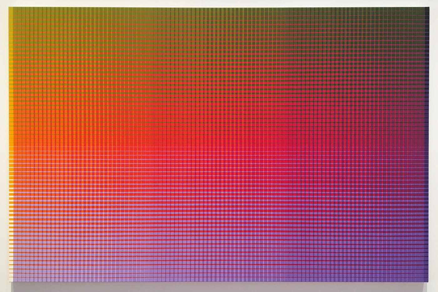
In her essay, Birmingham draws connections to Swain’s “brushstroke paintings” from Georges Seurat’s pointillism and Claude Monet’s serial haystacks and cathedrals, and in her section on Sanford Wurmfeld, she cites a 2015 exhibition, Past Present: Conversations Across Time, at the Allentown Art Museum in Allentown, Pennsylvania, in which “the curators invited Wurmfeld to create a new work in dialogue with Canaletto’s View of Piazza San Marco, Venice (1740-46),” a pairing that reflected Wurmfeld’s fascination with panoramic painting (see Yau’s review of the artist’s viewer-enveloping cycloramas, exhibited at the Neuberger Museum of Art, Purchase, New York, in 2009).
With regard to Wurmfeld’s “Canaletto Variations, #6, II-15 + B/2” (2014), one of the five paintings he contributed to Radiant Energy, Birmingham writes:
Inspired by the primary color palette (red, yellow, and blue) of the Canaletto, Wurmfeld arranges the hues chromatically on overlapping grids, a compositional structure he has employed since the mid-1980s. There is a gradation of color as the lines expand and contract horizontally and vertically, causing one hue to transition into another across an expansive field—almost like a moiré pattern. The effect is that of a luminous chromatic veil floating just above the surface of the painting, shimmering like Venetian light.
What is astonishing about these paintings is the degree to which such a highly structured color system can feel like a throbbing mist or a visceral splash. Mounted across a long wall flanking Swain’s “Untitled, 8 x 12 – Green,” the “Canaletto Variations,” in concert with the companion paintings “II – 18 + B:2 (YOY-VRV:Ys + Vt)” and “II – 18 + B:2 (YGY-VBV:Ys + Vt)” (both 2016), create an episodic panorama — three horizontal formats interrupted by two vertical canvases — that seems lit from within, vibrating under your gaze.
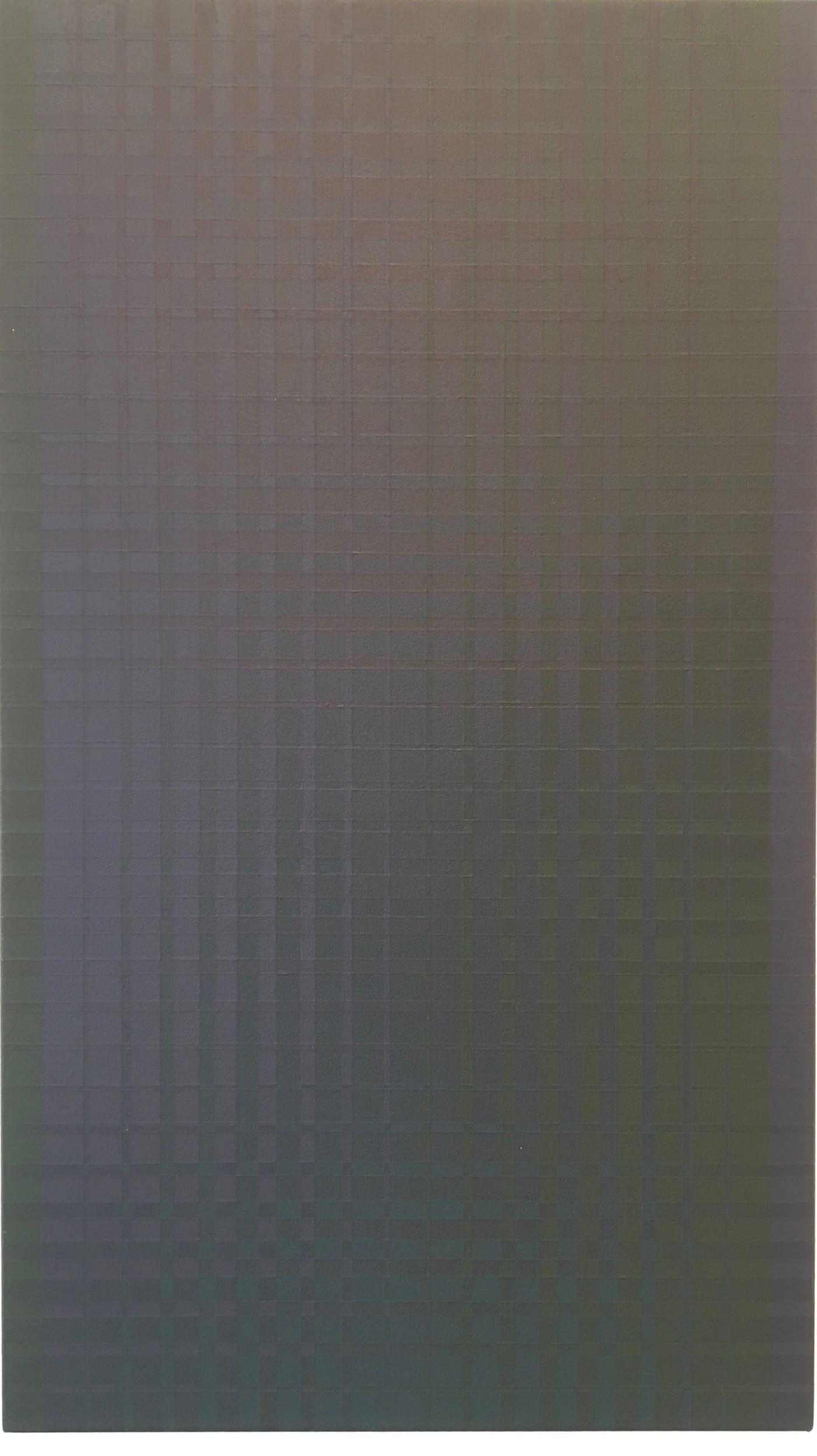
The two vertical paintings, “II – 15 #1 (Dk) (RO-BG)” (2010) and “II – 15 #1 (Lt) (RO-BG)” (2011), depart from the intense chroma of Wurmfeld’s other canvases (and the assumption that color equals bright, saturated pigment), treating black and white, their dominant hues, as rich subjects for investigation. Each are structured as grids, but not as meticulously overlapping patterns of color; instead, the cells beneath the all-white matrix of “II – 15 #1 (Lt) (RO-BG)” are tinged pale yellow or pink, while the all-black “II – 15 #1 (Dk) (RO-BG)” seethes with Stygian greens and violets, barely discernible but no less apocalyptic, Ad Reinhardt communing with Hieronymus Bosch.
That Wurmfeld’s paintings can bring to mind Bosch or Canaletto or Bonnard, whose swaths of white light feel connected to the white, pink, and yellow “II – 15 #1 (Lt) (RO-BG),” is a measure of their emotional pull and historical density — a sublime paradox enjoyed by these three artists and many of their cohort, whose investigations of color can, on paper, seem coolly analytical and divorced from hallowed pictorial traditions. Evertz, Swain, and Wurmfeld have invented their own admittedly hermetic interrogatory systems (borne out by their coded titles), yet the deeper they burrow into them, the fresher the air they breathe.
Radiant Energy continues at the Visual Arts Center of New Jersey (68 Elm Street, Summit, New Jersey) through May 13.