Scott Stack Rethinks the Rules of Op Art
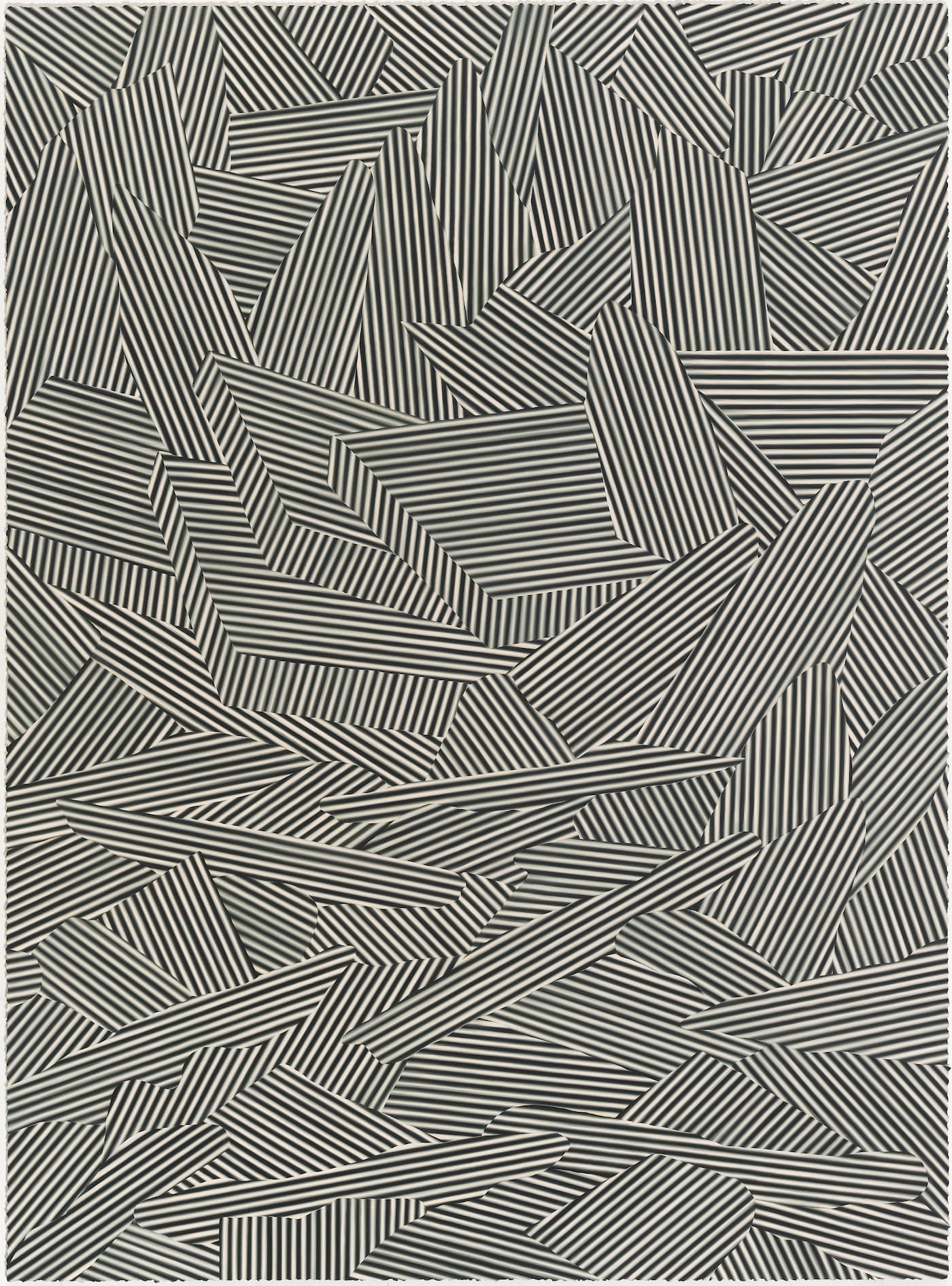
A number of Stack’s paintings look as if a storm swept through the repetitive patterns of Op Art, breaking them into shards.

CHICAGO — The roots of modern art go back to the rise of Impressionism and the simultaneous study of the law of optics in the late 19th century. The key figure in the merging of art and science, painting and optics, was Georges Seurat, who became the leader of a movement that Félix Féneon dubbed “Neo-Impressionism.” The use of pure, unblended color became a cornerstone of art devoted to optical effects; this is what is common to the work of Seurat, Josef Albers, Richard Anuszkiewicz, Sanford Wurmfeld, Gabriele Evertz, and Robert Swain.
Many consider that Op Art reached its apogee in the “swinging” 1960s, when the British painter Bridget Riley caught the attention of both the art world and fashion industry with graphically bold black-and-white paintings. The fashion industry’s appropriation of Op Art helped lead to its demise, which was further underscored by the widespread conclusion that painting was used up. This led to the 1970s, a decade dominated by Conceptual Art. In the 1980s, Ross Bleckner briefly reclaimed the easily mimicked, debased style of Op Art by making striped paintings with blurred edges, but never went on to further explore the possibilities of blurring. For him, Op was a hard-edged, non-painterly style to be consumed and dispensed with.
But the 1980s and the return of painting happened more than 30 years ago, and Bleckner is a period artist at best. One of the only artists of that period to have gotten something from Op Art is Philip Taaffe. Otherwise, Op has been largely marginalized or ignored (as seen with the Hunter Color School). However, if recent exhibitions are any indication, something is astir in our awareness of Op Art. More attention is being paid individually and collectively to the painters associated with the Hunter Color School, which is long overdue and good thing. Equally important is the thorough rethinking of the rigid rules associated with Op Art, most notably by Anoka Faruqee, whose show at Koenig & Clinton I reviewed in April 2017, and Scott Stack, whose work I first saw in the exhibition Scott Stack: Interior and Exterior at the Chicago Cultural Center (February 10 – August 5, 2018), curated by Greg Lunceford. A catalog with an essay by fellow painter Matthew Girson accompanies the show.
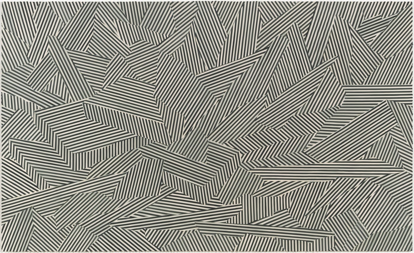
There are 12 paintings in the exhibition, most of them large. Stack’s vocabulary consists of striped planes arranged at jagged angles to each other, and open and closed solids. Stack’s use of blending shifts the paintings out of the graphic domain into the painterly. The edges are not hard and the forms are not rigid.
One of the unspoken cardinal rules of Op Art that Stack breaks is symmetry. A number of his compositions disregard symmetry altogether. Dumbly put, it is as if a storm swept through the repetitive patterns we associate with Op Art, breaking the bands into shards. Perhaps that is why the artist has titled three of the paintings included in the exhibition “Ice” (2014, 2015, and 2016) and numbered them sequentially. The title connects them to Caspar David Friedrich’s painting, “The Sea of Ice” (1823-24), which is also known as “The Wreck of Hope.” Stuck in the ice, a ship has been crushed by the floes, which rise up into the air in the painting’s middle ground. The ship’s splintered timbers are visible in the foreground, while in the background we see sky and more ice.
Set at multiple angles to each other, Stack’s sections of parallel bands vary in size, some large and others small. The painting oscillates between flat sections cleanly fitted together, like a jigsaw puzzle, and angular abstract forms jammed into packs, like crushing ice floes. The latter, abutting forms can be read as three-dimensional abstract entities — large shards of ice. The palette of dark green and pale, pinkish white conveys the scene’s bleakness. In the “Ice” paintings, Stack deconstructs the code for landscape so that it can absorb his version of Op Art. He has literally and figuratively broken up Op’s dependence on rigid forms in order to reconfigure them, push them into new territory. He is trying to salvage its forms from the ice of history.
The allusion to Friedrich’s painting introduces another current of meaning. Is painting, like the ship called Hope, stuck in an impossible situation? At the same time, Stack seems to be deploying the forms in a way that echoes our codification of landscape — foreground, middle ground, and background.
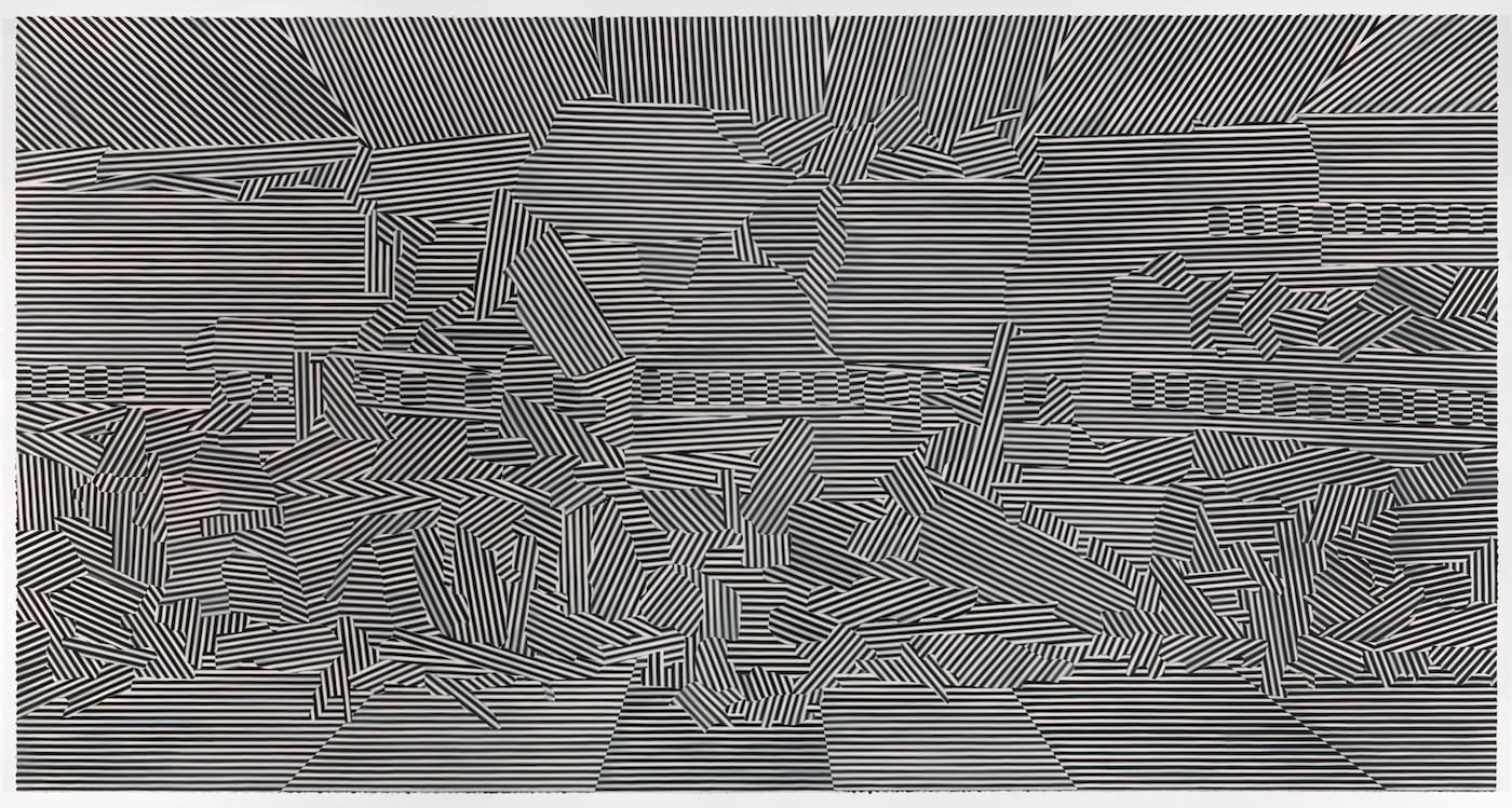
The forms situated along the bottom of the painting invite us into the work. In “Air 4” (2017), which is done in a panoramic format, like the ones Frederick Church often employed, I kept thinking I was looking at a pile of fuselages, as you might see in an airplane graveyard.
The inward-tilting parallelograms along the painting’s bottom edge become the entranceway into its cacophonous and contradictory spatiality. Pressing against the picture plane, a series of forms comprised of vertically aligned stripes extend down from painting’s top edge until they collide with distinct forms of horizontally arranged stripes. These sections suggest a sky we cannot peer into, a flattening of space. By defining the planes along the bottom edge as parallelograms, and the ones along the top as interlocking flat shapes pressing against the picture plane, Stack both echoes and contradicts compositional devices used to establish a landscape.
Meanwhile, in more or less the middle of the painting, single rows of vertical, lozenge-like shapes, their horizontal stripes alternating with the narrow band of stripes they are set against, can be read as the windows of a passenger plane. We cannot see through these windows, and they cannot be seen out of, ether. The stripes are like shutters sealing everything tight. This is what you see from afar. Move closer, and you see that Stack has been careful but unfussy in the painting of each band. The dark green becomes lighter toward the outer edges, while the pale pink ground darkens or lightens ever so slightly as one’s attention roams over the painting’s surface.
It seems to me that in the paintings collectively titled “Ice” and the one titled “Air,” Stack’s reconfigurations and blending push Op Art in an unexpected direction — toward what could be called a throttled landscape. Stack’s paintings are visual analogies of the state of painting: simultaneously stuck and moving forward.
Stack’s use of blending and his underscoring of paint’s materiality — which we see in the uneven edges of paint extending beyond the canvas support — connects him to Anoka Faruquee. Both artists never deny the materiality of paint in favor of the luminous, as many of their predecessors did. For them, matter and light are inseparable. Do artists working in separate cities constitute a movement? Stack and Faruqee’s revitalization of a discredited current of painting should put everyone on notice; nothing is ever exhausted or dead. There is always someone who will do something unexpected with whatever they’ve got.
Scott Stack: Interior and Exterior continues at the Chicago Cultural Center (Chicago Rooms, 2nd Floor North, 78 East Washington Street, Chicago, Illinois) through August 5.