Terry Winters's Inspired Rejections
Winters’s painting technique argues against gestural abstraction’s sweeping structures and minimalism’s solid-color surfaces.

Last week I reviewed Terry Winters: Facts and Fictions at The Drawing Center. I felt that I would be remiss if I did not also write about Terry Winters: 12twelvepaintings at Matthew Marks. The reason for writing about both exhibitions is the strong connection Winters makes between drawing and painting. As the gallery’s press release points out, the 12 paintings:
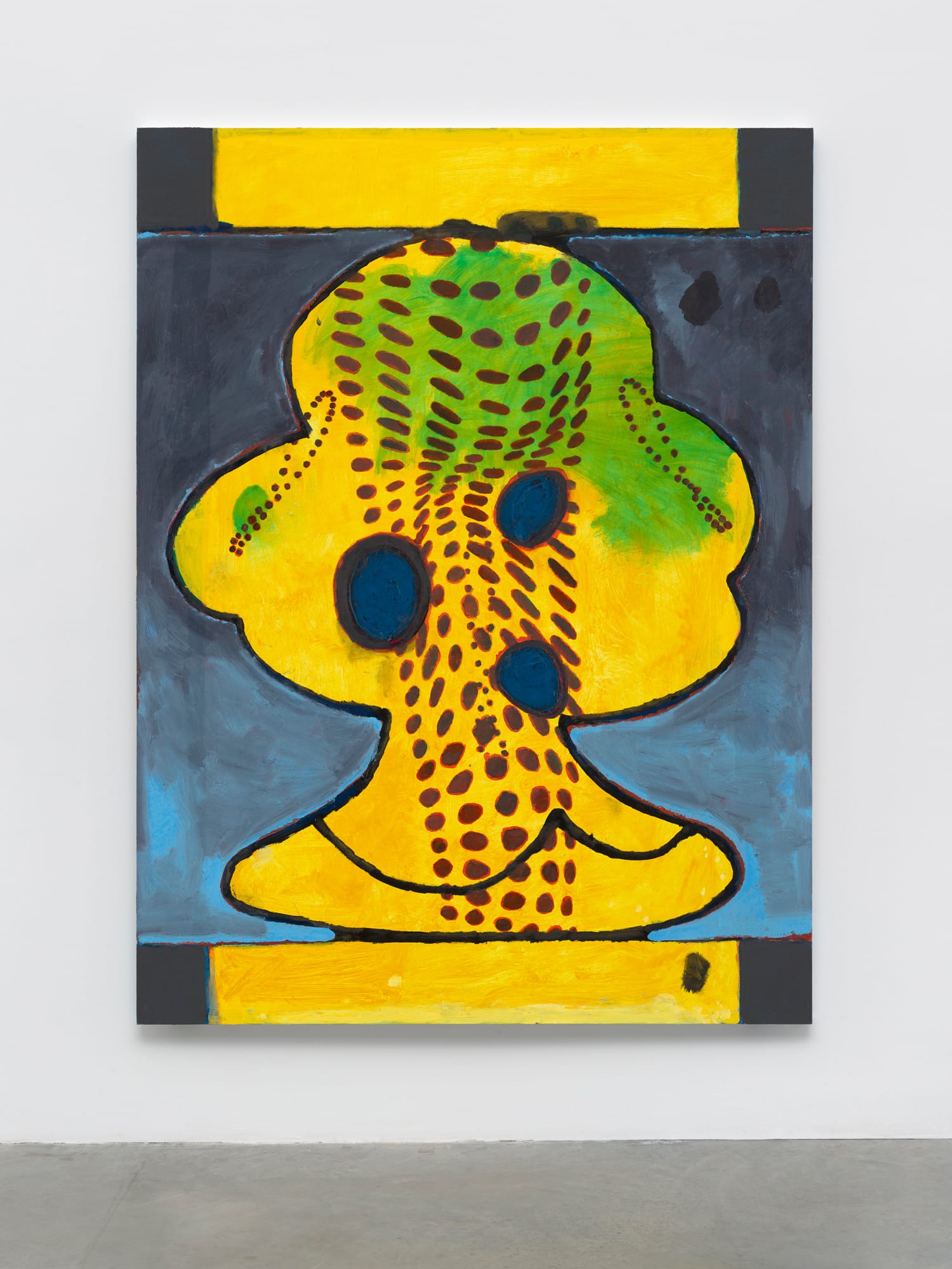
[were] completed in 2017. Each is five feet wide and almost seven feet tall and has been built up in layers of oil, wax, and resin. Winters begins each painting as a drawing, or a composite of drawings. The drawings themselves incorporate and modify found imagery, which is largely technical in nature.
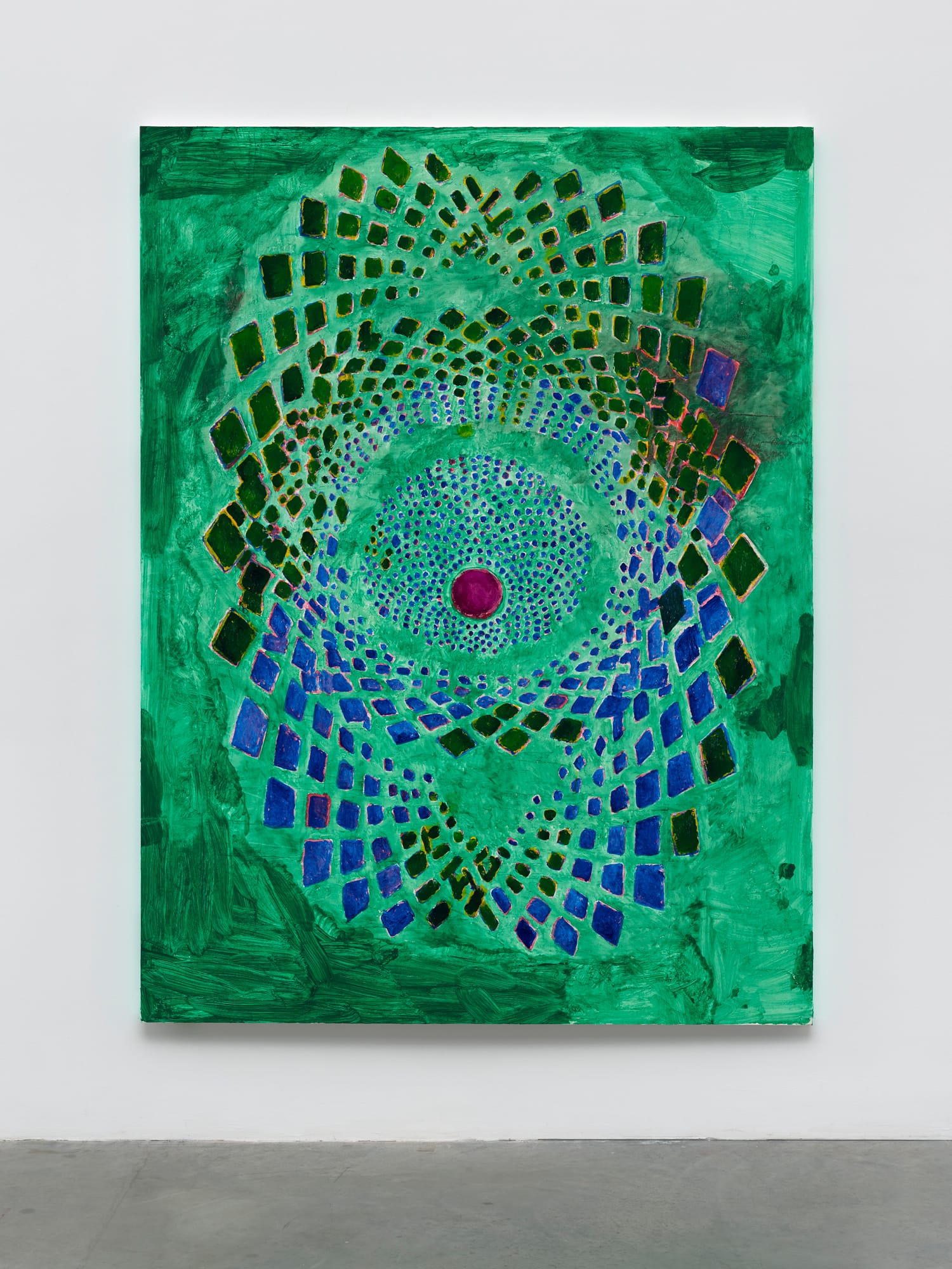
Knots, EKG charts and thermal imaging are among the representations and diagrams that have inspired him. For years, he has had an interest in tessellation, which connects to artifice and nature, tiling in Islamic art and the hexagonal cells found in honeycombs. If one strength of painting is to absorb the possibilities attained by science and technology, especially when it comes to seeing, Winters extends and broadens that strain, which dates back to Georges Seurat and his knowledge of optics.
By utilizing topological diagrams which often consist of many small abstract sections that, together, compose a pattern, multifaceted shape, or grid-like structure, Winters is able to focus his attention on two compositional formats central to abstract art: the centrally located shape and the all-over grid. The point is not to re-work or parody these conventional compositional formats, but to push their possibilities into new territories that have little to do with style or fashion. He seems to want to effect change through his attention to the smallest components of a shape or grid.
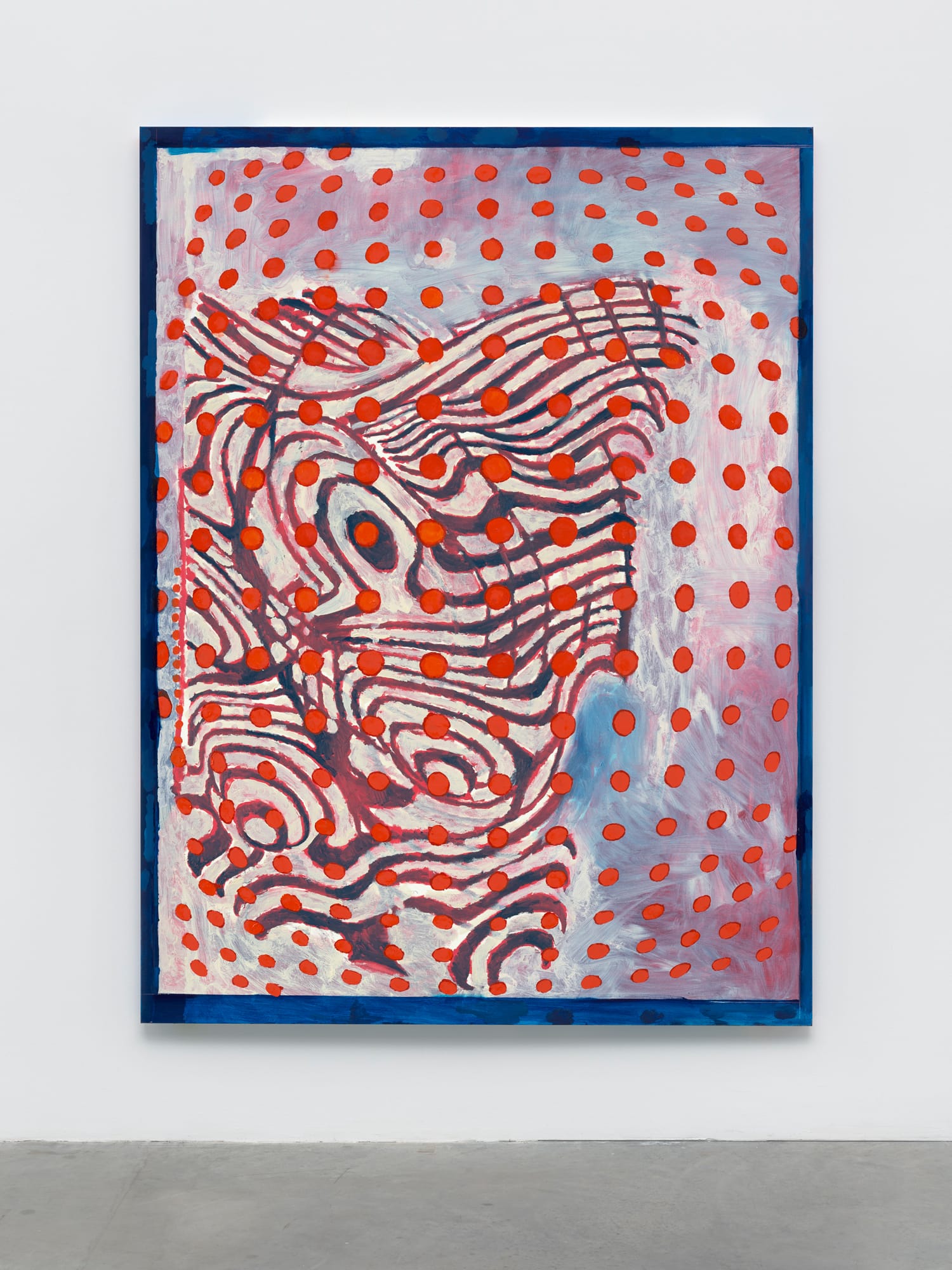
At the same time, the wavy lines in “Wave” reminded me that Winters does something unexpected in his paintings: he seldom makes a continuous, fluid line. In that sense, his art is not smoothly elegant. Rather, he often renders a line in sections, depicting a kind of scratchy movement that adds a feathery edge to his linear elements. This can be read as a sign of his hesitation or as his commitment to slow everything down and develop a painting part by part. I think it is the latter, which is interesting because this incremental manner of composition runs counter to the history of American postwar abstraction, starting with the Abstract Expressionists, with Jackson Pollock’s poured paintings being the one exception.
While Winters is not a naturally gifted painter, such as Willem de Kooning, he refuses to take the easy road. He neither avoids doing what is difficult for him nor turns his clunkiness into a signature style. His dedication is admirable, especially since everything he attains in his paintings is hard won.
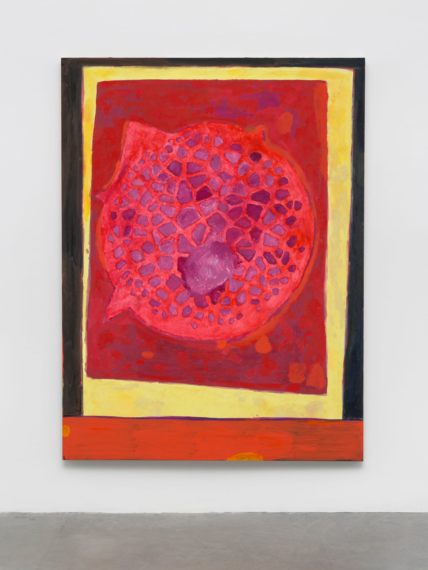
It seems to me that Winters’s interest in multifaceted structures, as in the cell in the largely red painting “Cell,” reveals a proclivity for forms that are atomized or in a state of change. The torqued structures and shapes he begins with are already undergoing pressure and transformation; nothing is static or secure. The layered process he uses to arrive at the final painting allows him to make various sets of decisions about the separate shapes within the overall form; he can move through the form slowly, changing things along the way.
Winters’s painting technique argues against gestural abstraction’s sweeping structures and minimalism’s solid-color surfaces. He seeks to shift our attention away from these by-now-commonplace ways of seeing into a new kind of concentration. So while the grids and centrally located shapes might strike us as familiar modes, his attempt to undo and interfere with them is fresh. His paintings often display a constant tension between the individual shapes and the overall configuration; this causes one’s attention to keep shifting in attempt to process divergent kinds of visual data. By adding visual information from another source, he complicates the tension. The artist seems to deliberately refuse to arrive at a unified resolution in his work: he wants to keep the visual situation complicated, but not unnecessarily so — which is a hard feat to pull off.
At times, Winters appears to fill in a small outlined circle with one color and then change his mind and cover it over with another. This can result in a halation effect, as in the red outline around cobalt blue shapes in “Cobalt.” Recognizing that everything that has been done in painting is available to him — from the optical to smudges — he includes it all in his work without resorting to parody, citation, or irony.
Winters is not interested in covering his tracks, which connects him to certain aspects of Abstract Expressionism. The surfaces run from matte to shiny, from thin, transparent layers to brushy surfaces. We see earlier forms peeking through the color, as well as splotches of paint dispersed across the surface. The swirling configuration of the parts is underscored by color choices, which enhance, alter and interrupt the sense of movement implied by the orientation of the shapes. The layered process involves three different materials: oil paint, wax, and resin. Each has its own materiality. His surfaces are neither smooth nor impasto. He has left the process of applying paint open to scrutiny, from the paint brushed in to fill an outlined shape to the layers of thinly applied, transparent colors.
The layering also enables Winters to bring together different sources, to compress two or more different diagrams. Instead of merging into a single, readable form, the layers interfere with each other. This interference becomes one of the hubs of our attention. We try to untangle what cannot be unraveled. He rejects the idea that a painting should be seen all at once (or what Frank Stella famously characterized as “what you see is what you see”). I think this rejection is both aesthetic and ethical: he knows that such seeing betrays the complexity of modern life. His layered process never adds up to a holistic image that can be easily absorbed.
At the same time, Winters’s paintings are not a record of their coming into being, as postwar gestural paintings have often been described; I would go so far as to say that his paintings are not gestural, nor do they describe their coming into being. They are layered groupings of fragments, each of which possesses its own identity.
While the artist has pursued this complexity of seeing through his incorporation of scientific diagrams and models, he has become a masterful colorist. This certainly wasn’t the case when he started out. He has moved from a near-monochrome palette consisting of earth tones, blacks, and oranges, which dominated his works of the 1980s, to a palette of colors and hues that changes from painting to painting. Some paintings in this exhibition work tonally (“Viridian”), while others work by contrast (“Figure”). Between the 1980s and today, there were times I felt that Winters was learning about color in public, that he was not afraid of showing paintings that worked by graphic contrast rather than something more subtle.
Winters’s use of different models and diverse strata is the opposite of reductive painting, Color Field painting, Pop Art, and Conceptual Art, which dominated the art world for many decades. Although he began exhibiting in the 1980s, he shares little with his Neo-Expressionist counterparts, many of whom, like Jim Dine and Lucas Samaras, have devolved into period artists. What most struck me about the current exhibition are the singular places into which he was able to push his strongest paintings. In his manipulation of faceted forms and grids, he reminds us that Stella was wrong to advance that something in painting could be used up. The fact is that nothing gets used up, at least in art.
I am reminded of something that Thomas Nozkowski said to me in an interview that appeared in The Brooklyn Rail in November 2010:
Improvisation […] is essential to my work. I want my ideas to be located at the tip of my brush. I want my materials to talk back to me. I want to be surprised.
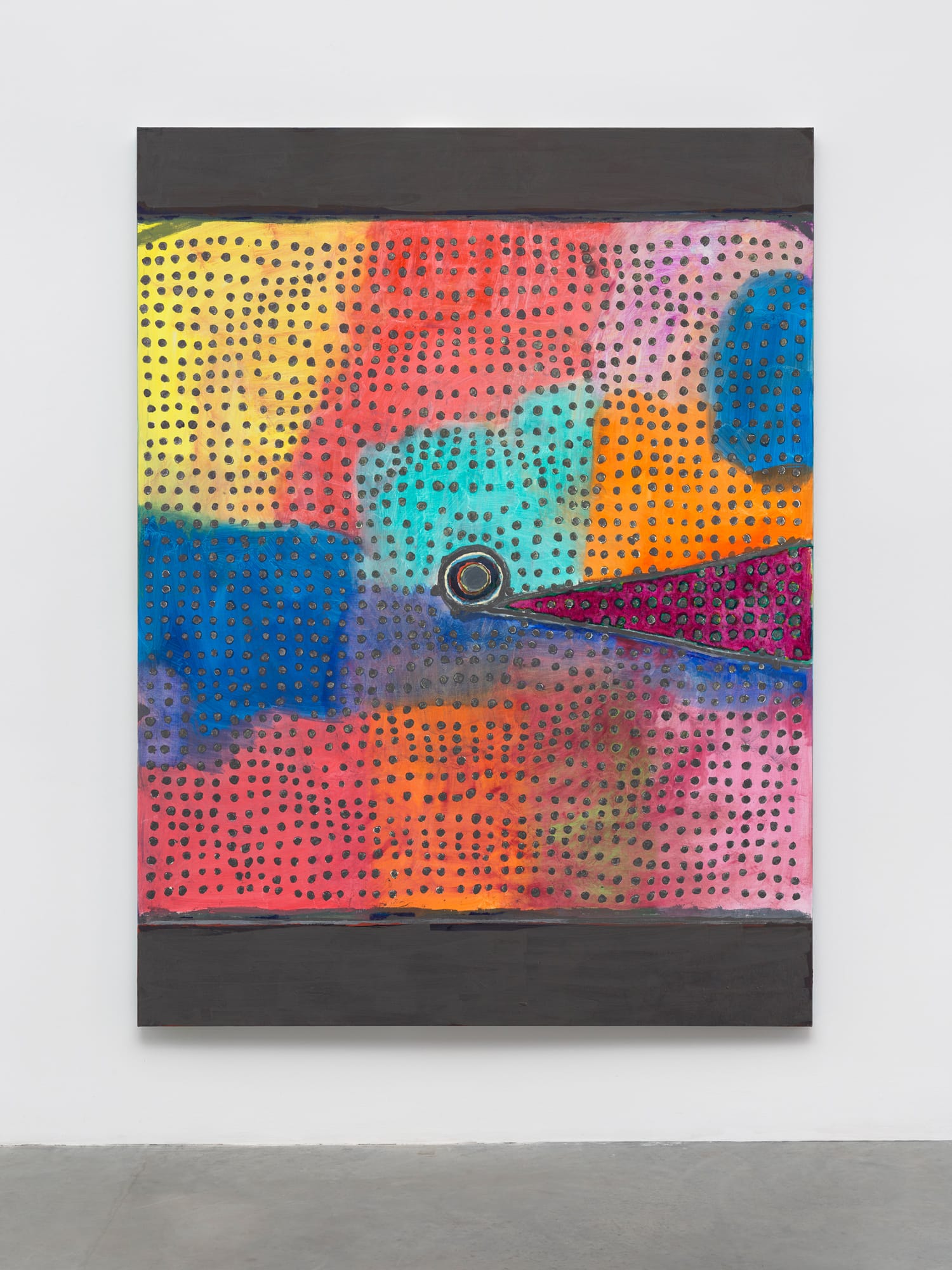
The desire for surprise runs through the strongest paintings in this exhibition. You get the feeling that the brownish-red shape in “Cinnabar” is going to change or the bulging grid of red circles in “Frame” is going to burst through the picture plane. This sense of a world undergoing constant change is a central feature of this work. How we might understand this vision without it becoming simplistic or reductive is just one of the reasons I keep looking at and thinking about Winters’s art.
Terry Winters: 12twelvepaintings continues at Matthew Marks (523 W. 24th Street, Chelsea, Manhattan) through June 16.


