The True Collaborative Power Between Artist and Curator
You can approach each work in this show as individual, but the really charming and kinetic action happens in the interactions.
DETROIT — Color-themed exhibitions often indicate a sense of slapdash or uninspired curatorial practice, which is why it was surprising to hear that Wasserman Projects was mounting Color-Aid for its summer program. Director Alison Wong, an artist in her own right, has never been known to phone it in, so the real question was: How can you make a show based on color really nuanced? To say that color is fundamental to the work of an artist is a little bit like saying that oxygen is fundamental to a breathing human being. Though color is not always the primary focus of a given work, it is a little bit difficult to avoid if your work appears within the range of normal-spectrum vision.
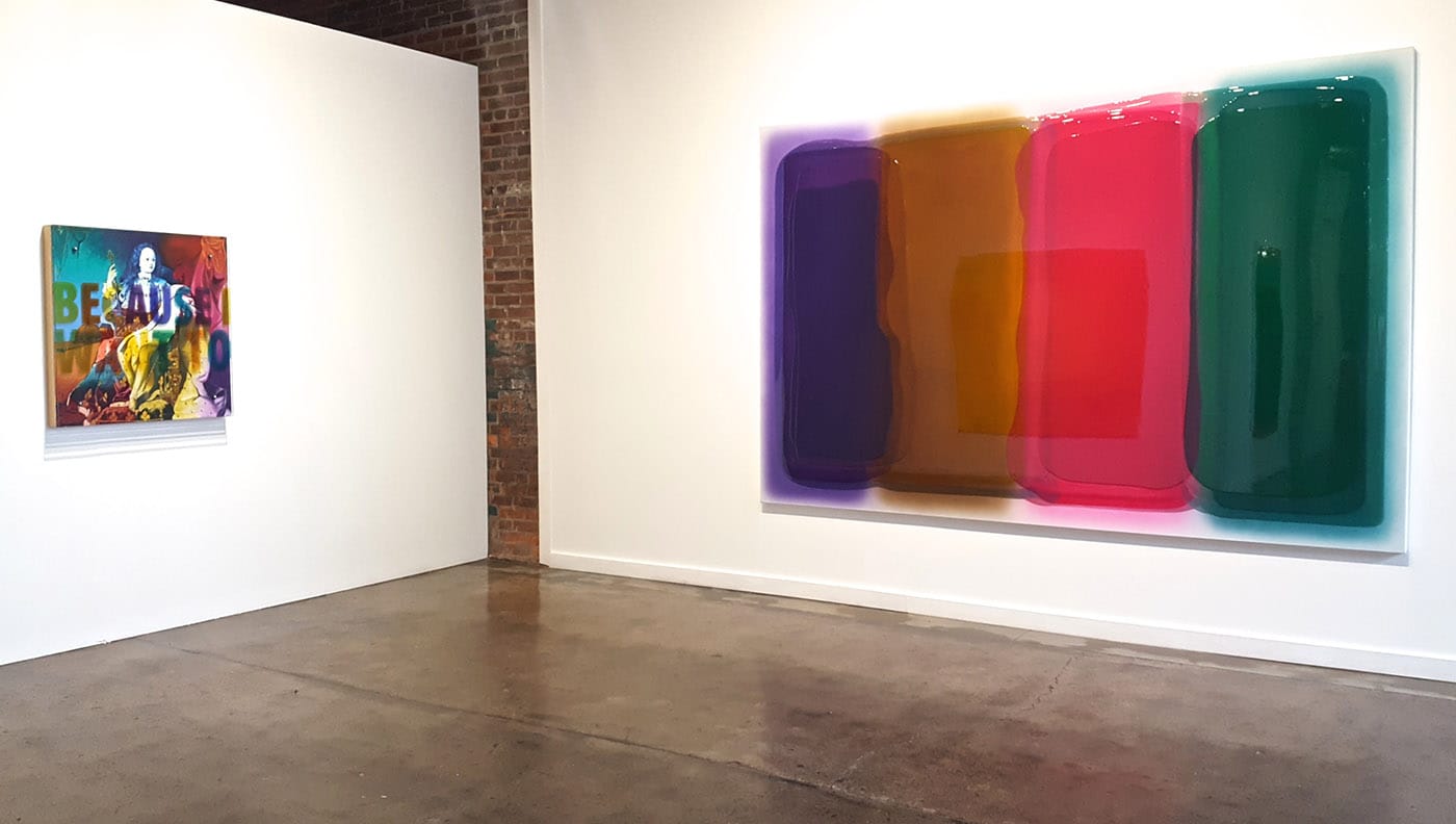
Color-Aid allows itself one gimmie on the color front, and these are the poured-resin canvasses of Cologne-based artist Peter Zimmermann. These works are comprised almost exclusively of vibrant, high-gloss color fields, achieved by pouring deeply hued resin in sharply defined and overlapping fields. The resulting compositions are, of course, anchored in the interplay of color, but equally convey engaging gesture, shape, and surface. I have long held to the theory that one of the benefits of being a curator is the opportunity to lick canvasses when no one else is around, and the candy finish on these works by Zimmermann would make the temptation almost irresistible for me (thankfully I’m not a curator).
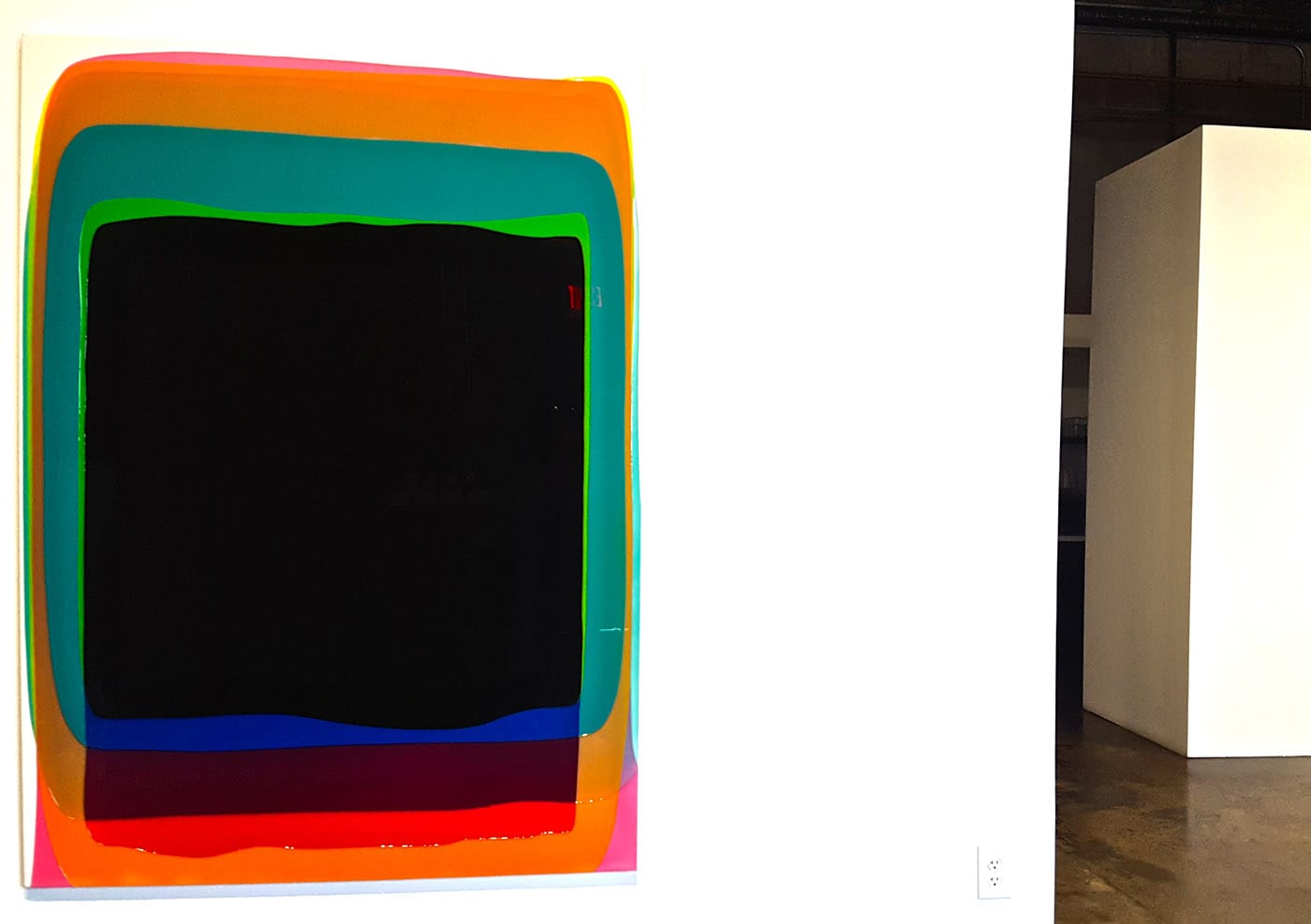
But even beyond the dynamic formal qualities of Zimmermann’s works, there is a conceptual element sometimes elusive to color-focused work. Greeting visitors is “black gate” (2017), a large canvas that features slightly irregular, telescoping rectangles of color. Around the edges, it is clear that the palette resembles the brilliant fluid inside glow sticks: orange, pink, teal, neon green. But the canvas is dominated by the middle ground where all these individual washes have overlapped to create an almost pure-black, highly reflective surface. Any viewer who might approach this as a field of color will find themselves gazing at their own visage in a dark mirror.
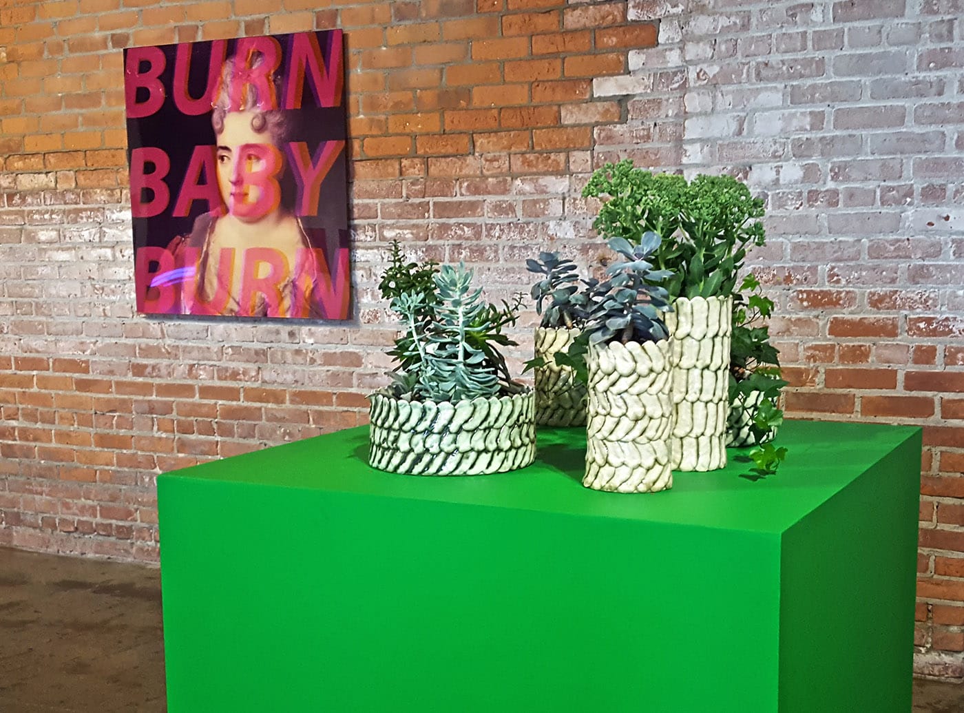
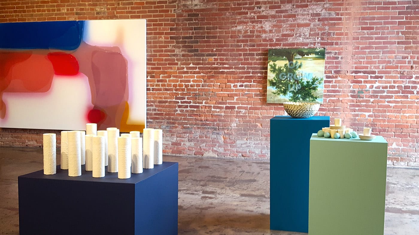
Zimmermann’s paradoxical layering of color to form blackness stands in contrast to Detroit-based sculptor and ceramicist Abigail Murray’s body of work, which barely employs color at all. For the most part, only the faintest washes of pastels color the variegated surfaces of Murray’s domestic and utilitarian forms: bowls, vases, espresso cups, all rendered in duplicate and artfully arranged by Wong on rainbow-colored plinths. Here, color acts as a framing device, allowing the shapes and textures of Murray’s work to stand out dramatically.
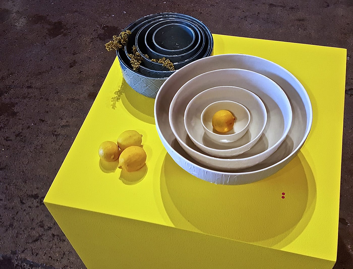
It is common to think of curatorial practice as a process of evaluating, researching, and presenting artwork as if through a pane of glass, with the work of the curator being treated as invisible or supplemental to the work of the artist, but Wong’s treatment of Murray’s pieces reveals the true collaborative power possible between artist and curator. Wong has arranged Color-Aid so thoroughly that there is hardly an angle in the gallery that has not been considered. You can approach each work as individual, but the really charming and kinetic action of the show happens in the interactions.
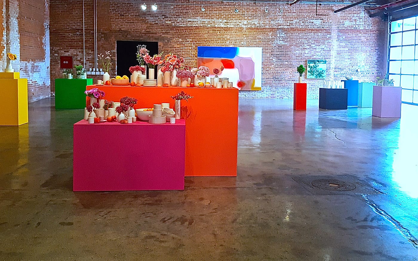
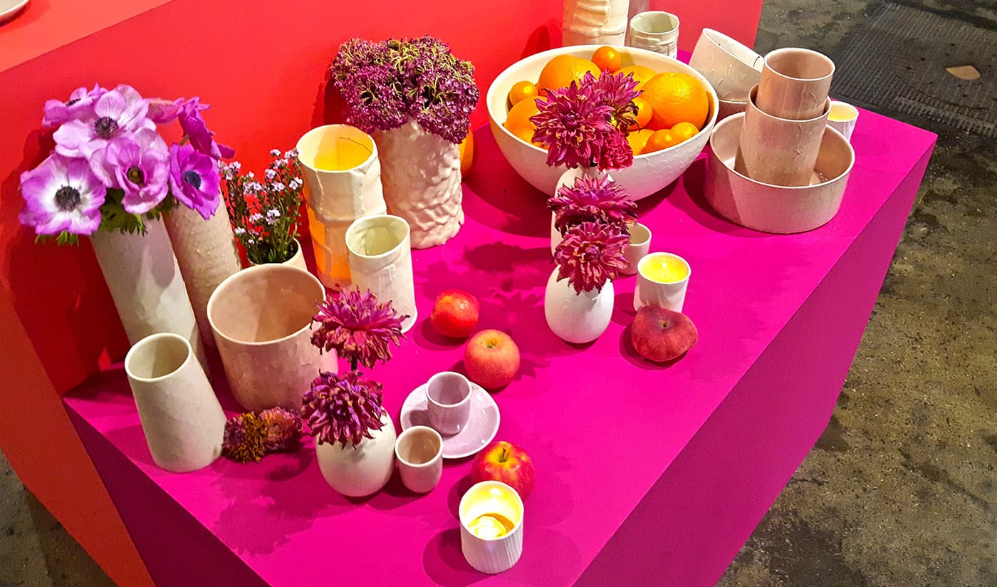
A 2011 piece by Ken Aptekar, the third artist featured in Color-Aid, is titled “OH GROW UP” and is a take on a detail of Asher Durand’s “The Solitary Oak (The Old Oak)” (1844). Clearly, Aptekar is making a little inside joke, having inverted the eponymous tree so it is, in fact, growing down, but Wong has added a visual gag of her own, positioning a bright green bouquet in one of Murray’s vases on an adjacent plinth. Depending on where one stands, you might notice the little tree growing up in contrast to the image of one growing down, or the way that the bright red plinth picks up highlights of Zimmermann’s “temper” (2013) on another diagonal. Wong has meticulously balanced this show with a complete spectrum of colors, textures, and shapes in a triumph of synthesis.
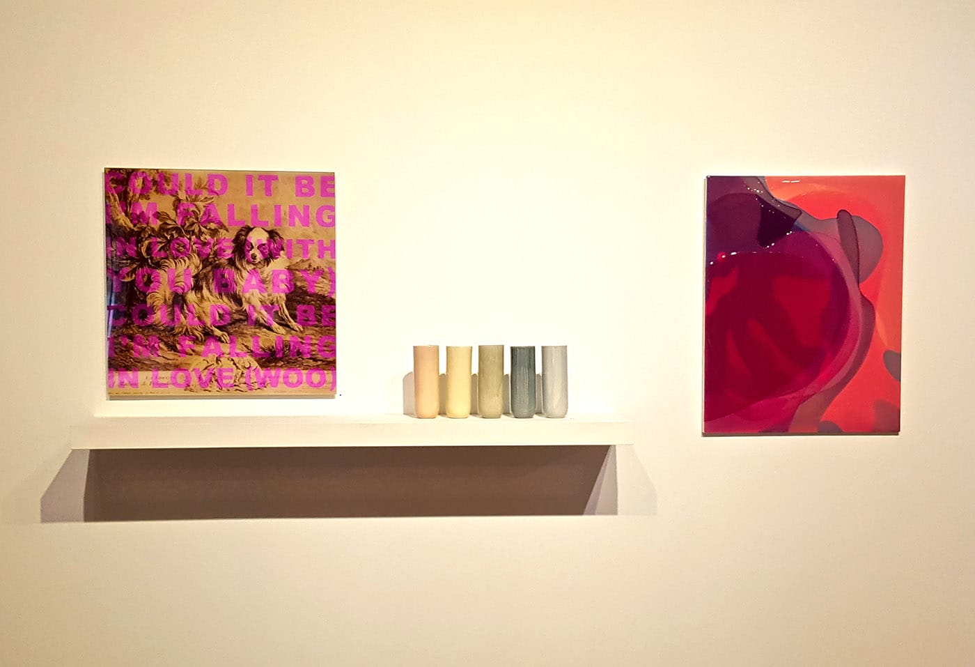
And there is another, even more invisible point of connection. Just as Aptekar lifts and rearranges snippets of classical paintings, overlaying them with song lyrics or other declarative statements, creating a decidedly ’90s graphic design vibe, it turns out that Zimmermann’s compositions are anything but arbitrary, but actually highly abstracted details taken from close-up bits of advertising imagery. With the walls filled with remediated images, and the chromatic splendor of plinths populated with domestic objects, Color-Aid cannily calls into question the hierarchy of art and design, vessel and content, image and meaning. Under Wong’s careful direction, Color-Aid manages to be a light, fun show with sneakily sophisticated undertones.
Color-Aid continues at Wasserman Projects (3434 Russell St #502, Detroit) through August 30.


