A Less Explored Side of Jasper Johns
When I visited Johns a few months ago, I saw two works that led me on a search for paintings that did not neatly fit in with his larger oeuvre.

Jasper Johns has often done groups of paintings that fit together: flags; targets; maps of the continental United States; fields filled with clusters of crosshatched lines; the wall above the far end of a bathtub: catenaries; a damaged photograph of the artist Lucian Freud sitting on a bed, holding his right hand to his forehead. These painting have been written about and scrutinized by many critics and historians, including myself. But what about one-of-a-kind works, those that don’t contain repeated motifs? What might we learn from thinking about these works?
We can surmise why Johns did not do another “Book” (1957), which was included in his first exhibition, Jasper Johns: Paintings, at Leo Castelli Gallery from January 20 to February 8, 1958. What else could he have done with it? Made from a found object, “Book” is an open book whose pages the artist has covered with red encaustic. The sides of the pages are painted over with yellow encaustic while the insides of the cover, which extends beyond the edges of the open book, have been painted blue. Near the bottom of the right hand page, two words are visible through the layer of red (read) encaustic: “he found…” I first saw “Book” in the exhibition Jasper Johns: Sculptures and Related Paintings 1957-1970 at Craig F. Starr Gallery (November 7, 2014 – January 23, 2015), which I reviewed.
There are other works Johns didn’t repeat, most likely for the same reason he did not do another “book.” One of them is “Painting Bitten by a Man” (1961), a small encaustic on a canvas measuring 9 ½ by 6 7/8 inches, which shows a gouge made by teeth marks. Would biting into another painting strengthen his point? This painting was included in Body Double: Jasper Johns/Bruce Nauman at Craig F. Starr Gallery (April 5 – May 24, 2013).
There is nothing else like “Painting Bitten by a Man” in his five volume Catalogue Raisonné of Painting and Sculpture (The Wildenstein Plattner Institute, 2017), directed and authored by Roberta Bernstein; with Heidi Colsman-Freyberger, Caitlin Sweeney, and Betsy Stepina Zinn. One of the interesting things about this painting is that the teeth marks suggest that the artist pushed his face into the encaustic surface into order to take a bite out of it, but, magically, his nose did not leave an indentation. (Obviously, he manipulated the surface of the painting before he sank his teeth into it.)
In 1961, Johns made a plaster cast of a fountain pen and affixed it to the back of a wood printer’s block. The object and wood surface are loosely covered with strokes of gray encaustic. In the lower left are the stenciled initials JS, with JJ stenciled in the lower right. “Fountain Pen” (1962) “was,” as it is detailed in the Volume 2 of the Catalogue Raisonné (page 216), “a gift of the artist on the occasion of [Jonathan Scull’s] bar mitzvah.” Although I have not seen this painting, I am intrigued by the fact that Johns made a plaster cast of a fountain pen rather than attached an actual one to the surface.
Another gift from around this time was “Paregoric as Directed Dr. Wilder” (1962). In this piece, Johns stenciled the title vertically up the middle of the painting, as well as collaged the prescription in the lower right-hand corner. In addition to the largely gray oil paint covering most of the canvas, the Catalogue Raisonné states, “Graphite and charcoal marks are visible.” The painting was sold at Christie’s, which is where I first saw it, on November 14, 2012. When I talked to Johns about this painting, he said that Dr. Wilder had prescribed paregoric for a particularly nasty case of diarrhea and that it took effect almost immediately. Paregoric contains a camphorated tincture of opium.
When I went through Volume 3 of the Catalogue Raisonné, which covers the years 1971-2014, “After Picasso”(1998) stands out as a “one-of-a-kind.” Again, we might surmise why Johns did not do another painting in this vein, as it was based on a reproduction, which had been printed upside-down. In Picasso’s painting, she is looking up from the bed, with her index finger in her mouth, while in Johns’s painting, she is looking down at the bare landscape. Instead of reworking motifs taken from Picasso, as he had done in a number of other pieces, he decided to duplicate a painting that he had seen only in a poor reproduction. Moreover, he cropped the image of Picasso’s “Reclining Nude” (1938), focusing on her head, hands, fingers, and upper torso.
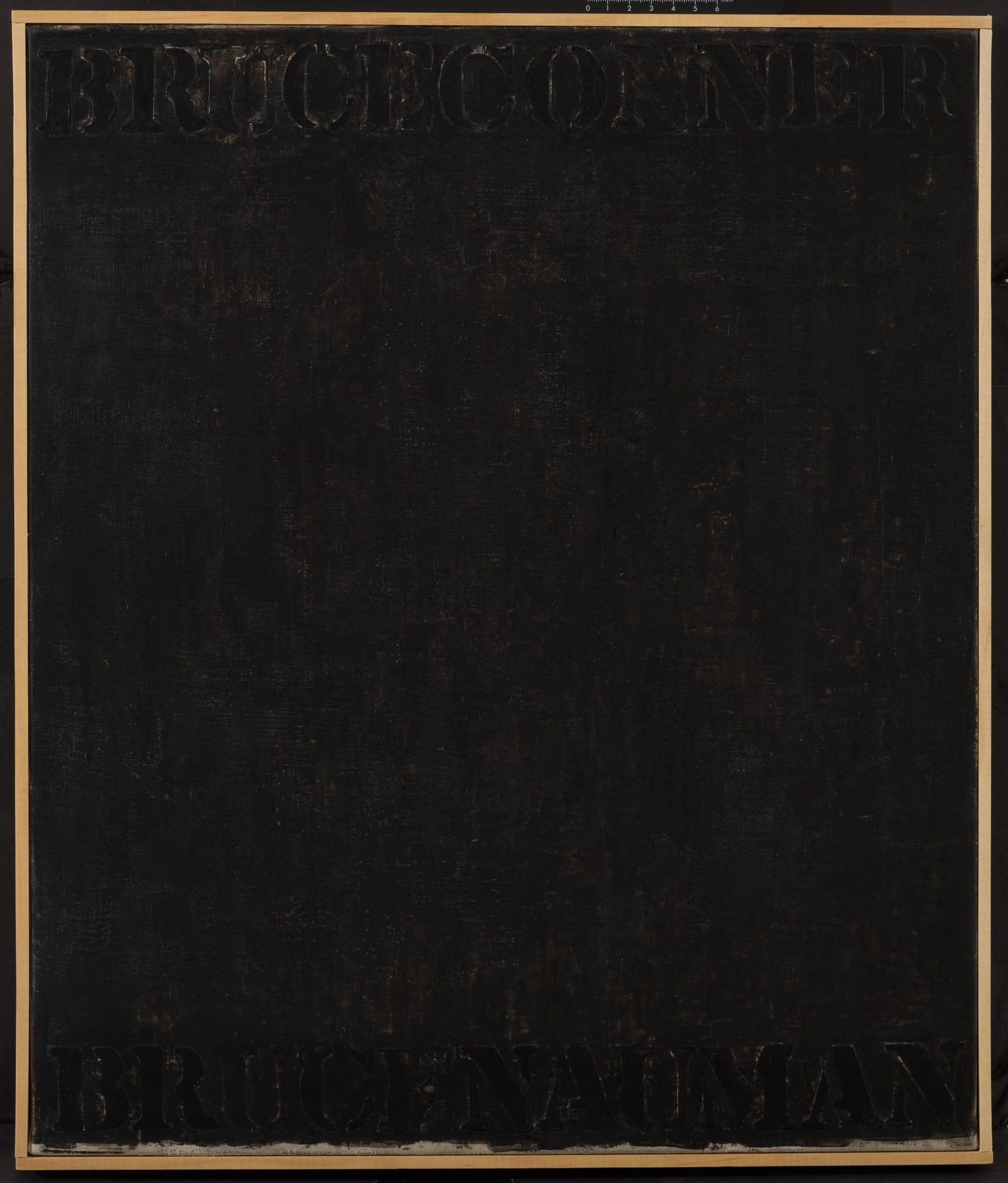
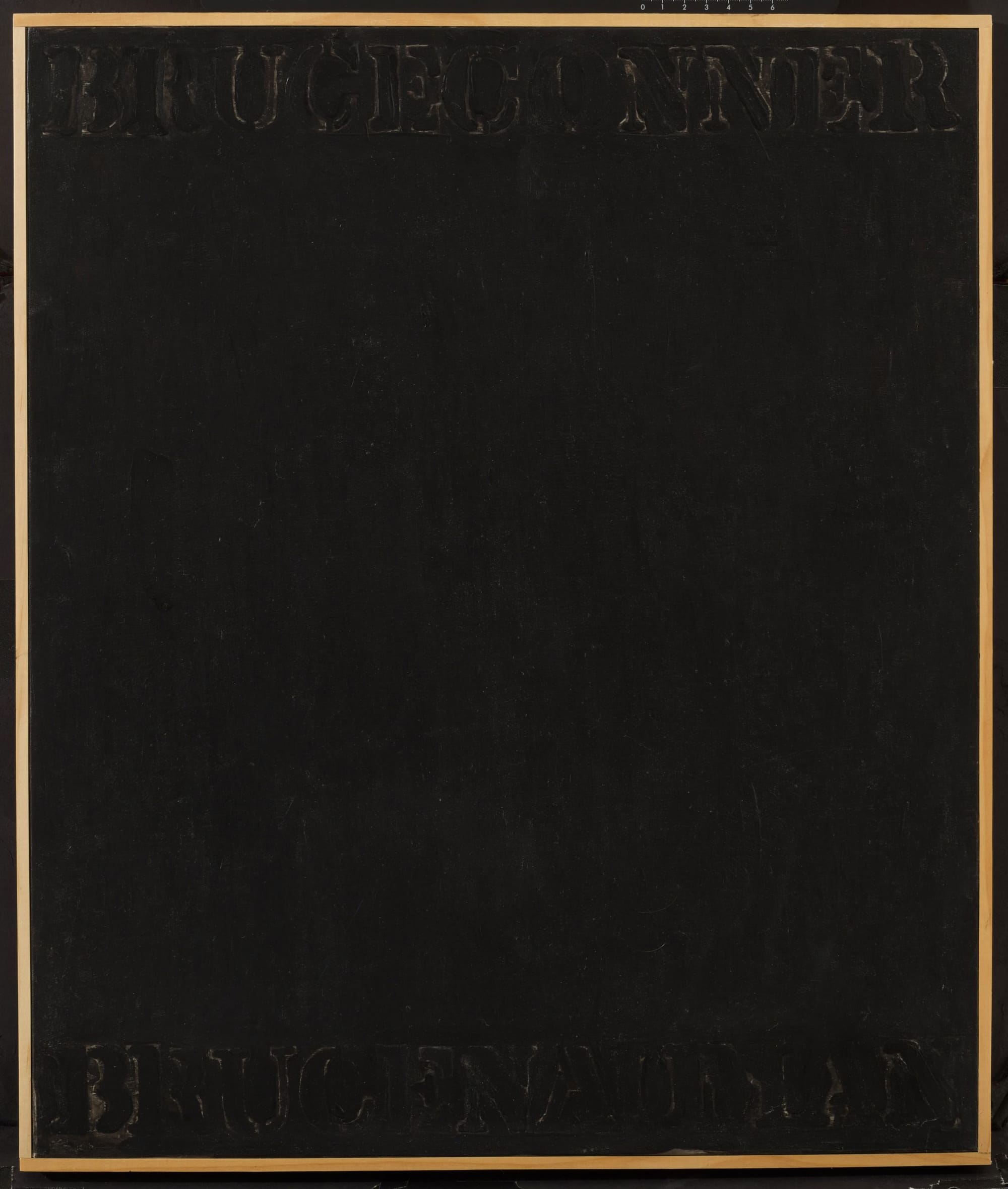
I began going through Johns’s Catalogue Raisonné looking for paintings that did not seem to fit in because of two works that I saw when I visited him a few months ago. They are nearly identical, with the primary difference being that one was done on fabric — a piece of bed sheet, I believe — and the other was done on canvas. Both paintings measure 20 1/7 by 17 inches and are done in acrylic and India ink. Along the top of the painting we read the name, BRUCE CONNER, while along the bottom we read, BRUCE NAUMAN. The letters and surface are covered in a black medium. The letters are raised and the canvas or fabric support is bare in areas around them. They were lying next to each on a table when I saw them. If I remember correctly, Johns did one and then, liking it, did another on canvas. There is nothing else like them in his oeuvre.
Both paintings are titled “Bruce Conner/Bruce Nauman” and dated 2016. Two men named Bruce, whose last names have six letters. Is that reason enough to pair them in a painting and then do it again? Is it because they have something in common? Should that be what I think about when I remember these paintings?
In 2016, Conner (1933-2018) had his first major show in New York. The Museum of Modern Art website described it as:
BRUCE CONNER: IT’S ALL TRUE is the artist’s first monographic museum exhibition in New York, the first large survey of his work in 16 years, and the first complete retrospective of his 50-year career. It brings together over 250 objects, from film and video to painting, assemblage, drawing, prints, photography, photograms, and performance.
The title of the show came from a letter Conner sent to one of his gallerists:
My work is described as beautiful, horrible, hogwash, genius, maundering, precise, quaint, avant-garde, historical, hackneyed, masterful, trivial, intense, mystical, virtuosic, bewildering, absorbing, concise, absurd, amusing, innovative, nostalgic, contemporary, iconoclastic, sophisticated, trash, masterpieces, etc. It’s all true.
Was seeing the show the reason that Johns did these paintings? Did he think about the connection between his work and Conner’s? Reviewing the exhibition for the NYR Daily (July 15, 2016), J. Hoberman wrote:
Conner largely abandoned assemblages in the early 1960s. It’s sometimes said that if he had continued in this mode (and continued to exhibit in New York) he would now be bracketed by Rauschenberg and Johns […].
If so, why did Johns put “Bruce Nauman” into them? I know that years ago Johns got copies of Conner’s films directly from the artist, as we talked about the proviso that came with them stipulating that these VHS tapes — which came in a signed edition — were not to be shown publicly, they were meant for home use only. Conner insisted that the titles of his works be spelled out in capital letters, which is how Johns spelled out the two names.
I like the fact that the one thing holding the paintings together is that these two men named Bruce both have six letters in their last names. That meant that all the letters could be the same size as he placed them across the painting’s surface. That might have been reason enough to make the painting. It might have even made the artist happy.