Jasper Johns Refuses to Play by the Book
Currently on view in the exhibition Jasper Johns: Sculptures and Related Paintings 1957–1970 at Craig F. Starr is “Book” (1957), a work I suspect many people either don’t know about or are not likely to have seen, even in reproduction.

Currently on view in the exhibition Jasper Johns: Sculptures and Related Paintings 1957–1970 at Craig F. Starr (November 7, 2014–January 23, 2015) is “Book” (1957), a work I suspect many people either don’t know about or are not likely to have seen, even in reproduction. It is certainly not one that will come quickly to mind when thinking about Johns’s oeuvre. It was included on the checklist of the catalogue published on the occasion of his first solo museum show in New York, Jasper Johns, which was organized by Alan Solomon at the Jewish Museum (February 16–April 12, 1964), but it wasn’t reproduced. After that, there are, as far as I know, only rare sightings of this obscure work.
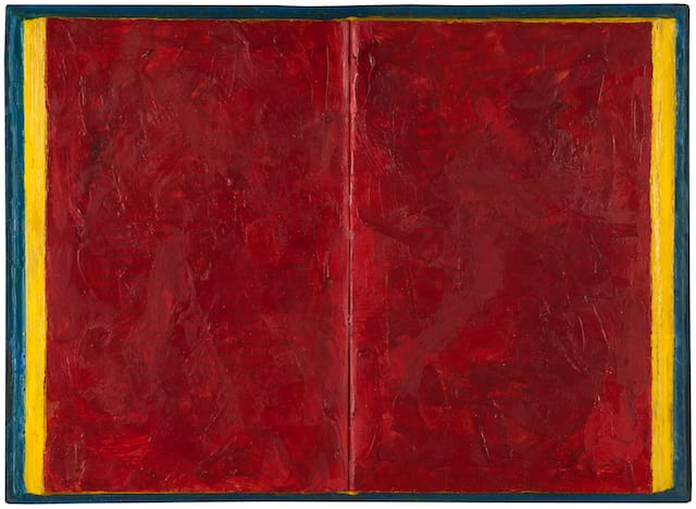
Given that Johns is known to repeatedly return to a small but slowly growing set of objects, such as the American flag, a light bulb and a Savarin can filled with dirty paintbrushes, this particular work is an anomaly, something he seems not to have revisited. There are no drawings or prints of it, for example, as there are of nearly every other thing in his first exhibition. Made of a found object, “Book” (1957) is an open book that the artist has painted over with red, yellow and blue encaustic and subsequently mounted in a wooden shadowbox frame.
“Book” was finished the same year that Leo Castelli opened his gallery on East 77th Street, where he included “Flag” (1955) in a group show in May. Johns showed “Book” in his first, groundbreaking exhibition, Jasper Johns, at the gallery (January 20–February 8, 1958), which, as we know, changed art history. In contrast to the “flags,” “targets,” “numerals” and “alphabets” in his first show at Castelli, “Book” is not considered an iconic work. For reasons that aren’t clear, it was included in the wonderful, massive, eye-opening, grab bag exhibition, The Spiritual in Art: 1890–1985, which was organized by Maurice Tuchman with the assistance of Judi Freeman at the Los Angeles County Museum of Art (November 23, 1986–March 8, 1987). The Spiritual in Art: 1890–1985, an exhibition that devoted an entire gallery to Hilma af Klint, was an unlikely place for Johns’ “Book,” which hardly seems spiritual or, although covered in encaustic, even occult. At the same time, it isn’t literal, but neither were his “flags” and “targets.’
There is a widely accepted view of Jasper Johns’s first exhibition that goes like this: with his “flags,” “targets,” “numerals” and “alphabets,” he integrated representation and abstraction, as well as made art about art (the flag, like a painting, is flat and two-dimensional), showing his peers a way to bypass Abstract Expressionism. Many critics pointed out that the numerals and the letters of the alphabet did not number or name anything in the world and were therefore abstract paintings in which a grid and repetition played a central role. Also, his all-white American flag further opened up the possibilities of monochrome.
According to this view, Johns’s early work ushers in Pop Art and Minimalism. Some critics, particularly those preoccupied with terminal progress, narrow the view further and describe his brushstrokes of hardened encaustic as the bridge between Abstract Expressionism’s volatile brushwork and Andy Warhol’s use of mechanical reproduction, the latter cited by many experts as signaling the death of painting. All of these narrative-driven viewpoints have had obvious consequences for art. They also had a well-argued agenda, which emphasized formal innovation and the paradigm of progress.
One problem, however, as Barnaby Wright points out in his essay, “Jasper Johns – Regrets” (2014), which is included in the catalogue accompanying the exhibition, Jasper Johns: Regrets, at the Courtauld Gallery, London (September 12–December 14, 2014), is that Johns has never shown any affinity with “the populist imagery of Andy Warhol or the ‘objective’ flatness of Frank Stella.”
Here, another narrative emerges, which pits Johns’s remoteness against Warhol’s popularity, and deduces that the former is intellectual and elitist, while the latter is brilliantly in touch with his audience and therefore democratic. This isn’t just a strain of anti-intellectualism, but a deep-seated mistrust of artists and writers who want to put everything into their work, including their intelligence, which the best ones know won’t save them. One reason people embrace Marcel Duchamp is because they think he was kidding and that the urinal was an ironic joke. I think they are wrong.
All of these narratives, which imply an objective or utopian goal that art should aspire to, are modernist fairytales. We are like children who want a story to have, if not a happy ending, then at least a soothing one. Postmodernists (or, as I sometimes think of them, bitterly disappointed modernists), with their declaration of the death of the author, of painting and originality, alongside their claim that de-skilling is a historical necessity, spend their time concocting another set of fairytales, which they teach in universities under the guise of Truth. The fact is that Johns didn’t buy into any of the modernist fictions — even those that originated with artists such as Piet Mondrian and Kazimir Malevich — from the beginning. He seems to have no interest in postmodernist fictions, either. Johns is a skeptic who thinks that any promise of fulfillment is an illusion. He was never interested in pictorial states of objectivity, purity, opticality, presence, immanence or in stopping time. He certainly did not wish to be associated with, or even try to accommodate his work to, an aesthetic agenda.
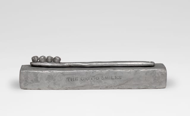
This is what critics either conveniently overlook or deeply resent in Johns, particularly if they are nostalgic for the 1960s when they were influential. He never became, in historical terms, a mainstream artist, never joined the parade that sprang up after him in the early 1960s. He didn’t align his work with either Pop Art or Minimalism. And he certainly didn’t join any of the clubs associated with a style, technique or subject. Instead he went his own way and, more to the point, he exposed what he thought of critics in two sculptural objects, “The Critic Smiles” (1959), a well-known work depicting a toothbrush with human teeth instead of bristles, which is included in the exhibition at Craig F. Starr, and “The Critic Sees” (1961), which replaces the critic’s bespectacled eyes with a pair of mouths. And with his painting titled “According to What” (1964), he seems to be calling all objective aesthetic agendas into question.
In “The Critic Smiles” and “The Critic Sees,” Johns focuses on the theme of eating (or consumption), which evokes the production of waste, something it shares with Duchamp’s urinal, which is, it is worth remembering, titled “Fountain” (1917). In substituting teeth for the toothbrush’s bristles in “The Critic Smiles,” he reminds us that cleanliness and dirt are an inseparable cycle in which decay is inevitable. “The Critic Smiles” exists on the opposite end of the spectrum occupied by such mainstream art works as Andy Warhol’s Brillo boxes and Jeff Koons’s Plexiglas-encased vacuum cleaners because neither of the latter two acknowledges disintegration’s inevitability. In his creepily fascinating “Death and Disaster” paintings, Warhol looks at death from the vantage of a voyeur, a bystander who will escape notice.
As we learn each day, capitalism and the industrial nations have yet to adequately deal with the production of waste and its deleterious effects on the planet. At the same time, and this is what gives “The Critic Smiles” its dark, malicious twist, the combination of a lead-like toothbrush mounted with teeth suggests that Johns sees a critic as a kind of civilized cannibal whose job is to clean up the art being looked at, while tearing it into pieces. Moreover, he identifies the relationship between art critic and art as a power struggle in which the critic is a parasite who lives off art rather than illuminates it. There are exceptions, of course, with Frank O’Hara and David Shapiro being among them.
“According to What” is a seven-by-sixteen-foot painting in which six canvases have been joined together, and to which a number of disparate objects have been attached. From a historical perspective, it is even more astounding that during mid-60s, when critics were promoting flatness, all-overness, the purely optical, objectivity and accessibility as the highest goals of contemporary art, Johns makes a confounding painting that incorporates a silkscreen of a newspaper as well as three-dimensional objects that project from the surface, including aluminum letters spelling out “RED YELLOW BLUE,” a small, backward-facing stretched canvas, a bent coat hanger, and a cast of a leg attached to a chair. Along with these disparate objects, Johns has juxtaposed several painting methods: Abstract Expressionist gestural brushwork; monochrome passages; thin washes; drips and spatters.
In “According to What,” which precedes the first known use of the word indexical by seven years, Johns aligns himself with the strain of modernism that embraces complexity and multiplicity — what many people disparagingly refer to as the “difficult” or, as they are apt to say, the “obscure.” This approach attests that there is neither a single vocabulary, nor a single way. Johns may circle back to a small set of objects and motifs, and seem compulsive in his refusal to let something go, but at the same time he is restless, paradoxically so. It is this combination of habitual and agitated that seems central to his art.
In “Book,” Johns made another of his preoccupations clear: he wanted to paint time, not try and act as if art could stop it. Perhaps this is a reason why he chose not to revisit the motif. Time is the universal leveler, and its passing is something we inhabit and cannot step away from, however much capitalism’s products and mainstream art say otherwise. A book admits time’s existence, even an open book whose facing pages Johns has covered with red encaustic. But the layer of red-pigmented wax doesn’t cover all the words. You just have to look and look again. I think there is something poignant and vulnerable about the fact that these two words are discernible near the bottom of the right hand page: “he found….”
Jasper Johns: Sculptures and Related Paintings 1957–1970 continues at Craig F. Starr Gallery (5 East 73rd Street, Upper East Side, Manhattan) through January 23.


