Brand New Roman: A Font that Swipes Corporate Brands
Want to type a message to a loved one and think it just needs more corporate branding? Here you are.


Sometimes I daydream about the iconography of this strange stage of capitalism, the weird and doofy visual distillations of everything repetitive, awful, or mildly apocalyptic: Kendall Jenner brandishing a Pepsi to prevent police brutality (and sell Pepsi), an octopus in a parking garage, white supremacists littering the Google Image page after a cursory search for “tiki torches.” Nothing is innocuous, but some of it’s funny.
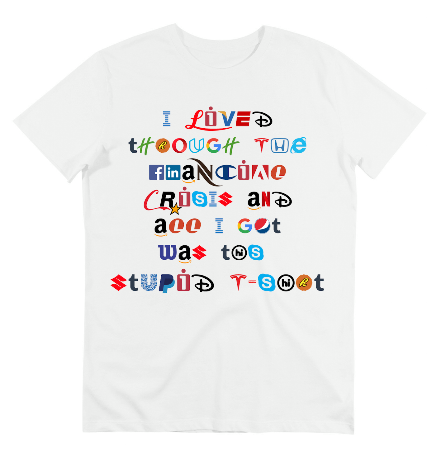
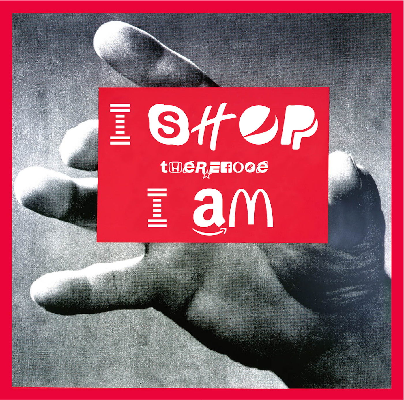
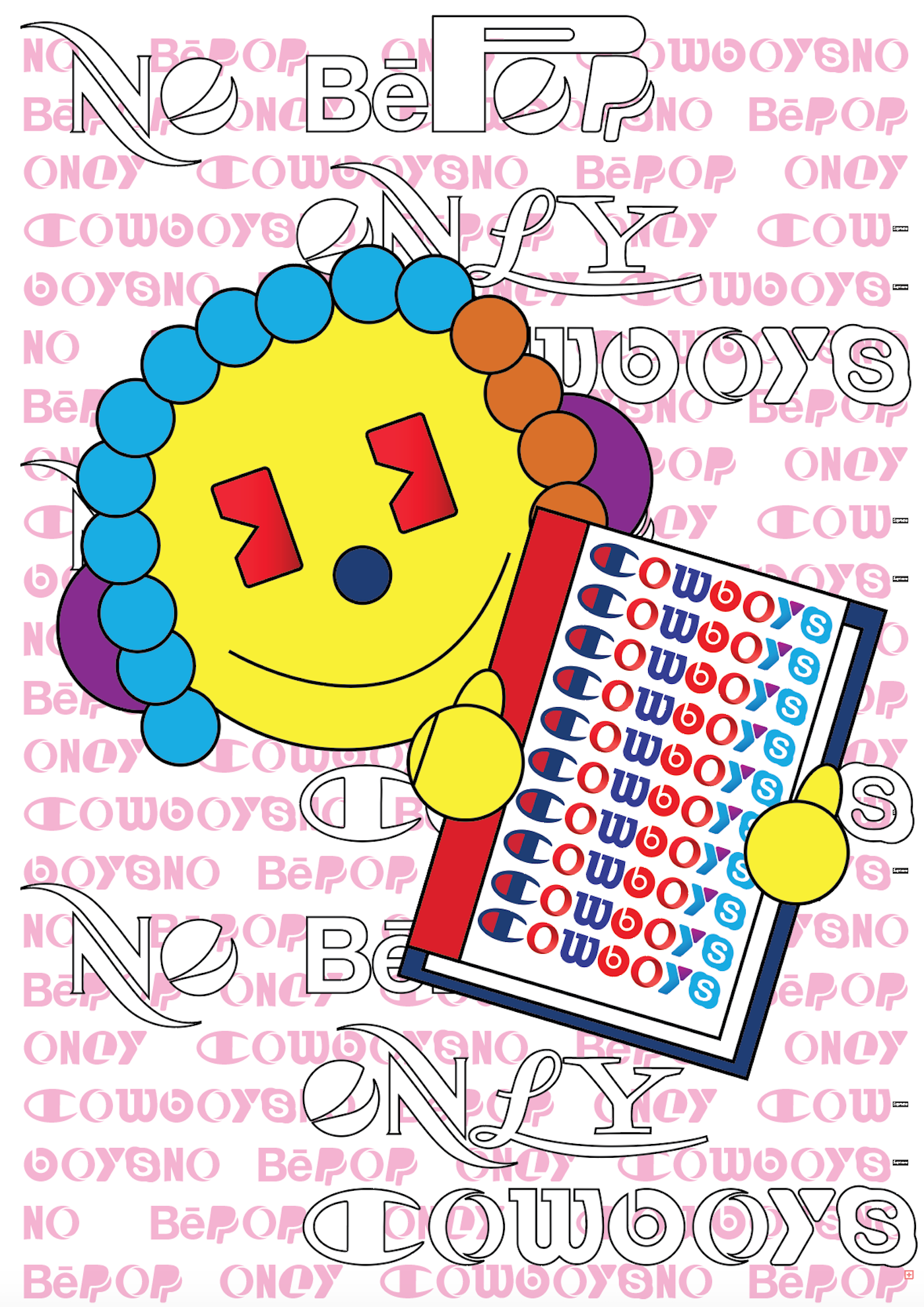
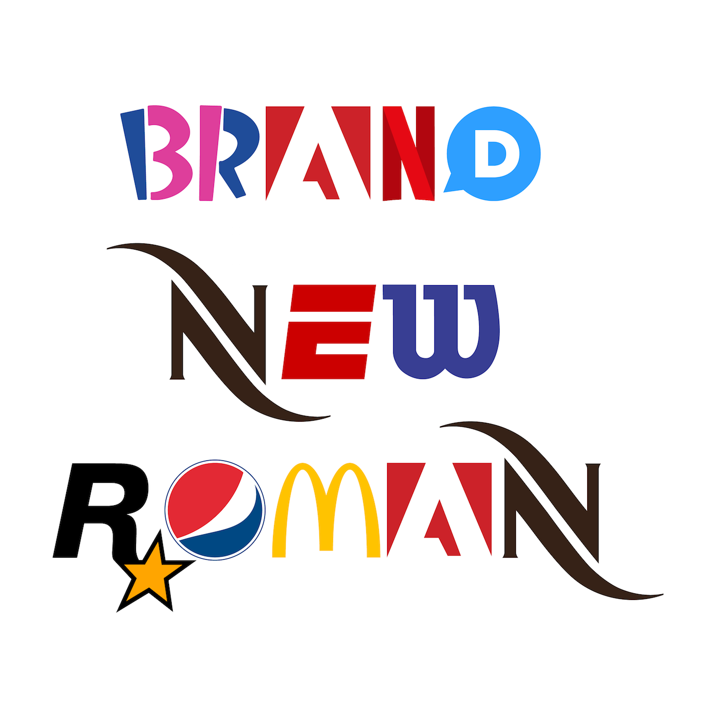
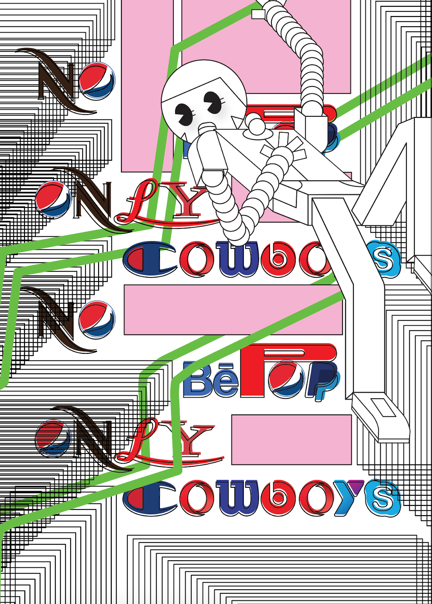
Hello Velocity, the web designers who encouraged folks to “Fight the Swipe” with their webapp, Meatface — images of users’ faces were turned into hunks of steak, for use in their Tinder profiles — have released Brand New Roman (get it?), a font composed entirely of corporate logos: an ESPN E, a Facebook F, an Amazon A, a Baskin + Robbins BR, a Honda H. (“Now all your content can be sponsored content, and sponsored by everybody!” the website reads. “But, If you’re sponsored by everybody, are you really sponsored by nobody?”) One designer has even subsequently created a plugin to turn all website text into the font (one for Chrome and one for Firefox).
Some of the earlier logos, like an IBM I and another E for Internet Explorer, render the whole thing a heartwarming throwback to mid-’90s issues of Adbusters, when the BMW font was used to spell “buy” and the Heineken typography to spell “consume” — check out how Brand New Roman is used to spell out the question in the header image, and you get the idea.
Because Hello Velocity specializes in what they call “internet experiences” (sticker web books, a sliding scale app for webstores), I got an email with a specifically tailored greeting, (best viewed on Firebox), along with designer Lukas Bentel’s note: “We want to get this font out in front of more creative people before we inevitably get c&d’d by one of the 76 brands whose logos we’re using.”
When I asked him for the impetus behind Brand New Roman — aside from the very obvious fact that it’s weirdly appropriate for now, right now — Bentel explained that the font was designed “to make fun of our inescapable hyper-commercialized environment. It’s honestly pretty nuts that you can make a full alphabet — with two letter cases, ligatures, numbers, and symbols — all out of brand marks that most people can immediately name 75% of. Ultimately I think it’s pretty aesthetically compelling and I guess that makes sense given all those sweet, sweet, branding dollars that have gone into crafting each letter.”
Scroll down to see more of the font in action, as utilized by various designers.