Richard Prince’s Dorky White Anger
These are works you do not scrutinize or reflect upon because there is really not much to examine, much less think about.

Nancy Spector, the well-known Guggenheim curator and longtime promoter of Richard Prince, once wrote:
If [Prince’s] entropic, decentered White Paintings evoke the post Ab-Ex work of Rauschenberg and Twombly,[his] Monochrome Jokes channel the reductive aesthetic of Ellsworth Kelly’s colored monochrome fields or Brice Marden’s early Minimalist paintings. But unlike the handcrafted essence of these art-historical sources, Prince’s paintings look store-bought, as if he had sent away for them. They are flat, banal, and pristine, like any mass-produced, commercial object.
Spector’s hatred of painting comes through loud and clear in the phrase, “handcrafted essence,” which sounds like a description of scented candles or small batches of artisanal beer.
Spector’s curatorial view is a privileged white summation of a male-dominated art history that culminates — painting-wise — with Marden and Kelly’s monochromes and is continued — post-painting-wise — by Prince. People of color or women need not apply.
Spector seems not to want to address the fact that channeling the work of another artist is hardly new. The fearless maverick artists Robert Colescott and Peter Saul made many vulgar and tasteless send-ups of Willem de Kooning — parodies that come to mind in light of the exhibition, Richard Prince: High Times at Gagosian, but more on that later.
The common response to these works has been “Basquiat meets Dubuffet” (read Black and consciously primitive), which I think is a sloppy comparison, at best. I am not sure whether Messers Basquiat and Dubuffet would be insulted by the comparison, since they are both dead.
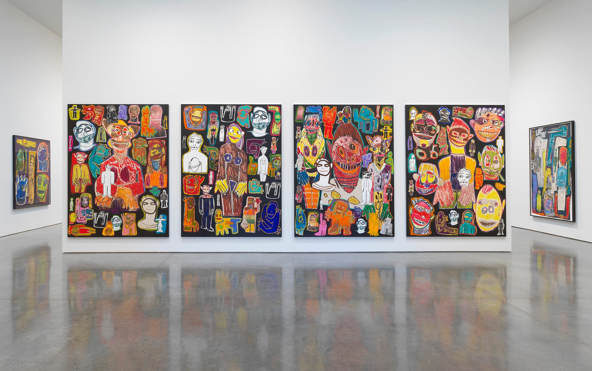
However, I do know that Prince’s works are not paintings, but large flat surfaces upon which paint — mostly black — is applied to bind the separate collage elements together in a unifying ground. They are all about modish arrangement. To cite Spector’s description of a different set of works, they look “mass-produced,” which is reinforced by the fact that there are more than 30 of them — many quite large — filling Gagosian’s expansive warehouse space.
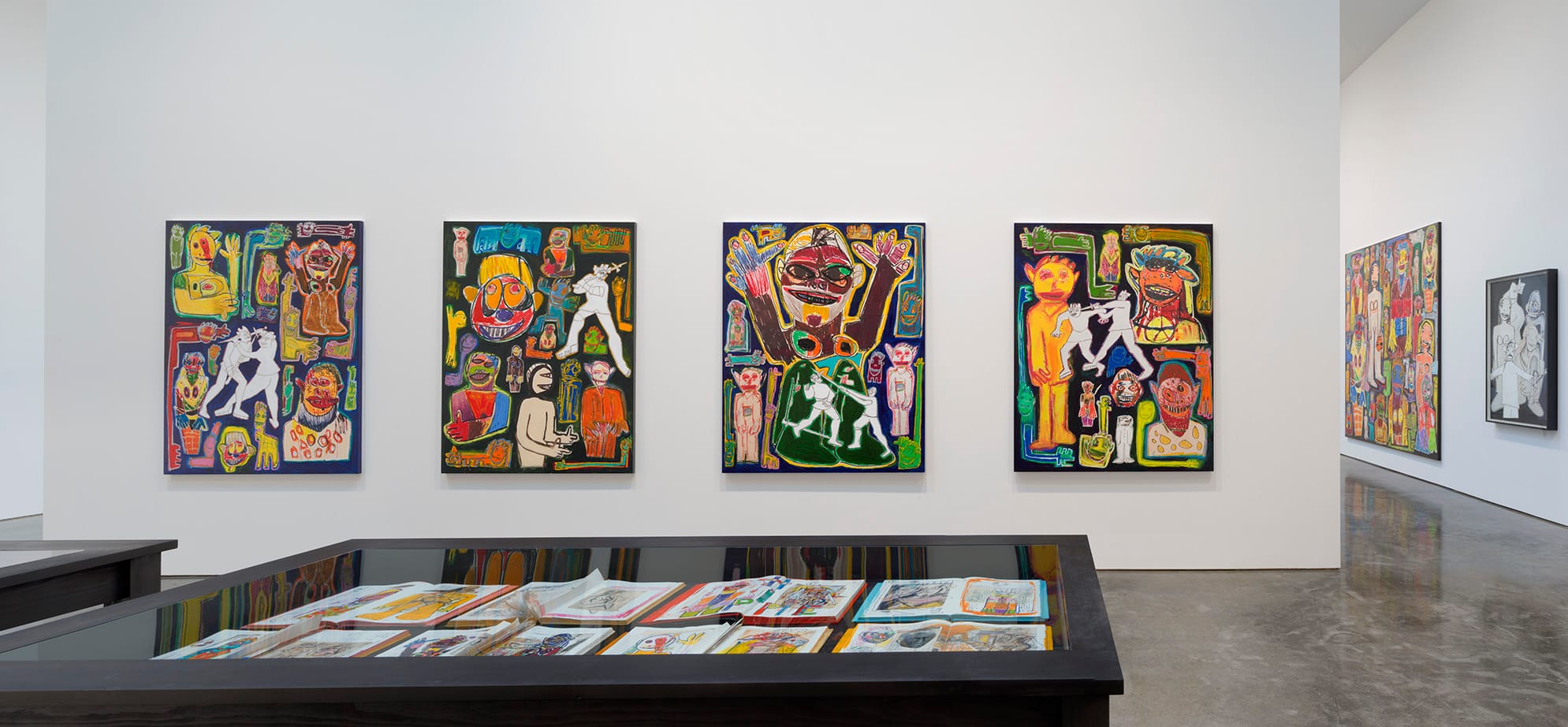
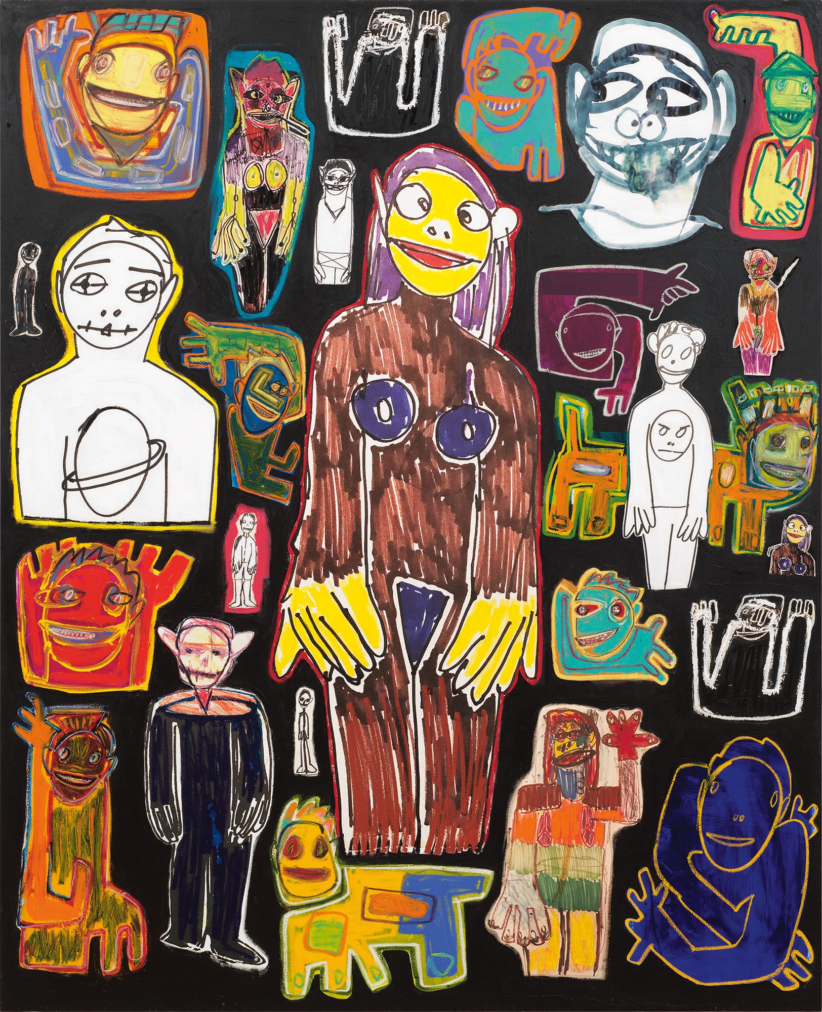
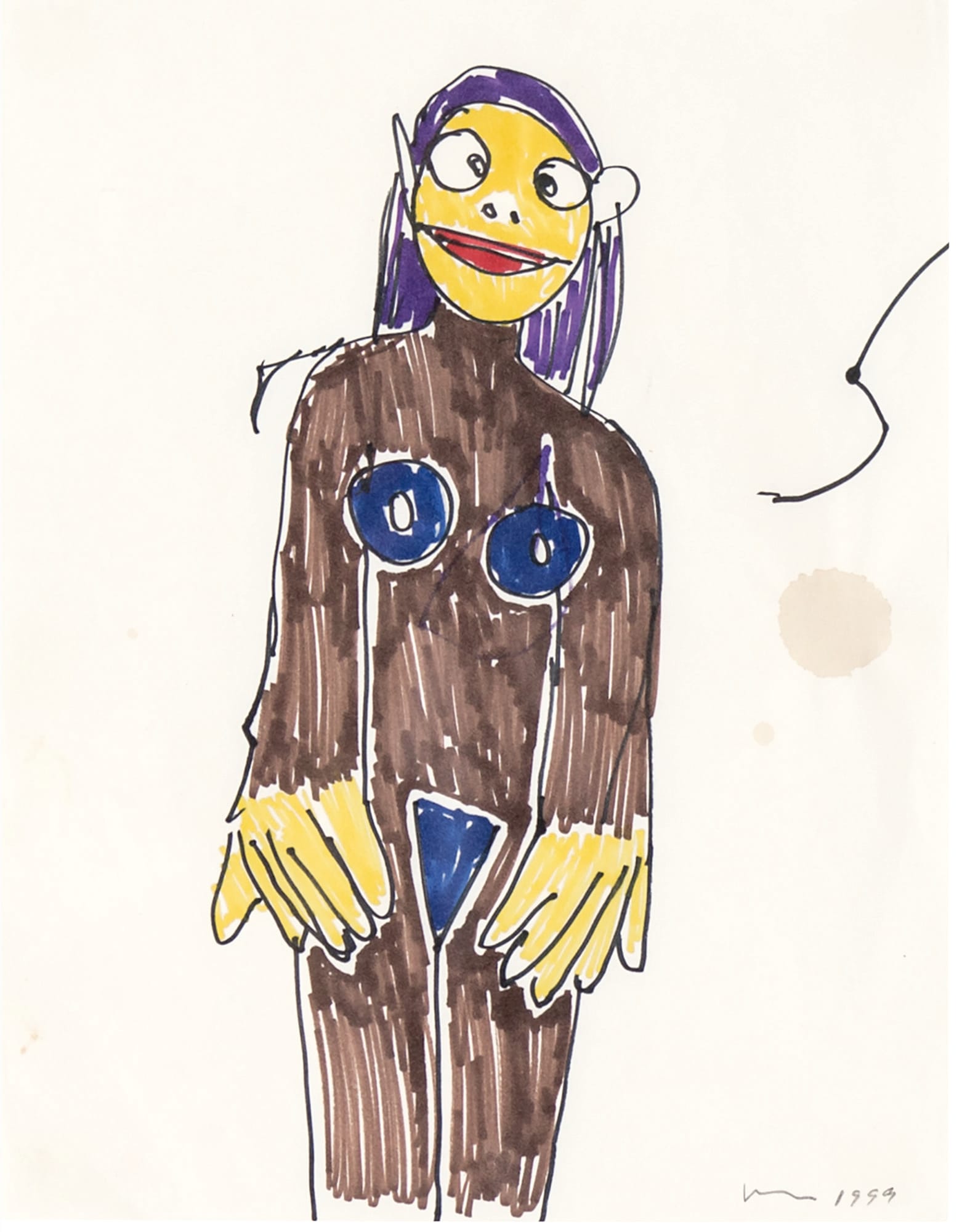
The collage elements are blown-up reproductions of marker drawings Prince made 20 years ago — mostly frontal views of flat faces and figures in various sizes, done in a faux primitive, expressionist style. A number of the original drawings are included in the exhibition, all signed and dated. These figures are always placed in the middle of the vertically oriented sheets of paper. The publisher of a book of these works, which Prince calls “Hippie Drawings,” characterizes them as a “droll collection of highly expressive drawings and watercolors, whose inventive shapes and joyful colors recall children’s drawings or paintings by the mentally ill.”
There is nothing really expressive about the “Hippie” drawings: they are generic recyclings of self-taught art. If you are able find some commonality between Prince’s laid-back marker drawings and the obsessive concatenations of Adolf Wolffli or Martin Ramirez, or the visionary memories of Bill Traylor or Minnie Evans, I have a bridge to sell you.
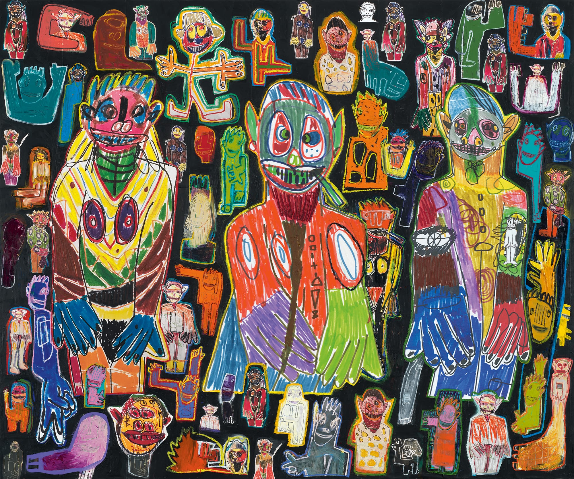
Prince uses an ink jet printer or similar mechanical device to make enlarged versions of these drawings, which are affixed to the stretched canvas surface. The arrangement of the figures is always tasteful, with a large figure or face centrally placed or, in some works, three large figures evenly spaced across the surface. The images surrounding them are separated by black paint, preventing the work from feeling too crowded or difficult to read. When Prince overlays one image on another, he makes sure the contrast is graphically obvious — an outlined white figure on top of a multicolored one. These are easy-to-look-at works, which hardly seems the case of the best works by Dubuffet or Basquiat, which demand the viewer scrutinize, unravel, and even read. There is nothing vigorous about Prince’s drawings: all the lines seemed to be made with same calculated cool.
Spector is right: Prince’s work comes across as banal and mass-produced, low-energy constructs. The compositions are tastefully balanced; the faces and figures seem more alike than different. They all have big eyes and big hands. Two smaller circles indicate nostrils. Mouths tend to be the same shape and stretch across the circular faces, like clockwork. Irregular circles are used to indicate breasts on standing nude women. Every mark is perfunctory and clearly placed so the viewer does not get confused. Smaller figures are often stacked up along the edges with enough space separating them that there is no feeling of claustrophobia.
These are works that you see but do not scrutinize or reflect upon because there is really not much to examine, much less think about. You might move closer to the surface and detect the edge of a collaged face covered over in black paint, or a brushstroke partially masking a pixilated surface. When I was at the exhibition, two young men kept challenging each other to figure out where the collage element ended, buried beneath a layer of black paint. Looking had become a kind of parlor game, a pleasant way to pass some time.
The other group of works, which was presented in vitrines, are de Kooning catalogs that Prince had defaced by cutting into them, as well as collaging heads and faces (his own works!!!) onto them This is where Colescott and Saul and the painterly transformations they made to de Kooning’s figures — especially his “women” — came to mind. It is not that what Prince does is too easy or puerile — though I suppose that could be said of them. I am a big fan of Saul, so being childish and lashing out does not bother me. Years ago, Jasper Johns famously wrote in his sketchbook, “Take an object / Do something to it / Do something else to it. [Repeat.]” Prince is satisfied with doing one thing, and what he does — I guess — is supposed to be outlandish or funny or shocking, but it is none of these. These paintings are stale jokes with no punchline.
After seeing the connection to Colescott and Saul, who are true outliers, something Prince can only pose at, it struck me that his motivation for making huge expanses populated by tastefully arranged faces and heads, nudes and knights — all of them aspiring to look demented but not quite pulling it off — is that he is an artist who always wants to come off as hip (read masculine) and snarky without actually sticking his neck out, as the artists that he channels did.
During the last decade, Nicole Eisenman, Dana Schutz, and Amy Sillman have been painting faces and bodies engaged in all kinds of gross, funny, weird, and ordinary things: sneezing, yawning, staring into a cellphone or at a vinyl record at a crowded party. Eisenman has done paintings of angry white men. She has painted faces that are green and putrid, as if they have come back from the dead. She is unabashed in her allusions to Philip Guston and James Ensor. Prince seems to be trying to channel that work and that sharp, excessive energy. The problem is that he is not a painter, but some kind of sad vampire. He uses paint and color, but he is not very good with either. He cannot get to the real thing, so he comes up with hollow signs for it. In his decades-long attempt to play the sophisticated vulgarian, Prince has finally come up with something all his own: Multicolored Prozac Expressionism.
Richard Prince: High Times continues at Gagosian (522 West 21st Street, Manhattan) through December 19.


