Nobel Prize Nixes Famous Medal in a Bland-New Logo Design
When will organizations stop spending millions on rebranding campaigns that swap images for bland, all-text fonts?

I’m no snob for typography — a dilettante at best, really — but the Nobel Prize’s logo redesign is a God-awful way to modernize the 123-year-old symbol of human ingenuity.
Established in 1895 and first awarded in 1901 to honor those who “have conferred the greatest benefit to humankind,” the new font combines the unassuming blandness of sans serif with the utilitarian perfunctoriness of the much-beloved and universally deployed Helvetica font. Such an impersonal style lacks the grace demanded of one of civilization’s highest honors.
This December, to coincide with its 2018 ceremony, the Nobel Prize introduced its new design by the Sweden-based Stockholm Design Lab as a way to integrate the various stakeholders within the organization under one holistic brand identity. As the Stockholm Design Lab states on its project page, the new logo is meant “to create synergies.” Accordingly, the design firm has adapted its new font from text on the prized Nobel medal. They then based its uppercase lettering on classic geometric shapes and the lowercase letters on tradition — early typefaces like Akzidenz-Grotesk, Berthold Grotesk, and Futura.
While the poetic sales-pitch of the new logo certainly rings seductive, there’s very little to fawn over in the actual product. Controversially, the Swedish firm has decided to nix the Nobel Prize’s famous coin from its logo. What is perhaps the organization’s most recognizable symbol will no longer feature prominently in its public-facing materials. The coin, which has for many years united the organization’s various outfits under a single image, will disappear.
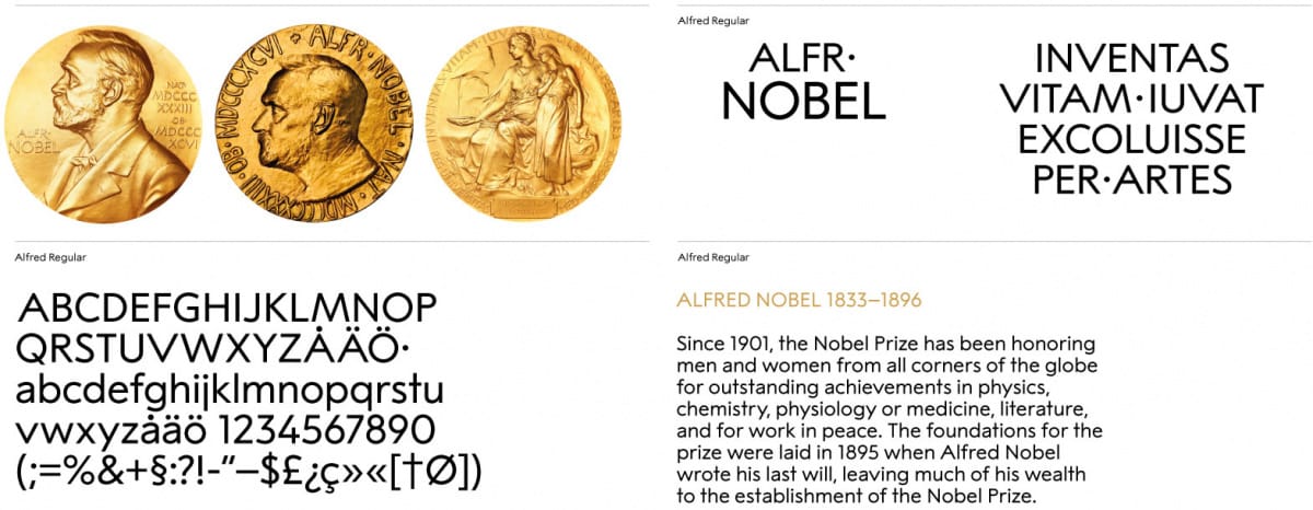
Not that the Nobel Prize’s old logo was doing the organization any favors. Weird letter spacing, clunky Times New Romanesque fonts, and a putrid mustard-colored medal combined to create a messy logo unbefitting the prize’s great importance. More maddeningly, the organization has used slightly different versions of the medal to differentiate between things like its concert series, museum, center, and media office. And these images of the medal seem to have gone through the blender a few times over the years; some like look poor renditions of Alfred Nobel masquerading as a yellow Colonel Sanders, of Kentucky-fried chicken fame.
But let not the sins of the past punish us with a blander future. The only thing worse than an ugly medal is an ugly, corporate rebranding scheme. Moreover, it signals a polarizing trend that forces brands to choose between going full image or full text. There are a variety of reasons why a company might decide to go image-only. For a company like Apple, which uses a white macintosh, deploying a symbol is a power move that denotes just how omnipresent the brand is across the globe. For museums, nonprofits, and cultural organizations, the use of a text-only logo brings more erudite connotations of posterity and learnedness.
The text-only option is a popular choice for cultural organizations like the Nobel Prize. Who can forget the Metropolitan Museum of Art’s fumbling rollout of their multimillion-dollar rebranding that replaced its beloved, architectural “M,” with the Wolff Olin design firm’s stiflingly cramped calligraphy that shouts THE MET at visitors?
Surely the Nobel Prize organization spent a similarly exorbitant amount of money on their redesign. And for what? Three words that preserve the brand, and not the identity, of a treasured accolade.


