System and Sensibility: Dorothea Rockburne at Dia:Beacon
Rockburne insists that her work has a mathematical basis, yet her most moving creations are those least tethered to a methodical, rational approach.

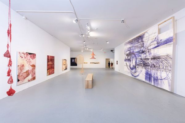
At the end of January, Dia:Beacon opened an exhibition of works made by Dorothea Rockburne between 1967 and 1980, much of it ephemeral installation art re-created for this show, presented in five galleries of different sizes. It is scheduled to be on view for five years; it is, in other words, a major statement about Rockburne’s place among the artists of the 1960s and 1970s who are the focus of Dia’s program.
The exhibition is laid out as a large square divided into three galleries on the left and two on the right. The organization of the works on view brings to mind one of those schematic overhead views of the brain that represent the left hemisphere as controlling linear thinking, mathematics, and logic, and the right one as guiding visualization, imagination, and rhythm. The distinction between right- and left-brain dominance is actually useful in approaching the work of Rockburne, who insists that her work has a mathematical basis, yet whose most moving creations are those least tethered to a methodical, rational approach.
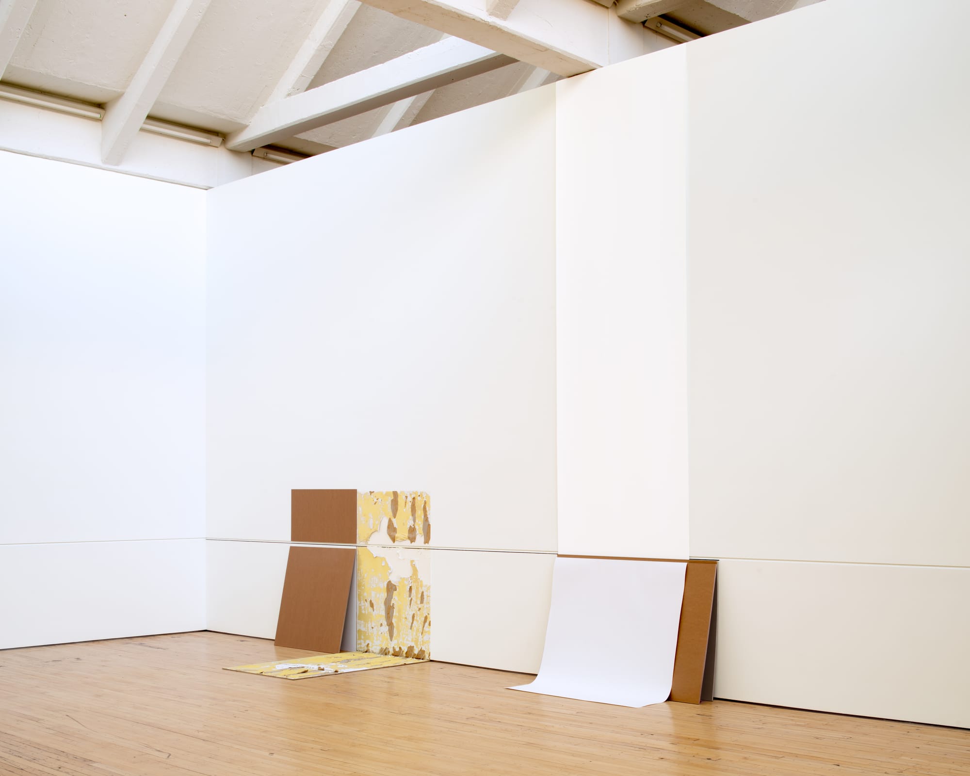
Set (1970/2018) is the earliest installation on view and the most obviously mathematical in that it incorporates a large “plus” sign, executed in graphite on the wall. That operator connects two distinct assemblages of paper sheets, one vertical, reaching from the floor to the top of the wall, the other horizontal, just over five feet in height.
The plus sign indicates that the work is the sum or product of a sequential operation. The artwork “materializes” this statement, numbers being replaced by a small repertoire of off-the-shelf materials, such as rolls of paper and rigid sheets of chipboard. Standard 40-by-50–inch chipboard sheets are “givens” — readymade yardsticks that allow the eye to gauge dimensions in relation to one’s body. Rockburne employs them as mathematical operators, “dividing” a length of paper into equal or unequal portions, “subtracting” a segment of paper by obscuring an underlying material, or “adding” by extending it. The chipboard has a practical function as well, supporting the flexible paper against the walls.
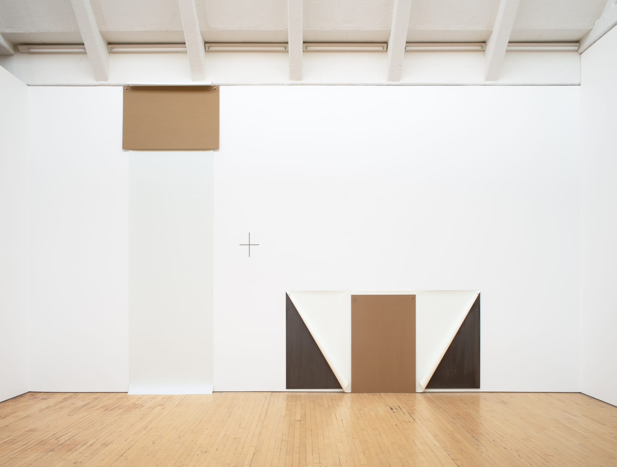
Set, a dry illustration of how simple math concepts may be represented, is a statement (“vertical plus horizontal”), not an equation. Rockburne needed a liquid, unpredictable element to introduce the idea of variability. “Variables,” together with givens and operators, could represent an algebraic equation — which aims to identify the unspecified, the unknown.
In this exhibition, the liquid element is first encountered in Intersection (1971/2018), located at the beginning of the show. A re-creation, like Set, it appears at first to be a very thin bed, extending from the wall. It is made up of an under-layer of paper and chipboard coated with black no. 4 heating oil. Spread over the oil — substituting for plastic sheeting seen in photos of the work’s 1971 version — is a clear nylon film, called Dartek, which is used for wrapping paintings that are susceptible to tackiness and abrasion. The transparent film overlaps the lateral edges of the “bed” by a foot or so, and extends up the wall by about a foot, meeting a horizontal charcoal line drawn across the width of the wall. Interacting unpredictably with the oil, the Dartek film has become a network of exaggerated wrinkles like the craquelure on the surface of an old painting.
This mysterious object conflates spatial and mathematical senses of “intersection.” The work occupies an intersection of floor and wall in the gallery. Two white chipboard modules and a modestly sized roll of white paper nestle into the joint between floor and wall, on top of the black “bed.” The white elements on top of the black might be understood as the intersection of two sets — A (black) and B (white) — such that all elements of B also belong to A.
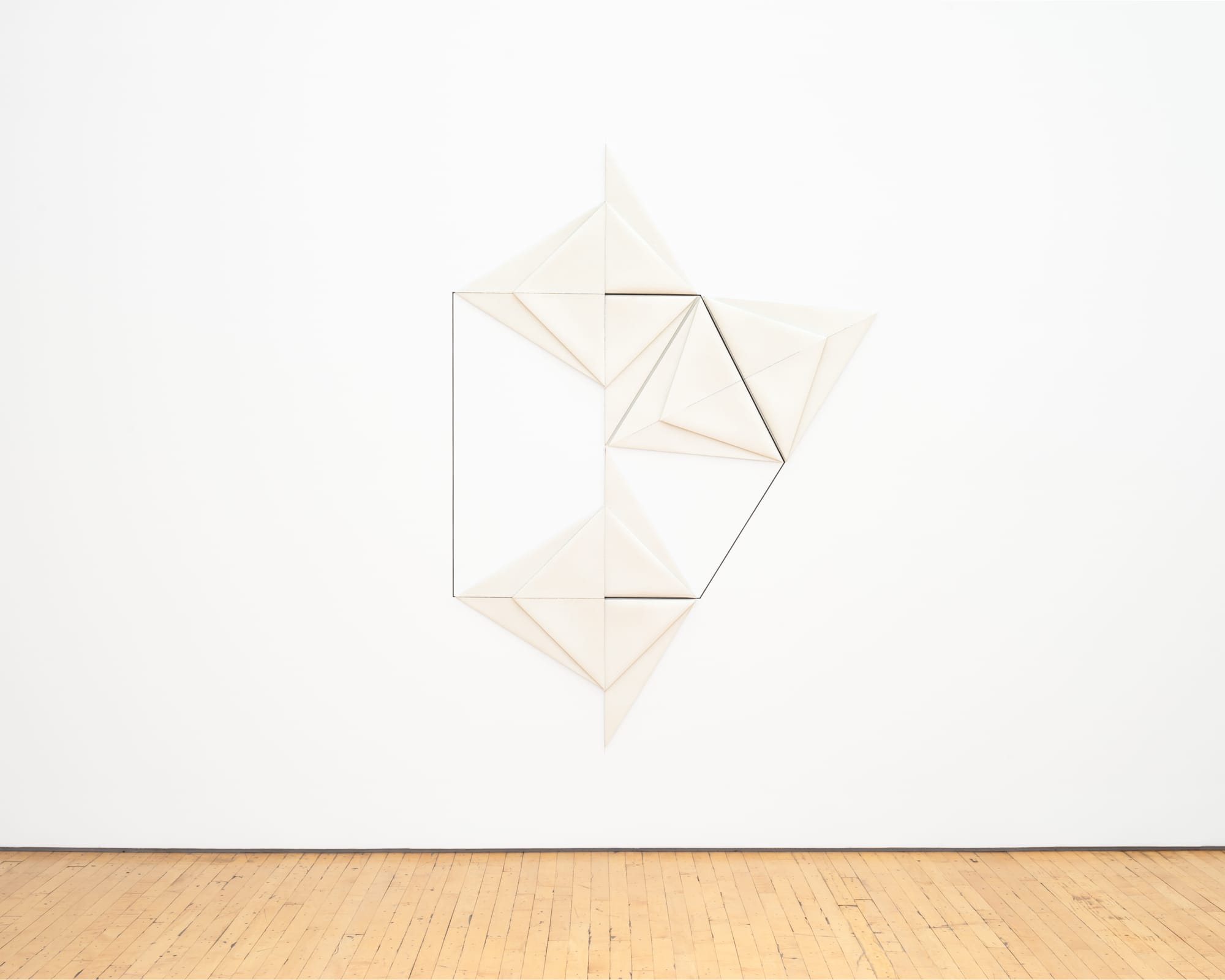
At this Intersection, the exhibition bifurcates into “left-brain” precision and predictability — as in the left-hand gallery’s samples of Rockburne’s mid- and late-’70s folded canvas paintings — and, on the right, the intriguing expanse of Domain of the Variable (1972). In the latter, liquidity — unpredictability and the realm of chance — expands into a full-blown gallery-specific artwork. Unifying the spare presentation is a crisp, chisel-shaped, inch-wide horizontal groove set into the gallery walls. Three distinct elements, each articulated by the chisel-shaped groove, appear in the space, like dancers preparing to perform.
One evokes a pair of seated figures, each composed of a full and a half module, like body and head, narrowly separated by the groove. The drab brown left-hand one is attached to the wall, but the right-hand one, which had been fixed to the wall by some adhesive, appears to have been pulled down from the wall onto the floor, leaving almost a mirror image of itself on the wall where adhesive pulled off pieces of paint and drywall, now stuck to the floor piece in a pattern exactly matching the damaged wall. Whether seen as a visualization of multiplication, or of positive and negative numbers, this piece is one of Rockburne’s most intriguing inventions. One may see it as a capsule example of a left-brain procedure generating unpredictable right-brain results. A second element, a column of white paper, is close by. Rising the full height of the gallery wall, it is held in place at its foot by a chipboard module, around which the paper is tightly folded.
A third horizontal element against an adjacent wall, Z from Domain of the Variable, is the most dramatic and colorful work in the exhibition. The original version of it appeared on the cover of Artforum in March 1972 — an apotheosis for an emerging artist in that period.
Composed of vellum-like paper soaked with grease, its length roughly approximates the height of the “standing” figure. The original version was made with a viscous liquid called cup grease, a mixture of mineral oil and other additives, once used to lubricate bearings and now, apparently, no longer available. Rockburne tried many types of grease as substitutes, finally settling on Ultralube LMX Red Grease. Striking pink when the work was first installed last May, when the front galleries of the exhibition were opened to the public, the color had become more subdued by September, mostly drying to a pleasing tawny yellow. Evidently the artist was not pleased, however, because the piece was remade for the current show and is once again pink. The pink paper terminates at the left edge in a dramatic diagonal tear, which creates a sense of movement, like a dancer stretching across a floor.
The artist has stated that participating in performances in the early 1960s inspired her work. In a 1984 lecture at Skowhegan, she said, “When I started working on … putting the floor into quadrants, and doing dance movements across the floor … somehow it clicked in with knowing how to put a canvas into quadrants […].” She has described to this writer how she came to see dance movements, such as the folding of the body, as being analogous to manipulations of paper or canvas.
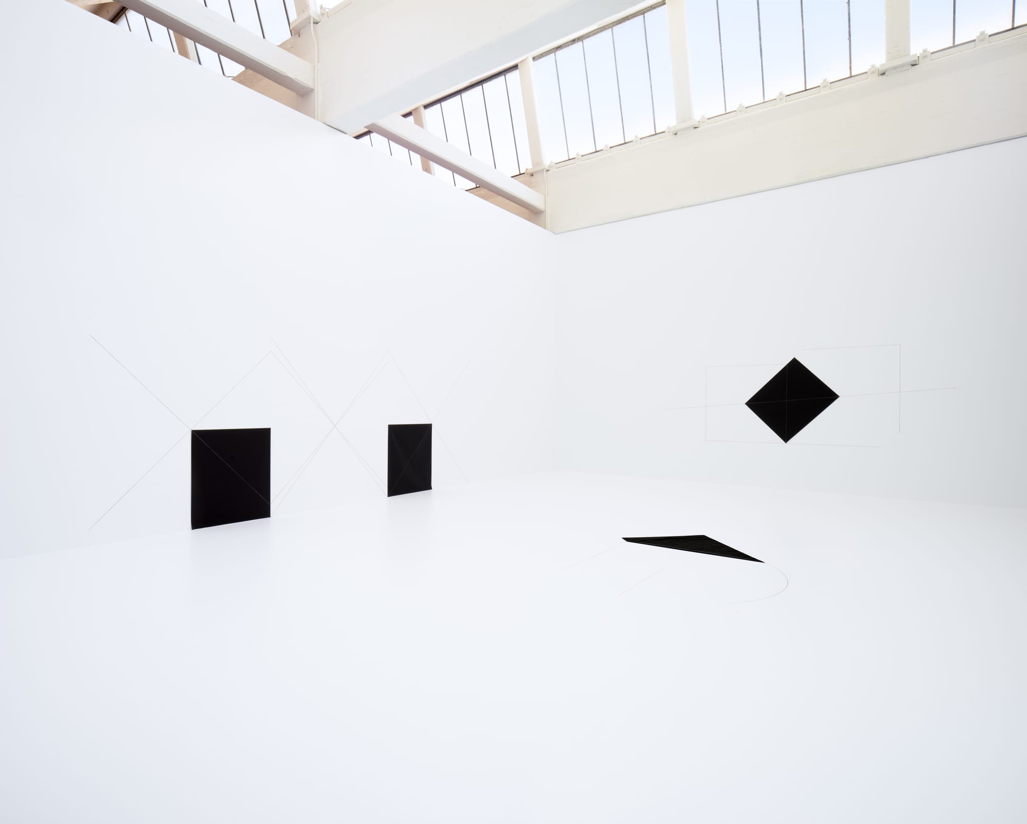
These comments came to mind when visiting a second gallery-specific installation on the “right-brain” side of the show. It is devoted to presenting six re-creations of Rockburne’s 1973 Carbon Paper Installations. The walls and the floor are painted a fairly blinding white — Rockburne insisted on creating a specific white for the walls of her show, colder and more bluish than Dia’s standard white; the staff now calls the color “Dorothea white.” The gallery re-creates a 1973 Bykert Gallery installation of the carbon paper works, in which both walls and floor were drawing surfaces painted white. In the Bykert show, the floor’s gradual discoloration as visitors walked on it was considered part of the piece. In Dia’s version, intended for long-term presentation, viewers are limited to two at a time, shoes removed.
The central element of each of the six separately titled works is an approximately 30-by-40–inch double-sided sheet of black carbon paper. The carbon paper has been folded on the diagonal and from adjacent corners to longer sides, to make a pair of isosceles triangles. Unfolded, the carbon paper’s creases are drawn upon and extended outward onto the wall or the floor, depending on where the carbon paper is located.
The lines intersect and overlap in complex and seemingly unpredictable ways as they emanate from the black rectangles that generate them, suggesting large geometric figures on the wall or floor. Viewing works such as “Carbon Paper Installation: Whitney Piece” (1973/2018), the visitor tussles mentally with a gestalt, suggested by the lines, that stubbornly refuses to resolve itself into a closed form.
Rockburne is typically pegged as a post-minimalist, but that is misleading. She is in many ways a pre-minimalist, her work steeped in the relational compositions of 20th-century abstraction before minimalism. She also embraced the painstaking attention to materials and methods developed by the Bauhaus in Germany and its progeny, specifically Josef Albers, who left Black Mountain College for Yale shortly before Rockburne arrived at Black Mountain as a student, in 1950. Yet she was also thoroughly imbued with the practice of assemblage, having sustained a friendship and, later, a working relationship with Robert Rauschenberg, and having lived for six years or so with an accomplished and meticulous assemblage artist trained at Chicago’s Institute of Design, Gene Hedge. There is an intriguing continuity, in terms of palette, materials, and techniques, between Hedge’s brown and black works of the early to mid-1960s — made by layering and tearing industrial building paper, that is, Kraft paper laminated together with bitumen reinforced with sisal fibre—and her adoption in 1968–69 of Kraft paper and chipboard panels, coated with linseed oil mixed with graphite or soaked with oil, as the medium for her “set theory” experiments.
Rockburne often attributes her interest in set theory and topology to Max Dehn, a brilliant German émigré mathematician; Dehn was known for important contributions to topological theory and was the sole math teacher at Black Mountain from 1945 until his death in 1952. Her accounts of going on walks with him in the woods, where he would reveal the underlying mathematical bases of natural forms, have the air of a fairy tale. However, her interest in set theory is manifested in her art much later, as she approached the age of 40 and gained critical attention.
Minimalism’s emergence between 1964 and 1966 set the stage for her — literally. Many of Robert Morris’s seminal primary forms, first shown as sculpture at the Green Gallery in December 1964 (with re-creations of those works now enshrined at Dia:Beacon), originated as props for performances by dancers including Simone Forti and Yvonne Rainer. Having taken part in workshops at Judson Dance Theater (co-founded by Rainer) in the 1960s, Rockburne naturally saw installation in theatrical terms. Her introduction to the circle of Sol LeWitt, by Mel Bochner, prompted her to make the minimalist space, until then a secondary, essentially passive setting for primary objects, into a theatrically active component of an installation. Bochner, exploring similar paths, but with a dry intellectual approach, had co-organized an exhibition, Art in Series in November 1967, not long before he met Rockburne, and published in Artforum an influential article, “The Serial Attitude,” asserting that serial order is “a method, not a style.” Rockburne realized that serial methods could be employed for personal expression, that a method could generate a style.
Most expressive were the elements you can’t see in historical photographs: the viewers. Echoing the Judson Dance Theater ethos, viewers of her work could encounter an installation and complete it with their active presence; they could be inadvertent dancers responding through their bodies to the monumental paper figures of Domain or to the dance-like “choreography” of lines emanating from the carbon paper pieces. She crucially recognized that the work is not complete without human interaction. “The viewer was drawn into the room,” she recalls in the catalogue for her 2011 retrospective at the Parrish Art Museum, “and that engagement comprised the completion of the work, much as a viewing audience does in dance.”
When a number of her pieces were first reproduced, in that March 1972 issue of Artforum, Bochner, Rockburne’s partner for some years, contributed a note about her art. He wrote (presumably with her approval), “Rockburne’s art has no one-to-one correlation with mathematical set theory. These are not illustrations.” Rockburne seemed to confirm this in 1977 when, “over Christmas eggnog,” she reportedly told Robert Pincus-Witten, her erstwhile critical champion, “It was never about the system — it always was about sensibility.”
Over the years, metaphor hardened into myth, however, as Rockburne gradually pruned the connective tissue between her youthful Black Mountain College experience and her emergence on the New York scene, retailing the story of her early encounter with Max Dehn as an all-purpose explanation of work made nearly twenty years afterward. The story was bought: Dia’s wall signage forbiddingly instructs viewers that the work is “based on set theory.” For Rockburne herself the distinction between art and math seems to have collapsed. She told the New York Times in 2015, “I wanted very much to see the equations I was studying, so I started making them in my studio,” she recalls. “I was visually solving equations.”
The math myth makes good copy but ignoring her immediate predecessors and the aesthetic context in which she emerged diminishes her historical position. By reintroducing relational composition into advanced practice — in the guise of supposed “equations” — Rockburne was, in effect, participating in a dismantling of the unitary, single-narrative “American” art that authority figures of the ’ 60s — Stella, Judd, and others — had promoted. Her most interesting work can be viewed as using the ostensibly epistemological tools embraced by advanced art of the ’ 60s to begin building a fresh art of sensibility, not system.
Dorothea Rockburne is on long-term view at DIA:Beacon (3 Beekman Street, Beacon, NY).