The Golden Age of Arcade Game Typography
A vividly illustrated survey of typeface design, Tosh Omagari’s Arcade Game Typography is a satisfying compendium for anyone occasionally gripped with nostalgia at the sight of a lone Ms. Pac-Man machine.

In his 2007 stand-up special, Werewolves and Lollipops, comedian Patton Oswalt once said: “My geekiness is getting in the way of my nerdiness as I grow older.” Browsing through Arcade Game Typography (Thames & Hudson, 2019) by Toshi Omagari, I know just what Oswalt means. A staff typeface designer at Monotype UK, Omagari studied typography and typeface design at Musashino Art University in Tokyo before earning his MA in typeface design at University of Reading. His 272-page debut is a meticulously catalogued and vividly illustrated survey of typeface design during the golden age of arcade games. There, at the nexus of arcade games and typography, my own geekiness battled with my nerdiness for pole position.
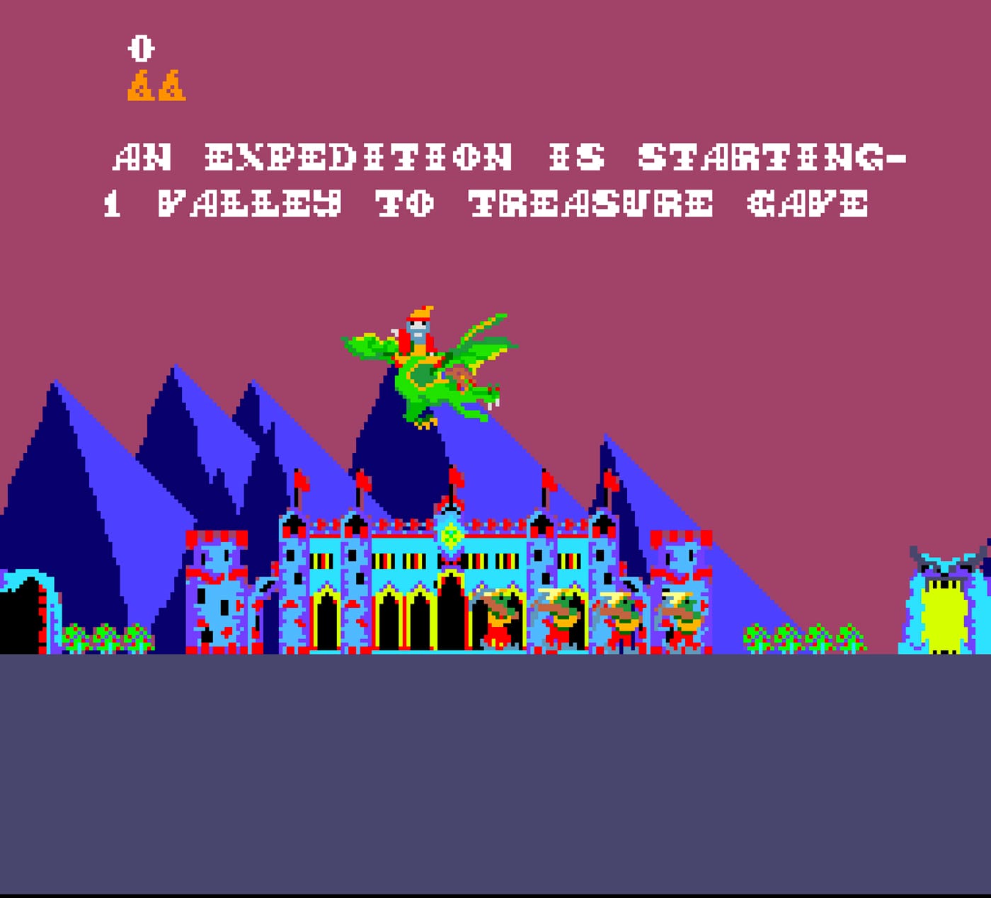
For folks who are less geeky or nerdy, or both, the foreword by Kiyonori Muroga, editor-in-chief of Tokyo-based IDEA Magazine, outlines arcade game typography for the layperson. Muroga delineates the particular genre of arcade game typography covered in the book in terms of a time-frame (the mid-1970s to the early 1990s) and industry leader (Atari). Importantly, he distinguishes it from the later typological evolution to Microsoft and Apple-era information processing. Omagari later stresses that arcade games did not use fonts — in his words, “the physical manifestation of a typeface,” which he describes as “an abstract idea, a design that does not take physical form.” While this may seem like a meaningless distinction to non-geeks, one concrete example is that some of these games did not even employ an entire alpha-numeric array, designers only creating those letter-objects necessary to convey the fixed messaging possibilities of gameplay.
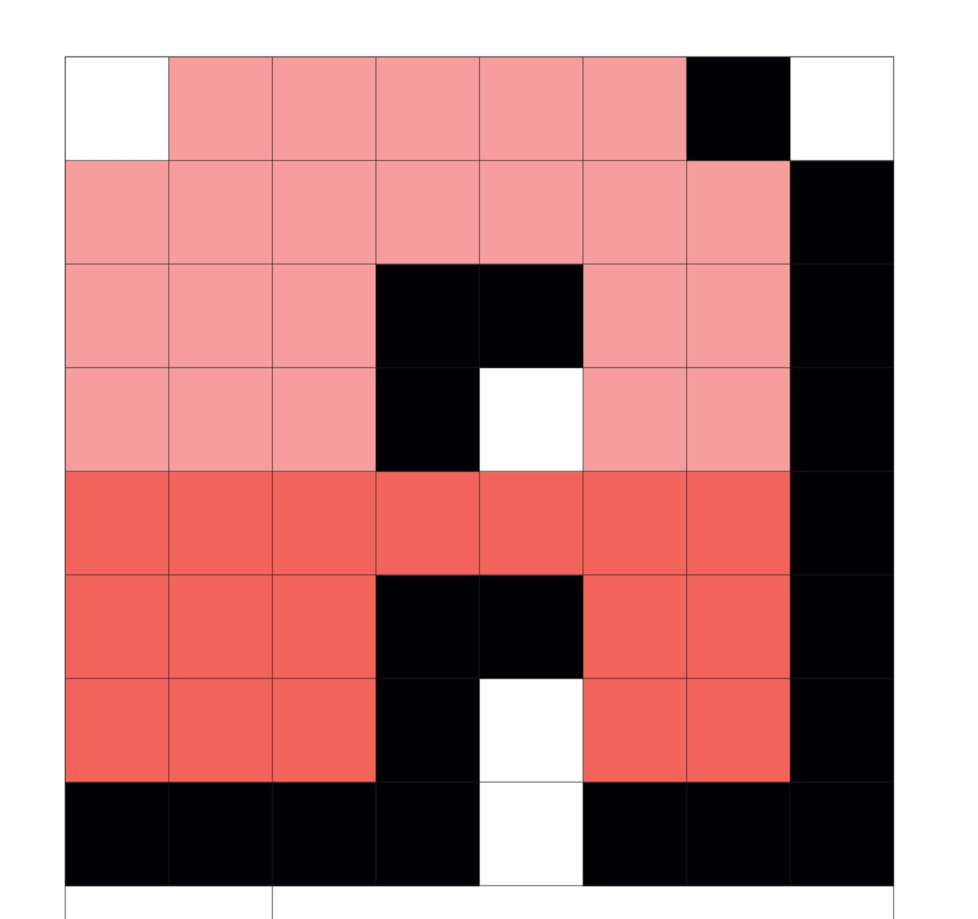
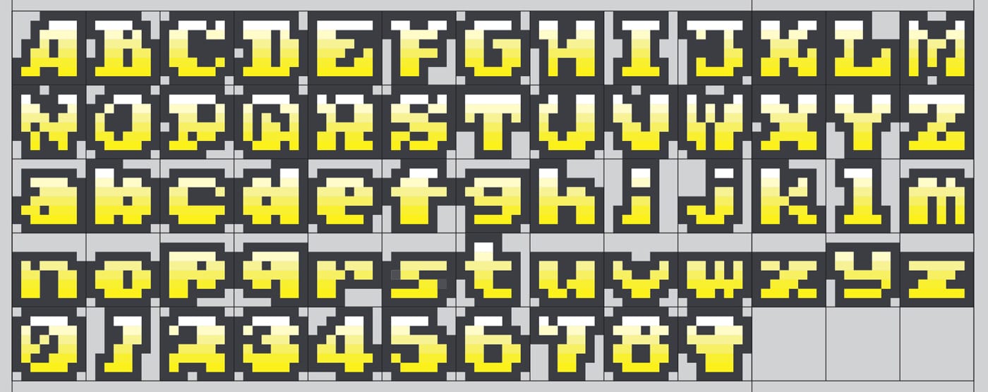
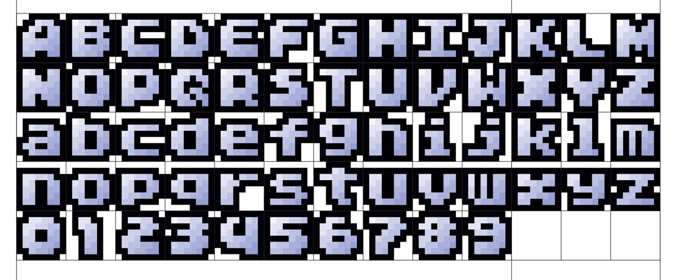
Omagari follows Muroga’s forward with a preface that ups the ante, focusing on the 8×8-pixel plane, which he poetically likens to an infinity symbol. He’s about to back that metaphor with an avalanche of information on the ways in which arcade game typography evolved from the level set by Quiz Show (Atari, 1976) into some 1,600 unique families of letter forms, through small and large design changes in the 8×8-pixel space allotted to each character.
But push up your glasses, geeks, because first Omagari’s got to lay out the rules, in a section literally titled “The Rules.” After defining a set of terms around ideas of typeface, he launches into a two-page dissection of the 8×8 monospaced aesthetic. (Though he acknowledges that later-generation videogames have their own scintillating typographical history, for purity’s sake Arcade Game Typography restricts itself to the 8×8 pixel format.) Now 15 pages into the book, I am becoming concerned that, ultimately, I am neither geeky nor nerdy enough to continue.
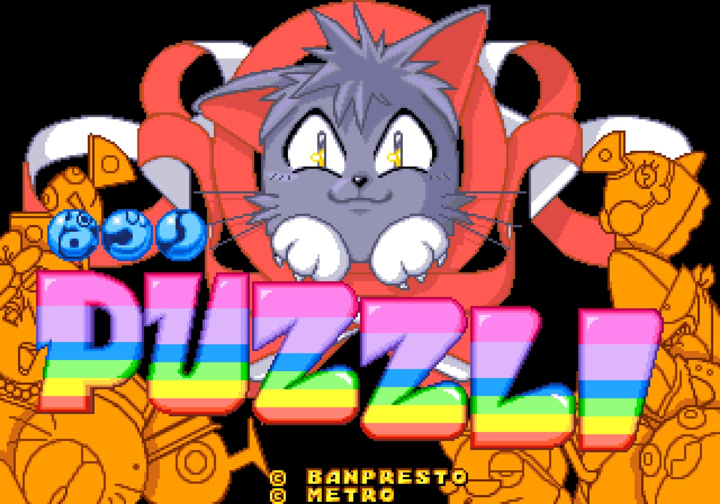
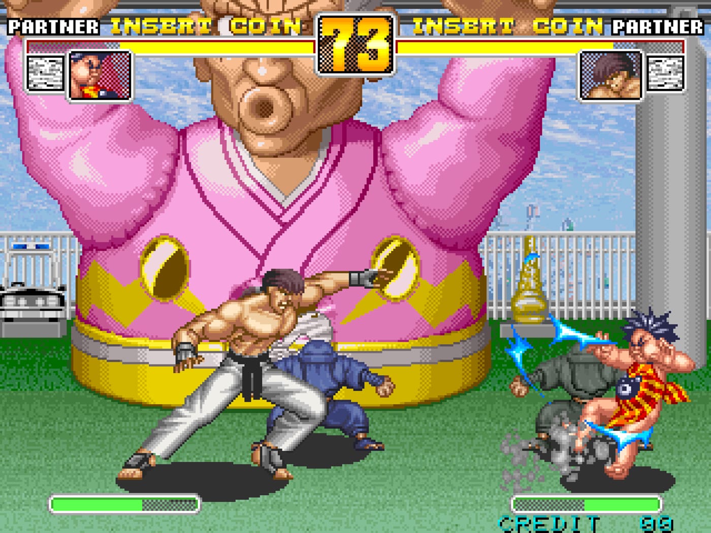
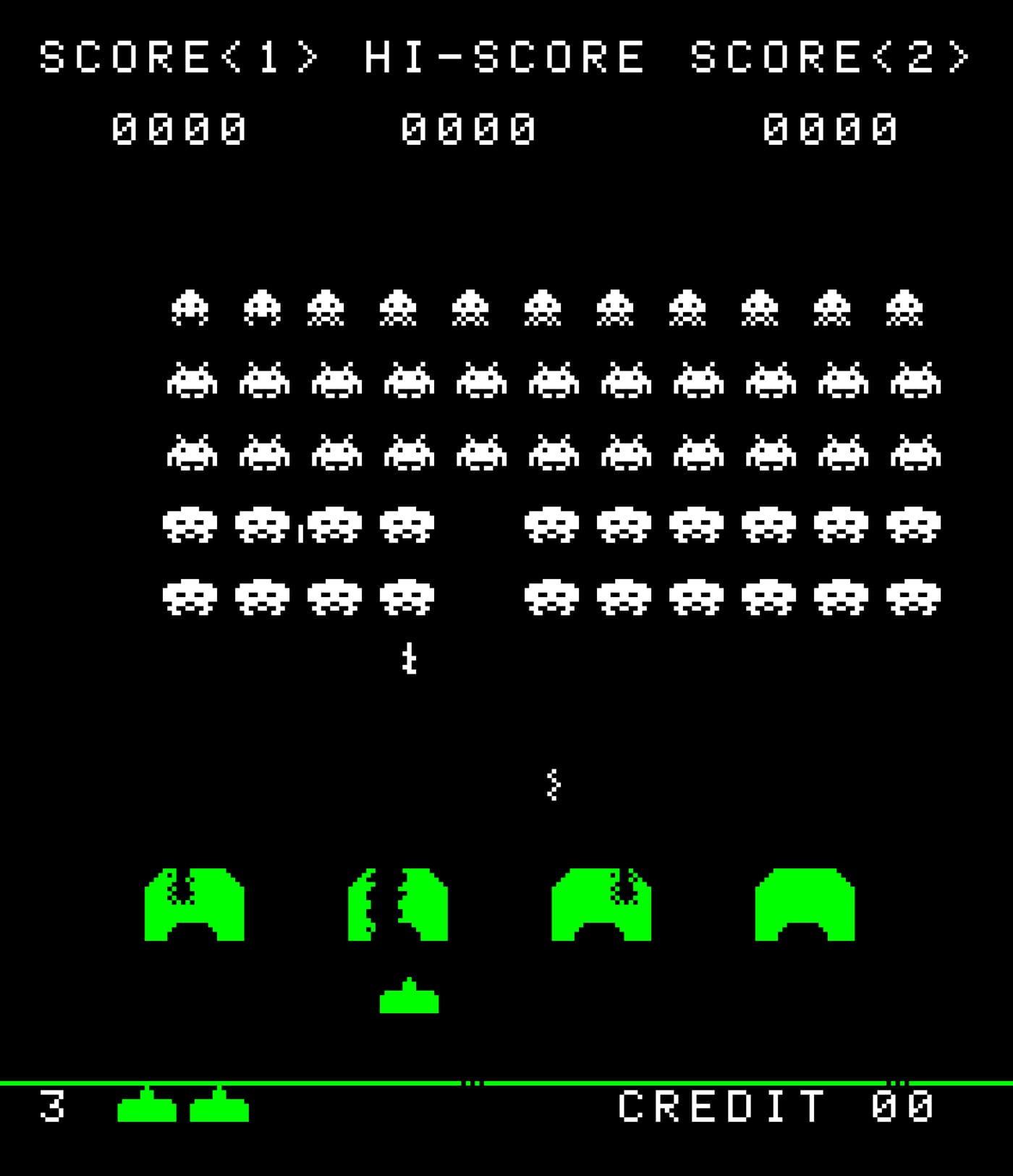
With the turn of just one more page, however, the heavy lifting is over! What follows is a bright, colorful, and nostalgic turn through major players and hidden gems of arcade game design. Having so painstakingly established the field of play, Omagari moves out of the way and lets his reader scroll through page after page of typefaces and screen captures that show them in action. His layouts enable us to detect the smallest changes and evolutions in typefaces, as they highlight the bold breakout designs that gave games like Space Harrier (Sega, 1985) and Tetris (Sega/Atari, 1988) a distinct look and feel.
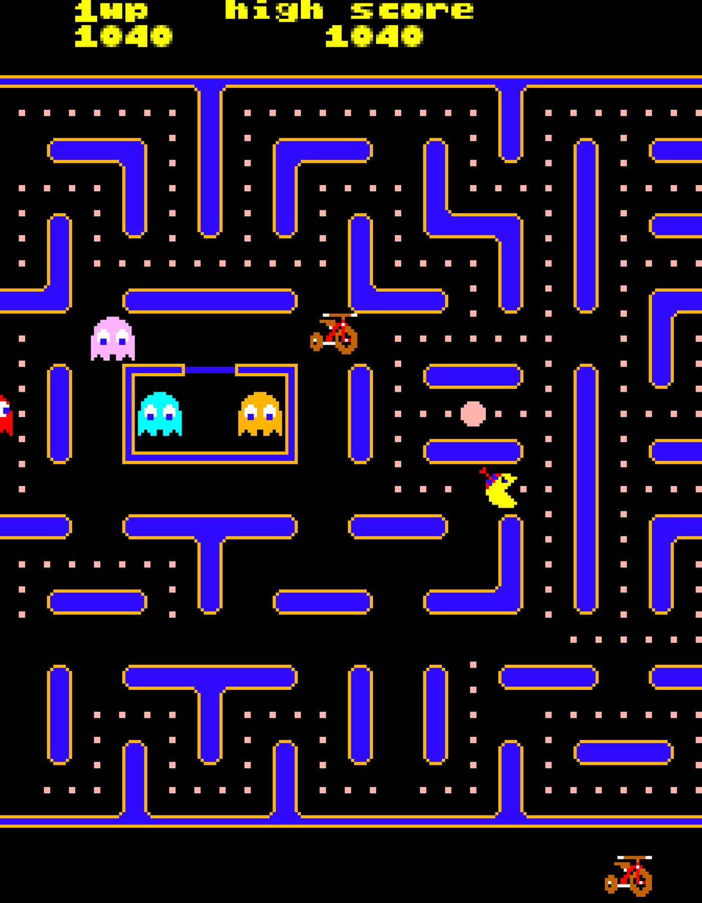
While Omagari is probably right to propose that his readership is comprised of two circles — game geeks and font nerds — with little to no overlap, I find it a satisfying compendium for anyone occasionally gripped with nostalgia at the sight of a lone Ms. Pac-Man machine, remembering the days when arcades were attached to every movie theater, malls, and boardwalk, zinging with noise and energy and flashing in freeplay mode. Arcade Game Typography is a loving tribute to the part played by design in many a childhood and still many a nerdy adulthood.
Arcade Game Typography by Toshi Omagari (2019) is published by Thames & Hudson is available online and from select retailers.